[UE4] Morgue
polycounter lvl 6
A little something I've been working on in UE4. It's very much a WIP but I'd greatly appreciate any feedback.
Thanks in advance.
[ame]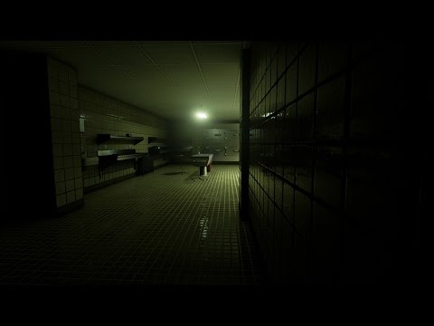 http://www.youtube.com/watch?v=ma5SJPXTR2c[/ame]


Thanks in advance.
[ame]
http://www.youtube.com/watch?v=ma5SJPXTR2c[/ame]


Replies
Looks like you're off to a good start. I'm liking the wall tiles, especially the dimensionality you get in the highlights. The ceiling tiles seem a bit flat, I'd like to see more separation of the tile from the metal strips as it's pretty 2D compared to the walls. The contrasting red cans are a nice start, but I think the scene is far too yellow-green overall.
You have a lot of strong square textures dominating the scene, it would help to break them up somehow. How about a few circular drains in the floor, or a calendar or anatomy posters hanging above the desk against the wall? Not sure what story your scene is telling yet, but if you're going for horror, some bloody streaks or pools could also break those areas up and create some contrast while you're at it
I can't tell if they're placeholder, but the metal cabinets against the back wall in the last shot seem really flat and low-fi compared to the great level of detail you're showing with the sheet, trash cans, and metal tray stands in the scene.
Keep working at it, I'm looking forward to seeing more!
Once again,
Thanks
If you want to use a tile floor and wall, make them differentiate from each other more - maybe the wall tiles are rectangular, stark white and a bit glossy while the floor tiles are dark, square and dirty, like this image.
Just gather enough reference photos, both for your architecture and set decoration, but also lighting and camera composition. I think the sort of sickly-green look you have going right now is hurting, rather than helping. Are the lights tinted green, or are you color correcting through post process effects?
Thanks
As for critique I have to agree with Doxturtle. The overall environment is deceptively empty because there is too much empty open space. Try experiment with bring your walls in so that your areas of focus are closer together. Use the image provided by Moosecommander for reference.
I'll be looking forward to seeing you progress. Keep up the good work!
I would take the green out of the lights - give them a dull blue or yellowish tint, but not green.
If you want to add a bit of green, you should do it through color correction with a LUT. I'd suggest pushing the greens in the shadows, and yellows in the highlights if you go this route.
I think the one thing that felt off to me is the ceiling. Looking at other "classic" morgues, most of them don't seem to use that cardboard or whatever it is tiled ceiling. A flat ceiling or something with way less repetition would be nice.
Maybe the wall is setup so that the bottom half is the square tiles, and the top half is like a painted wall or something? Separated by like wood trim? I can't seem to find any good morgue ref right now.
Just kinda throwing some ideas out there.
I also preferred the tiled flooring. Perhaps having the wall bricks shaped like bricks like in that reference picture than squares may help break it up?
It would be nice if your environment also told some sort of story, At the moment it has no interest or much focus.
Get some mood boards and reference together. I feel like that would help you a lot.
I liked the floor better before when it was tile, but I agree it shouldn't be too similar to the type of tile as the walls, which it was pretty close too. Some high spill/stain areas will color their floor with a pattern or similar color to the most common stain so they avoid big blank expanses of ground that will show off stains.
Actually, just swapping the wall and floor textures might work, put the wall tile on the floor and vice versa.
What I notice is the big distances between everything it shows off the repetition in the textures and makes it look unfinished. But if you pulled everything in, what you have, would be able to contribute more to the scene and it would require less filler and props to bring it to life.
Careful with your ref, TV set morgues tend to be a bit roomier so they can fit their cameras, gear and actors all around the room (morgues aren't that popular, people wait for reports in real life heh). But actual morgues tend to be a bit smaller because they do want things close by, a bit like an operating room. Also
The tables don't really seem anchored in the scene, part of that seems to be their shadows that are different than the trays?
I think it would be worthwhile to carve up the ground and create modular pieces so you can better introduce and integrate unique details, like drains, wear and bases for the tables, which will help them blend into the ground a little better.
I agree about the drop ceiling, it doesn't seem all that practical, things splatter up too and the entire area is designed to be hosed down.
Also think about vents in the ceiling and revisit your choice in lighting fixtures. It seems like a good opportunity to do one of those swivel arm lights. They are exploring inside dead bodies, this room would have the capacity to flood the room with light, even if 90% is turned off for this scene. That infrastructure is ceiling detail, even if its turned off.
You probably haven't gotten to them yet but don't forget to run electrical pipes along the walls. In spaces that don't have hallow walls (like the basement of a hospital) those things are typically tacked onto the wall. Especially as things are upgraded and they diverge from the hospitals original building plan. They are simple ways to add detail, age and variation.
If you're going more for that scene from No Country For Old Men then your hallway will need to be similarly lit. You can't do both black hallway and well lit morgue area because the lighting and art direction are at contrast with one another.
Thanks
I think if you cramped it up some, you might get a more "filled out" feel to the room. And you would get the added benefit of more things reflecting other things and cooler light interactions.
The props themselves look great they just seem a little anti-social.
I think for a game environment it needs to be much more compact, rather than the realistic spacing you currently have. Unless it has interactivity that requires that space, I think you should move the walls closer together and rearrange some props to fill it up a bit.
Sorry if it feels like I've just regurgitated @WarrenM's point, but I wanted to reiterate it as I think it'll really help the scene.
I think the green hue of your earlier screenshots was effective in making it feel quite medical - it might be worth bringing a bit of that back; and maybe dialling back the saturation of the floor. Beautiful props though (I particularly love that cloth!).
I'll say a few things;
I'm glad you made the change on the floor and the ceiling, your most recent post definetly breaks up the monotony, I'd make the tiles even a little bit bigger.
Also the room is too big. I've never actually been in a morgue so I dont know the sizes, but without anyting going in the room, the size really detracts from this piece overall. So i'd compress it a bit to make it feel a little claustrophobic.
Thanks in advance.
[ame]
That feels A LOT better. Everything clicks together a lot better with it's pulled in tighter. I like the changes to the floor and the base of the tables, the lights, all great additions, nice work.
Things to think about adding:
Scales to weigh organs.
Grossing Station? It looks like you have a large stainless steel sink area which might be used for washing down organs or flushing out intestines but they might also have a station to take things out and examine them closer. They also might get bits and pieces and have to go over them and they aren't going to use the large tables to do that.
Transfer Gurney.
Test equipment. Its part lab?
Microscopes.
blood gas analysis.
LOVE those door hatches although I feel they could be scaled up a little to better fill the space they're in. Maybe 125% each? Just so there's less dead space between them.
Maybe also do something where each door hatch has a slot where a clipboard or something can be attached ... so you know who's in which one.
You might also consider taking that green color you had on the floor originally and maybe doing a half painted wall around the exterior. Like green from the floor to about halfway up and then what you have there now the rest of the way. Might give the walls more visual interest for little cost.
The chunky latches and hinges on the crypt doors look GREAT. Nice work there.
Please keep posting! I look forward to seeing more!
I'm finally going to start applying after I finish this scene and update my portfolio. I'm heading to Austin in a couple weeks for the IGDA Career Catalyst event and will have the opportunity to meet with representatives from several studios. I'm really hoping this scene will be good enough to help me get into the industry, I sincerely appreciate everyone's help.
Things like this are what I miss when I have to use Unity for freelance work.
[ame]
On a more serious note great stuff and an awesome job on taking crits. Maybe you can push it a bit more on the texture work with some pbr-ish type effects, such as waterstains/wetness mixed into the roughness of the floors, smudged/foggy areas on the metal bits and scratches only really seen when the light hits them at certain angles, etc. (Sort of how metal looks when it collects condensation from breathing on it in a cold room if that makes any sense) Basically all of that stuff can be done only in the roughness map as an additional effect, although you can very lightly (like 15%-5%) have some in the albedo map to make it stand out just a bit more. I find substance painter great for adjusting details like that.
I wouldn't make it super dirty/or bloody myself as I like the creepiness I'm getting from the sterilizing feeling right now. Just enough to say, hey... someone cleaned up something that was here a few minutes ago
I'll be really interested in the lighting once you get there !! It's going to play a huge part.
Waiting for updates..:)
I'm not sure about the ceiling, but for the walls.
1. X-Ray viewer (could glow dim with an x-ray on it?)
2. Chart of the human body
3. Remember to wash hands near the sink
4. Maybe some red text (can't think of any right now) to add a hint of red to match the trashcan.
5. Labels on the equipment: https://postmediawindsorstar.files.wordpress.com/2014/09/morgue_2-1.jpg
5.5 Or, for a red label: http://vignette3.wikia.nocookie.net/creepypasta/images/3/3c/Morgue_%281%29.jpg/revision/latest?cb=20120727232009
6. Some sort of towel dispenser or like needle disposal: http://www.southportandormskirk.nhs.uk/news/UserFiles/Image/Pic%202%20Fridge%20room%20after%20%20BEn%20and%20Clare.JPG
Ok I'm gonna stop there but hopefully that helps get some idea of what you could add.
looks good so far!