Home 3D Art Showcase & Critiques

Metroid-inspired mech girl

Nix
polycounter lvl 13
Offline / Send Message
Nix polycounter lvl 13
Latest stuff:
armor_textured.jpg


concept_colors.jpg


original post:

I want to try and step up my concepting and modeling a little, design-wise as well as technically, because I feel I've been slacking.

This is gonna be Metroid-inspired, mostly in the sense of, I want to make a girl in a mech armor, and I want to make a morph ball form of it. :p I really like how the design elements of Samus' different armors carry over to their respective morph ball forms. The actual design itself, I'm not gonna specifically try and capture the Metroid style (gonna go for something bulkier with no helmet), but who knows how it'll end up.


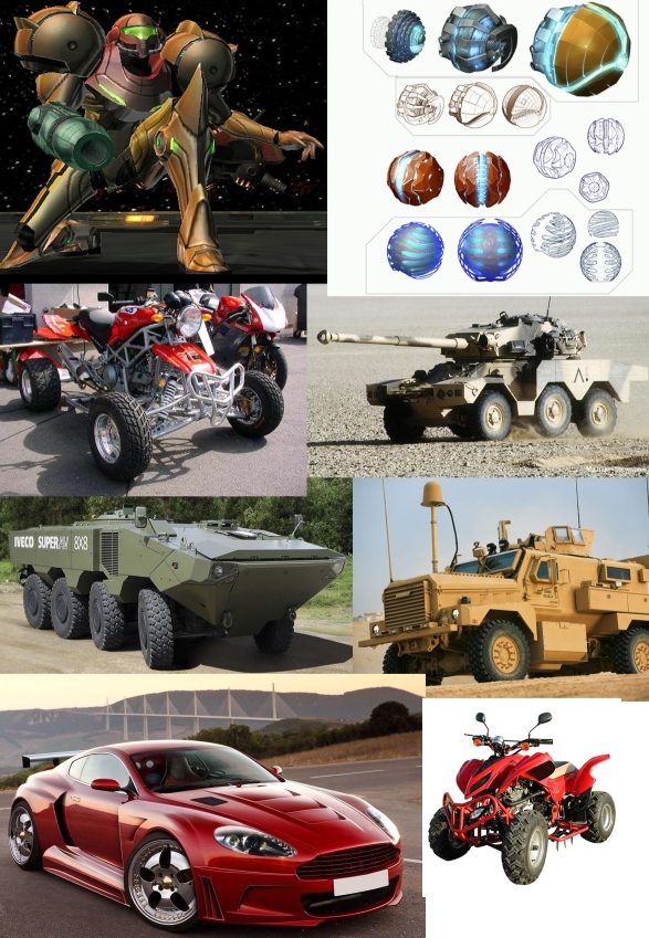
Here's some stuff I gathered for inspiration:
mech.jpg


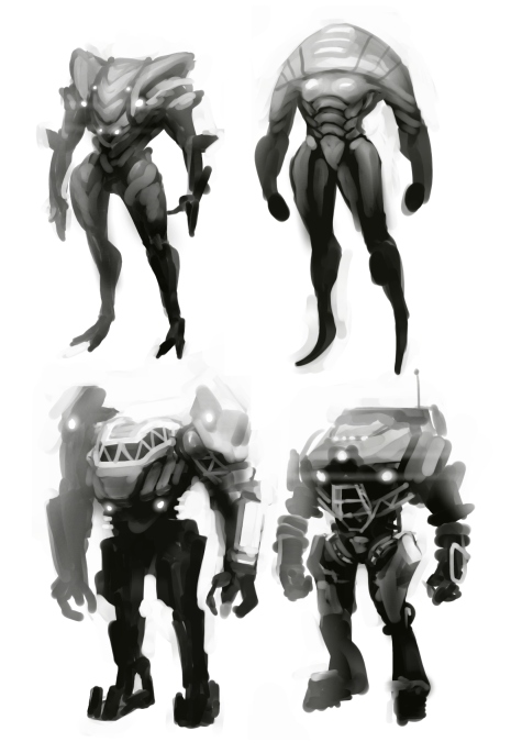
And here's some initial sketches for the suit and the girl. Not really happy with them yet, don't know if I should try to mess with these more, or do a bunch of new ones. Whaddya think?
mechsketches.jpg

facesketches.jpg

Replies

  • Hofsta
    Options
    Offline / Send Message
    Interesting. I'll be watching this one.
  • BradMyers82
    Options
    Offline / Send Message
    BradMyers82 interpolator
    looks like a good start, I like the sketches.
  • erroldynamic
    Options
    Offline / Send Message
    erroldynamic polycounter lvl 18
    Sweet! Looking forward to seeing this progress. Digging the sketches, I think the bottom right might be my favorite.
  • Snader
    Options
    Offline / Send Message
    Snader polycounter lvl 15
    I'm not fond of the suit lacking a head. The latter two at least look like machines so it makes some sense, but they look of a completely different scale than a human. More like a mech than a bodysuit. All I see when looking at #1 is a pokemon.
  • Sukotto
    Options
    Offline / Send Message
    Sukotto polycounter lvl 8
    I agree with Snader, the bottom two look more like mechs/transformers while the top two look more like weird alien creatures.

    I do like the direction you're heading in with 1 and 2 with somewhat of an organic suit of armor idea but it could be pushed a little further
  • WorldWithoutWords
    Options
    Offline / Send Message
    WorldWithoutWords polycounter lvl 6
    Gonna be cool man :) I like the sleeker less angular direction of the top designs but they're a bit too organic maybe :0. (P.S. Your models are f*cking awesome :D)
  • Nix
    Options
    Offline / Send Message
    Nix polycounter lvl 13
    Thanks a lot for the comments. :D

    I did a whole bunch more silhouettes, headless and with head, I want to try and take this whole concepting thing seriously for a change. :P I'm still kind of struggling with the whole process, the garbage vs. usable stuff ratio is still way too low IMO.

    moremechsketches.jpg


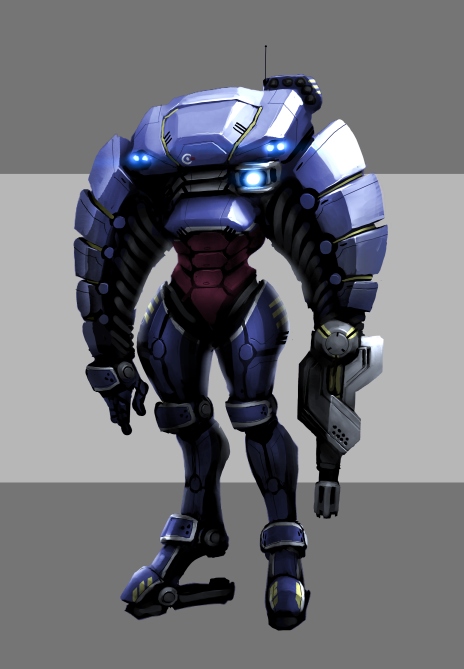
    I did however end up with a design I liked. I'm sorry, I was way too attached to the whole headless thing to let go of it, lol. I did try and make it look a bit more natural as if an actual human would fit in there (drew it over the outline of a human figure). I guess if you squint there's sort of a head outline, though.

    conceptwip2.jpg


    And here's some girl sketches, I think I like the left and upper right hairstyles most, but I'd love to hear some opinions.

    girlconcept-hairstyles.jpg
  • Rob Macko
    Options
    Offline / Send Message
    Rob Macko polycounter lvl 6
    The design sketch you're going with looks cool to me. One thing that comes to mind since you're relating this to Samus, is that she and her suit are very agile. This suit looks very heavy, like a half tank suit. I'm interested to see where you take this though ;)
  • Nix
    Options
    Offline / Send Message
    Nix polycounter lvl 13
    It does look more heavy, though like I wrote in the original post, I don't mind if it ends up that way. :)

    This is the last time I'll mess with the concept, next I'll have some modeling done.

    concept_colors.jpg

    concept_frontback.jpg
  • Alex Pointer
    Options
    Offline / Send Message
    I think this concept is very good-you have some asymmetry going and the overall design of the character is very unique. My only concern is that those elbows aren't going to bend properly, unless you are limiting or eliminating elbow rotation all together-that would be my only feedback on this because the overall design is awesome!
  • YoutLeaderVal
    Options
    Offline / Send Message
    I like the top-right hairstyle the most. The one on the left looks cooler and more attractive, but it feels same-y. The top-right one reminds me of Aeon Flux; it's flashy and gives me the impression of a bleak future. It's more unsettling and adds to the notion of her being some kind of battler.

    The mid-right one looks like a lackey, and the bottom-right one has an air of importance, but nothing really fun to look at without knowing the story.
  • YoutLeaderVal
    Options
    Offline / Send Message
    Also, that suit looks awesome. I know you said you won't mess with the concept, but, just throwing it out there, what do you think of some organic-looking kind of protrusion? Maybe to help her do backwards cartwheels or jump or something?
  • dpaynter26
    Options
    Offline / Send Message
    dpaynter26 polycounter lvl 11
    Holy Chun-Li Thighs, i would work on making them smaller if you are going to model her outside of the suit like your sketch
  • niefong
    Options
    Offline / Send Message
    dpaynter26 wrote: »
    Holy Chun-Li Thighs, i would work on making them smaller if you are going to model her outside of the suit like your sketch

    Why are stylized big thighs bad?
  • Nix
    Options
    Offline / Send Message
    Nix polycounter lvl 13
    Progress!

    armorwip1.jpg

    Alex Pointer: I'll definitely move the plates a little further apart. I had this whole thing in mind where the arms of the armor bend as a whole, like a tube, while them being quite roomy inside would still allow the angular bend of a human arm inside. But even considering that you're right that the plating makes it too rigid as it is now. Gonna work on that.

    YoutLeaderVal: Yeah I think I'll go with the upper right one. I can't quite visualize your idea with the organic looking protrusions though. Kinda like stabilizers?

    dpaynter26: Haha sorry man, I like big thighs and i cannot lie. ;D I kinda wanted to differentiate her from Samus in design and also body type. I appreciate your two cents, though. :) I did draw the armor around the sketch of the character, so she definitely fits inside the suit, if that's what you were thinking. Or did you mean something else? Does it look anatomically incorrect?
  • Nix
    Options
    Offline / Send Message
    Nix polycounter lvl 13
    More progress~

    Crits very welcome btw.

    armorwip2.jpg
  • Nix
    Options
    Offline / Send Message
    Nix polycounter lvl 13
    Long time no post! Here's the highpoly for the suit finished, colors and materials aren't final (still missing a bunch of paint details) but it's getting there.

    If anything's off, technically or otherwise, I'd love to hear it.


    armor-hipoly.jpg
  • Blaisoid
    Options
    Offline / Send Message
    Blaisoid polycounter lvl 7
    looking good.
    lots of edges feel too pinched though.
    also, surface gets messy in some areas, like legs right below the ass have those little bumps and whatnot. i guess it ain't easy to get it right with all those cuts and circles.
  • Mask_Salesman
    Options
    Offline / Send Message
    Mask_Salesman polycounter lvl 13
    Nice work,
    I wouldn't expect you to want to change it so late now but the square head piece you've chosen really breaks the design flow form me. And it's abstract from the rest of the shapes already in use, my eyes would expect more curves to continue the flow. Actually the very first two concepts were good examples of this.

    Well anyway you've shown good concept to end product skills either way so congrats :)
  • Bacn
    Options
    Offline / Send Message
    Bacn polycounter lvl 13
    Great model, but there's two things about the arm cannon that irks me a bit.

    First is the location on the arm. Most guns of this nature start at the elbow and cover the entire forearm, which makes them look a lot more comfortable to use when dealing with recoil. It's hard to tell where the gun is situated in regards to the pilot in the suit, but on the suit itself it seems to start right above the wrist.

    locationp.jpg


    The second thing that bugs me is the protrusion on top of the gun. The design gives the impression that's the direction the barrel is supposed to move due to the recoil, which would send the pilot's arm flying in a weird direction at best and break her wrist at worst.

    recoilg.jpg
  • Nix
    Options
    Offline / Send Message
    Nix polycounter lvl 13
    Blaisoid wrote: »
    looking good.
    lots of edges feel too pinched though.
    also, surface gets messy in some areas, like legs right below the ass have those little bumps and whatnot. i guess it ain't easy to get it right with all those cuts and circles.

    Pinched, as in too sharp? There's an edgesplit modifier still there, I should remove that to soften up those edges a bit. If that's what you meant anyway.

    And yeah, the bumps. :( It's pretty difficult, I feel I could spend hours just trying to smooth it out. I wonder how people usually handle this (curved surfaces with inset detail).

    Nice work,
    I wouldn't expect you to want to change it so late now but the square head piece you've chosen really breaks the design flow form me. And it's abstract from the rest of the shapes already in use, my eyes would expect more curves to continue the flow. Actually the very first two concepts were good examples of this.

    Well anyway you've shown good concept to end product skills either way so congrats :)

    Yeah I don't think I'll put a different head on at this stage (it reads a lot as a head, although I initially intended for it to be more of an extension of the torso, a "headless" design). I agree on the flow though, I think it looks a bit better in the final concept drawing, whaddya think? I've messed with the head and arms a little to kinda try to capture that a bit better.


    Bacn wrote: »
    Great model, but there's two things about the arm cannon that irks me a bit.

    First is the location on the arm. Most guns of this nature start at the elbow and cover the entire forearm, which makes them look a lot more comfortable to use when dealing with recoil. It's hard to tell where the gun is situated in regards to the pilot in the suit, but on the suit itself it seems to start right above the wrist.

    The second thing that bugs me is the protrusion on top of the gun. The design gives the impression that's the direction the barrel is supposed to move due to the recoil, which would send the pilot's arm flying in a weird direction at best and break her wrist at worst.

    Yeah the gun's kinda iffy. I'm resisting temptation to just throw it out and redo it at this point, haha. I agree it looks a little weird compared to established arm cannon designs that start at the elbow, I guess I just wanted to be all different, but I'm not sure it worked out. :P I imagine the arm motors/hydraulics being pretty strong to deal with the recoil (the arms are pretty huge).

    The hand on the left isn't indicative of where her real hands are, because it's some kinda extended robot hand. I would imagine her fist would be sitting right at the gun's circular base connection. So wrist breakage shouldn't be an issue in that case, I hope?

    Thanks a lot for the detailed response. :D
  • Nix
    Options
    Offline / Send Message
    Nix polycounter lvl 13
    Did a bake and texture and a quick rig. I considered adding some wear to the armor, but I think I kinda like the cleanness, whaddya think?

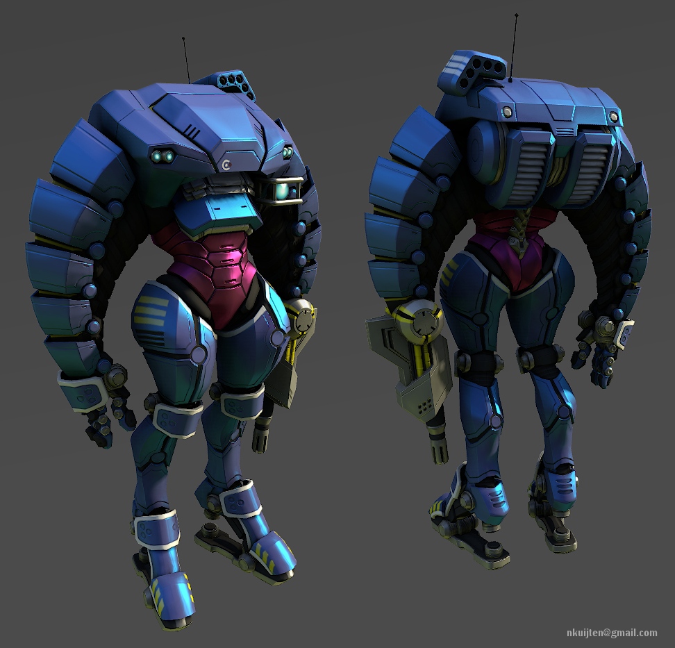
    12410 tris, 2048 texture (diffuse, spec, normal, emission)

    armor_textured.jpg

    armor_textured_posed2.jpg

    armor_wires.jpg

    armor_diffuse.jpg

    Are there too many uv islands? I don't know how to really decrease the number of them any further without major distortion, is it just a matter of simpler modeling?
  • Daft.Eng
    Options
    Offline / Send Message
    The armour is great, but the pose really made me smile, something about that simple pose really helps to add life and give a sense of what it moves like.
    Absolutely inspiring stuff, I love the clean texture, but I can't help but be intrigued by the thought of a more worn version.
  • D4V1DC
    Options
    Offline / Send Message
    D4V1DC polycounter lvl 18
    So original and different from what we usually see, I like her!

    Maybe a short walk or other animations would bring more life to her.

    Like Daft.Eng says I can see her moving around, springing into action at times. :)
  • FullSynch
    Options
    Offline / Send Message
    FullSynch polycounter lvl 11
    Wow looks fantastic, it has a nice charm to it. It looks great clean, but a little wear and tear might make it look even better? :)
  • ZacD
    Options
    Online / Send Message
    ZacD ngon master
    I feel the design only works in the posed render, looks awesome though.
  • erroldynamic
    Options
    Offline / Send Message
    erroldynamic polycounter lvl 18
    Man, that came out great! Love the design, very unique and has "character". I dig the clean look too.
  • Sebeuroc
    Options
    Offline / Send Message
    Sebeuroc polycounter lvl 13
    Cool, cool. I like the cleanness, but even something brand new has a few dings and scratches. A little grunge would go a long way in tying the whole thing together (especially in the spec map.) Nice work!
  • Shanthosa
    Options
    Offline / Send Message
    Shanthosa polycounter lvl 11
    I really really dig this. Absolutely awesome work.
  • Mr.Wednesday
    Options
    Offline / Send Message
    Whoa. Got a stiffy over this. Love the well thought out design. I will most def keep an eye on this thread. Good job!
  • butt_sahib
    Options
    Offline / Send Message
    butt_sahib polycounter lvl 11
    Looking pretty hot.

    I agree, you could try giving it a minimal dirt/grunge/scratches pass.
    I also think that you could add a smoke-y/cloud-y specular map for the metallic parts to really break it up in places.
  • AdamRodgers
    Options
    Offline / Send Message
    Wonderful work, love it too bits. Now more please.
  • Nix
    Options
    Offline / Send Message
    Nix polycounter lvl 13
    Thanks all for the kind words. :D And... other (pants-based) expressions of approval. I guess with all the comments about it, I'm gonna add a little texture to this thing later. I do feel like I want to see how that looks, myself.
  • Mask_Salesman
    Options
    Offline / Send Message
    Mask_Salesman polycounter lvl 13
    The headless design is cool I guess, new directions are always good to try out, I will say I dont think it deserves a 2048 texture tho, due to it being mainly block colour textures, I would emphasize on material definition atm because of that. It parts are metal you need to get that across, simply overlaying metal textures and edge wear is an easy way of getting that across.
    Also focus of the specular alot, metal is often defined in the specular more than the diffuse as a way to differentiate material differences.

    keep it up dude :)
Sign In or Register to comment.