Home 3D Art Showcase & Critiques

So I'm painting this lady with a spear...

Hey guys and gals! Been out of the loop for a while without much time to set aside for anything art related, and I realized the lack of it has been dragging me down. So here I am trying to work off the rust.


Something5.jpg

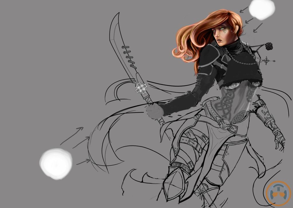
So here's the start of it I guess. Still mostly in the line art and block out phase although I've given a little more love to the face. By no means is anything set in stone.

I'm not really happy with a lot of what I have going on right now so I was hoping I could get some good feedback and or tips. Be mean if you must, I cant take it. Thnx!

Replies

  • vreza
    Options
    Offline / Send Message
    vreza polycounter lvl 12
    does the long handle of the spear go between her legs? kind of an awkward pose I'd say..
  • Hofsta
    Options
    Offline / Send Message
    No it doesnt even though it looks like it does. Never erased that end of it and didnt catch it until now. Thanks.
  • Selaznog
    Options
    Offline / Send Message
    Selaznog polycounter lvl 8
    While you have some nice rendering going on, I think it's usually best to block it in with colours (or even black and white) first, and then do passes of detail over it all at once.
  • GarageBay9
    Options
    Offline / Send Message
    GarageBay9 polycounter lvl 13
    Without her left (right to us) leg out further to support her weight, it looks like she's about to just flop over on her face. Very strange looking pose with the alignment of the legs and hips.
  • njc6425
    Options
    Offline / Send Message
    cool looking character even at this point :)
  • Avanthera
    Options
    Offline / Send Message
    Avanthera polycounter lvl 10
    Her looking like she's falling is a good thing, it leads the eye that ways toward the face and such, and makes her look more dynamic. I'd move her right leg (our left) inwards, so it crosses the other leg a bit, atm, from her hips to her knees is basically a box, but if you make it angled inwards, it will look much more feminine and dynamic. Like others have said, It may be a good idea to get a lot of things blocked out in order to see the composition/etc. easier.

    Gogo man!
  • Hofsta
    Options
    Offline / Send Message
    Thanks for the feedback guys! Initially I was thinking she was going to be some kind or warrior mage or w/e and that sue may be hovering/ flying. To this end I ended up with the sort of angled pose, now that you guys have brought this up maybe I will pull her back a bit so that you can see all of her and I can make this idea more apparent. Or do you guys think that the comp looks better pulled in? I spose I can always block it out and experiment.

    I will definitely move that leg in to get the pose looking more femine though.

    As far as the blackout vs detail goes I agree with and appreciate the advice. I tend to get fixated with the face on any new piece that I do and tend to over render it before I really should. I'm done with it now though until I block out the rest of her.

    Anyhow, hope to get more progress up later tonight!
  • Hofsta
    Options
    Offline / Send Message
    This is what I got done tonight. Took all the advice to heart and broadened my strokes to start working on the big picture. Got the entire character blocked in and I'm beginning to see my comp a little better. Hopefully by fixing the leg position and showing her feet all that were brought up before are resolved or at least alleviated.( or maybe I made it worse, now I'm not sure about the pose...)

    Something6.jpg


    Let me maybe try and explain what I'm doing a bit so everyone is on the same page? She's some sort of warrior caster kinda chick. She is supposed to be about to take off into the air, but she is unsure of something and is looking back at something or someone as she prepares to fly away. Thats the pose I'm gong for so please tell me if I'm nailing it and if not suggestions on how to get there.

    Thanks!
  • Hofsta
    Options
    Offline / Send Message
    Also... I know its a little early to start worrying about colors at this stage, but these were so easy to do that I couldn't resist. Let me know if any of these grab ya'll or if I'm going about it wrong.

    Colors.jpg
  • z0ltan
    Options
    Offline / Send Message
    z0ltan polycounter lvl 13
    It is never too early to start worrying about color. I dig the red and blue quite a bit.
  • Sako
    Options
    Offline / Send Message
    love the third one)
  • Hofsta
    Options
    Offline / Send Message
    I haven't gotten much done lately. Started back at it with tweaking a few things...such as the cloth elements which were piss poor. I really need to find some good ref for capes and shit in the wind. Help?

    Something9.jpg
  • Steve Schulze
    Options
    Offline / Send Message
    Steve Schulze polycounter lvl 18
    Superhero comics might be a good reference - Superman, Batman or Spawn or any number of other caped folks.
    batman.png
    Smug Batman thinks he's better than you.
  • Hofsta
    Options
    Offline / Send Message
    Thanks Jack, I'll look into that. If you find anything specific, send it my way would ya.
  • CandyStripes05
    Options
    Offline / Send Message
    CandyStripes05 polycounter lvl 9
    daaaaaaaaaaaaaammmmmnnnnnnnnnnnnnn
    ps: red and blue was a solid choice
  • Teessider
    Options
    Offline / Send Message
    Teessider polycounter lvl 11
    I agree with other people in that the red/blue colour scheme is the best! Can't wait to see this finished!
  • Hofsta
    Options
    Offline / Send Message
    Still derpin away for those of you inclined to care. Roughed out a better cloak and made a few other changes.

    I wanna hear some crits for you people! Don't tell me what I'm doing right, just what im doing wrong.

    Something11.jpg
  • Ruz
    Options
    Offline / Send Message
    Ruz polycount lvl 666
    the hair spolis it for me , my eye is drawn straight to it. looks a little made up.
    left arm looks a little awkward, like its coming out of her side/torso
    looks good overall though
  • Hofsta
    Options
    Offline / Send Message
    Is the hair jarring because it looks fake or because of the color? To be honest I'm not happy with the hair yet either but im holding off on obsessing over it till I get more of her refined. I'll dick around with the left arm a bit and see what I can do about that. Thanks for the feedback man.
  • Jessica Dinh
    Options
    Offline / Send Message
    Jessica Dinh polycounter lvl 10
    Your painting technique is gorgeous :D and I really love the contrasty colors - but her sword arm is broken. You can fix that by fixing the perspective lines on her arm - right now the upper arm is coming toward us (should be going back slightly), and the perspective lines on the forearm are so unclear it is actually hard to tell if it is coming forward or going back. I would draw her arm as a cylinder first until it looks more natural. Imo, the pose of this arm actually needs some foreshortening to look correct. If you can, I would have someone try recreating this pose for you so you can snapshot it for reference (have them lean against something maybe).
  • Torch
    Options
    Offline / Send Message
    Torch interpolator
    Fek me :O Great choice of colors!
  • Hofsta
    Options
    Offline / Send Message
    Hmmm, I'll see what I can do Jessica. Thanks for pointing that out.
  • artstream
    Options
    Offline / Send Message
    artstream polycounter lvl 11
    Echoing what Jessica said, I think the torso needs to be revisited as well. It's not anatomically incorrect, but it does look pretty painful. Her chest is almost completely facing away from her center, while her abdomen is right in line with her pelvis. Your body can twist like that, but I don't think to the extreme degree that you have now. I think if you relax the torso's twisting, it would help the arm look more natural as well.
  • Hofsta
    Options
    Offline / Send Message
    That may be harder to fix...

    where were you guys when I was still roughing out the pose and wanted crits XD ?
  • UltraLrod
    Options
    Offline / Send Message
    UltraLrod polycounter lvl 7
    I'm no expert or anything, but I feel like her face doesn't show enough emotion compare to her pose. The painting has so much going on that the face just has this bland "I don't care look." I don't know how everyone else feels about her face, but it probably can just be me. I recently watched Jason Chan and Feng Zhu tutorial on character concept and they tell a lot about drawing in the character face. It is the most important part of the human body. So just my 2 cent. =D
  • Hofsta
    Options
    Offline / Send Message
    link to the tut? I would love to watch it.
  • Alberto Rdrgz
    Options
    Offline / Send Message
    Alberto Rdrgz polycounter lvl 9
    i think what's throwing this off is the lack of dynamic lines in there. Look up, drawing the marvel way, they teach those techniques.

    http://www.youtube.com/watch?v=OLx57FWCdz0
  • UltraLrod
    Options
    Offline / Send Message
    UltraLrod polycounter lvl 7
    This is Jason Chan tutorial. It's on the Massive black DVD that you can buy.

    [ame="http://www.youtube.com/watch?v=1no3IVKnOmM&feature=related"]Jason Chan Character Design 1: Style Exploration - Adobe Photoshop - YouTube[/ame]

    Here is Feng Zhu. Its either the Zombie Knight, Video Game character, or one of the character tutorial.

    http://www.youtube.com/user/FZDSCHOOL
  • Hofsta
    Options
    Offline / Send Message
    Reworking the pose, some rough stuff in there but you guys get the idea. Still not done with this stage of it, but give me what you got anyhow.

    And please, help me nail this shit down before I start my render passes! lol.

    Something12.png
  • artstream
    Options
    Offline / Send Message
    artstream polycounter lvl 11
    The arm looks much less painful now, good work. The torso is still a bit twisted. I did a quick paintover if you don't mind.

    SomethingPO.png

    The green is what you currently have: her sternum/chest facing one way, and the belly button facing forward. You'll need to bring the two closer in terms of which way they are facing (the red arrows indicate less painful twist directions). Just my two cents though, feel free to disregard it if you disagree.
Sign In or Register to comment.