The BRAWL² Tournament Challenge has been announced!
It starts May 12, and ends Oct 17. Let's see what you got!
https://polycount.com/discussion/237047/the-brawl²-tournament
It starts May 12, and ends Oct 17. Let's see what you got!
https://polycount.com/discussion/237047/the-brawl²-tournament
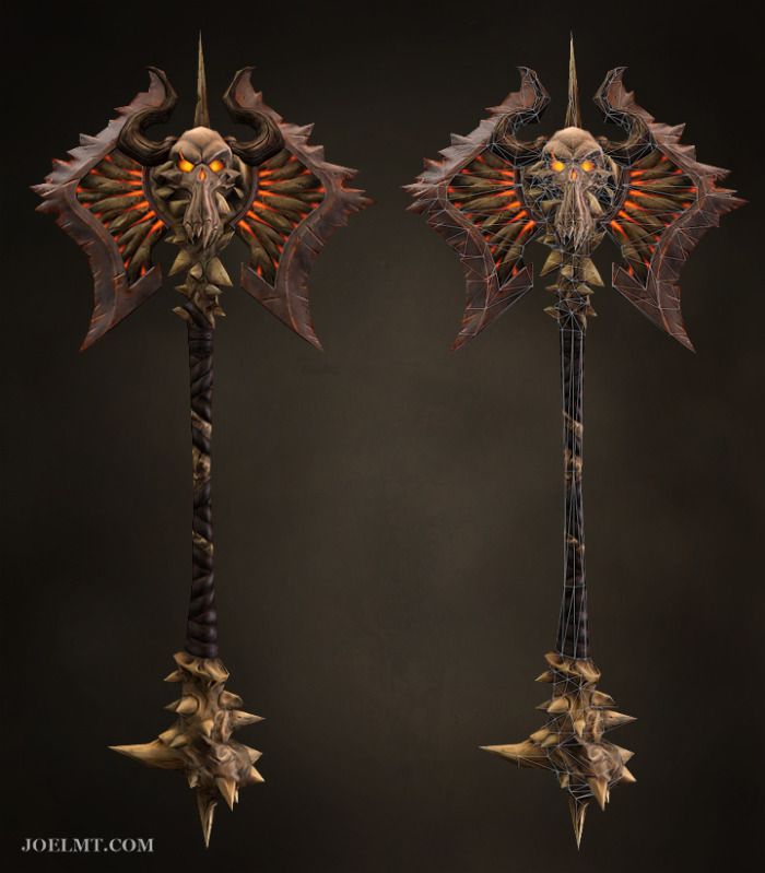
[DS2] Axe, jmt
Latest Update:
People have done some great work already.
Here are some silhouettes I drew tonight:

People have done some great work already.
Here are some silhouettes I drew tonight:
Replies
I like 7, 8 and 12. They look very interesting. Anyways, good luck!
Do you have any personal preference? Demonic, Angelic or whatever?
Also a fan of number 3.
I tried some more variations on the style of 8, but I don't think I like them as much as 15 and 16.
15 and 16 are in Darksiders Core style. The bottom is supposed to be a skull with spikes coming out of it. The handle will be a femur with leather lashed around it. I might make a skull between the axe blades.
Here they are with the character scale comparison:
Which looks better - 1 blade or 2? I'm going to start detailing the concepts.
I love the final image you have with the asymmetrical axe. Fantastic job at developing your silhouettes!
Is it obvious that the asymmetrical version is shattered? For some reason, I can't get the shards to look very good.
Also wouldn't mind seeing some other silhouettes worked up like this one was.
As for which one is better, I like the double bladed. It looks a lot cooler when compared to Death in the images above.
One thing you might wanna try out is rotating the skull to face the right side direction, where the secondary blade is right now. Many designs have put their main ornament on the front view ( which is for good reason ) so maybe it'll be worth to try something a bit different.
It's going great though. Will the blue runes be carved in and glowing?
I also like how absolutely badass the dual blade variant looks with death, but I would definitely advocate some more asymmetry in them to be honest. Break up those shapes!
Good job none the less man!
@akacg Thanks.
@AimBiZ If I go with the double-bladed version, I'll have to scale the blades down a bit. I plan on trying some other placements for the skull. I was planning on having the blue runes carved in and glowing in the darksiders style.
@Maph Thanks. I'm not loving the runes either. Maybe I should just remove them. What kind of asymmetry do you mean, like a largish chunk out of one side?
Here are the ideas that I will experiment with tonight after work:
1. Kingdom of the dead style - Bone blades and crown
2. Faintly glowing fault lines
3. Big chip on one blade
4. Remove runes from blades and maybe skull
5. Have bony spikes from the handle extend over the metal, under the skull. Possibly clutching the skull and radiating out onto the blades.
6. Putting the skull in another spot (this will require an additional asymmetrical version)
And Frostmourne style:
Here's a little more refinement on the latest color concept:
I would also do something about the transition from metal to flesh, it's a bit too abrupt as it stands right now imho.
I'm planning on giving the blades fewer, bigger spikes. Hopefully that will make it more intimidating. I'm not sure what I could do about the transition between the bone radiating from the skull and the metal blades, though I agree that it's a bit too abrupt.
Here's another WIP shot of the sculpt:
And an updated concept:
Love it!
T.
imo a little bit to much spikes on the blade
@BluPanda - I considered 3 options for the skull:
1) Skull face on the front and back of the skull on the other side.
2) A squashed skull on each side.
3) One skull with a face on both the back and front.
I decided on method #1. It seems to add some depth and realism, as well as having the other side look different, but I'll have to sacrifice some texture res. We'll see how it turns out. I may regret it. #2 would have given me problems with the horns and spike.
@hannes d - The blade spikes were probably the part that gave me the most trouble. I'm past the point where I can majorly change them now. I'm not super pleased with them, but it's time to move on.
I guess it's time to do the low poly and bake, unless anyone can see anything else I could improve with the sculpt.
Thanks, jeebs and Kraken.
That kind of stimulated my imagination in that direction, hahaha
[ame="
@Stinkhorse: I hated the skull for quite a while as I was working on it, then at some point it eventually started to look cool.
@XRevan23: Thanks
I created the low poly mesh tonight (1799 triangles). I've still got to figure out a couple of things with it. I'm a little intimidated by the thought of having to bake out the normals for all of these spikes and weird angles.
And an Easter Egg: