The BRAWL² Tournament Challenge has been announced!
It starts May 12, and ends Oct 17. Let's see what you got!
https://polycount.com/discussion/237047/the-brawl²-tournament
It starts May 12, and ends Oct 17. Let's see what you got!
https://polycount.com/discussion/237047/the-brawl²-tournament
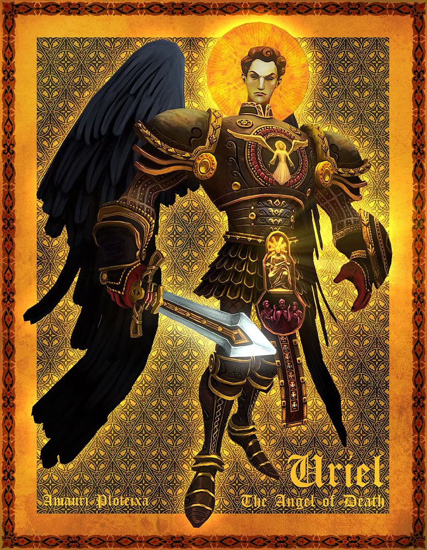
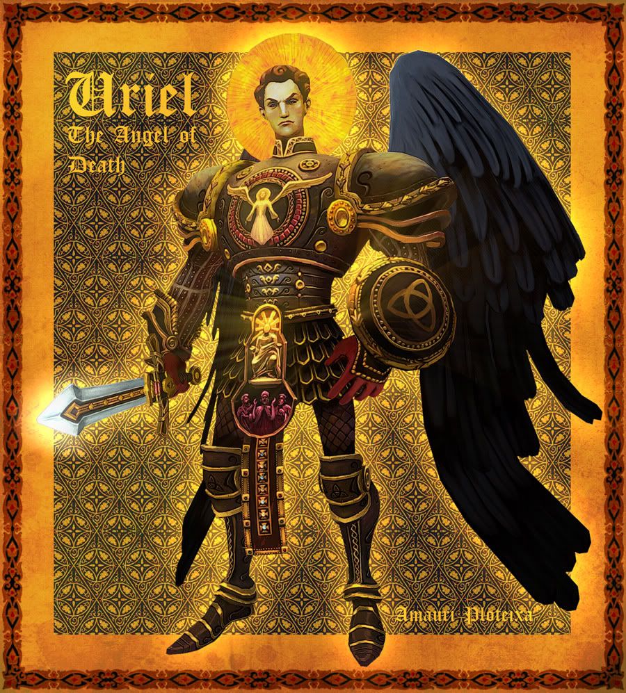
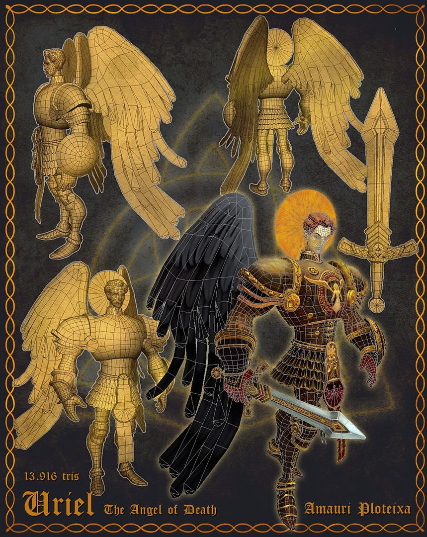
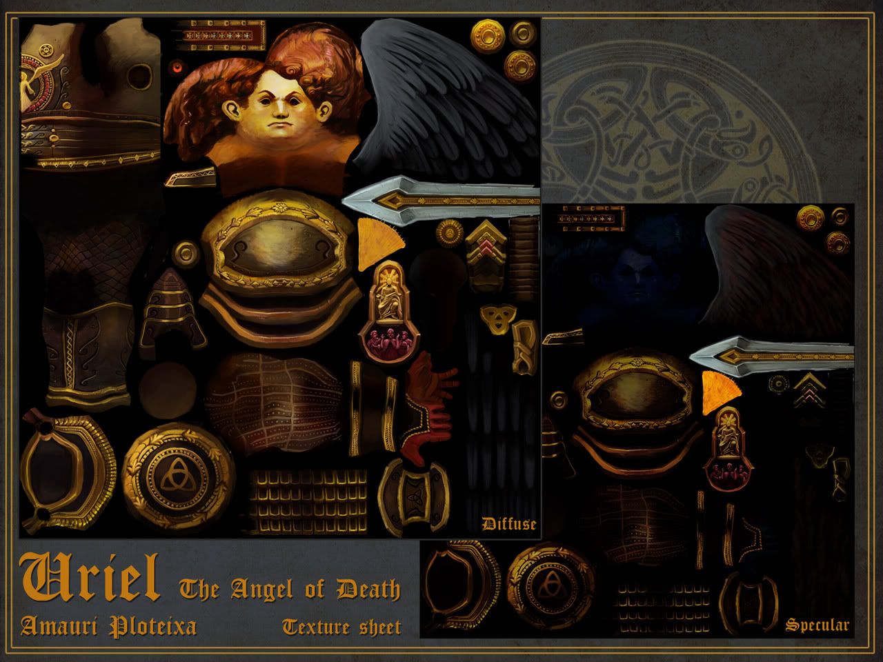
Hand painted stuff
polycounter lvl 18
Heya guys. My main new year's resolution is to enter on gaming industry. As I know, a job won't fall from sky in my arms, so I start practicing, to learn and improve as more as possible.
My goals, at this moment are to be good at painting and hand painted models. I'm gonna post my projects here, to receive some feedback and tips from the members of this glorious comunity.
***************************************************************************
MOST RECENT WIPS:
My goals, at this moment are to be good at painting and hand painted models. I'm gonna post my projects here, to receive some feedback and tips from the members of this glorious comunity.
***************************************************************************
MOST RECENT WIPS:
Replies
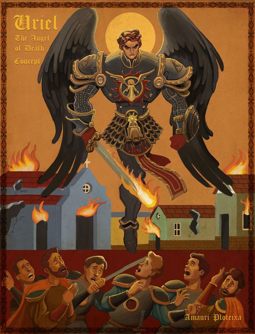
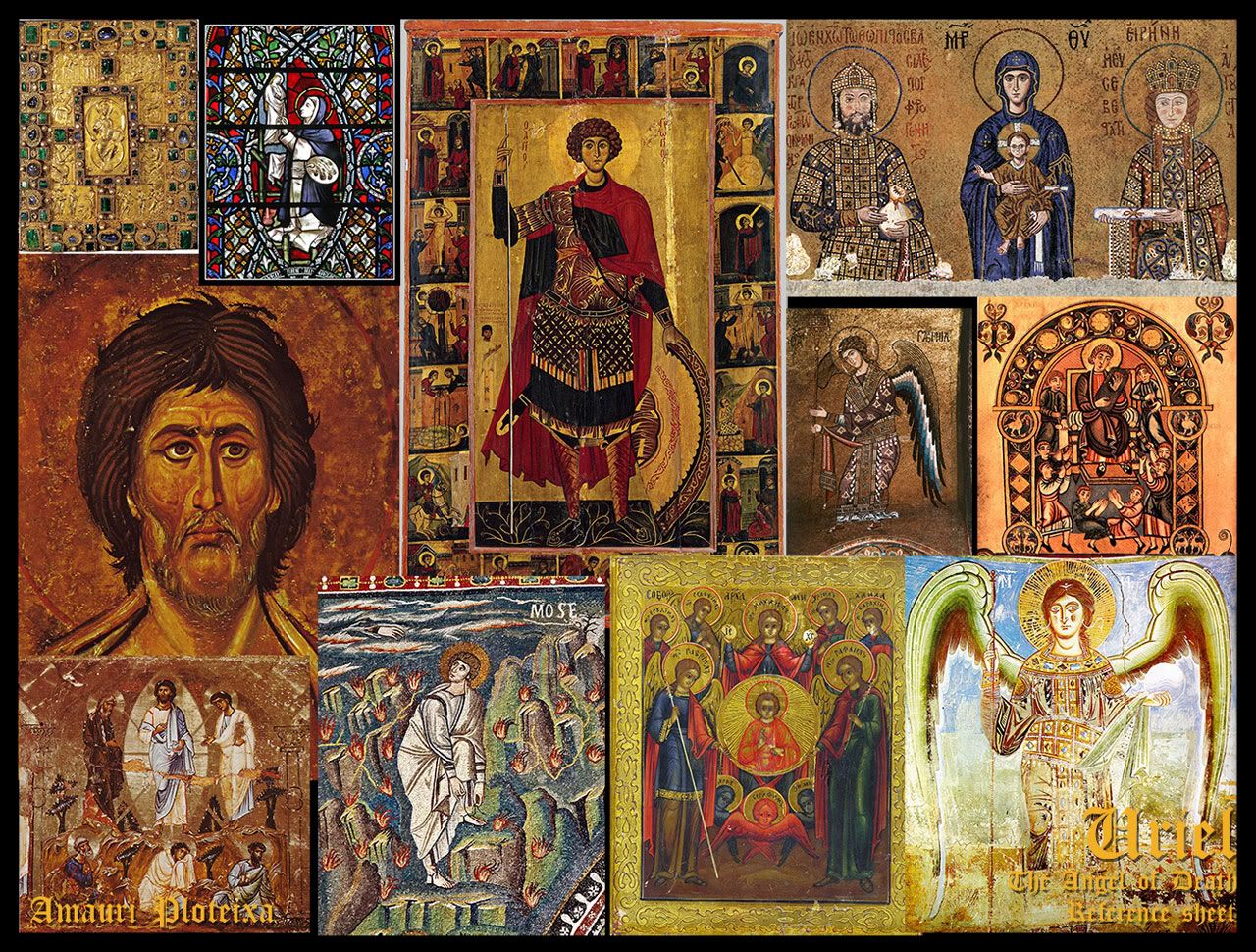
Concept:
Model:
I worked a bit more on this guy this weekend. Here are some progress shots.
first of the cracks on the shield are way too regular. randomize more in terms of placing and size.
also they all look like cracks, but what makes metal believable is not only cracks but also lighting and scratches. for hand painted a combination of some cracks and lots of scratches works best imo.
also your light for the shield is placed directly above the shield.
this may seem like the most usable preference, but its not.
a static top skylight makes everything look boring and symetrical, and since u do have unique uv´s you should be using them.
for me a 45° light works best, realy good to place some dynamic into an object and also gives the eye something to look at, and you better ways to render out shapes.
for the orc, the metal does have way too few scatches and cracks imo.
i´d recommend you to try that out, it may look better the way it is now, but it maby could look a lot better if you add more detail.
gues your still tweaking on that guy anyway.
and the transitions between some of his bodyparts dont look realy good. im talking the front and side of the head here. it looks like you realy picked some weird projection angles from wich you painted your textures.
(t
subscribed!
The orc is really cool! I love his face especially, and the way you painted his skin. Except it looks like his neck muscles/tendons whatever should be taut, but instead they look wobbly. Unless that's like excess droopy skin or something? but it's not really reading like that either.
His armor could use some work imo. For example his shoulder pad thingies look like they were cut out of cardboard and there's not too much sense of construction. I'd imagine there might be stitch seams, some wrinkles/folds where the spikes are connected, scratches, etc.
The lighting on the belt looks a little funny too, there's lighting on the top, but it seems like there should be a little ao there instead, where the studded belt rim meets the rest of the belt - right now it kinda looks like that area is glowing.
I really love your painting style though, so keep going, can't wait to see more :]
@Nix: I'm not looking at specific references to paint these. This is just my style. But I'm influenced by a lot of people. Mainly: Craig Mullins, Linda Bergkvist and Ruan Jiajia on 2d side. And Pior, Ben Regimbal, Bobo, and Haikai on game art side. FirstKeeper and Murphy are very new influences too, as well as Jessica Dinh, that was one of my strongest motivations to invest on hand painted stuff. I felt very motivated after reading her thread of wells.
really had a wonderful style to it. good job.
Next time, I´ll try to make this diferentiation preserving the painterly look. Thank you, man.
I'm a fan now:)
Time for personal projects, is too little this month. So, sorry for the lack of updates. But anyway, I'm trying to proceed as much as I can. Soon I'll post my next concept and model.
I'd tone down the use of white/bright colors though - just make things darker, and be cheaper on light colors, since it seems like you have a tendency to make things bright.
Have you considered posting small tutorials? I would love to see your process
totally agree, just more subtle gradients of colour from light to shade in general would be nice, by all means keep the cool brush stroked look you got going on but you could overlay some gradient maps or something to get the look you want.
@TheTurner: Thank you, but I don't think I'm good enough yet to make tutorials. Anyway, there's nothing really special here. I just use the same metal color for highlights (brush in linear dodge mode).
It also looks (though I can't judge very well because of the skirt) as though her legs are a bit short, and her arms a pinch too long.
Snader: Body and skirt have 16 sides. I´ve added 2 more loops on skirt, on height... How many sides do you suggest I put on width of skirt?
On a positive note, I love the texture progress so far.
It's strange, it's like if this model is not flowing right. Maybe I have to start from beginning again.
btw, i like the older version as well.
current version's eyes make me think of husky dogs, they feel artificial. face has become pretty baby like or doll like, it has indeed lost some of the original charm.
strong lines on the nose gives her that slightly disgusted look, was that on purpose?
Let me know guys what do you think.
I think some of her features are bit harsh? I did a bit of a paintover. Pretty crappy and not sure if it's the direction you're going but maybe it can give you some ideas.
God I hate it when I just can't tell what exactly is bothering me, when something just doesn't 'feel' right...
And some more work on textures and polycount magical artifacts.
Couple things - She is too short below the knees, and I think her shoulders are a bit wide. Also her arms are a bit thick beneath her armpits, making it look like she has flabby arms.
Really, really love the design of this char, and the textures are amazing so far
I agree with jessica on the proportions.
And these polycount fireballs look pretty amazing aswell. Could we see I wire of them, please? ^^
About the balls, nothing fancy. A simple sphere, and some planes, with transparency and their rotation tied to the camera rotation. 120 tris, and a 256 map. I tried 128, but it looked too rough in comparison with her texture.
Turntable: http://i1197.photobucket.com/albums/aa426/jramauri/Witch_turn1.gif
Not so much
Something in between
PS: Your turntable doesn't seem to be very.. turning
EDIT Turntable works now. Lookin' good^^