Hand painted studies
polycounter lvl 9
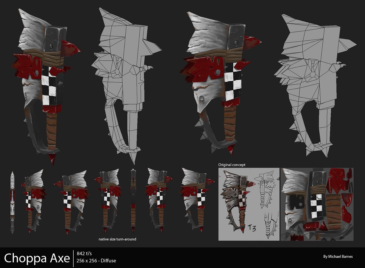
Hey guys , here is a Ork Choppa axe that I made yesterday. I set myself the task of creating the whole asset over the space of a day so that I could see where I am in terms of modelling speed. Hopefully I should be able to get more of these short studies out before committing to a big project, They are really fun.
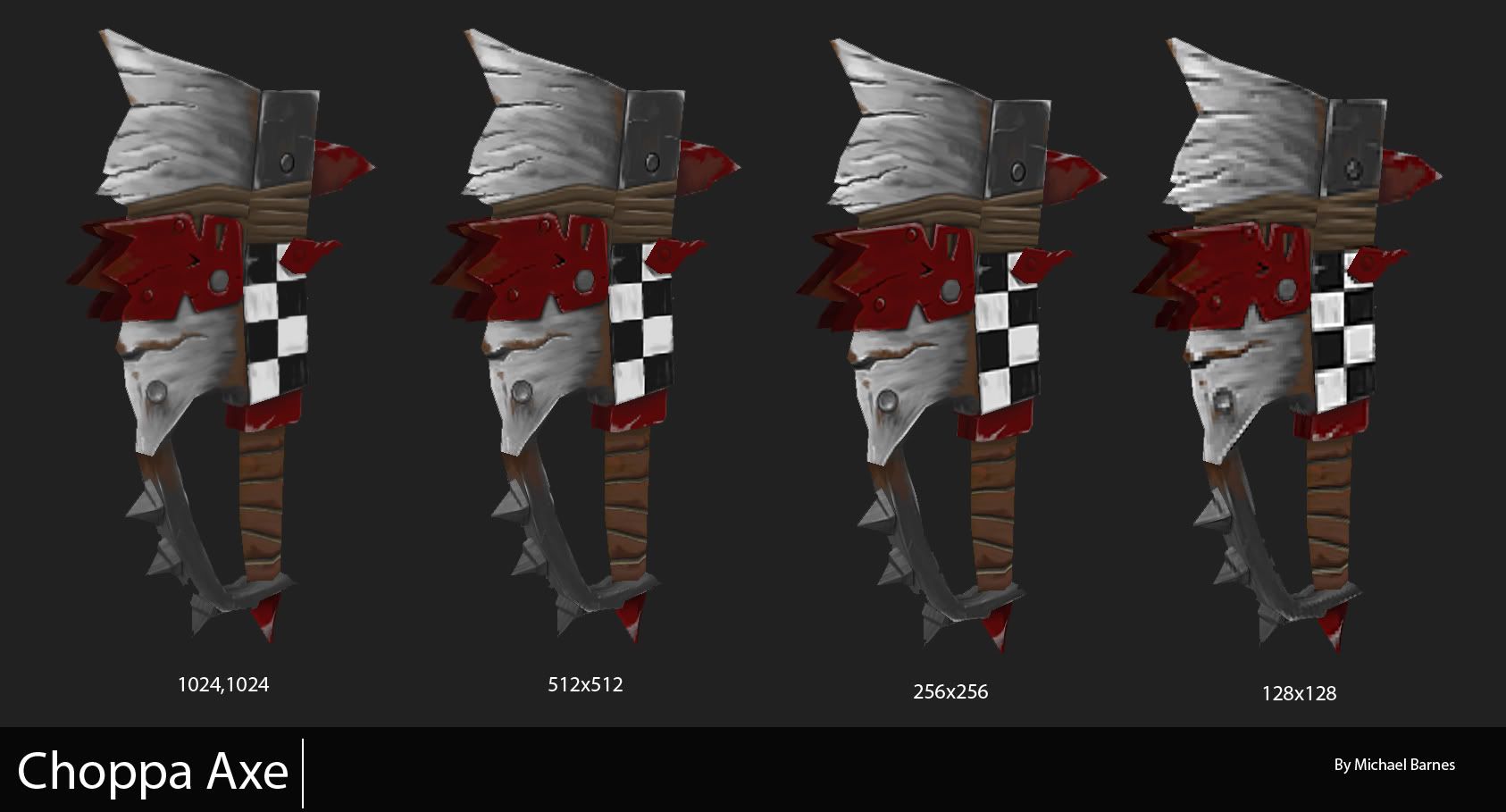
Here is a picture to show the texture compression.
I am hoping to get 1 of theses assets done every week. I am planning on modelling either a shield to go with the sword or something from the Warcraft universe.
So, hopefully I will stick to my word and manage to get some nice little studies up on here
[EDIT - The concept art was found on Warhammer Online]
Replies
I used the flat shader in 3ds max without lighting and for some reason the 256x256 seems to look better than the 1024x1024.
Both assets together come in at just under 1500 tri's
Meshes: Looking good, I dont see any problems here. Spot on. Might save some tris here and there, but thats not what this thread is about. Some wasted UV space and resolution mixup on the front of the shield, as someone in the other thread already pointed out.
Textures: Your colors seem good, the wood is really damn nice.
Biggest problem I see is the inconsistency in shading (light values). For example, the outter metal ring around your shield indicates that the light source is above the shield and slightly infront of it, so there is a light falloff. The frontal sides of the metal ring that face the camera get darker from top to bottom. This is good, but should be followed everywhere. The whole wood part of the shield is missing any kind of light falloff, making it look wierd and out of place compared to the metal ring. This is most likely the biggest problem.
Try putting in some stronger highlights at the upper part of the wood and make the wood darker towards the bottom. Also, make it reflect some light towards the metal (slightly orange / red reflection). Same goes for the ork head on the shield, light falloff and highlights are needed.
Shift the hues around more. For highlights, move the hue towards yellow, for shadows go towards blue (this is not always right, but works pretty okay as a general rule). Play with saturation when you do highlights. The ork head on the shield could look really metal-plate-ish, but right now it looks like plastic.
Put in some scratches around the shield. The wood and metal ring look very clean for a shield that is used to take hits from sharp metal things. Dont forget that many of the scratches need highlights. This can help improve your overall lighting impression alot.
Increase the amount of ambient occlusion you have got going on in general. The bolts on the metal ring. The ork face plate. You have got some occlusion there, but it is to small and clean to seem realistic.
Your darkest values should be closer to black. This makes it look abit like a diffuse map for a game engine with normal maps and engine cast shadows. But since you inted to do hand painted (which is based around very little engine lighting) you have to fake that stuff. If you do not inted this to be such a texture, forget my feedback, because it will work quite well then
I hope this helps and you can post another update. Im really interested in what other artists do in this field of texturing. Good luck, gonna follow your thread ! :thumbup: