[UDK] Abandoned robot factory
Hey guys,
Long time lurker of this forum but this is my first time posting up any work (a little nervous!).
This is the first fully textured environment I've built so there's been something of a -massive- learning curve for me. I'm hoping to get some feedback here so I can continue to learn more and push the environment to higher level of finish")
The concept itself was based on a painting I did a few months back, though I developed the environment a fair bit from the original painting.

I'm not sure of the best way to texture the robot as it's so large. I'm thinking this method [ame=" http://www.youtube.com/watch?v=zoHMtVjoFtk"]http://www.youtube.com/watch?v=zoHMtVjoFtk[/ame] might be my best option.
Still a lot of work to go but all feedback is welcome!
Long time lurker of this forum but this is my first time posting up any work (a little nervous!).
This is the first fully textured environment I've built so there's been something of a -massive- learning curve for me. I'm hoping to get some feedback here so I can continue to learn more and push the environment to higher level of finish
The concept itself was based on a painting I did a few months back, though I developed the environment a fair bit from the original painting.
I'm not sure of the best way to texture the robot as it's so large. I'm thinking this method [ame="
http://www.youtube.com/watch?v=zoHMtVjoFtk"]http://www.youtube.com/watch?v=zoHMtVjoFtk[/ame] might be my best option.Still a lot of work to go but all feedback is welcome!
Replies
I decided to split the robot's body into 2 2048x2048 textures and paint the textures as normal. Texture painting is not something I have a huge amount of experience with but I'm pretty happy with what I have so far.
RobStites: My thinking behind the design of the robot was that I wanted something that appeared quite 'low-tech' as if was just metal sheets riveted together.
Update on the bunny bot. Not sure if I'm going to stick with the orange paint, I'll wait and see what it's like in the level before I start tinkering with it.
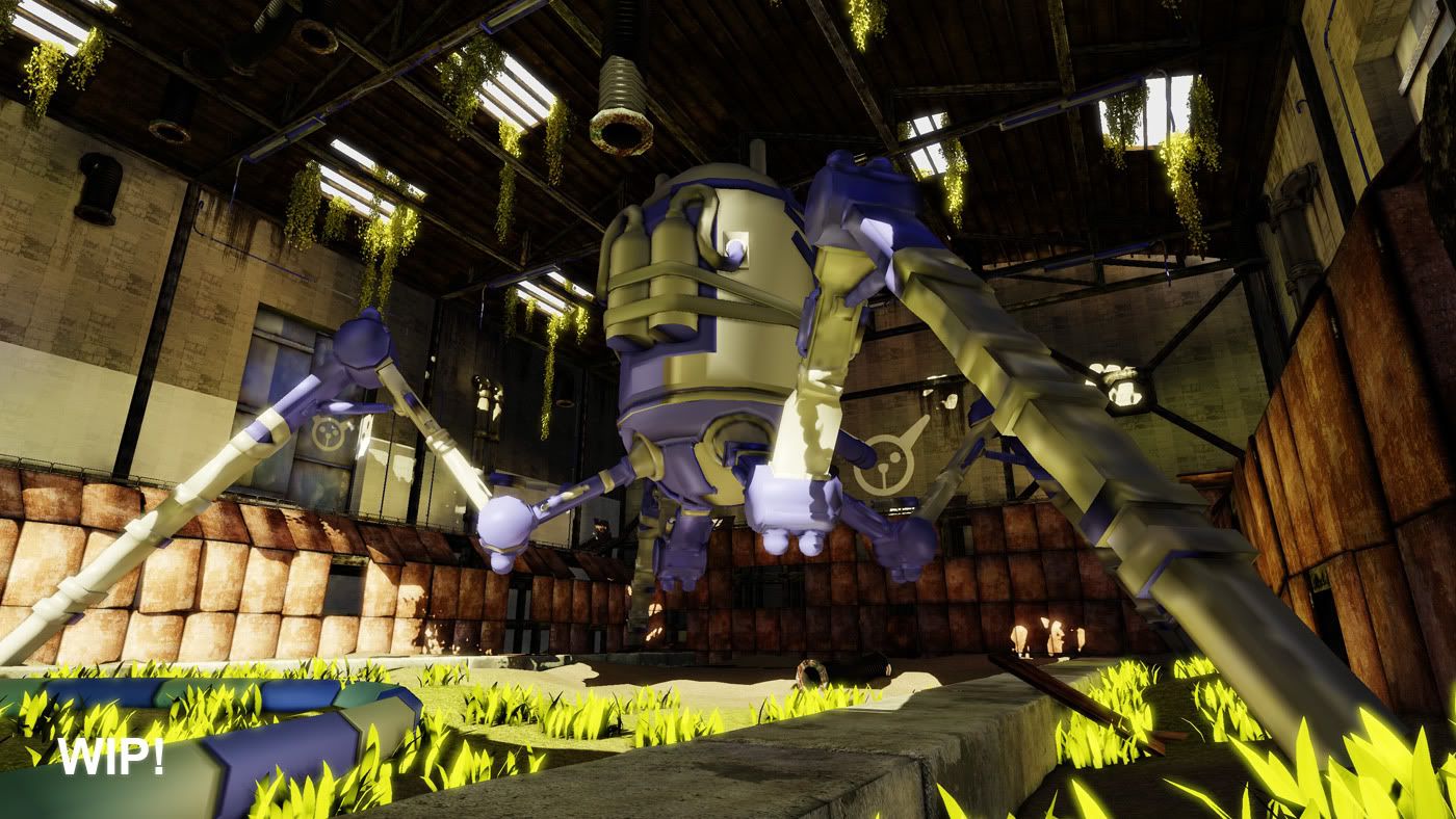
Can imagine this being a rediculous boss fight in an equally rediculous Conker's Bad Fur Day-type game. Also; the grassy tufts in that fourth screenshot seem to be glowing, is that meant to be happening?
Loving it so far.
So in general I'd say - stick to your concept.
re.wind, Snader: Thanks for the feedback guys, I agree that the original shape has a lot more character to it.
johnnybrach: Thanks
Re-built the body of the robot and gave it a new lick of paint, I think this is a definite improvement over the previous version.
Now, it looks weird. The legs are skinny compared to its upper bulk and looks super flimsy. The colors are to saturated and everything is screaming for attention. You put a lot of red "dots" and its creating a lot of buzz.
The face on the robot doesn't have that ironic cuteness as the new face does and is kinda boring.
Again, I love your concept. stick to it.
I decided to start over and build something more faithful to the original design. I added curved armour plates to the legs to give the whole design a more organic feel and to bulk out the legs to make them feel more powerful. I'll add smaller details such as panel lines and rivets later on in Photoshop.
Any feedback before I move onto the low poly is welcome.
One thing that I would like to see is a change with the exhaust/chimney...In the concept they are really present and they add a lot of character to the machine and it fits really well with the character painted on the front. Cause right now it's very small and placed right in the middle and in your previous versions they were just placed symmetrically on each sides...I think you should follow the ones in the concept a bit more, but maybe make them more..."raw"? Exhaust with the plates with holes...like those maybe? just an opinion
But the cigar in his mouth could be pushed more.
I think you should have some kind of pipe/vent sticking out of his mouth and painted like a cigar. Maybe have smoke coming out of it.
Baddcog: Thanks dude. I'll keep that idea in mind.
I decided to go the Zbrush route and rough this guy up a little (it is a war machine after all). I haven't done much work in Zbrush like this so this type of sculpting is new to me. Hopefully I've conveyed the idea the this robot has seen a fair few battles.
however its good that you've re-rebuilt it, as it now looks LOADS better! well done!
Once again the white sections will be rockin' a reflective material in UDK.
But seriously, that's some real improvement you did there ^^
The scratches do not seem like they are placed with much thought really, the pumps on the back for instance have a lot of scratches compared to most of the robot, but they are also the parts that would be exposed the least to scratches, at least in the wear form they are now.
Though it looks awesome already obviously.
Motherdear: Thanks dude, I think you're right about the scratches, if I have time near the end I'll revist them.
Kratilim: Thanks man, I think I'll go back and try adding some more colour variation to the diffuse.
BlvdNights: Ta dude, I still need to go back and jazz up the spec map.
Hokay I've been working on the level over the past few days and thought I should share what I have so far.
The lighting is still a WIP, only using a skylight and directional light at the moment. My main concerns so far are:
-The robot looks a little flat, possible jazzing up the spec map will help this?
-Obvious repeating texture on the bunker wall, not sure of the best way around this?
-I'm a little worried it looks a little barren, due to the size of the environment it's tough to pad it out with dress assets
My list o' stuff still to do is as follows:
-Replace/re-texture a few of the older meshes from when I first started (and was a massive nooby >_>)
-The grassy section in the middle still needs to be polished
-The roof looks a little bland, I'll try splitting it into sections for added visual interest
-Add a few more smaller dress assets (warning lights, pipes, crates etc..)
-Jazz the ivy up with some large polygonal vines
-Add subtle dust effect in the light beams
-Final lighting/post effects/beauty shots
I think that's pretty much everything? As always feedback is appreciated!
If you're worried about the environment looking empty, maybe add some working tools, ladders, scaffoldings and such, since it's basically a garage for that metal beast...just a suggestion
Other than this, my level of experience prevents me from helping you more
I tried out whats_true's suggestion and made the robot pink. I think the design works a lot better now and the rust and scratches stand out a lot more, I'm pretty happy with how it looks
Really love the scene, great work so far.
I'd also continue to experiment with different face-paint designs, something about the bright white and sharp angles in the newest one just doesn't look right. Other than that though, I can't stop looking at this guy!
The one thing that bugs me, and maybe it was explained already, and its totally not a big deal, but if is if this is a factory how did the mech get so banged up and beat up? If it was an abandoned repair facility, it would make a bit more sense.
Things like water stains, plant life ect should be present on it maybe? Also some factories take great care in preserving the metal, applying coatings that are later removed just so things aren't damaged and that paint can be applied later to a clean surface.
Maybe the mech was abandoned in the factory? Maybe it was being repaired it doesn't really matter because this scene is awesome.
KartoonHead: Thanks man! I'll throw up a texture breakdown & wireframe shot once I'm done with the level
Mark Dygert: Thanks man. The level is actually meant to be an abandoned robot hangar but I wasn't thinking when typing in the title of the thread and I don't know if you can change thread titles :P
Snader: Thanks! The black line art definitely looks better
I'm trying to get this ol' thing pretty much done by Friday. I still need to work on the lighting a little bit more and work on the post process stuff. I'd still like to add in some smaller assets such as crates and warning lights on the walls but I'd like to get the level's lighting and key assets looking solid first.
As always feedback is always appreciated!
Edit: Although, as others have mentioned, I much prefer the face on the original concept:
This one has some nice artistic brush strokes and shading, rather than what looks like a giant stencil. I think it would be nice to think that each of these behemoths has a custom paint job, rather than rolling out of the factory like this
Stunning concept and work though - are you planning on having the foliage growing over the machine as in the concept?
Really love what you've done so far! Udk scene is a bit dark at some spots compared to the concept though.
As for the face, I personally didn't like it much on the concept and I like the vector versions better. Like people said before the concept face looks to be an actual model rather than just a decal, and personally I'd find that to comical compared to the rest of the scene.
Anyway, good job and keep it up. Subscribed.
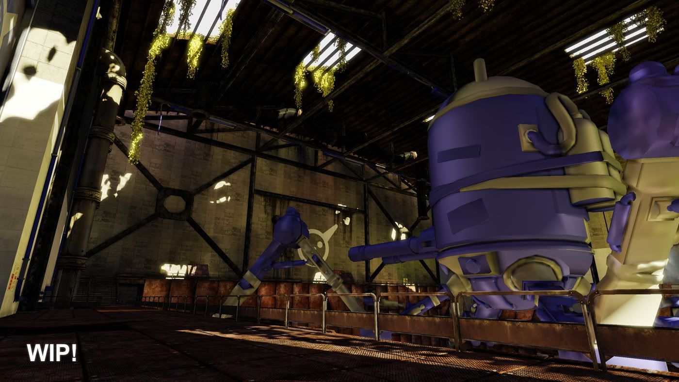
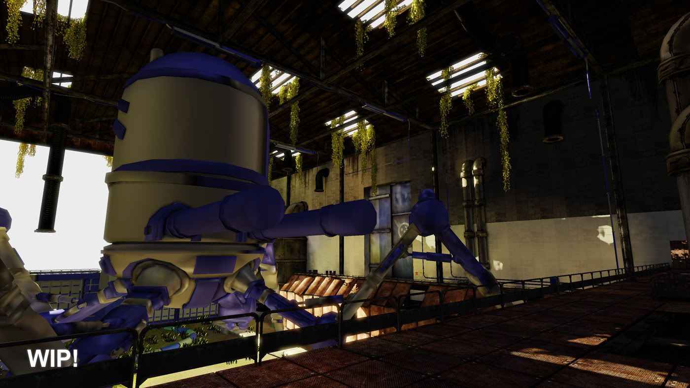
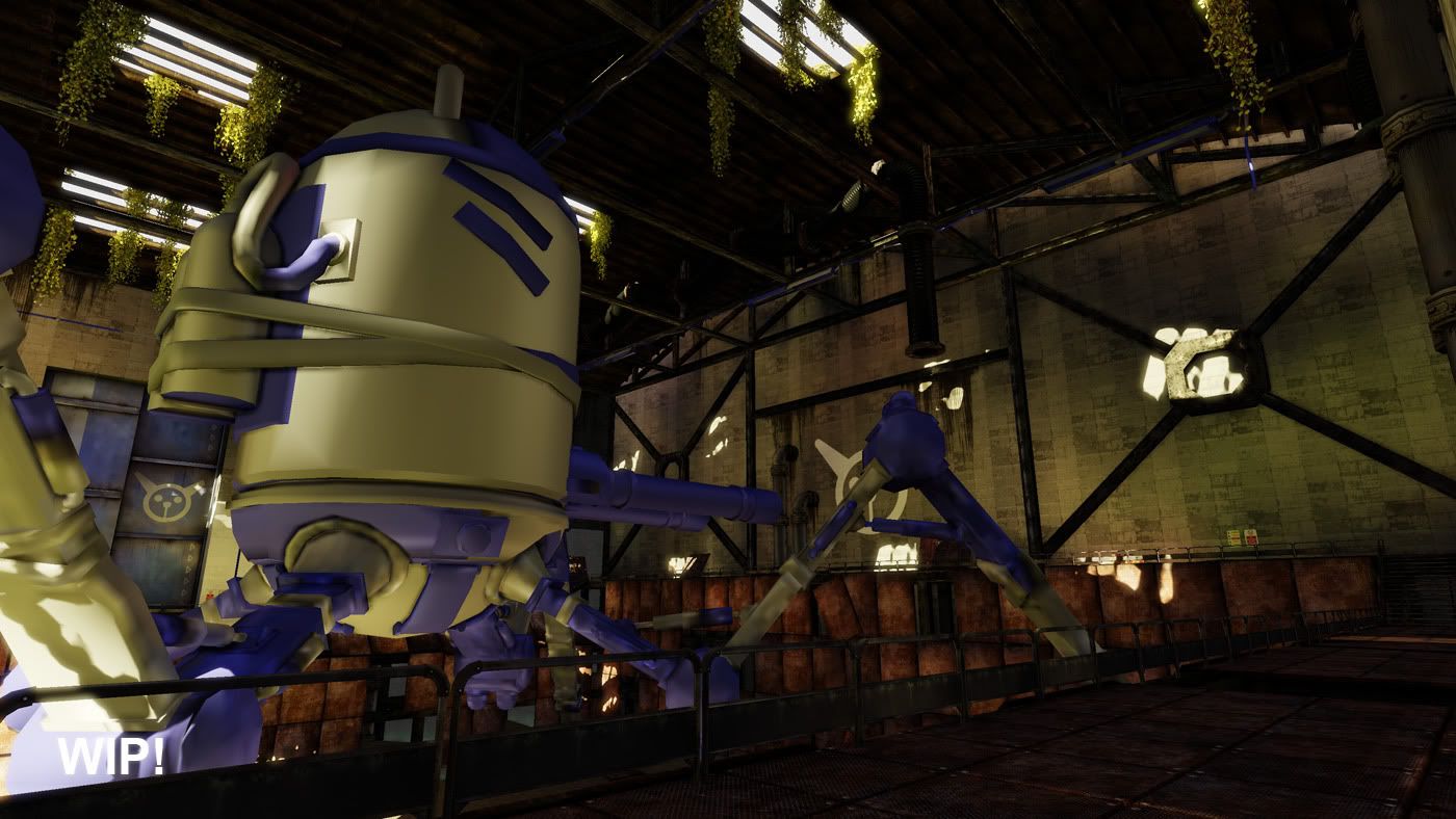
Dirtied up the walls a bit more, added a couple of new assets, added some minor graffiti to show there has been some human presence and worked continued to work on the lighting.
I'm pretty much happy to call this thing finished. I know I could continue to work on it but as this has been my first textured environment it's taken me a ton of time to get to this stage and required a massive amount of learning, I'm itching to move onto something new knowing everything I do now
I still need to do a production light bake (images are baked with preview lighting) and record a video which I'll try and get done this week.
Feedback would be appreciated as I can take it on board for my next project
The shadow across the robot looks a little blurry in the middle two shots, this is because of the lightmap LOD. I'm still trying to work out how to force it to remain at its highest LOD for sexy portfolio shots.
Really love the design on the robot!
http://i.imgur.com/z2aRo.jpg
This one is a little goofy and looks like whoever made the robot just slapped it on. Maybe you dont have to go with the original design but i would think about making it less goofy. But then again that is a pretty minor thing to worry about if youre done and other people seem to like it so yea.