The BRAWL² Tournament Challenge has been announced!
It starts May 12, and ends Oct 17. Let's see what you got!
https://polycount.com/discussion/237047/the-brawl²-tournament
It starts May 12, and ends Oct 17. Let's see what you got!
https://polycount.com/discussion/237047/the-brawl²-tournament
Errybody loves handpainted stuff

greentooth
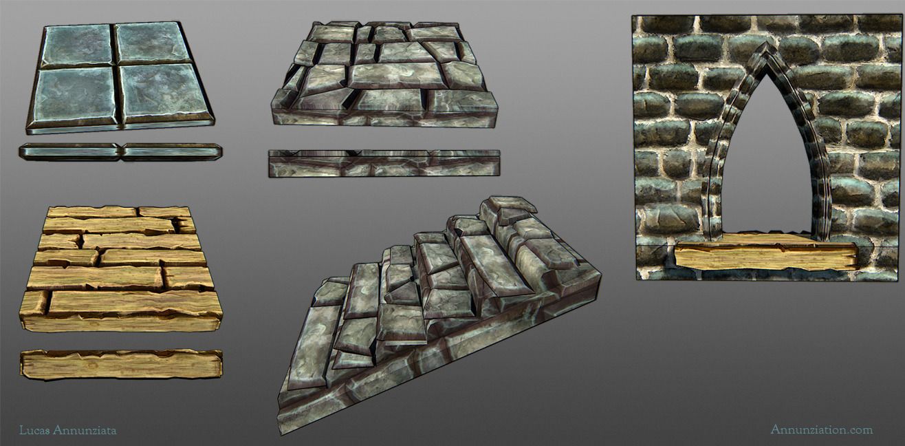
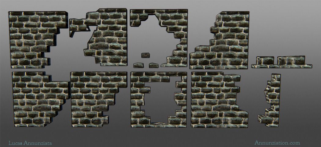
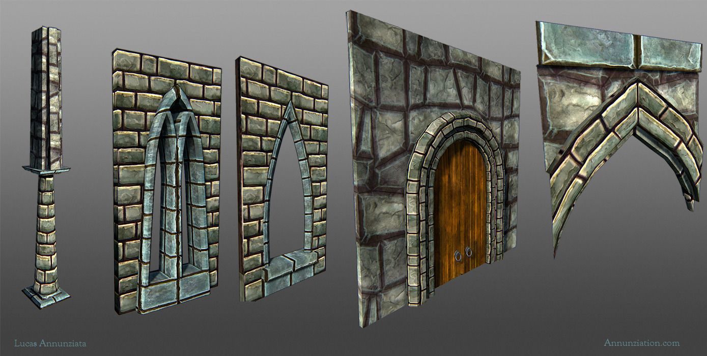
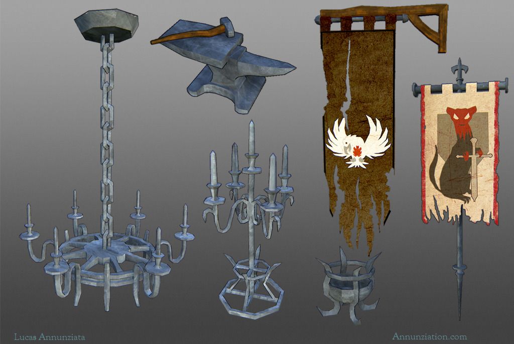
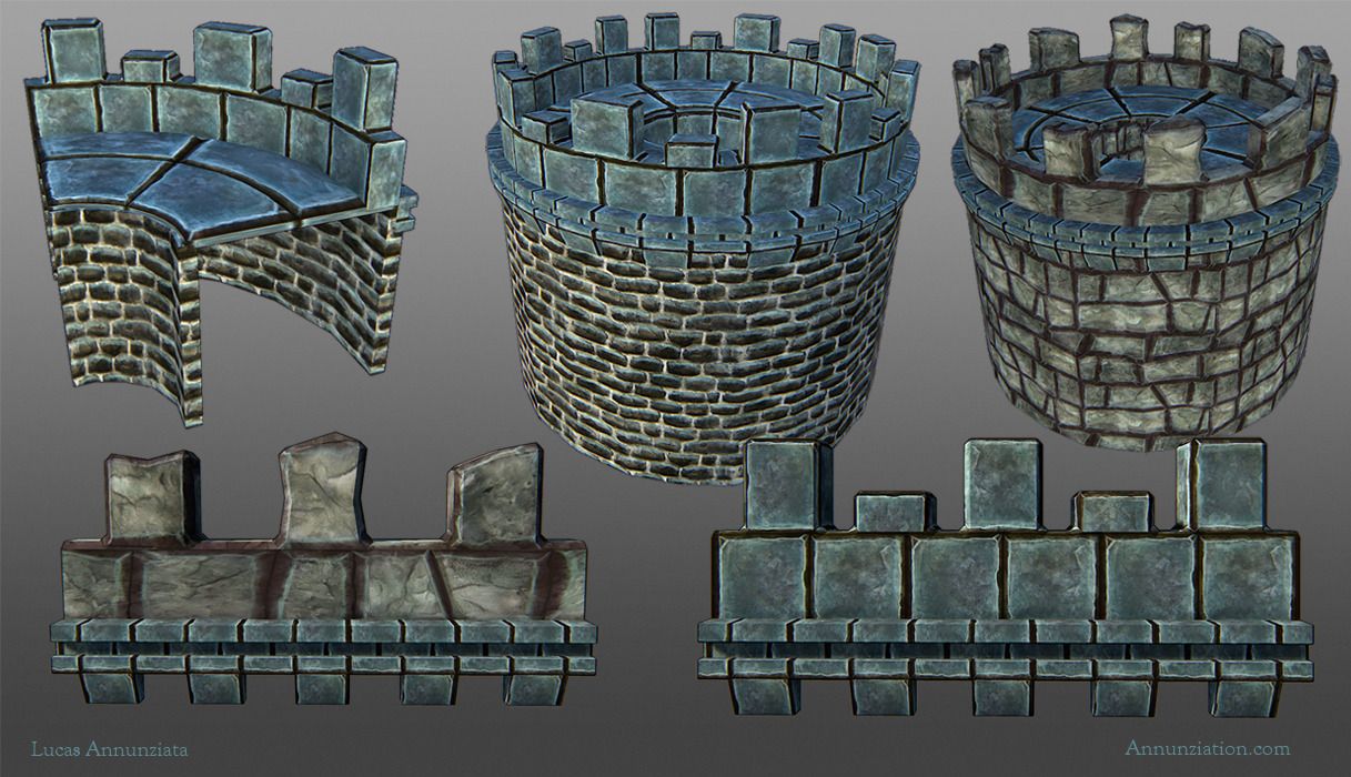
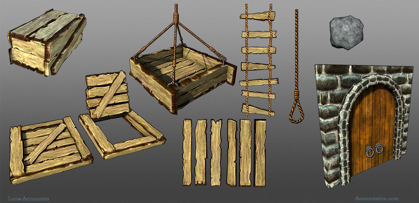
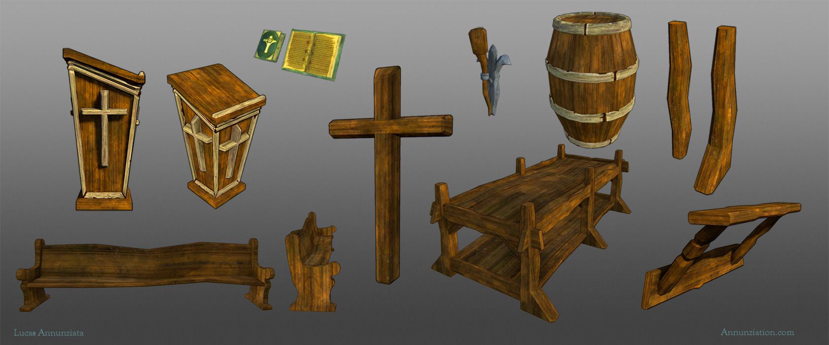
So for the past couple weeks I've been working on my senior team project with a 5 other students, (2 artists 1 designer 3 programmers) creating assets for a side-scroller in Unity. Since I'm doing all the environment assets, I went about making some tiling textures and then making the assets based upon the textures, which is a workflow I had never tried before. I've been very much inspired by all the handpainted assets I've been seeing on here in the past few weeks (Jessica Dinh, Jenn0_Bing especially), and figured this would be a good time to take a stab at doing some of my own and am looking for some feedback on these. I banged these out really quickly, and just moved onto the next one when I got stuck. As of right now, the only uniquely textured assets are the two banners and the bible.
I don't have any shots of them all put together in-engine yet, but I'll make sure to get those up soon. Also, if y'all have any cool resources for unity shaders/nifty tricks to making things look pretty, I'm all ears. I've got very little experience with this engine.
All of these shots are from Marmoset.
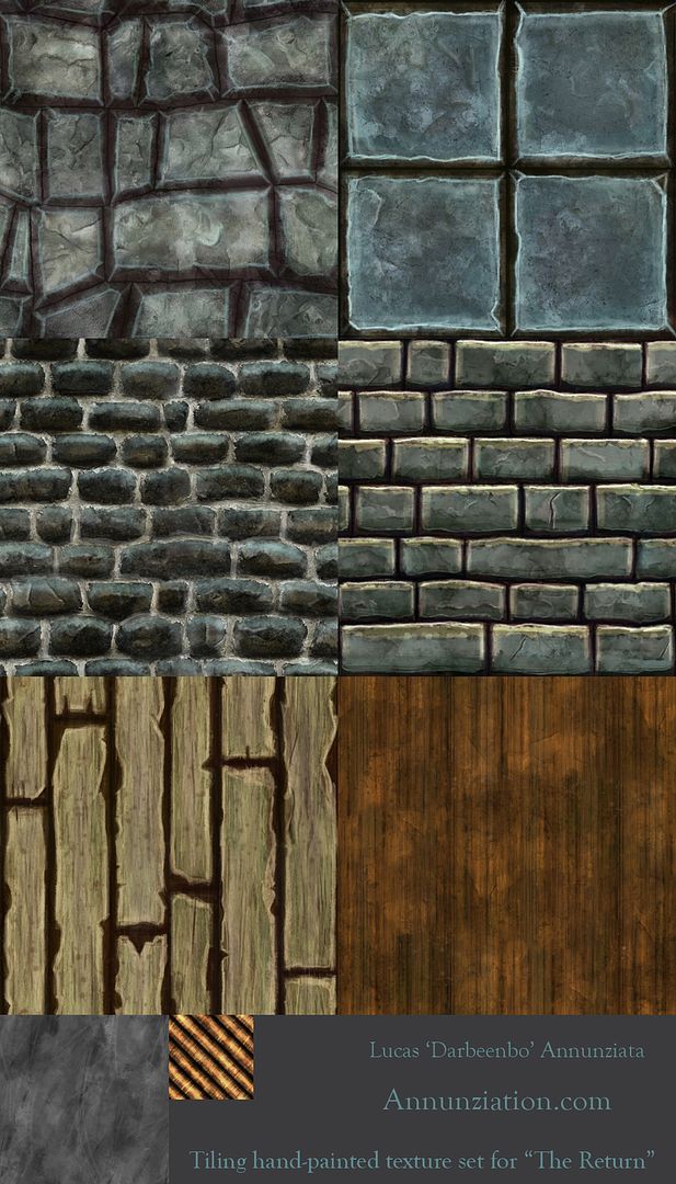
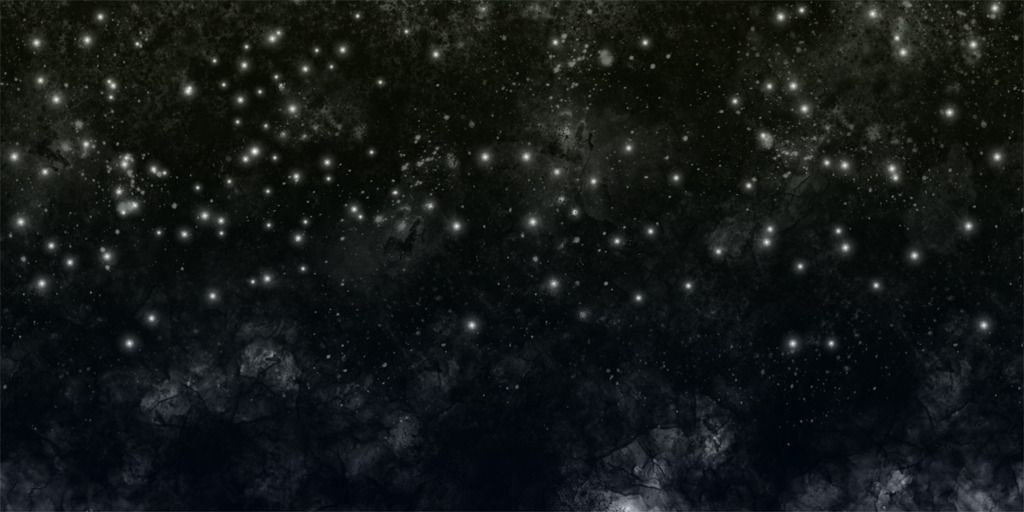
And a pretty nightsky background for the environment:
I don't have any shots of them all put together in-engine yet, but I'll make sure to get those up soon. Also, if y'all have any cool resources for unity shaders/nifty tricks to making things look pretty, I'm all ears. I've got very little experience with this engine.
All of these shots are from Marmoset.
And a pretty nightsky background for the environment:
Replies
You should Put the self illumination at 100% and paint in the shadow/lighting information.
Also, start by baking your Ambient Occlusion. Specular should be brighter.
Also rather than paint the textures with TOP lighting, paint them with FRONT lighting, with a bit of a top-ish angle. Specular highlights should look like they're coming from the top.
Some of the things (like the wood) look a little too 'contrasty' for wood. That kind of contrast would be better suited for grout filled rusted metal.
I also think they would look better without the photo overlays.
^.^ Good Start Mr. DArbeenbo!
I actually didn't use photo overlays, but I was using a custom inkwashy kinda brush, but I guess that doesn't read all that well. I'll keep at it though. Thanks for the advice.
The color choices are a bit all over the place. Maybe once they are in a scene with lighting it will all gel together better. But right now the colors are a bit lacking. Try desaturating all of your textures (just a desaturate layer in Phoshop to be non-destructive) and seeing how the values are all working. You want to make sure you have a good range of values in your textures/scene and that they all make sense.
Look at actual reference while painting these. It will help a ton.
I am liking the style you have with your textures right now, but you should try not to use watercolor brushes in PS, just stick with the good old round brush :b that's purely opinion though.
As for painting realistic details into your textures. You don't have to do that, it is all up to how you want the final piece to turn out. Remember to gather enough ref so you know exactly how you want your work to turn out, then push yourself to get there :]
Keep at it, painting textures is not an easy thing to just "get" all of a sudden.
and remember that Polycount has a wiki for texturing as well:
http://wiki.polycount.com/TexturingTutorials
I hope this helps you out :]
Jeffro: wow, desaturated it was really helpful to see how the contrast is (not) working. Thanks for the tip, and I'll make sure to look at some references now, rather than just going from my head.
Gameguy21: Point taken. I'll see what works for me.
Andrew Mackie: Reference, reference, moar reference, wiki, Round brush got it. I'll take these things into account
Once again, I appreciate the feedback. I'll try not to disappoint with the next iterations
NEW:
OLD
Contrast is best used for drawing the eye to certain details. When EVERYTHING has high contrast you can no longer use it for details - the details will just get lost. Same for vibrance.
Here's changes I would make.
I've started working on some new textures for a later section in the game, and here is where the first stone floor one is at:
You're having a serious problem with edge and form definition, and it's caused largely by your purposeful avoidance of hard, single-pixel edges. You're painting most everything with a somewhat soft brush and not hardening your edges.
When you do harden an edge you're beveling it at 10+ pixels, which causes awkward, cartoony shapes that do not look functional and read as artificially plastered on, rather than as concrete forms.
Finally, reconsider the randomness of your tiling shapes - many of your shapes are very awkward - your bricks and stones are not laid in obvious lines, and instead float wildly up and down and consist of odd, yet perfectly-fitting geometric shapes which are very unnatural.
Props to all the people I worked with on this. Here is one last dump before I wash my hands clean of this project:
[ame="
All environment assets shown I created except for Skull wall texture by Marguerite Dibble, Trees and 2d BG sky assets by Steve Nelson
And these are the final characters that were implemented. Models by me, textures by Marguerite Dibble: