Home 3D Art Showcase & Critiques

My dive in to hand painted texture work.

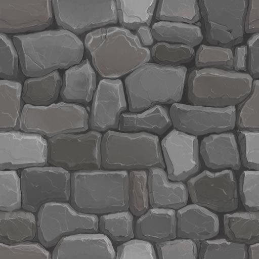
I like to hand make all my textures and now I want to get the hand painted look and here is my attempt. This first texture is a wip and I can see some too obvious repetitions in the pattern - so I plan on break that up a bit. I am looking for some critiques as I plan on updating this thread for a while.

old_stones_wip.jpgold_stones_wip2.jpg

Enjoy

Replies

  • aaronaton
    Options
    Offline / Send Message
    aaronaton polycounter lvl 6
    Yeh its REEM! Hand painted textures are like....so HOT right now!
  • Cremuss
    Options
    Offline / Send Message
    Cremuss polycounter lvl 12
    Hi !

    I'd say it's pretty good but I have a few notes :

    - 3 to 4 bricks are way brighter than the others which make the tiling obvious. Try to equalize a bit the overall lighting. Making variations is good but don't over do it.

    - Your texture is kinda divided into 2 area : one half with rounded shaped bricks and the other half with a more rectangular shaped bricks which make the tiling even more obvious. I'd say make only rectangular bricks or rounded bricks, not both. Or do both but randomize their positions.

    - I'd put a little color and also lighting variation instead of a pure gray/black between the bricks.

    - Edge Highlight looks good too but it's not that strong. I'd say you could overdo it a bit to add some contrast.

    - Also, try to add some lighting variation along with color variation with a bigger brush inside each bricks. Right now each bricks has a specific color/lightness but it remains almost the same for the whole flat surface of the brick. You did put some cracks there but bricks contains more lighting and color variations than that.

    Hope it will be hopeful !

    Cya !
  • dinfet
    Options
    Offline / Send Message
    -Thanks Aaronton (I had to look up the meaning of 'REEM')

    -Cremuss, these are great suggestions and will continue to work on them.
  • dinfet
    Options
    Offline / Send Message
    Alright I made some changes but feel I am having some issues with the adding of color within the stones. I will keep working on this. The variation in the stone shapes is better and feels much better, I will continue to work on this aspect as well.
    old_stones_wip3-1.jpgold_stones_wip4.jpg
  • dinfet
    Options
    Offline / Send Message
    Today I made some ivy that I can use for something growing on the wall. As it stands right now it is on its own map but I will attach it to another one later after I made a few more textures.

    ivy_wip.jpg
    ivy_image1.jpg

    Now back to the stone work for me.
  • dinfet
    Options
    Offline / Send Message
    I went to work on a wood texture and I will combine some rope metal onto the texture, so it is a wip of course. It took me awhile to get the right look but it seems to be a little hard to read on an object so let me know what you think.

    wood_wip1.jpg
    wood_wip2.jpg
  • Macattackk
    Options
    Offline / Send Message
    Macattackk polycounter lvl 7
    nice, maybe add a few more small cracks and some moss on and in between the rocks to help blend the ivy in with the scene. also try some more desaturated patchy areas in the wood to create a more natural look
  • Gannon
    Options
    Offline / Send Message
    Gannon interpolator
    More color variation in your leaves please!
  • Jeff Parrott
    Options
    Offline / Send Message
    Jeff Parrott polycounter lvl 19
    I think you're focusing on smaller details. Try thinking about large details first. Get those reading right then render the texture after that.

    The textures as a result of skipping the large details read as being very flat.

    More contrast on the rocks.

    Completely black shadows? Tone those back.

    Not sure if this is in Maya, Max, UDK, whatever. But it looks like you're getting some apparent texture filtering with this making things read a bit blurry. I'd say remove that or make sure the UV scale ratio is even across the surfaces.
  • Jenn0_Bing
    Options
    Offline / Send Message
    Jenn0_Bing polycounter lvl 7
    Nice stuff, I think you could maybe benefit from having a little more contrast in these textures. For example the gaps between the blocks seems very shallow, which would make sense if you included some mortar of sorts, but to me it looks like you were going for more of a dry-stone look.

    Your Ivy looks great for one simple texture, will keep that in mind for when I add Ivy to my work.
  • dinfet
    Options
    Offline / Send Message
    Macattack-Yeah I am still working on the stones and plan to have same moss in a different
    texture. Thanks for the desaturation tip, I shall try that.

    Gannon- Will do.

    Jeffro- Thanks for all the help, I will work on these things. The black shadow is simply a result from the default lift in the 3ds max viewport.

    Jenn0-Bing- More contrast in the texture is a good idea, I will see what I can do.

    Thanks again everyone, you are all most helpful.
  • Jessica Dinh
    Options
    Offline / Send Message
    Jessica Dinh polycounter lvl 10
    Hey! Super beautiful so far! :) All the textures work really well together, although I agree with others maybe a little more color variation throughout will make it even better.

    One thing I notice: in your stone you tried to add color, but your strokes look very timid and a little splotchy. Don't be afraid to use the full pressure of your pen, just make sure the color you use is less saturated. Brush the pure color lightly over the base color of your stone (to make a sort of palette), then sample from that! Looking forward to improvements
  • dinfet
    Options
    Offline / Send Message
    I have been out for a few days due to ripping my cornea...now I can see I can continue my work.

    Thanks for the advice Jessica I will try do that when I make more adjustments.

    I have only a small update to my test scene. When I get more of the textures done then I will create an actual scene, sort of a backwards way of doing things but It has been interesting. Once the textures are more finished I will place a bunch on one texture map to map evironmental objects from. I managed to get some dirt on the ground but will push the contrast on it more. I added moss to a part of my wall texture but think more moss is still needed, at least at the bottom of the wall.

    I made some grass and plan on adding a different color for variation purposes. I also started a water texture but is in is very early stages of creation. Anyway I hope you enjoy it so far.

    handpainted_wip1.jpg
  • brandv3d
    Options
    Offline / Send Message
    brandv3d polycounter lvl 12
    Cool, Looks good. It seems a bit clean and flat.. If you added a AO pass or painted some shadows in the cracks and gaps, and maybe a bump or normals map for the rocks especially. Not sure why there is a light brown line on the corners of the wood, maybe it's what you were going for but it looks unnatural. Your right, the water texture needs to be further developed.

    The grass bottom looks like it was just cut off at the root, if you look in nature they grow out of the ground at different points not like you have in your texture map, I assume its an alpha. Just make those different lengths and make the end of the rope more rounded. Right now it seems like it just got cut off too. But other than those little things it looks great and hand painting textures are being a trend now, so keep up the good work.
  • MainManiac
    Options
    Offline / Send Message
    MainManiac polycounter lvl 11
    Hmm. that last picture is usually the result I get if I try and hand paint anything environmental, not sure why. Its almost as if the models have to look hand crafted too.
  • UltraLrod
    Options
    Offline / Send Message
    UltraLrod polycounter lvl 7
    very nice. keep it up. i been trying some hand paint texture myself but keep end up in twist
  • Paunescu.Daniel
  • dinfet
    Options
    Offline / Send Message
    brandv3d- Thanks, I am working on creating a normal map for the rock wall but I am wondering what the best way to do it is actually - Right now I am creating my own grey scale of the rocks, then will use the Nvidia normal map filter to create the map. The problem is that it is very time consuming but I cannot think if a better way to do it. I will adjust the wood map and water more. The grass is just on an alpha plane.

    frell- I like the hand crafted look.

    UltraLrod and Paunescu.Daniel - thank you both.
  • dinfet
    Options
    Offline / Send Message
    Alright I have a couple of textures to post after a short hiatis. I am not entirely happy with them though. The first is a grass texture but something looks off with it so I am looking for feedback before I put more time into it - one issue I think that to me it looks too busy compared to everything else.
    grass512_wip.jpg

    The rocky/dirt wall would be used for a mining tunel wall or perhaps other areas. I just need some fresh eyes.
    dirt_wall_wip.jpg

    Thanks all.
  • Tadao215
    Options
    Offline / Send Message
    Tadao215 polycounter lvl 13
    i really like that rocky looking texture. maybe that grass one is too flat?
Sign In or Register to comment.