Reply
Reply
 
Thread Tools Display Modes
sapphireLight's Avatar
Old (#1)
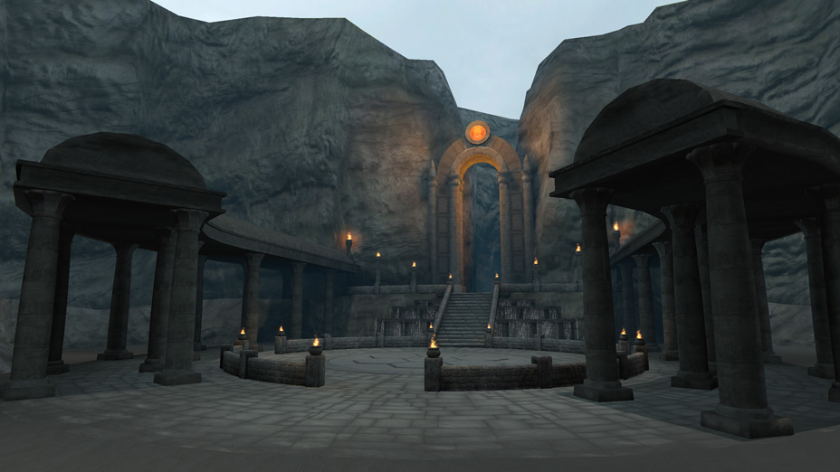
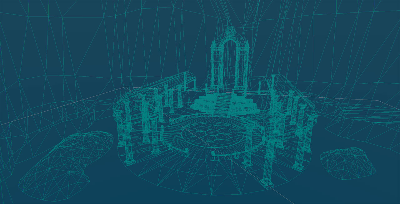
For my most recent 3D project, I wanted to create an environment using Unreal Development Kit. I decided to build a gateway to an ancient city from a fantasy story I'm writing. Here is the result. I would appreciate any critique, so please let me know what you think. Thanks!


Offline , null, 6 Posts, Join Date Aug 2009, Location USA  
   Reply With Quote

Jeremy-S's Avatar
Old (#2)
I'm no environment artist, so take this for what it's worth. It's not bad so far, the modeling looks good to me, the design is there too, but it's very very gray, and boring. There's no weathering to the stone, the lighting is very basic, there's no atmospherics, or shadows, it's just kinda "bleh".

But if it's just a start, it's not a bad one. You need to push this a LOT further. Get some reference, and study the shit out of it. Image search old places like this, and get inspiration, and ideas for ways to push it. Put those images into a collage, and refer to that a lot.

In short, good for START, not nearly finished yet. Keep going
Offline , polygon, 696 Posts, Join Date Jan 2007,  
   Reply With Quote

megalmn2000's Avatar
Old (#3)
Bake some lightmap within UDK, this will give more depth with shadows in the scene.

http://eat3d.com/free/udk-light-map-...basic-overview
Offline , polygon, 612 Posts, Join Date Aug 2010, Location Montreal, Qc, Canada Send a message via Skype™ to megalmn2000  
   Reply With Quote

VictorSantos's Avatar
Old (#4)
The concept it's pretty cool but I think that the light set-up and the textures can give a lot more strength to the scene.

Like this:


You can play a lot with the afternoon light.

Keep it up mate!
Offline , spline, 211 Posts, Join Date Mar 2011, Location Spain  
   Reply With Quote

nfrrtycmplx's Avatar
Old (#5)
Doesn't look terribly ancient either. There needs to be more distress on the corners of stone and in the cracks between objects.

Offline , triangle, 470 Posts, Join Date Sep 2005, Location LA, CA Send a message via AIM to nfrrtycmplx  
   Reply With Quote

sapphireLight's Avatar
Old (#6)
Thanks everyone for your suggestions. I made an updated version with different lighting. Does this look better?

Offline , null, 6 Posts, Join Date Aug 2009, Location USA  
   Reply With Quote

Ged's Avatar
Old (#7)
better, still quite flat, the lights are angled almost straight at the structure, not very atmospheric, look at the previous picture, a harsh orange directional light from one side and a blueish gray from the other side with most of the place in shadow not in light.
Offline , veteran polycounter, 3,903 Posts, Join Date Feb 2007, Location UK cheltenham  
   Reply With Quote

Mike Yevin's Avatar
Old (#8)
i agree with the other comments regarding the "clean-ness" of the scene when its meant to be an ancient gateway.

another thing worth mentioning again is the lack of color in the scene, right now i see greyish and a few specks of orange. sometimes taking a look at things with a different perspective can help a bit:


**udk includes this feature, in engine. i believe its called "squint" or something like that. its one of my favorite tools for breaking down the large picture of your scenes

with this blurred paintover, you can see how little color you have (currently) in your scene. things like green overgrowth or reddish dirt and dust can help out with this a bit.

also, id like to reitterate the image that nfrrtycmplx posted:

Quote:
Originally Posted by nfrrtycmplx View Post
i think some epic shadows crawling over the scene from the pillars, like in the above image, would really look good in this scene.

just a few points to think about, keep it going
Offline , polygon, 525 Posts, Join Date May 2009, Location Eugene, Oregon Send a message via AIM to Mike Yevin Send a message via MSN to Mike Yevin Send a message via Skype™ to Mike Yevin  
   Reply With Quote

sapphireLight's Avatar
Old (#9)
Okay, here's another attempt, trying to get better shadows and improve the look of the pillars.

Offline , null, 6 Posts, Join Date Aug 2009, Location USA  
   Reply With Quote

Jimmg's Avatar
Old (#10)
Looking better! Still looks kind of greyish, maybe put some browns in there?
Offline , null, 19 Posts, Join Date Oct 2010, Location Alabama  
   Reply With Quote

Ged's Avatar
Old (#11)
the right hand side of the picture is looking pretty strong now, maybe dirty it all up a little with colour and grittyness the floor looks mostly clean white. Might wanna put something on top of the cliffs in the background eg grass with hanging vines or something as they currently look like very low poly planes.
Offline , veteran polycounter, 3,903 Posts, Join Date Feb 2007, Location UK cheltenham  
   Reply With Quote

Blitzy's Avatar
Old (#12)
The lighting looks much better and its playing with your normal a lot more.

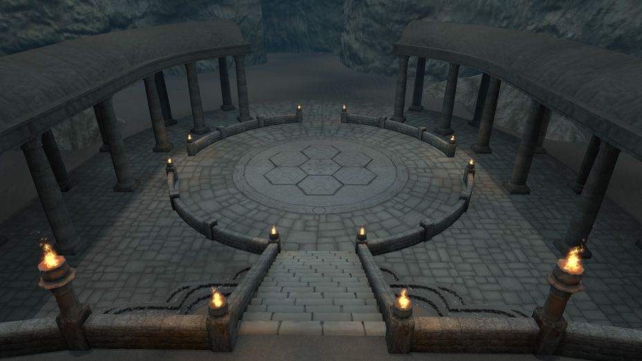
I think it could help to break up the white tiles with some more weathering, cracks, and if your going to add greenery to the scene couldn't hurt to have some overgrowth in between tiles. Also, having some tiles that are physically ajar would help to break up the flatness more.

Ryan Cook
Freelance 3D Artist
[Portfolio]
Offline , null, 13 Posts, Join Date Sep 2010, Location Grand Rapids, MI  
   Reply With Quote

Robbyh's Avatar
Old (#13)
so much sex in this thread !

Keep it up
Offline , line, 87 Posts, Join Date Jul 2009,  
   Reply With Quote

Jeremy-S's Avatar
Old (#14)
MUCH more visual interest in there now! Looks a lot better. Just gotta get some more details in the textures, add some vines and things like Ged suggested, maybe have some plants growing between the tiles like in the screens Blitzy provided... You can take this piece very far, as long as you keep going. You're doing good so far
Offline , polygon, 696 Posts, Join Date Jan 2007,  
   Reply With Quote

SnaFuBAR's Avatar
Old (#15)
You definitely need some vegetation of some kind in there. Find some suitable references for the type of environment you're going for. As it is now, it's just too sterile and I can't get a feel for what kind of region this is supposed to be in.
Offline , spline, 176 Posts, Join Date Jun 2008,  
   Reply With Quote

Jessica Dinh's Avatar
Old (#16)
Lighting looks nice, much better than first post!
Offline , dedicated polycounter, 1,667 Posts, Join Date Nov 2010, Location Southern California  
   Reply With Quote

jordan.kocon's Avatar
Old (#17)
What lighting setup are you using? I always have trouble getting bright lighting with nice, dark shadows like you have here.
Portfolio: http://jordankocon.carbonmade.com/
Enviro artist @ Digital Extremes
Offline , polygon, 554 Posts, Join Date Dec 2010, Location London, Ontario  
   Reply With Quote

sapphireLight's Avatar
Old (#18)
Here's a new update.


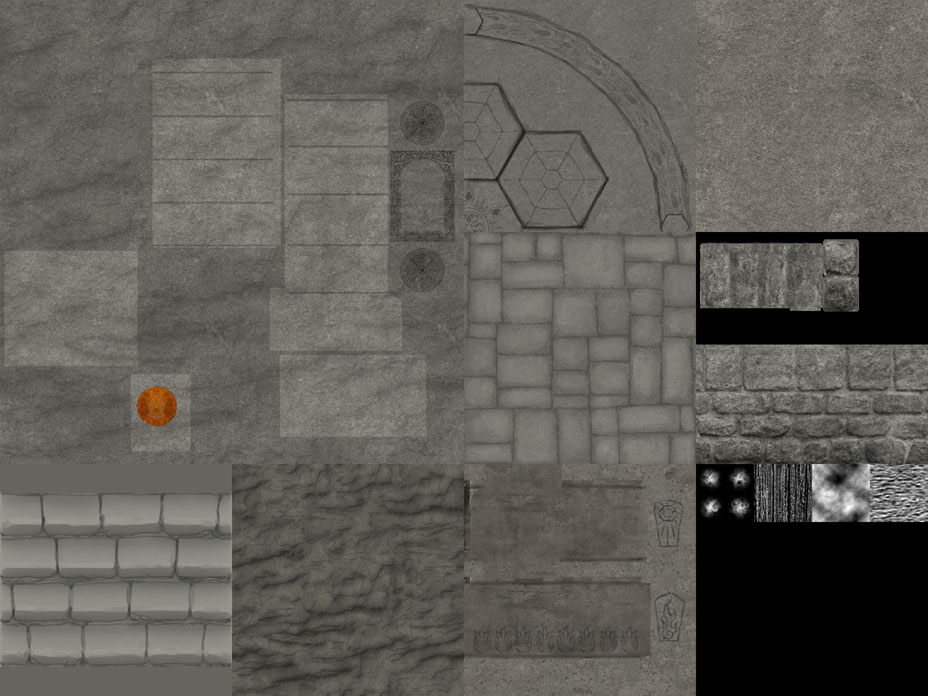
The scene is lit with a light orange Dominant Directional Light with a high brightness setting and a blue Environment Color. There's also a little bit of bluish fog in there. While working on this current version, I made the textures a brighter color, which helped them bounce the light around, unlike the dark gray textures I had before. I also tried to make the place look more ancient by breaking up the ground tiles with some patches of dirt and grass.


It's crazy how different it is from the first version. I really want to thank you guys for your advice. It's helping me a lot!
Offline , null, 6 Posts, Join Date Aug 2009, Location USA  
   Reply With Quote

slipsius's Avatar
Old (#19)
the difference between the first and last post is astounding.

Im not an enviro guy, so take this with a gain of salt, but I think the middle stones need some cracking. everything else in the scene is cracked except for that center thing. And maybe a vine or two growing up one or two of the pillars.

Possibly some sort of human influence as well, like, something left over from some ceremonies? old relics, or something. That just popped in my head, so i really dont know what else.

looks great though!
Offline , card carrying polycounter, 2,452 Posts, Join Date Apr 2009, Location Toronto, Ontario  
   Reply With Quote

Xendance's Avatar
Old (#20)
I think the lighting is a bit too dim.
Offline , triangle, 376 Posts, Join Date May 2010,  
   Reply With Quote

Jeremy Wright's Avatar
Old (#21)
Drastic improvement!

I say keep going with the weeds/grass in the cracks between stones. Right now you only have it in the dirt. It would creep its way into the crevices. I would do it sparingly, though.
Offline , polycounter, 1,197 Posts, Join Date Mar 2006, Location Mississippi  
   Reply With Quote

Alex3d's Avatar
Old (#22)
Great work on lighting! As mentioned above, keep going with vegetation.
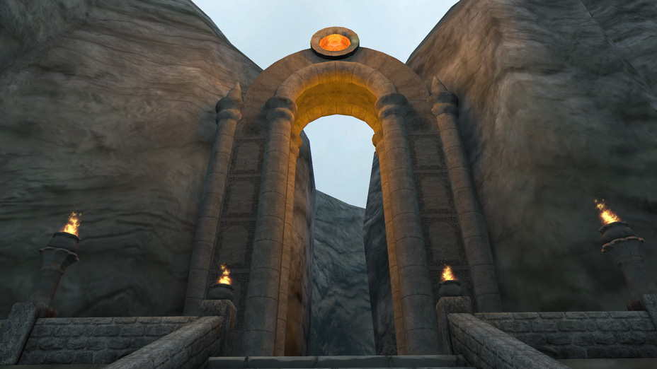
However, here is a problem: The title says "Ancient Gateway", yet it seems brand new. You need to add TONS of decay to this piece: Broken columns, cracked ground plates, collapsed ceiling, beaten up gateway and as said above - relics/garbage. The piece seems too uniformal, so when you will be breaking stuff do so randomly. Another tip is that ideally you want people to travel through the gateway; however in your case my eyes always linger on that orange thing. Please light the area beyond the gate, or place something there that would make the audience wonder whats inside and keep wanting more! Sorry if I seemed harsh, but I just wanted to help. Anyways, keep going, you're doing great
Alex Nikolaev | Environment Artist | Latest WIP
| Ubisoft Toronto
Offline , spline, 216 Posts, Join Date Jan 2011, Location Toronto  
   Reply With Quote

Blitzy's Avatar
Old (#23)
Going to agree with previous sentiments about it looking too clean.
The floor tiles should be cracked and chipped to hell. The greenery should have more of a creeping effect has it grows in between the tiles.

On a side not I'm not fond of the dirt mask on the tiles. Its too soft, doesn't seem believable and just comes off feeling too much list a quick and dirty "Photoshop mask". Focus on placing broken up tile meshes around the areas that are masked away with dirt. It'll help give the floor more depth.

Last edited by Blitzy; 09-27-2011 at 12:09 PM..
Ryan Cook
Freelance 3D Artist
[Portfolio]
Offline , null, 13 Posts, Join Date Sep 2010, Location Grand Rapids, MI  
   Reply With Quote

SouthpawSid's Avatar
Old (#24)
this has come so far from what it was. Gotta love the help you get here on the awesomeness that is PC! Maybe some trees on top of the cliffs would be cool? Just a suggestion
3D Artist at Obsidian Entertainment
Portfolio: http://btb3d.com
Offline , polygon, 671 Posts, Join Date Feb 2010, Location Vista, CA  
   Reply With Quote

BARDLER's Avatar
Old (#25)
You might want to look at the lighting a bit, in the afternoon the lighting tends to be yellowish which will cause the shadows to be purplish. This will give the scene a more natural lighting instead of a florescent manufactured white light with black shadows.
"I greatly appreciate any advice, tips, tricks, knowledge, feedback and/or any critique on my work." Thanks!
Portfolio - looking for internships
Online , polycounter, 793 Posts, Join Date Mar 2011,  
   Reply With Quote

Reply

Thread Tools
Display Modes

Posting Rules
You may not post new threads
You may not post replies
You may not post attachments
You may not edit your posts

BB code is On
Smilies are On
[IMG] code is On
HTML code is Off

Forum Jump

Copyright 1998-2012 A. Risch