ArenaNet Internship Creature
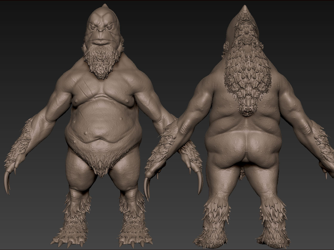
What's up guys. When the word got out about ArenaNet starting up their Internship Program again this year (thanks Swizzle), I expected to see a bunch of entries here. I guess some of you guys are holding it pretty close to the chest ") Well, I know that this is the best community to help me make the best creature I can make and hopefully help me land a spot. Right now, I'm in a really bad situation and I'm trying to claw my way out! Anyways, enough of my yammerin'. Here is where I'm at so far. Still lots to do, so I'm open to any C&C you guys may have. Thanks for watching.
Well, I know that this is the best community to help me make the best creature I can make and hopefully help me land a spot. Right now, I'm in a really bad situation and I'm trying to claw my way out! Anyways, enough of my yammerin'. Here is where I'm at so far. Still lots to do, so I'm open to any C&C you guys may have. Thanks for watching.
Replies
Beyond that I think you've done a very good job!
Do. Work.
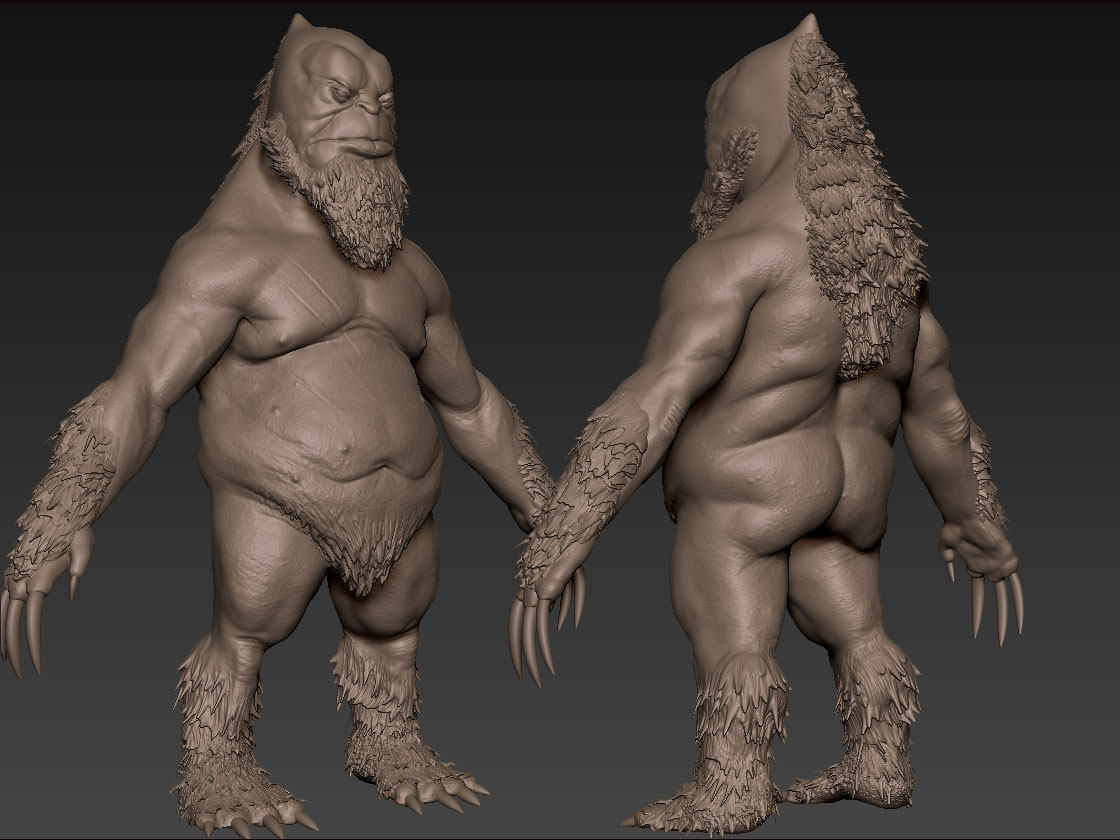
Anyways, here is an Update. I changed the proportions, posture, and added some more detail to the body. All comments and Critique are very welcomed.
I gotta ask tho, what's up with the inflamed taint?
And aside from its' inclusion, I feel that it doesn't give the sense of depth that the rest of your model has. Like, in the pecs for instance, you have this nice puffy shape which folds over sharply. I think some consistency is needed across that perineum. Not to mention that its' positioning atm its pretty much capping his anus 0.o
I guess what I'm trying to say is, right now you've got a lukewarm taint on your hands... I would say either push the forms so that it has more deep recesses and bulbous shapes like the rest of the model, or just obscure it with chunkier butt flab.
But there you have it. Either way, I think you've done a good job taking everybody's crits into account. And thank you for giving me the opportunity to ponder taints this lovely Sunday morning.
Greatest of successes to you.
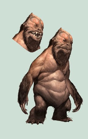
Marine - Dude, you had me staring at that concept for about two hours trying to figure out what was going on with his legs lol. I've decided, after careful research that he has gopher type claws and bear type legs, with a little human influence. Thanks for commenting.
Robat - Nice eye man! I didn't even think about that area because I planned to cover it with fur. Thanks for the comment.
Larkbeef - You're right about the nose. I always try to put a little hyper realism into my pieces with a little stylization. However, like you suggested, I cut the tip off because it just didn't match the concept. Thanks for the comment.
Alright guys, here's an update. I'm almost done with the sculpting and then it's time to crank out the Low Poly. I really want to do a great job on this, so if you see something wrong, please let me know. Thanks.
The topo at the top of his head, like around the forehead, looks really dense compared to elsewhere. It just looks to me like an area where the normal map should be doing the work, and not really the topology.
I did a quick paint over, certainly hope you don't mind but I thought it might help to illustrate my points. There are areas of high dense geometry where it really isn't needed as well as not enough geo in other areas. The joints need more love and edge definition, as well as your over-all mesh flow. Be sure to define your deformation points. (1) to hold one volume, (3) to hold the second volume, and (2) edges used to deform. Around knees and elbows adding hinge edges as well as giving the "front" of the knee, and "back" of the elbow more edges will greatly help with deformation during animation.
Also I see what you're trying to do with some mesh edges with a lot of his fat folds which is great to define, but you're losing strong rings that will hurt the final "animatability" of the model. New words rock. Make sure the flow is good and then go in and get fancy with support edges for fat jiggling, support edges for muscle structures and the like.
Good luck man, I hope this helped in some way.
I'm not sure if you're planning it, but an ambient occlusion pass and crazybump diffuse conversion from your normal map would go a long way to improving the look of the bake.
Vorge - Dude, thanks a bunch for taking the time out to do that paintover. I think it really helped me a lot. I have changed the topo and hopefully it looks better. Let me know if you see anything wrong.
foreverendering - Thanks man. Yeah, I plan to do the whole AO thing to help things pop. Right now, it's a bit muddy because it's not properly UV'ed and nothing is really getting much texture space.
Okay guys. I decided to do a quick rig, after changing the topo up, to see what my deformation is looking like. Let me know what you think.
Stoofoo - Thanks bro. Yeah, the viewport is just for wip's.
disanski - Thanks man. Yeah, with the AO, they should separate better.
itismario - Thanks dude. That is exactly why I saved those polys for later. He already has a mouth cavity though.
vorge - Thanks again for the topo help. I really appreciate it.
Okay guys, I've been struggling to get time to work on this guy (but life is full of obstacles waiting to be overcome). Anyways, I have him uv'ed, normals and AO baked, and I am currently finishing up his skin texture. Let me know what you think. Oh, and I know about the seams, I like to paint those out once I'm completely done with my colors.
I feel like the hair should be more brown instead of the reddish-tone. I know you normal mapped the hair and sculpted it, but you'd probably just be better off doing regular alpha hair planes for it, and then have a simple hair texture underneath that on the diffuse.
Try to make the diffuse map support the shape of the character. Right now it's too noisy to even see some of the major muscle groups.
Spend some more time on each texture map, maybe even post them if you want too
EDIT:
Maybe take a look at this:
http://www.gameartisans.org/forums/showthread.php?t=11290&page=8
Thanks for the critical crit man! I really appreciate it. Everything you mentioned were things I had in the back of my mind, but I guess I got blind to it after a while. Thanks a lot. Also, I would like to thank you for that ref image. I had seen it before, but never thought to check it out for this project. Anyways, thanks. Here is an update. C&C very welcomed.
Some things to consider:
1) where is your skin color variation? Try darkening the skin on the back and lightening areas that won't see the sun as much. If he's hunched over when he walks, the skin on his chest wont get as much sun as the back. Think of reasons to give color variation that make sense.
2) why is his fur looking like a plastic add-on? Integrate it! Look at the hair line of any animal that goes from fur or hair to skin. Staggered edges! Also consider adding shorter hair over the body. Think sean connery. He's a goddamn yeti! Right now I see 2 colors. Orange. And brown. All of our textures have a lot of color variation.
3) consider cooling down the skin overall and adding some nice reds to the creases. Right now he looks orange. Having that nice variation might make him look a little more alive.
/2 cents.
/bed
Deadline is closing in on us, so I'm pretty much running on fumes to get this to the highest level I can. I really need this opportunity! Anyways, here is where I'm at now. As always, C&C is very welcomed.
Like Zipfinater is saying, around the legs and arms, as well as up the side, the seams are fairly visible. When you bake out your highs and lows, it seems to be messing up the smoothing groups, or something. I can't really explain it, and I'm pretty sure the creature is all one smoothing group, but when xNormal does it's render (or Max's render to texture), it can create these problems.
A quick fix for the seam issue would be to export the model as a .3DS file, take that file into photoshop and fix the seams by hand. Photoshop use to crash, but the CS5 version is stable enough. I've not had it crash, yet, but it is a little laggy on updating. I find it a lot easier to fix seam issues this way, because you can see it on the model, rather than guess on the texture map. If your not familiar with this method, I'll try to find a link, or else throw up a quick tut on it.
That slight turn of the head and the slightly curious look from the eyes, it really conveys a sense of life from within. You pushed the hardest thing (I would consider it hardest) to push, even more than the concept.
Love the chest hair, it's a nice touch, bringing it back from serious, to more of what the creature really is - awkward.
Great job Marcus.
Thanks for the compliments man. I do feel that emotion is an important factor and I do try to convey a sense of feeling in my pieces. I'm glad you noticed. Good eye!