The BRAWL² Tournament Challenge has been announced!
It starts May 12, and ends Oct 17. Let's see what you got!
https://polycount.com/discussion/237047/the-brawl²-tournament
It starts May 12, and ends Oct 17. Let's see what you got!
https://polycount.com/discussion/237047/the-brawl²-tournament
Temple Guard [WIP]
Hey guys,
I am a third semester student at think tank training centre in Vancouver.
This is my frist peice on my demo reel and I need some honest feedback.
and my real main concern is the abbs and chest area. im trying to make it look reptilian but it dosnt feel right. I know its bloby at the moment but alot of its still being figured out.
Concept by Daarken:
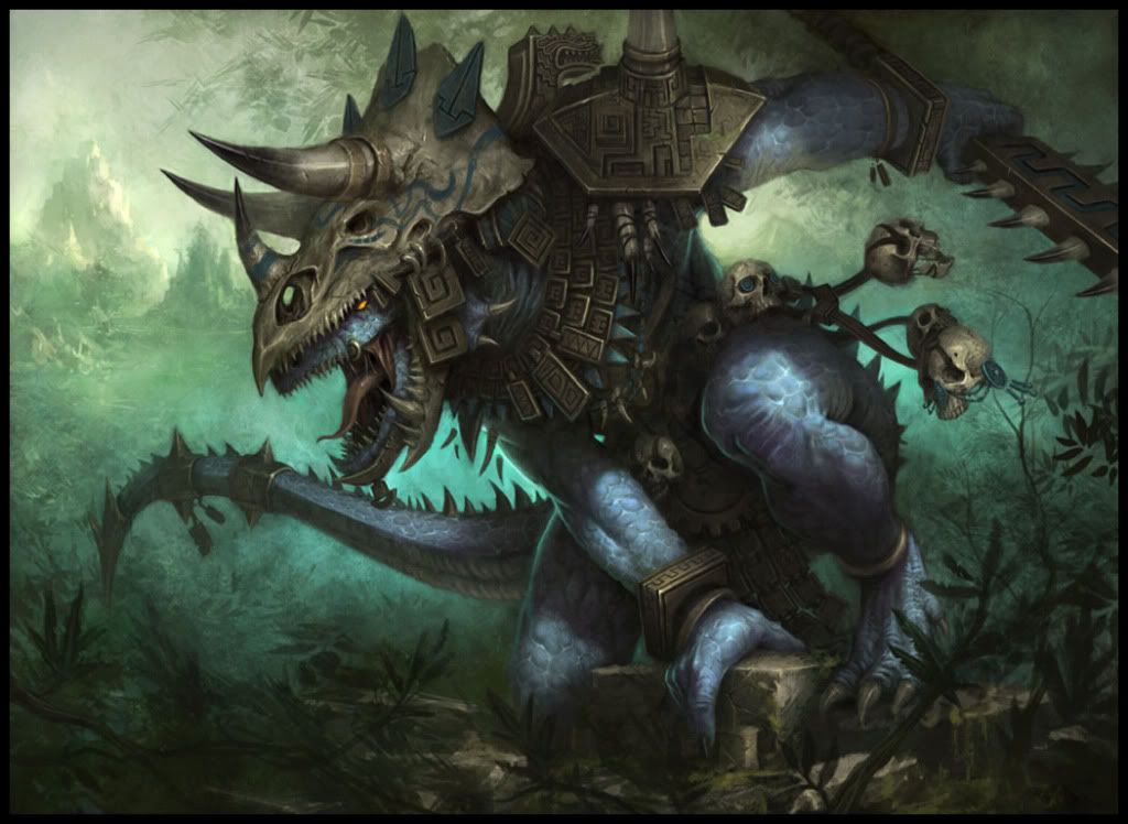
Sculpt:
I am a third semester student at think tank training centre in Vancouver.
This is my frist peice on my demo reel and I need some honest feedback.
and my real main concern is the abbs and chest area. im trying to make it look reptilian but it dosnt feel right. I know its bloby at the moment but alot of its still being figured out.
Concept by Daarken:
Sculpt:
Replies
also i agree with haikai on the pose... he dosnt look at all natural or balanced as he is posed now...to avoid unnessecary texture stretching when you finish and pose him, you may want to go with a more natural base pose to work off of.
@DDuckworth: agreed on the knee and I belive I have fixed it
@haikai: I'm working on making him look a little more reptilian, but from my mentors cretic he wanted me to take it in a slight more humanoid way. but im still going to push it.
@d.hynes: thx for the belly scale cretic! and I've credited the concept artist now.
@Cap Hotkill: Indeed I will
@woogity: Yeah.. im working on beafing up the hands.. I didnt really give them much love before. The scales im still playing with till I feel they hit right. I dont want to cover him in them yet I dont want to little xD
and I'll work on getting his pose a little more.. reptilian
Thanks for the feedback everybody!
For example, the concept is very focused to big shapes, however, you have some very strainey muscles in some areas. The problem with this is that this guy has thick scaly skin being a reptile and all. That vein on his bicep, fx, wouldnt pop like that I wager. In fact, Im not sure you cna even see veins on this guy.
Look at how subtle the muscles are hinted on the concept. Strong shapes.
the only change I didnt do much to was the posture.. for two reasons.. I prefer sculpting on him this way, and I kind of look at it as hes leaning back "did a test pose and it all came out looking like the concept" and theres no spikes on part of his back due to the armor covering it.
Sooo, I finally started to light this guy.. and thought i would show what I have.. the textures on the armour are really fadded though.. if anyone can come up with ideas that be cool
My ONLY complaint...this guy has so much damn character in him, yet his right hand (the one supporting his weight) is almost boring. I feel like his fingers should be bent a little...not really sure how to describe it; tried googling it.
Basically like, the tip of the finger should be flat against the rock slab with the middle join bent and pulled back; like he's gripping it with a lot of strength. If my poor explanation eludes you, I'll draw a picture :P
Honestly though.. awesome work!