WIP: Modular sci-fi set
polycounter lvl 13
I am currently working on some modular sci-fi parts to support research I am doing (found here http://www.polycount.com/forum/showthread.php?t=78444) and am in need of some opinion, it is currently a WIP and the smaller detail like bolst etc. has yet to be added.
The wall style I am not sure on, to go heavy detail, medium detail or low detail walls, I want this area to feel like an industrial / mechanical / dirty functional area, there will be a simple look that will be used for living areas, will post these up later when I have done.
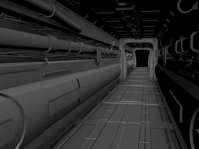
Overall feel of this modular set
Simple wall with monitor
slightly detailed wall
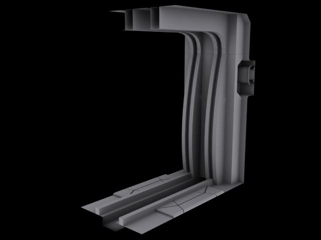
Large fan unit for air con
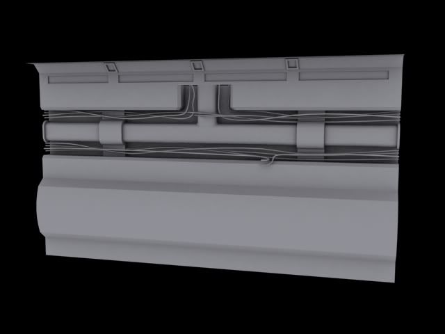
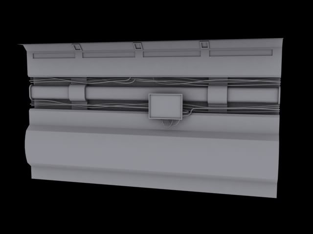
T-Junction pipe & wires
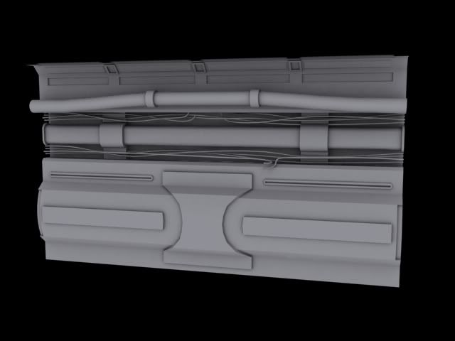
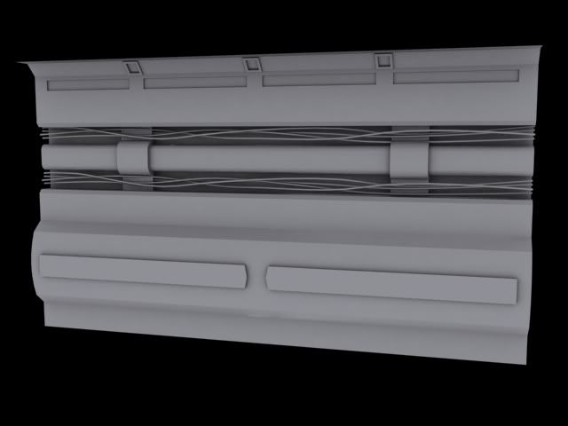
Heavily detailed wall
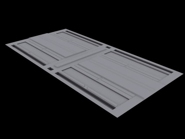
Floor
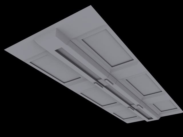
Roof
Bulkhead with emergency door (hidden atm)
The wall style I am not sure on, to go heavy detail, medium detail or low detail walls, I want this area to feel like an industrial / mechanical / dirty functional area, there will be a simple look that will be used for living areas, will post these up later when I have done.
Overall feel of this modular set
Simple wall with monitor
slightly detailed wall
Large fan unit for air con
T-Junction pipe & wires
Heavily detailed wall
Floor
Roof
Bulkhead with emergency door (hidden atm)
Replies
i still need to do a door way, corners, few extra add-ons for this set.
Overall feel
Window curved beams
Window block beams
Wall
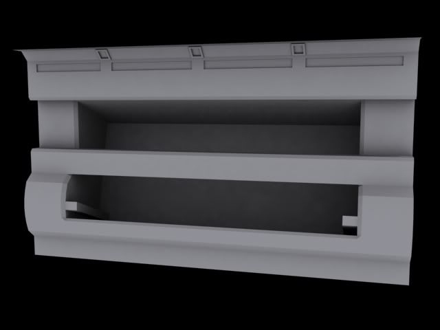
Wall open pannel
Door
Bulkhead
Floor
Roof
Edit*
Also going to atempt to do similar to philip K aswel with photshop
http://www.philipk.net/tutorials/modular_sets/modular_sets.html
I want this hallway to feel spacious however the height feels wrong when ever I play it in game, UDK has a high camera it feels like
I have another issue, this one I have tried and tried and tried to fix, it came from this issue originaly http://www.polycount.com/forum/showthread.php?t=76476&highlight=modular
To fix this I made the floor a tile, this fixed the shadow issue however I now get some strange effect between them in the distance, initialy this was showing up near the camera until I masked off the edges from the reflection.
below is the problem, looking at the top of the floor there are blue pixels showing in the gap when this shouldnt be.
I have padded the UV's, padded the model itself incase it was some sort of edge effect I was getting, padded the material around the edges more, while this works to a point, it never gets better than what is shown
with extra padding (notice the reflection vut of a fair bit into the tile)
No padding its worse
This is the material I set up