Home 3D Art Showcase & Critiques

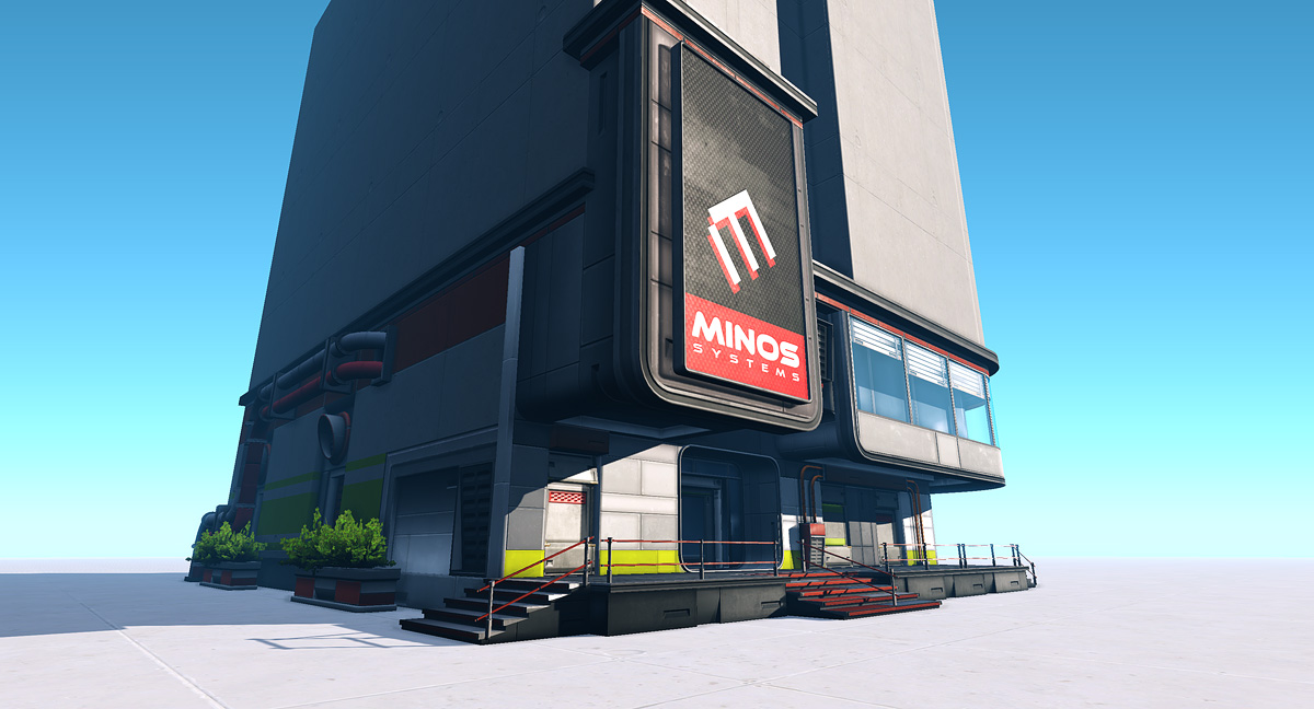
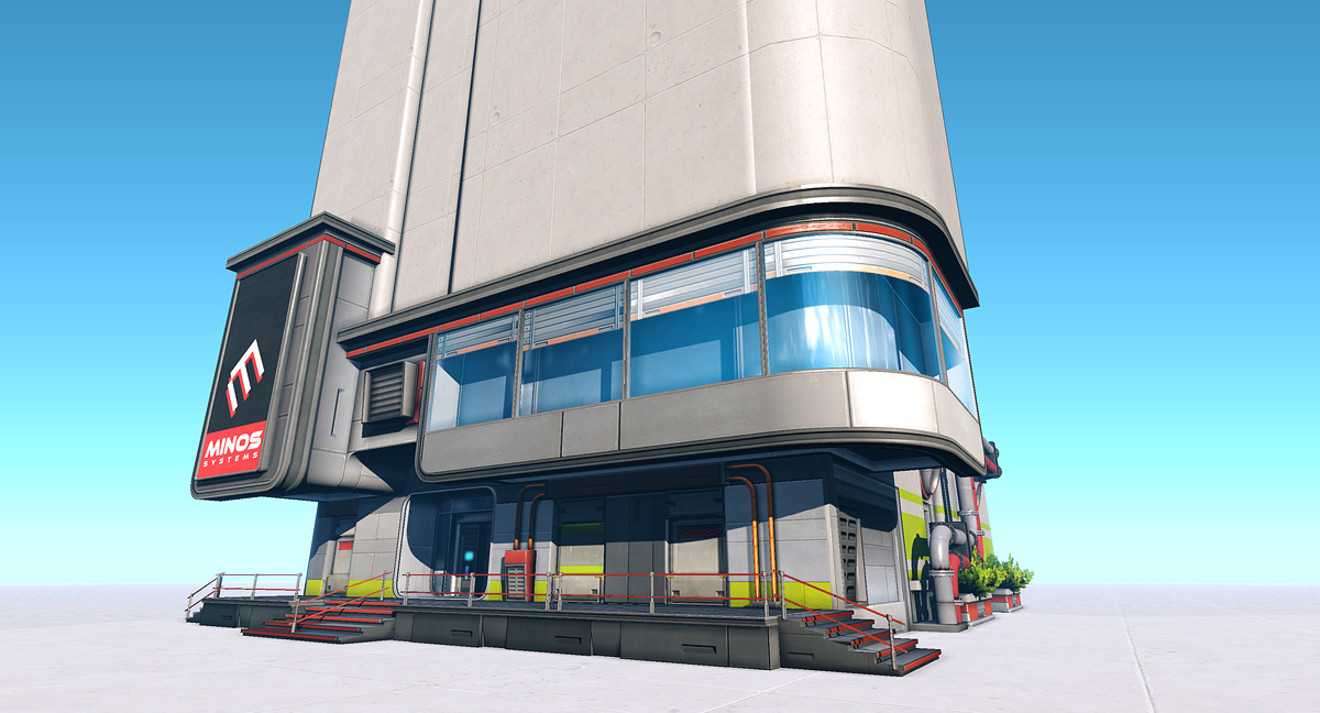
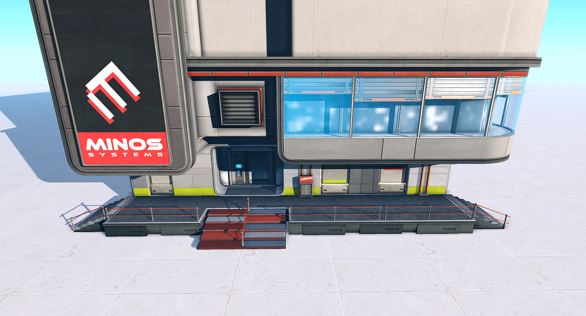
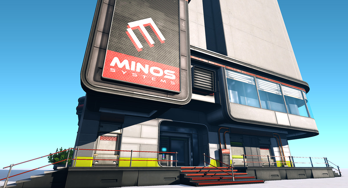
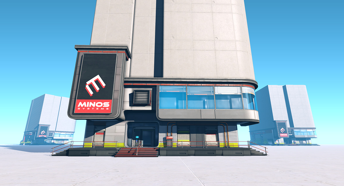
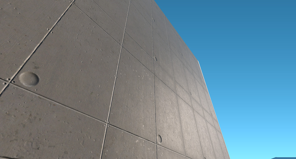
Slick & Clean Sci-Fi Building [UDK]

polycounter lvl 16
Offline / Send Message
Minos polycounter lvl 16
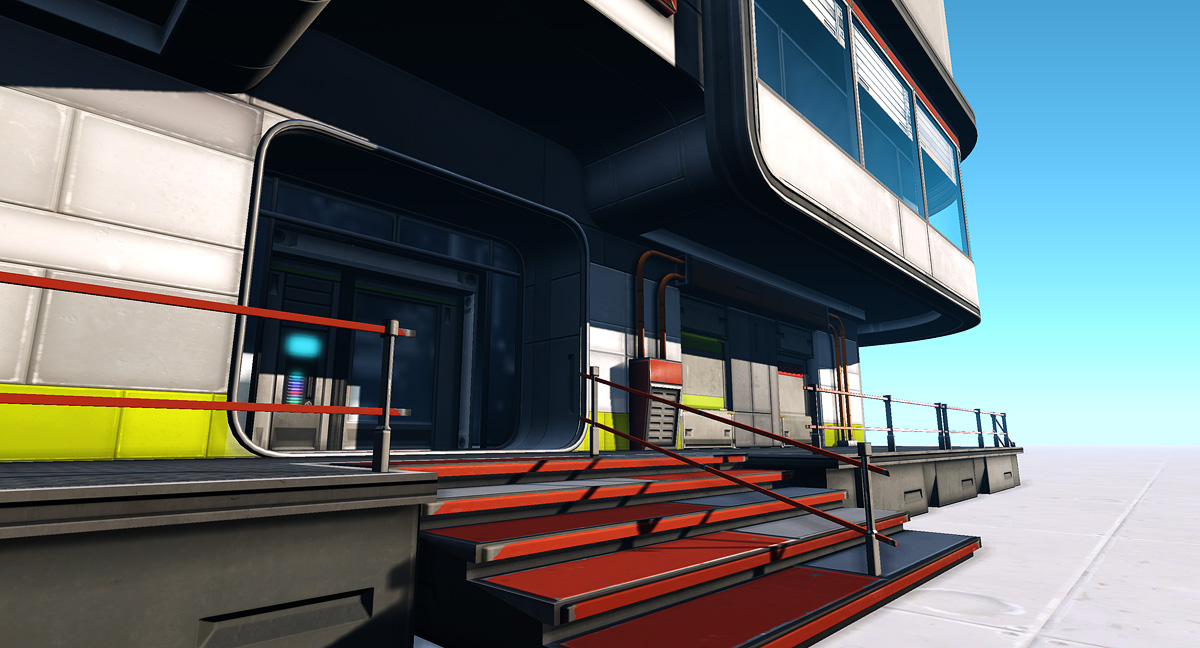
Hi! I just thought I could post some screengrabs from a little building I'm working on. My goal with this is to make a clean & stylish building. So far I have the first floor done and I hope to have the rest of the building done soon.

This is rendered inside UDK with a simple direct light casting dynamic shadows.

b_beatuy03.jpg
b_beatuy04.jpg
b_beatuy05.jpg
b_beatuy06.jpg
b_beatuy07.jpg
b_beatuy08.jpg
b_beatuy02.jpg
b_beatuy01.jpg

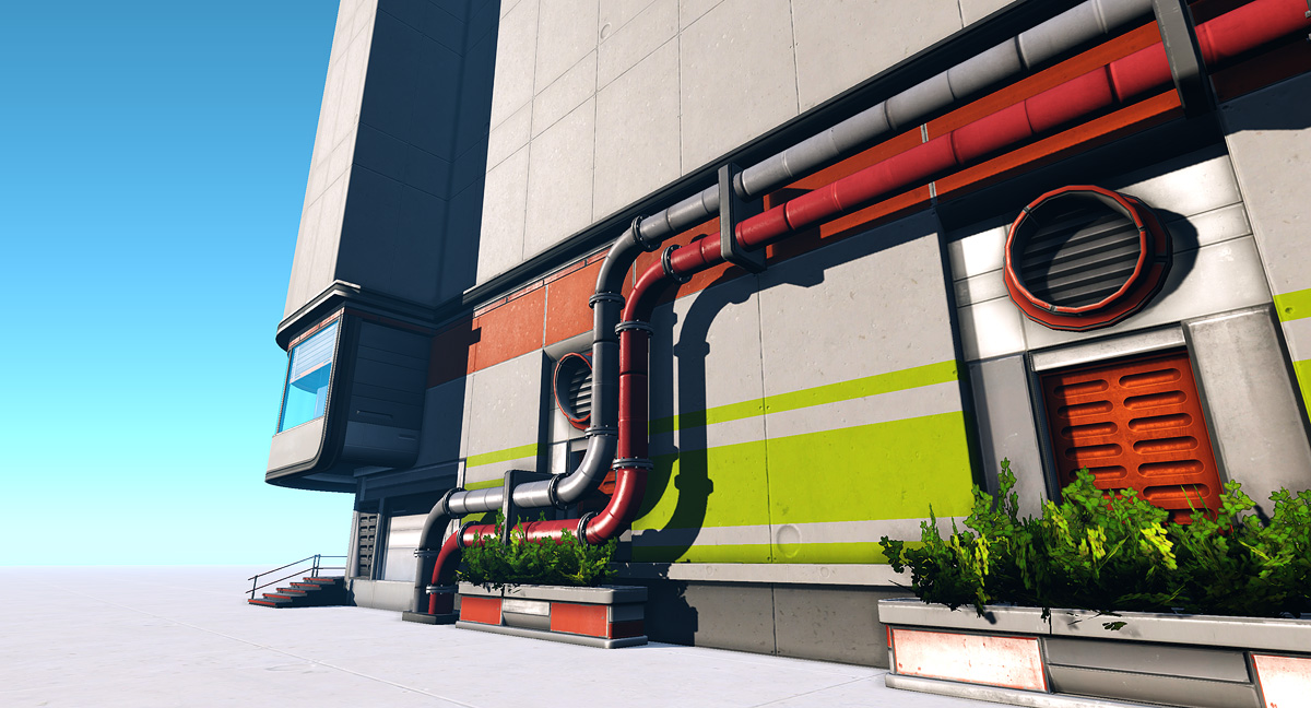
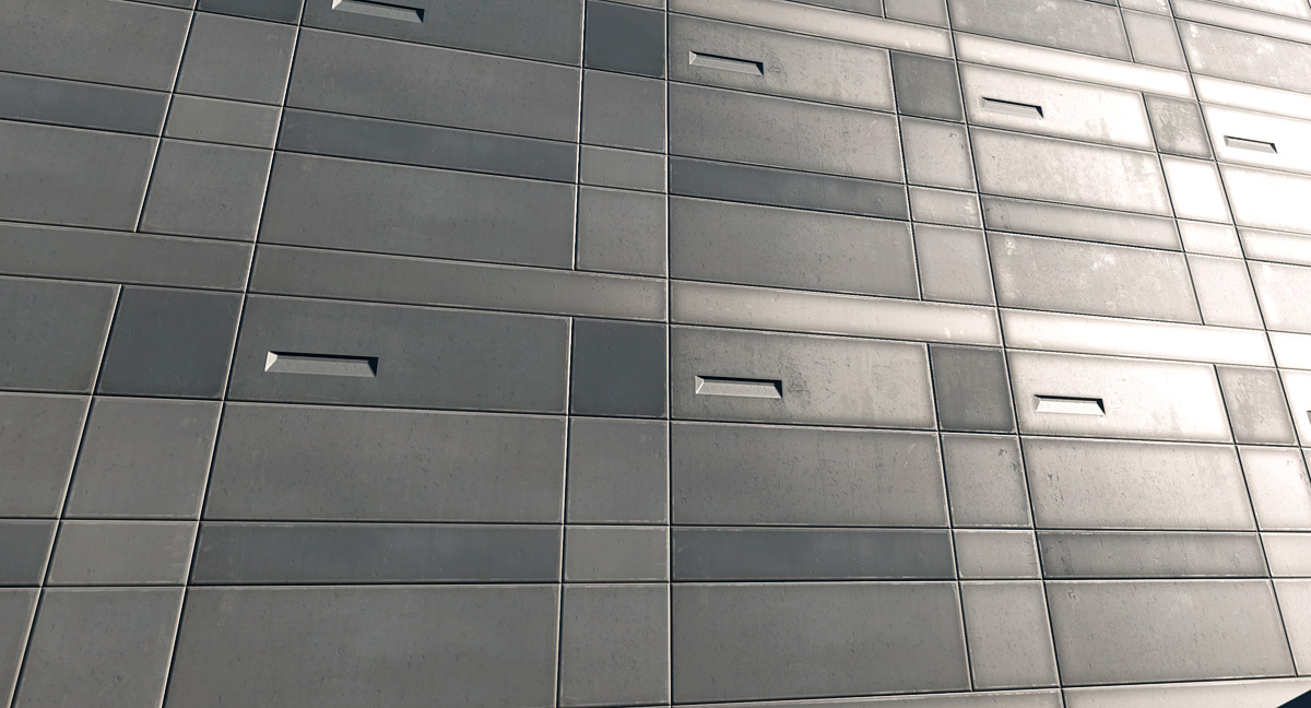
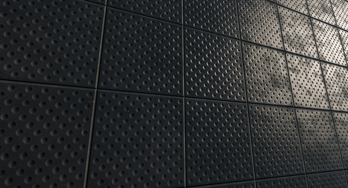
Some of the materials:
b_materials01.jpg
b_materials02.jpg
b_materials03.jpg

Please let me know what you think!
- Thiago Klafke

Replies

  • Arac
    Offline / Send Message
    Arac polycounter lvl 8
    This looks fantastic already!

    Only thing that seems a little odd is the panels around the door or entrace.
  • Minos
    Offline / Send Message
    Minos polycounter lvl 16
    Hboybowen wrote: »
    your front door glass what is going on there? It seems distorted very pixelated?

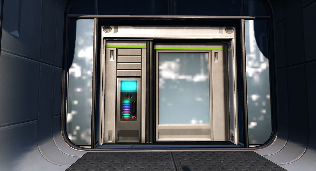
    It's a silly cubemap but it does its job when moving around it.
  • Neolight
    Offline / Send Message
    Neolight polycounter lvl 10
    Awesome design as usual dude.

    Definetly keeping tabs.
  • Ihazard
    wow that looks very nice, I can't wait to see more progress on this :)
  • Synthesizer
    Offline / Send Message
    Synthesizer polycounter lvl 11
    Awesome stuff as usual Minos :) Is this going to tie in with your previous sci-fi building? I'd love to see an entire complex in this style.
  • gauss
    Offline / Send Message
    gauss polycounter lvl 18
    Nailed the stated intention and what's more there's a lot that is very pleasing about this building visually, mostly to do with those warm colors and exposed ducting and such--just the right balance between futuristic and believable, without getting too cold-blooded about it. Thanks for sharing.
  • SaferDan
    Offline / Send Message
    SaferDan polycounter lvl 14
    wow this is really amazing :)

    It looks fantastic!

    Well done man :)
  • warby
    Offline / Send Message
    warby polycounter lvl 18
    love it

    "clean" is very underrated !
  • [HP]
    Offline / Send Message
    [HP] polycounter lvl 13
    It is indeed, nice work minos
  • KingFurryWobbler
    Offline / Send Message
    KingFurryWobbler polycounter lvl 12
    sweet stuff - hurry up n finish it :D
  • d1ver
    Offline / Send Message
    d1ver polycounter lvl 14
    hey, minotaur, your sci-fi stuff has a great feel to it.)
    I personally find clean, slick stuff harder to execute, then all the grungy uber detailed, so - great choice.) Nothing to crit so far. Gimme more=)
  • Al Anselmo
    Amazing! I can see a great color variation while still creating a clean and light atmosphere.
    This is already good and I'm sure this will get even better!

    Keep up with the great work, min0!
  • teaandcigarettes
    Offline / Send Message
    teaandcigarettes polycounter lvl 12
    Bitchin!

    I've always liked your strong use of colour; the high contrast and saturation really reminds me of Mirror's Edge.

    I'm gonna follow this one :thumbup:
  • Nizza_waaarg
    Offline / Send Message
    Nizza_waaarg polycounter lvl 15
    *additional generic art compliment* :3

    really love that style man, and everything around the windows on the first floor looks awsome, slick texturing all around too. Goin right in the inspiration folder ^^
  • AimBiZ
    Offline / Send Message
    AimBiZ polycounter lvl 14
    Sweet stuff! You should build an enviroment surrounding the bulding. That would really be ace if anything. :D
  • Shogun3d
    Offline / Send Message
    Shogun3d polycounter lvl 12
    Nice and clean, looking good!
  • JobyeK
    Offline / Send Message
    JobyeK polycounter lvl 13
    Awesome mino! Looking forward to seeing the progression.
  • megalmn2000
    Offline / Send Message
    megalmn2000 polycounter lvl 13
    I love the use of colors and forms! Reminds me of the game Mirror's Edge! :)
  • ajr2764
    Offline / Send Message
    ajr2764 polycounter lvl 10
    Well once I saw the name..I thought oh thats the guy who did that other amazing sci-fi piece. I love what your doing with the clean style, I'm a big fan of sci-fi in general. I happen to be playing Dead Space 2 right now and must say I can see this building and the last piece fitting right into the world especially with your color schemes. Keep up the good work.
  • chrisradsby
    Offline / Send Message
    chrisradsby polycounter lvl 14
    I really like it, great work on the colors, I like the clean saturated look. Hopefully the world will look like this in the future :)
  • SimonT
    Offline / Send Message
    SimonT interpolator
    yeah that looks really good.
  • roosterMAP
    Offline / Send Message
    roosterMAP polycounter lvl 12
    love the architecture!
  • Matroskin
    Offline / Send Message
    Matroskin polycounter lvl 11
    great work!

    Simple yet efficient and clean.
    Good idea to post material samples btw ;)
    I am working on my personal sci-fi thing and actually have spent some time on adjusting metal pannels shader and stuff so your samples provide additional good ref for me :)
  • divi
    Offline / Send Message
    divi polycounter lvl 12
    nice :D really liking your style.
  • Pedro Amorim
    Looks great!
    If I had to nitpick.. it would be that the circular vent in this picture http://thiagoklafke.com/misc/temp/b_beatuy05.jpg

    needs more segments..
    Right now, it seems that you are using the same ammount of segments in the pipes and in that vent. Which is not nice. Bigger things should have more sides.
    Other than that, looks nice :)
  • paulsvoboda
    Offline / Send Message
    paulsvoboda polycounter lvl 12
    This has been said a lot before but this is looking great.
    I love your use of colour, the simple, clean but very effective textures and materials and the architecture itself.
    The only small thing is I don't really understand what's going on with the door. Maybe try to up-res the cubemap slightly.
  • popngear
    ^^

    I was about to say that, but he did first, so what he said :)

    For the cubemap you can try doing a cubemap sample in the editor with a scene that is just a blue skydome. You can bring it into Photoshop after and run a blur on it too so the details aren't so easy to pick out.
  • lewist
    Really nice use of saturated color and clean textures. Definitely gives me a mirror's edge style vibe. I can't wait to see how you continue the next couple of floors.
  • passerby
    Offline / Send Message
    passerby polycounter lvl 12
    i like, very clean looking but still looks believable and lived in.

    and your colour reminds me a lot of Mirrors Edge especially the red pipes and railing.
  • pior
    Offline / Send Message
    pior grand marshal polycounter
    Slick and clean!
  • Gannon
    Offline / Send Message
    Gannon interpolator
    Very nice, you should see what you can do to clean up that cube map.
  • Heartless
    Offline / Send Message
    Heartless polycounter lvl 8
    Amazing.

    My only gripe would be the yellow. I think it'd look better as grey.
  • mkandersson
    Offline / Send Message
    mkandersson polycounter lvl 7
    Very nice! Looks great. Though I dont fancy the yellow colour
  • JasonLavoie
    Offline / Send Message
    JasonLavoie polycounter lvl 18
    ohhh Thiago, you melt my heart good sir :) It would be great to hear some insight in how you start these projects, how do you choose a style / how you go about building these pieces and creating your textures.

    You've become one of my fav artists buddy, really pumped for this :)
  • JordanW
    Offline / Send Message
    JordanW polycounter lvl 19
    This looks fantastic, I've always wanted to make something like this. I would recommend using a different method of reflection, The cubemap doesn't hold up very well in screenshots. Maybe try using a 2d reflection mapped to screenspace or something.
  • Minos
    Offline / Send Message
    Minos polycounter lvl 16
    Thanks everyone, I'm really glad you like my work :)
    Awesome stuff as usual Minos :) Is this going to tie in with your previous sci-fi building? I'd love to see an entire complex in this style.

    As much as that would rule I don't have plans for that atm!
    warby wrote: »
    love it

    "clean" is very underrated !

    Indeed!
    d1ver wrote: »
    hey, minotaur, your sci-fi stuff has a great feel to it.)
    I personally find clean, slick stuff harder to execute, then all the grungy uber detailed, so - great choice.) Nothing to crit so far. Gimme more=)

    That's true. The thing I like the most about working on clean environments is that special attention must be paid to define the materials properly. Concrete should look like concrete, metal should look like metal and so on.

    That's also why I chose to go with simple dynamic lights for this scene. It's easy to overlook poor material definition when you have lightmass with all the cool light bouncing going on.
  • Minos
    Offline / Send Message
    Minos polycounter lvl 16
    ajr2764 wrote: »
    Well once I saw the name..I thought oh thats the guy who did that other amazing sci-fi piece. I love what your doing with the clean style, I'm a big fan of sci-fi in general. I happen to be playing Dead Space 2 right now and must say I can see this building and the last piece fitting right into the world especially with your color schemes. Keep up the good work.

    Thanks :) I started playing Dead Space recently and although it looks a bit rough in some parts, the materials are pretty good and atmosphere is fantastic! Just wish I had played the game earlier =)
    I really like it, great work on the colors, I like the clean saturated look. Hopefully the world will look like this in the future :)

    Judging by how things go at the moment, the future will probably look more like Fallout though :(
    Matroskin wrote: »
    great work!

    Simple yet efficient and clean.
    Good idea to post material samples btw ;)
    I am working on my personal sci-fi thing and actually have spent some time on adjusting metal pannels shader and stuff so your samples provide additional good ref for me :)

    Glad I could help somehow!
    Looks great!
    If I had to nitpick.. it would be that the circular vent in this picture http://thiagoklafke.com/misc/temp/b_beatuy05.jpg

    needs more segments..
    Right now, it seems that you are using the same ammount of segments in the pipes and in that vent. Which is not nice. Bigger things should have more sides.
    Other than that, looks nice :)

    You are right sir, I'll fix that!
    This has been said a lot before but this is looking great.
    I love your use of colour, the simple, clean but very effective textures and materials and the architecture itself.
    The only small thing is I don't really understand what's going on with the door. Maybe try to up-res the cubemap slightly.
    popngear wrote: »
    ^^

    I was about to say that, but he did first, so what he said :)

    For the cubemap you can try doing a cubemap sample in the editor with a scene that is just a blue skydome. You can bring it into Photoshop after and run a blur on it too so the details aren't so easy to pick out.
    rdmlegend wrote: »
    Very nice, you should see what you can do to clean up that cube map.
    JordanW wrote: »
    This looks fantastic, I've always wanted to make something like this. I would recommend using a different method of reflection, The cubemap doesn't hold up very well in screenshots. Maybe try using a 2d reflection mapped to screenspace or something.

    Agreed, the cubemap looks horrible.

    JordanW: I tried to do that in UDK several times but could never figure out exactly how to. Does anyone have any idea how to do that?
    ohhh Thiago, you melt my heart good sir :) It would be great to hear some insight in how you start these projects, how do you choose a style / how you go about building these pieces and creating your textures.

    You've become one of my fav artists buddy, really pumped for this :)

    Thanks Jason =)

    This building started a bit different than my other UDK scene. For this one I gathered a lot of references upfront. I browse several modern architecture sites quite frequently so I have a nice reference folder for that. I also love Syd Mead (I think he's the greatest modern artist) and he has always inspired me a lot.

    Regarding movies, nothing is prettier than 2001 imo, so that's also always a big inspiration.

    Here are some of the references I used for this:
    000.jpg
    001.jpg
    002.jpg
    003.jpg

    This building has quickly became one of my favorite buildings, the colors, the materials look fabulous:
    Futuristic-Architecture-Building-2.jpg
    1315738390_16786842a0_b.jpg

    I then created a quick mockup model to check composition and try some ideas. The final version looks pretty different though:
    b_concept.jpg

    Since I decided not to use lightmaps for this, I could overlook some of the planning and work with big collapsed meshes (something I was not used to). I also like to work on both geometry and textures at the same time (always try to use texture proxies!!), so the process wasn't as straightforward as it should be but that's how I work :)

    I hope that helps, please let me know if you guys have any addition questions!

    Now onto the top floors and I'll wrap it up as soon as possible.
  • JordanW
    Offline / Send Message
    JordanW polycounter lvl 19
    You should be able to take reflection vector, use transform vector and go from tangent to screen, then component mask of R,G then *0.5 and +0.5 then use that as your image's texture coordinates
  • salman_fas
    Here a tutorial I made a few years ago about using a 2d reflection. I saw this method was used a lot in Gears 1.

    http://www.salman3d.com/tutorials/tut1.html
  • Minos
    Offline / Send Message
    Minos polycounter lvl 16
    Thank you very much JordanW/salman_fas. I could have never figured this out by my own.
  • Oniram
    Offline / Send Message
    Oniram polycounter lvl 16
    looks amazing. wondering if you could take the time to show the "modularity" (if there is any?) of this.. id be really interested in seeing the method of creation for this.
  • Cooljay
    Looks very interesting. I like the style you have going on with this building
  • seth.
    Offline / Send Message
    seth. polycounter lvl 14
    yummy stuff. I can only echo all the nice things that other people have said. Buildings don't normally do it for me ( other half does arch vis so I may have seen too much :D) but I do like this very much.
  • danjohncox
    Offline / Send Message
    danjohncox polycounter lvl 7
    Great looking piece! How many different texture maps do you have for this piece(not including spec or normal)? And how did you handle things like the wall on the left side, with the pipes. It's got that green strip there, was that just a material adjustment or did you make another version of that diffuse?
  • Jister
    yumi!
    are you gonna leave the upper part all concrete?
Sign In or Register to comment.