Home 3D Art Showcase & Critiques

Purgatory: Environment

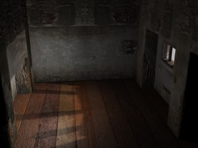
This is an environment I am working on for a movie I am shooting on green screen. The seen is lit by simple omni lights. I am thinking about replacing the floor with something more befitting a concrete building. Looking for input.

4.jpg

3.jpg

2.jpg

1-1.jpg

Any input is sincerely appreciated.

Replies

  • Sean VanGorder
    Options
    Offline / Send Message
    Your proportions and scaling seem to be a little off. I think the main issue is the scaling of the floor texture, as it seems way too big. You said you're going to replace that, but keep the scaling in mind.

    Also, the mirrored pieces are pretty obvious, especially since they are positioned in the center of the shot and the viewer is looking directly at it.

    I think the lighting could use a bit of work as well, as it's a little bland at the moment. Increasing the contrast of light and shadows would probably go a long way. Adding in some light shafts coming through the window would also make it a bit more interesting.

    After fixing it up a bit, I think you'll have a nice little scene. Will you be adding any props?
  • The Umbrella Man
    Sean_EG: Yeah I am doing a huge tree that will be growing out of the ground, with latin words inscribed on it. Aside from that I am not sure yet. Kinda working with whim and fancy as I go.

    I am probably going to do two maybe three versions of the archway to break up repeating patterns. The floor is pretty craptastic. I don't like wood for this environment, and I will probably go with dirt and broken tiles of some sort.

    On a slightly related note, I am looking to create my normals in zbrush, but I haven't found a good way to project a texture onto a model without the texture being slightly off. Is there a good workflow tut for doing environment pieces in zbrush?

    I have been doing my normals in the nvidia plug in, but I am not digging the results. Too noisy without a whole lot of depth to speak of.
  • The Umbrella Man
    Some changes:

    2-1.jpg

    1-2.jpg

    Made changes to the lighting, saturated the colors, increased intensity, faked bounce a bit, etc. Going to fix the normals on the tiles next. Think they were angled weird which is causing some weird tiling. :(

    Going to bed now.
  • SnakeDoctor
    Options
    Offline / Send Message
    SnakeDoctor keyframe
    The wall to the right seems like the proportions are off. Try scaling down the bars and making more of them to get a sense of the size of the wall. Right now it looks like a prison for hobbits :). I like the grungy feeling your giving the scene.
  • G3L
    Options
    Offline / Send Message
    G3L polycounter lvl 9
    don't be afraid to model some cracks of your own to break up the silhoutte in some areas. of course just make sure they're the big ones and not the small little cracks on the walls :)

    and there is some weird issue going on with the tiles where the depth is really deep but the other places where the grout is in between tiles, it doesn't seem as deep or have any depth at all. how did you make the normals for the tiles?
  • The Umbrella Man
    @snakeDoctor: Good idea. Since the Bars are tiled textures there no unwrap so I can just screw around with the proportions without a whole lot of work.

    @G3L: I am probably going to do a couple variations to the wall pieces tonight since I found some cool tuts on zbrush. The problem I found with the tiles is that the projection cage in Max was at an angle so they projected from the center further and further out until it started to look weird at the outer edges. Gonna go home and tweak it. Too bad I will have to redo the damn diffuse :)
  • Shogun3d
    Options
    Offline / Send Message
    Shogun3d polycounter lvl 12
    The symmetry on the wall is quite noticeable. Rather, you should run a horizontally tiled texture. Floor tile is nice but there are some noticeable gaps/banding between tiles. Looking good otherwise, keep up the good work!
  • looprix
    Options
    Offline / Send Message
    looprix polycounter lvl 8
    The first piece's texture and shader look great! ...the other two could use similar treatment. Also the assets are too blocky, give them a more interesting broken silhouette. Think Uncharted 2.
    Looking forward to seeing your progress!
  • The Umbrella Man
    Spent most of the night improving the textures. Made about four different archway textures, going to do a more broken up one tomorrow night. Also re-rendered the normals on the tiles, and added a raytrace reflection to it.

    1-3.jpg
  • The Umbrella Man
    Here's another update. Did a broken pillar version in zbrush, and brought it over into max after many computer problems. (Video Card died!) I really like where it is right now, but I think I am going to add in bits of the steel frame inside the pillar like the fence link type, or just the solid rebar. Let me know what you guys think.

    BrokwnWall.jpg

    Scene.jpg
  • Pangahas
    Options
    Offline / Send Message
    Pangahas polycounter lvl 10
    I think the floor is too shiny, totally contrasting the worn look of the surrounding walls..
  • teaandcigarettes
    Options
    Offline / Send Message
    teaandcigarettes polycounter lvl 12
    I think you should try to make a block-out first. The scale is really off and some of the shapes seem unnecessarily chunky.


    Slap a grey material on everything and take it from there; if you can make it look good with geo only it will look even better when textured.

    Keep it up man :thumbup:
  • kaptainkernals
    Options
    Offline / Send Message
    kaptainkernals polycounter lvl 12
    Something stands out a lot to me, is the flooring. In large part due to the fact that tiles seem to be going under the pillars. From wall to wall it looks fine, but the tiles seem to go under the pillars, and the roundness of the bottom of the pillars don't help - all together it just seems like the pillars are floating there.

    What could help, is wall trim:

    965497-VIP-Torture-Room-Prison-Cell--Toul-Sleng-Phnom-Penh-2.jpg
    1st image, you can quite clearly see trim along the wall and floor boundary.

    509220313_f5ed31e686_b.jpg
    2nd image ^ the trim is broken and missing in large sections, but you can there was once trim, trim is pretty standard with any flooring, it's either wood, or tile or something else. While in this image you can see rounded edges at the floor, you can clearly see how and where the tiling ends, with wear on the tiles where the trim used to be.

    EDIT, what i've said is pretty much what teaandcigarettes said, it's about the shape and form of everything.
  • The Umbrella Man
    @kaptainkernals That is... That's the most perfect referrence I could have ever gotten. Thank you!

    @teaandcigarettes I will try blocking out my scenes first from mow on. I worked on the ceiling, and I won't try texturing it until I have the rest of the scene modeled.

    @Pangahas I just changed the reflective material to be less mirror like.

    Taking the crits I got here and getting to work :)
  • Builder_Anthony
    Floor tiles need more debris from the walls.
    Add cracks to floor tiles.
    Some sort of green thing right past the doorwall.Seems kind of bright compared to rest.
    Light seems a little bright ....the rays on the door.
  • The Umbrella Man
    I don't have any doors in my scene. Are you sure you aren't mistaking the photo posted by kaptainkernals for the 3d scene? If so... Lol.

    Here is an updated version with the ceiling that I have blocked in. Let me know what you think.

    vaulted ceiling
    VaultedCeiling.jpg

    Scene-1.jpg

    Heres a shot with my biped in there so you can get a sense of scale.

    Scene-2.jpg
  • The Umbrella Man
    Nother update:

    Changed the ceiling, didn't like where the other one was going. Decided to go with something a little simpler. I am going to do a version that has the drywall broken apart with the support beams showing.

    VaultedCeiling-1.jpg

    Scene2.jpg

    Scene-3.jpg
  • duxun
    Options
    Offline / Send Message
    Rock It !!!!:poly130:
  • Shiniku
    Options
    Offline / Send Message
    Shiniku polycounter lvl 9
    Cool to see somebody putting all the crits into action, it's looking a lot better than it did in the first post. Cool stuff!
  • The Umbrella Man
    SOme broken drywall for that ass (will be making several different kinds of broken drywall soon):

    Scene001.jpg
    Scene002.jpg
    Scene003.jpg
    Scene004.jpg

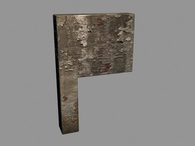
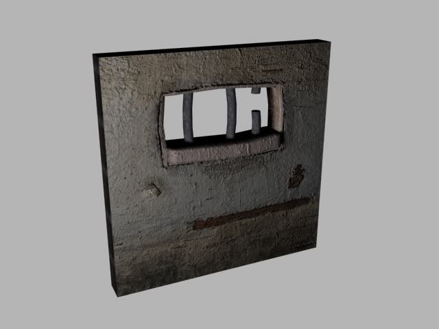
    Decided to make this a jail. Here's the solitary confinement cell door (unfinished):

    Scene006.jpg

    I'm printing this shot out and getting a tattoo of it on my ass:

    Scene005.jpg
  • DDuckworth
    Options
    Offline / Send Message
    DDuckworth polycounter lvl 6
    The bars on the window stand out to me, they look fake, in part because they are so thick and so few of them. Also that they are bent and the broken one just doesn't do it for me. I feel the broken one shouldn't be so cleanly cut if it's eroded, and I don't know why they would all be bent in random directions. I would think they would be mostly straight. But even if you ignore all of the above advice I think the thing that would improve them the most would be a little rust in a circle around base of each bar on your concrete/plaster texture. Bars that are old and have been there a long time will be leaking rust in that pattern all around themselves.

    Here is the best picture I could find, you can see it a little bit, even if not rusted they would always have at least a slight raised lip around them from where painting around them or placing the concrete
    91631103.jpg?v=1&c=IWSAsset&k=2&d=B53F616F4B95E553F192EF169D47B301819EDF509FDE697BAB6BBDB6AD90185EE30A760B0D811297

    Hope that helps! Your scene is really coming along though, i think you ended up choosing a great floor
Sign In or Register to comment.