Home 3D Art Showcase & Critiques

warlock

polycounter lvl 17
Offline / Send Message
tucho polycounter lvl 17
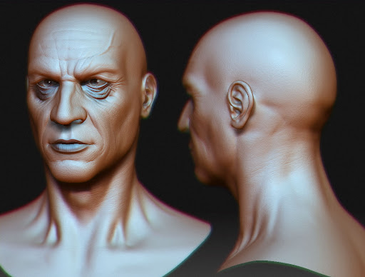
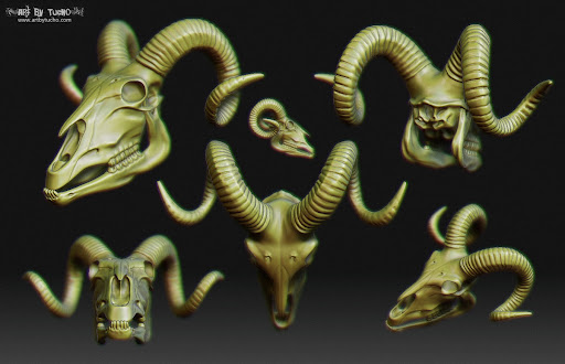
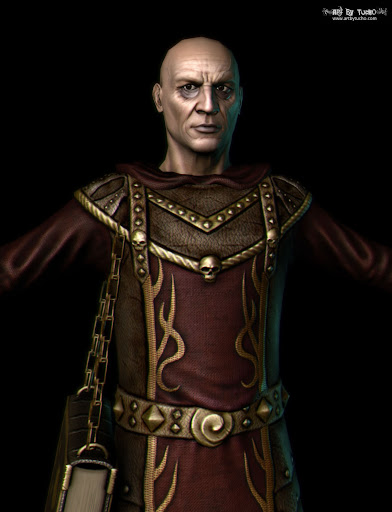
Hi people, here is one of my latest models, it is almost finished, I need to improve a bit the textures, pose the model and work on a good illumination and render.

I hope you like it, as always crits and comments are welcome :)

warlock9.jpg

warlock8.jpg

warlock_body_retopology7.jpg

spellbook2.jpg

scepter_5.jpg

scepter_4.jpg

warlock_texture_wip11.jpg

warlock_texture_wip11_2.jpg

warlock_texture_wip9.jpg

Replies

  • Sirdelita
    Options
    Offline / Send Message
    Sirdelita polycounter lvl 10
    looks great! Love the red and gold colors, and that book is insane. Do you plan on posing this bad boy?
  • cadyw
    Options
    Offline / Send Message
    this style really doesn't appeal to me, and I think it's a little old news— that said, I have to give you MAD RESPECT, because he does look awesome! that second pic....woah
  • marlfox8
    Options
    Offline / Send Message
    the bags under his eyes are kinda abrupt and well.... he kinda looks boring.his costume isnt very elaborate(im not saying it has to be giant and flowing)
  • tucho
    Options
    Offline / Send Message
    tucho polycounter lvl 17
    Thanks for your comments guys :)
    Do you plan on posing this bad boy?

    Yes I do, I stopped work on this model for a couple of months because I'm really busy, but when I have some time I'll pose it and I'll make a nice render
    this style really doesn't appeal to me

    I do it to have a more realistic character in my portfolio (the most of them are monsters and creatures) but is not a really realistic guy, he's a bit stylized.
    the bags under his eyes are kinda abrupt and well.... he kinda looks boring

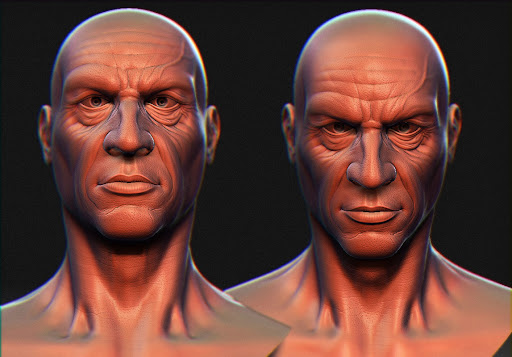
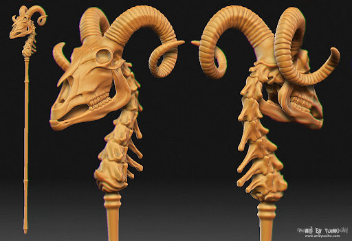
    I exagerate all the detail a bit on the Ztool to get a nice nice normal from it, I also try to put a neutral expression on his face
  • conte
    Options
    Offline / Send Message
    conte polycounter lvl 18
    wow that's some neat job, tucho!
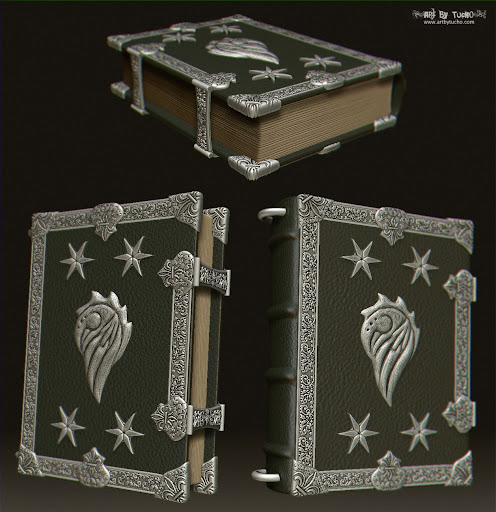
    i like the book and how accurate lowpoly is.
    on the crit side: i'd fade that specular on his clothes out, make his face texture less plastic and more natural(spots, color variation)
    thanks for the wip shots!
  • felipefrango
    Options
    Offline / Send Message
    felipefrango polycounter lvl 9
    cadyw wrote: »
    this style really doesn't appeal to me, and I think it's a little old news— that said, I have to give you MAD RESPECT, because he does look awesome! that second pic....woah

    I feel the same way, I don't really like the style (not YOUR style, I mean the fantasy setting and the realistic approach) but I have to admit it looks really good. I'd love to see it in realtime though, I personally think that rendering game-res models in mental ray or whatever it is that you've used detracts from the model itself and kinda makes it look worse. I think you'd benefit much more if you put him in a really cool pose and tried Marmoset, maybe put him in Unreal or use Xoliul's 3dsmax realtime shader. :thumbup:
  • tucho
    Options
    Offline / Send Message
    tucho polycounter lvl 17
    Hi guys, thanks again for your comments.
    on the crit side: i'd fade that specular on his clothes out, make his face texture less plastic and more natural(spots, color variation)
    thanks for the wip shots!

    Yep, I have to improve the current textures and create another ones: glossines, environment mask, etc.
    I personally think that rendering game-res models in mental ray or whatever it is that you've used detracts from the model itself and kinda makes it look worse. I think you'd benefit much more if you put him in a really cool pose and tried Marmoset, maybe put him in Unreal or use Xoliul's 3dsmax realtime shader.!

    Yep, I agree, I made some tests with U3 and Xoliul shader, probably I'll use the last one to get the final image, I also tried with marmoset but I don't like the result with this model.

    warlock_U3.jpg

    warlock_xoliulshader2.jpg
  • Visceral
    Options
    Offline / Send Message
    Love the model man ;) long time since i saw the name Warlock and didnt end up in a WoWFan Art thread.
  • Lonewolf
    Options
    Offline / Send Message
    Lonewolf polycounter lvl 18
    love that book

    nice stuff!
  • tucho
    Options
    Offline / Send Message
    tucho polycounter lvl 17
    thanks for your comments guys :D, I'm glad you like it.

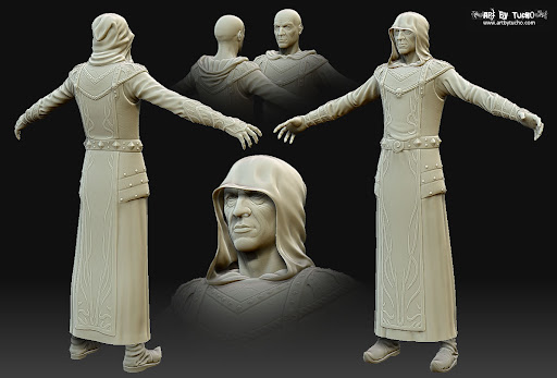
    I had some free time last days and I worked a bit on the pose, here is the first image of the posed warlock... with a crappy skinning, I have to improve it a lot, but skinning is not one of my better skills :S

    walock_posed_WIP.jpg
  • felipefrango
    Options
    Offline / Send Message
    felipefrango polycounter lvl 9
    Aaagh, he's floating and he glows.

    Seriously though, don't overcomplicate your presentation, simple is almost always better.
  • tucho
    Options
    Offline / Send Message
    tucho polycounter lvl 17
    Aaagh, he's floating and he glows.

    well, for this reason I put W.I.P. in big letters on the picture ;)

    I don't know how I'll compose the final image, but I don't want to put a flat background, this picture is just a test
  • felipefrango
    Options
    Offline / Send Message
    felipefrango polycounter lvl 9
    tucho wrote: »
    well, for this reason I put W.I.P. in big letters on the picture ;)

    I don't know how I'll compose the final image, but I don't want to put a flat background, this picture is just a test

    Yeah, man, I understand, it's more of a personal gripe. It's just that IMHO you're not gaining anything with this, it takes you longer to "compose" and it sort of detracts from the asset itself, so personally I'd just ditch the effects altogether.
  • Saman
    Options
    Offline / Send Message
    Saman polycounter lvl 13
    apart from what felipefrango just said my critique would be the hand grip on the staff. It looks very stiff and unnatural.

    Cool character btw!
  • kodde
    Options
    Offline / Send Message
    kodde polycounter lvl 18
    Nice work.

    My crit is same as Goraaz, fix that hand. Doesn't grip properly and comes off stiff.

    Also that solution with chains that holds the book ought to somehow weigh down on the clothing? At the moment that book feels more like an empty handbag of some kind imo.
  • edoran89
    Options
    Offline / Send Message
    You did a very good job on giving the face character, a lot or face models are generic but i'm really liking this one.
  • Richard Kain
    Options
    Offline / Send Message
    Richard Kain polycounter lvl 18
    This is a great character, and I think it turned out well with the final product. And now onto the criticism. The scull on the head of his staff is cool, but it's way too shiny right now. And I also think the texture for it is way too dark. Dial back the reflectiveness of the body of the skull, and leave the horns shiny. I don't know if you were trying to make that part look metallic or not. But I think it would look better if the body of that skull was made of sun-bleached bone.
  • georgemancer
    Options
    Offline / Send Message
    Love, love, love the accessories. The face sculpting is really well done too.
  • tucho
    Options
    Offline / Send Message
    tucho polycounter lvl 17
    Thanks for your comments guys :)

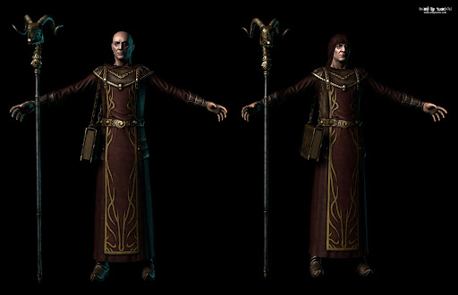
    Finally I had some free time to finish my warlock and compose the final scene.
    I "rendered" the character in realtime with Xoliul shader (thanks to Laurens Corijn for this awesome dx shader :) ) and I rendered environment with final render (because realtime shaders have some problems with alpha ordering). After I compose the final picture in photoshop and add a bit of DoF using the Z depth map.

    final_picture_small.jpg

    Another picture with the hood and different illumination

    final_picture_hood_small.jpg

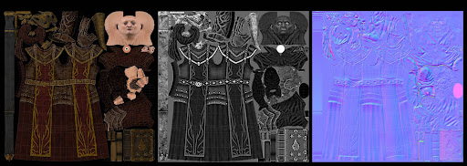
    Finally the wire and textures

    warlock_textures.jpg

    I hope you like it, as always crits and comments are welcome :)
  • kodde
    Options
    Offline / Send Message
    kodde polycounter lvl 18
    Nice, went straight to my \Cool3D\ folder :)
    That expression and look of the character in the latest image is great.
  • bounchfx
    Options
    Offline / Send Message
    bounchfx mod
    great sculpting! The spec and materials feel a little off to me though, I really think you could push it more.
    The bones almost feel like they're made out of metal or bronze, though it might be that you just have your scene lights way too close to the model, as you're getting a huge light cast on his forehead and face that seems to detract rather than add to the presentation.

    nice work, though! I like it.
  • Dim
    Options
    Offline / Send Message
    Dim polycounter lvl 10
    That's really fantastic work! My only comment on the presentation is ditch the chromatic aberration, or at least minimize it.
  • Jungsik
    Options
    Offline / Send Message
    Jungsik polycounter lvl 6
    this looks freaking bad ass !!!!!!!!!!!!!
    you kick ass !!!! :D
  • ivanushka
    Options
    Offline / Send Message
    Great work, the very last screenshots read well! My only critique; The linked chain scale seems odd/off and having bigger skulls (especially the middle one) might give a visual pump to the flow of the character's fabric.
  • lildragn
    Options
    Offline / Send Message
    lildragn polycounter lvl 17
    Nice work man, I had to model a ram's skull for work and it was annoying to say the least, so nice job here. Also with the hood on, I would've loved to see more shadows in the face as it appears too bright or lit evenly, throws off your lighting efforts here imo.

    Nice stuff.

    ~t
  • tucho
    Options
    Offline / Send Message
    tucho polycounter lvl 17
    thanks for your comments guys, I'm glad you like it :)
    The bones almost feel like they're made out of metal or bronze

    In fact in theory they are made of the same metal than the stick with golden paint, you can see it in the image below

    scaled.php?tn=0&server=21&filename=sceptertexture.jpg&xsize=640&ysize=640
    though it might be that you just have your scene lights way too close to the model, as you're getting a huge light cast on his forehead and face that seems to detract rather than add to the presentation
    I would've loved to see more shadows in the face as it appears too bright or lit evenly, throws off your lighting efforts here imo

    I'm quite bad lighting scenes... I need to learn a lot about lighting
    My only comment on the presentation is ditch the chromatic aberration, or at least minimize it

    Yep, I normally exagerate a bit the chromatic aberration, I think this is a question of tastes, some people like it and another ones hate it.
  • Saiainoshi
    Options
    Offline / Send Message
    Saiainoshi polycounter lvl 9
    Looks awesome! Have you thought of painting more lighting into the texture, like top to bottom? I think it would add so much.
  • Danglebob
    Options
    Offline / Send Message
    Danglebob polycounter lvl 15
    dig that book big time.
  • BradMyers82
    Options
    Offline / Send Message
    BradMyers82 interpolator
    Looks like I'm late to the party.
    Awesome job on the character man. My only crit, and it's way too late at this point I know, is that the silhouette is pretty weak. I realize that a lot of it is because he's old and he's wearing a robe, but I still think you could have made the silhouette more interesting. So... great job on this one, on the next one pay special attention to the silhouette and nail that first.
    I really like the way the Dominance war III winner mentioned silhouette, Dimitry Parkin:
    To get this entry done must have been no easy feat. Tell us about your working habits? Basically, what's your secret to your apparent success?

    Well, above everything else, I primarily focus on making the silhouette look good. This is a general impression of the piece and it has to have the right sense of 'character'. If I've gotten the right sense of weight and mood, then the character will feel more alive to others and myself. I also spend most of my time on the sculpting stage of my work. I find this to be the most pleasing part of the process, and I’ve had a number of years of experience with Zbrush. This experience has been a big plus in my career and in Dominance War.

    Read the full article here: http://www.gameartisans.org/dominancewar/spotlights/parkin/index.php
    Can't wait to see what you do next! :)
Sign In or Register to comment.