No more freaky faux-anime style o_O

interpolator
Last week I've been working on redoing an old texture of mine. Without much further ado, here's what it looks like now:
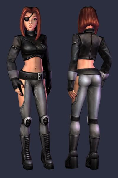
100% self illumination:
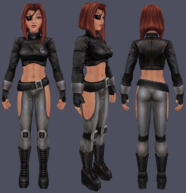
Flat:
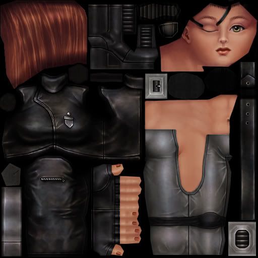
And for comparison, here's the old version. Looking at it now, the face is just horrible. I don't know what's up with the clothes either... looks more like a concrete texture.
http://img.photobucket.com/albums/v19/wayuki/chinatsu_yucky.jpg
http://img.photobucket.com/albums/v19/wayuki/chinatsu_yucky_texture.jpg
100% self illumination:
Flat:
And for comparison, here's the old version. Looking at it now, the face is just horrible. I don't know what's up with the clothes either... looks more like a concrete texture.
http://img.photobucket.com/albums/v19/wayuki/chinatsu_yucky.jpg
http://img.photobucket.com/albums/v19/wayuki/chinatsu_yucky_texture.jpg
Replies
Only thing i dont like about her are the side openings of her pants and boobs lack some weight, ofcourse that could be because she wears some super push up bra or something.
Also now that i looked more at her i think her knees might be little too low.
edit: forgot to say that i really like the balance between realism and cartooniness and her somewhat doll like face.
Hair could maybe do with some sharp dark lines, but the rest has a really nice style - not ultra-realism, but not basic anime either, a tasteful mix.
Keep it up
not sure how those side opening would work either. they would just make her trousers fall down, unless they were stapled to her belt or similar
only pain will bring be closer to her!....a tad sick perhaps
and her boobs look like they're on an invisible shelf.
those two crits aside, I think its a sweet update, good way to show your progress, too.
great improvement over the last iteration.
my only little crits are to try a very tiny shadow around the interior edge of the pants. just to help 'pop' them away from the skin a little and add some depth there.
second is the badge/medal in the 3/4th shot bending over the breast breaks illusion for me. maybe move it up more on the flater part of her chest and see how that looks.
nice butt!
Texture-wise, awesome job. Huge improvement over what was a pretty bland texture.
I think the back of the hair where the middle strands meet look a bit odd
Hip size looks just fine to me. Plenty of women don't have that kind of wide hips that Spacey depicts, and the current look fits her very well. It's easy to go overboard with it, and end up superwide hips and ultraslim thighs as in e.g. comics like Witchblade.
I'd rather fix up the other textures first and make some new stuff as well. It's rather barebones (read: crappy) ATM. It's also a very weird mix of artwork, but I'm applying at anything vaguely art related.
@Toomas: I don't think the knees are too low, it's just the perspective view throwing things off a bit. Here's an orthographic view:
As for the boobs, I blame it on comics.
@Ruz: Yes, the idea is that the pants attach to her belt in some way. The deep reddish parts are almost completely covered by her hair, which is also reddish... I think it works like this.
@Sectaurs: The eyes are actually an eye's width apart, they're just very large. I think bringing them closer would look strange. I do think her one eye is slightly shifted to the right, but so are the other features on that side. Hey, who's perfectly symmetrical, anyway?
@snemmy: I did try to move the badge elsewhere, but then the placement is just ugly. I think the only way around it would have been to actually model it on.
@Spacey: The model is about 7 heads tall... not exactly heroic, but it's within the ranges of normal. Also, according to a plastic surgeon, the hips line up with the side of the breasts, ideally, though they can be as wide as the shoulders. So again, I think the hips are within the ranges of normal.
@CheapAlert: I agree about the hair, but I couldn't get it any better with the mirroring there.
@tremulant: Thanks man. On a side note though... I'm a dudette, LOL.
Hip size looks just fine to me. Plenty of women don't have that kind of wide hips that Spacey depicts, and the current look fits her very well. It's easy to go overboard with it, and end up superwide hips and ultraslim thighs as in e.g. comics like Witchblade.
[/ QUOTE ]
Had a feeling I overdid the hips after I posted that...
I completely agree, many real women don't have the "perfect" hourglass shape. I just like the curves
DemonPrincess: Looking good. Now start cranking out some work to fill that portfolio up!
[ QUOTE ]
Hip size looks just fine to me. Plenty of women don't have that kind of wide hips that Spacey depicts, and the current look fits her very well. It's easy to go overboard with it, and end up superwide hips and ultraslim thighs as in e.g. comics like Witchblade.
[/ QUOTE ]
Had a feeling I overdid the hips after I posted that...
I completely agree, many real women don't have the "perfect" hourglass shape. I just like the curves
[/ QUOTE ]
Just realised I wrote "ultraslim thighs" when it was supposed to be "ultraslim waist". You're right about curves, though, and it's a very subjective thing
DemonPrincess, you should consider having your portfolio in English. If the Netherlands is anything like Sweden then the people who are going to hire you will be very fluent in English, and you'll increase your chances in getting noticed abroad.
What's the market for game artists like there?
[/ QUOTE ]
Not very good, I'd say... there's only one major company. So, I'm applying for more generic art positions as well.
BTW whats their name?
BTW your pixel stuff is very nice so maybe you should do some DS spec models.
Anyways! Nice job DP. Maybe it has been said already, but I think that the eyes still have a tiny touch of that anime style you seem to try and avoid on that piece. I'd be curious to see that character with slightly more realistic ones. Also, I like the hair on the side view but it might be cooler with some assymetry seen from the front.
I love the pants material - and the big hands!
I wasn't going for perfectly realistic, because the facial proportions of the model are also kinda stylized. So I went with a cartoon-realism mix for this. I do intend to do more realistically proportioned stuff as well... My portfolio really needs it.
I am not sure how curtain things in your design work. for example the belt is holding up the pants, but how? the eye-pad strap is placed a bit strange and the bracellets look molded around her arms (must have been painfull). I dont mean to bitch....but
I geuss those things maybe need some more thought next time.
About the job thingy in the Netherlands. Do not forget about Motek, they are doing some cool 3D stuff aswell (only not with games as far as I know). I believe motek has connection with some dutch 3D companies aswell.
We are trying to organize some stuff in North-Holland (should be intersting for some people from polycount aswell). But I will create my own thread for that :P.
greetz charger