I'm lost - Chinese Bridge? Texture
polycounter lvl 7
Hello,
I am just trying to make 1 diorama of this humpback chinese bridge which i found in pinterest.
http://www.pinterest.com/pin/546905948473373687/
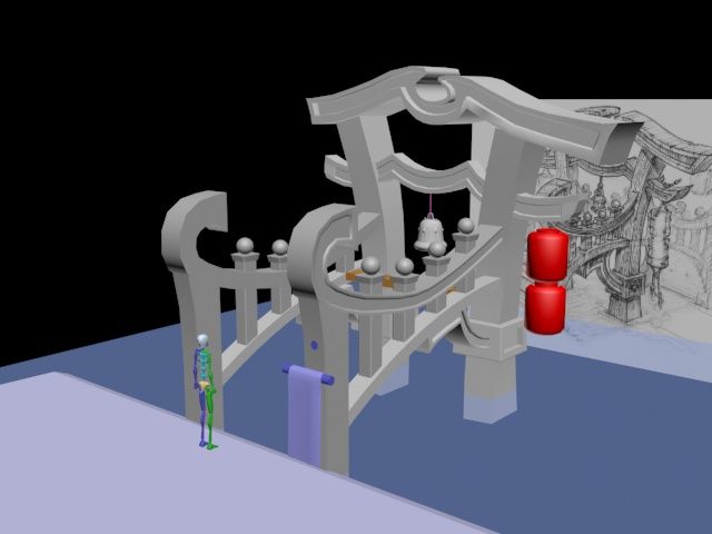
Here's the block out so far.
I want to try to make it a bit stylize but I suck at hand painting. I was hoping polycounters people could help me direct what is wrong because I tried looking at people's hand painted stuff all the time and mine cant get near that finish stage.
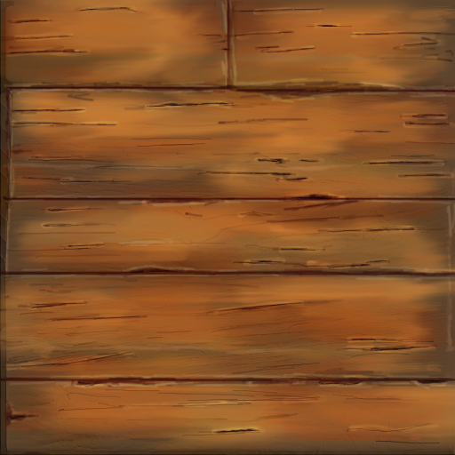
So I started with making the wood plank since this is the very common texture?Okay come at me brah! Hit me hard!
I am just trying to make 1 diorama of this humpback chinese bridge which i found in pinterest.
http://www.pinterest.com/pin/546905948473373687/
Here's the block out so far.
I want to try to make it a bit stylize but I suck at hand painting. I was hoping polycounters people could help me direct what is wrong because I tried looking at people's hand painted stuff all the time and mine cant get near that finish stage.
So I started with making the wood plank since this is the very common texture?Okay come at me brah! Hit me hard!
Replies
Cheers
First off, you are not trying to recreate an exact likeness, but rather a representation. So, similarly to your cute oversized bridge, make the texture cute.
This is very vague sounding... The main problem you have is that you tried to get to the finish stage without having the basics down properly. For example, try to take a big brush with little flow and start working out the basic shapes, and then slowly, but certainly start modeling the details in while keeping track of the shapes.
This may sound like sculpting, the way I describe it, and in a way handpainting textures is very much like doing a zbrush sculpt, but instead of sculpting volume, you sculpt light
In general, try to avoid too many little details when making textures. If you want to model in grain, try to exagerate it instead of being too detailed. Unguided detail just looks like noise.
Sorry if this comes across as vague. It's been a while that I gave feedback.
I tried sculpting the wood, I can say that I don't know how much is too much for stylized..
I baked the AO and try to color it from there using big brush with little flow and darkening the cracks and giving it highlights. Does it look wood enough?
Right now you're missing color variation, beside that everything feels a little pixelated and noisy to me. Work from big details to medium ones to smaller, I feel like "medium" is missing.
Search "pinterest hand painted texture" via google and there will be a bunch of good links or search pinterest directly. Beside that it's a good idea to build up a reference and/or inspiraiton folder. (With hand painted and photo footage)
Isn't 1-2 Big? 3-4 medium? 5 Small? 6 color variation? I can't figure out which one is this "medium"
But really I tried looking at those wood textures I just cant make it look like those. Sorry guys and thanks for helping.
You could also count 2 als medium size details if you count chosing a main color as a big one. And your last one missed those changes in saturation and hue. (Like you did in your first one)
Another question...
Why are you using such a redish color palette? Is that for a special reason?
Just in case that you're unsure about color choices, it's nothing bad about color picking from a reference image.
I'll leave you a wood/plank tutorials:
Planks (but I wouldn't do gradients on a ground texture)
Style is chunky, somewhat WoW-ish, which could fit your bridge.
You don't need to follow it in detail, it's just for your inspiration.
On which texture size are you painting? Some people like to paint double the size they want to use in the end. Like if you want a 512 in the end they start with a 1024.
To be honest I don't know why i choose redish color.. maybe because I keep looking at this bridge right HERE
I'll make sure to match color a brown bridge when it become nicer xD
The resolution might be why my texture looks blurry unlike people's texture. I used 512 all the way. I just tried making another one and I think it is slightly better with no blur? I duplicate the layer instead of doing 1024 -> 512. I'll do that next try.
And I think the smaller and crispier the scratches are better? Left compare to right^
What it looks like on 3D
http://imgur.com/gfOcVLk
[EDIT]
nvm this is better