[WIP] Hovercraft

polycounter lvl 11
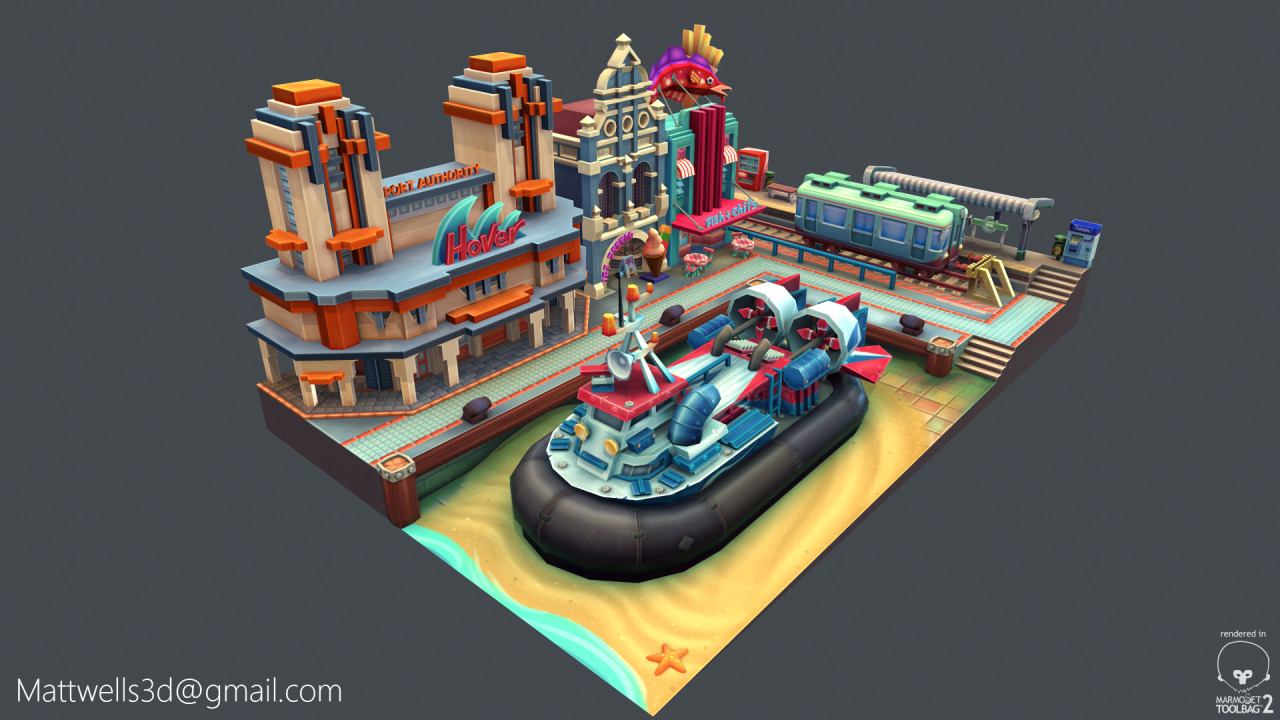
TL;DR Version: This is the latest screengrab of my scene:
So recently I got the idea to model a hovercraft.
I've decided to model one of the mid-size AP1-88 passenger craft that ply the Solent between Southsea and Ryde in southern England, I don't have any concept, so here is a reference photo:

And here is a video of one of them taking off, I like how the cushion inflates and it slides down the slipway on its side. (I don't intend to rig and animate the cushion though)
http://www.youtube.com/watch/?v=krHwp4DOrw4
I want my hovercraft to be low poly, brightly coloured and stylised. It will look used and battered, but not dirty. It will eventually sit on a slipway and be surrounded on two sides by shop fronts, similar-ish to this image, but more contained.

The whole scene have a maximum of 10k triangles and the textures will be atlased onto a 2048 square.
Anyway, this is what I've got so far. It's 4038 triangles and covered by a single 1024 diff map, which is pretty basic at the moment (especially around the cushion)


I showed the image to a friend who suggested that to make it look more stylised I should exaggerate the smaller features, make the railings thicker etc. so I've made this paintover as rough idea as to where to go next.

Any more thoughts/crits/suggestions?
So recently I got the idea to model a hovercraft.
I've decided to model one of the mid-size AP1-88 passenger craft that ply the Solent between Southsea and Ryde in southern England, I don't have any concept, so here is a reference photo:
And here is a video of one of them taking off, I like how the cushion inflates and it slides down the slipway on its side. (I don't intend to rig and animate the cushion though)
http://www.youtube.com/watch/?v=krHwp4DOrw4
I want my hovercraft to be low poly, brightly coloured and stylised. It will look used and battered, but not dirty. It will eventually sit on a slipway and be surrounded on two sides by shop fronts, similar-ish to this image, but more contained.
The whole scene have a maximum of 10k triangles and the textures will be atlased onto a 2048 square.
Anyway, this is what I've got so far. It's 4038 triangles and covered by a single 1024 diff map, which is pretty basic at the moment (especially around the cushion)
I showed the image to a friend who suggested that to make it look more stylised I should exaggerate the smaller features, make the railings thicker etc. so I've made this paintover as rough idea as to where to go next.
Any more thoughts/crits/suggestions?
Replies
*Edit: Now there working*
Looks cool, but the details on the pillow are a bit undefined.
I agree with billy above -- can you spare a few polys to add some dimension to the cushion? Also, I'm a bit confused as to what the cushion details are -- I get the ones that are just stylized stitches, but I don't understand what the ones are that appear to be holes?
But it looks really nice ! Keep going.
Assuming the engines are always running, the two props can be replaced by a pair of planes with an alpha prop disc texture.
Looking good though
I can! I've reduced the poly count down to 2701 triangles and modeled a few of the stitches.
They were actually little studs that stick out the cushion. I don't know what purpose they serve on the actual vehicle though, either way they're gone from the texture sheet now.
Latest WiP pics
Ok done a bit of a paintover.
here are some points
1) shine on cushion rubber section is too blobby. Use a gradient.
2)stitches are too fat. Due to highlights/shadows
3)removed modeled stitches, just do that in the texture
4)Too many stitches.
5)Shines on the pipes etc are to sharp, more soft. Also noticed your highlights go over the shadows, erase them out.
6) shine on some of the edges are way to white.
7) add some gradients to the poles.
8)pipes at the back need texture to be blended. Looks like an ao bake with hard edges on.
9) Bolts on the red section can be more defined.
Ill add a screenshot with the number pointing to the areas i mean. That be easier! Good job though!
I also feel it might be too contrasted at the moment but i wouldn't worry about that until texture if more final.
Ok, I think I've got all of the points covered and I've changed the base colour from white to a light blue and turned down the AO multiply-layer from 100 to 90 per cent visibility, which should hopefully make it less contrasty
The only other things that stand out to me is the painted in lighting from the lights. Looks too red, should be more yellow. Also the end of blue pipes, i don't think they need the chips at the end. Other than that good job!
The main issue i think it's all the white that shades every color. That's why i like the first image better. The blues remained blue, and the red was red.
Anyway, great work overall, and i love that you took feedback from the forum.
Thanks, i'll look at these issues tonight. With regards to the scale I envisioned the Hovercraft sat at on a slipway and the final camera angle being slightly pulled out, which is why I exaggerated the size of the stitches and bolts.
I want the final thing to be a little isometric diorama, Similar to Marie Lazar's lovely marketplace piece:
http://www.polycount.com/forum/showthread.php?t=125175
I was on a train for a few hours at the weekend so I messed around with a couple of ideas for what the quay could look like:
or maybe
or even
(I appreciate the scale is off on the three above pictures)
As before I don't have any concept, but a couple of interesting reference photos as a starting point:
1) This... cinema? in Surabaya, which can pass for a train station/ferry terminal.
2) These adorable vintage trains that serve the suburbs of Izumo on the north coast of Honshu.
I've made the blue darker, the background colour less grey and removed some of the white edge overlay, I reckon this should give it back some definition.
(I'm going to do a paint over because it looks a bit busy at the moment)
Some sort of giant fish on building on the right will look good...
(Jebus, Imgur really crunches images down)
Lighting next. (I've decided against doing another railway building)
Nevermind I take that back....the transition from the sand to the tiles looks a bit like cake batter and not sand. Mmmmm now I want cake, thanks a lot.
Still loving this though.
Twist in the tale: the whole scene is a topping on a delicious Victoria sponge.
But Serially,
The waves on the "Hover" sign could use a few more edge loops to round it out. Some areas have a higher poly res to make them rounder (like the door with "Ice Cream", the edges of the train, etc) so the jagged quality of the waves doesn't entirely match.
Anyway, I'd play this in a heartbeat. Thank you for sharing!
how did i miss this! love the colours! Is this just pure diffuse?
Do you have any tips/tricks on how you paint those sharp highlights on the edges? I've been thinking of just taking the UV-unwrap but it doesn't always work out that well.. maybe you have a quick process of doing these?
I totally love this btw, but I already said that on the handpainted thread.
Love that art deco feel.
Do you use soft brushes for this kind of paintings?
Thanks! It is just diffuse, with lights/shadows cast in Marmoset.
No, just the standard rounded-corner square brush with flow and opacity set down to about 40%
The AO was baked in 3ds Max, Hue/Sat adjusted in PS and multiplied over the top of the painted texture with 85% visibility.
The white edges were made with the Line tool (layer set to soft light) - I literally trace round the edges of the UV-unwrap. It's quite time consuming, but the result is much cleaner than using the UV-unwrap itself.