Home 3D Art Showcase & Critiques

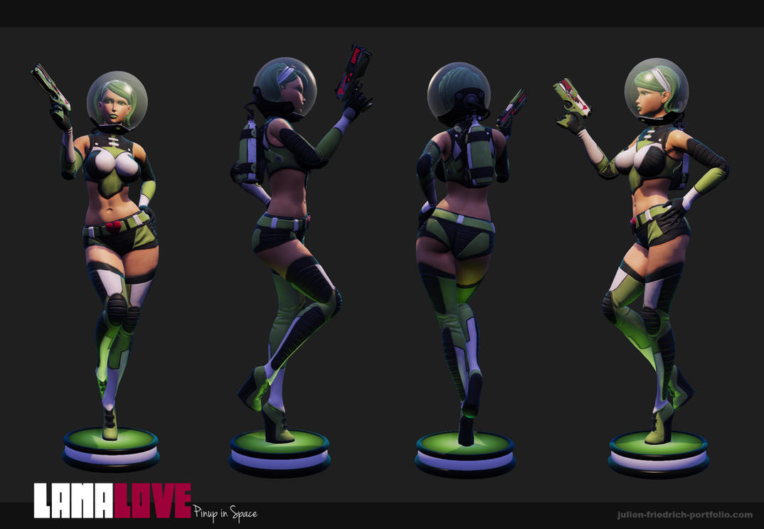
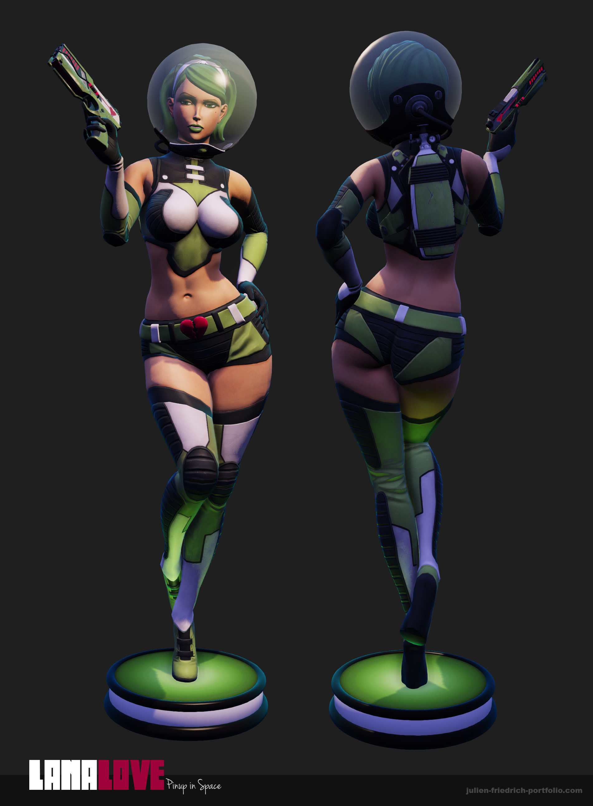
Lana Love - Pinup in Space

polycounter lvl 8
Offline / Send Message
Texelion polycounter lvl 8
Yay ! I finally found some time to finish this pinup ( started in septmeber 2012, *sigh* ). Well I'm better at doing faces now but I didn't find the courage to redo the head... As she is skinned and rigged I will shot other poses later ^^.

Any comment will be useful for my next work.

lana_love_tunrnaroud_by_texelion-d6k8hbf.jpg

lana_love_specs_sheet_by_texelion-d6k8ip5.jpg

lana_love_big_shot_by_texelion-d6k8iye.jpg

the_love_gun_by_texelion-d6ituib.jpg

Replies

  • Grimm_Wrecking
    Options
    Offline / Send Message
    Grimm_Wrecking polycounter lvl 8
    I dig it man!

    Sorry no crits :| just props.
  • WadeWT
    Options
    Offline / Send Message
    WadeWT polycounter lvl 6
    I really like this, I'm not so much a fan of the lighting, though. so much is in shadow and it just looks a bit too dark overall. I think the green you used for her costume could use a bit more saturation. Near the feet in your screenshots you've got a green light or something which makes the green of her costume look much nicer. I think if you tried to match that in your texture it'd look ace. Also her gun looks a bit out of place. I like it as a standalone piece, but next to the model it just looks too flat. There's lots of nice curves all over your model - data ass, dat hair, dat helmet, and then the gun just ends up looking kind of flat in comparison. These are all small things, though, I think you did an awesome job!
  • Dimfist
    Options
    Offline / Send Message
    Dimfist polycounter lvl 8
    I agree with Wade. I would bump up the saturation of the greens as they do seem a little flat in this lighting scheme.
    Very cool idea and model!
  • thatanimator
    Options
    Offline / Send Message
    thatanimator polycounter lvl 6
    very fancy way of presenting the wire! good idea!!
  • Shiniku
    Options
    Offline / Send Message
    Shiniku polycounter lvl 9
    Looks awesome, I love this!
  • mazz423
    Options
    Offline / Send Message
    mazz423 polycounter lvl 9
    Looks great, although personally I think you could maybe do with making your metals slightly more, well, metallic. Right now though they're looking a little dull to me, upping their specular intensity would help I think.

    Just something totally nit-picky though, and other than that I think it looks great as is.
  • Texelion
    Options
    Offline / Send Message
    Texelion polycounter lvl 8
    WadeWT wrote: »
    I really like this, I'm not so much a fan of the lighting, though. so much is in shadow and it just looks a bit too dark overall. I think the green you used for her costume could use a bit more saturation. Near the feet in your screenshots you've got a green light or something which makes the green of her costume look much nicer. I think if you tried to match that in your texture it'd look ace. Also her gun looks a bit out of place. I like it as a standalone piece, but next to the model it just looks too flat. There's lots of nice curves all over your model - data ass, dat hair, dat helmet, and then the gun just ends up looking kind of flat in comparison. These are all small things, though, I think you did an awesome job!

    Thanks for the crit, I agree. However I have a new monitor which is pretty bright and saturated so the lighting is not dark at all.

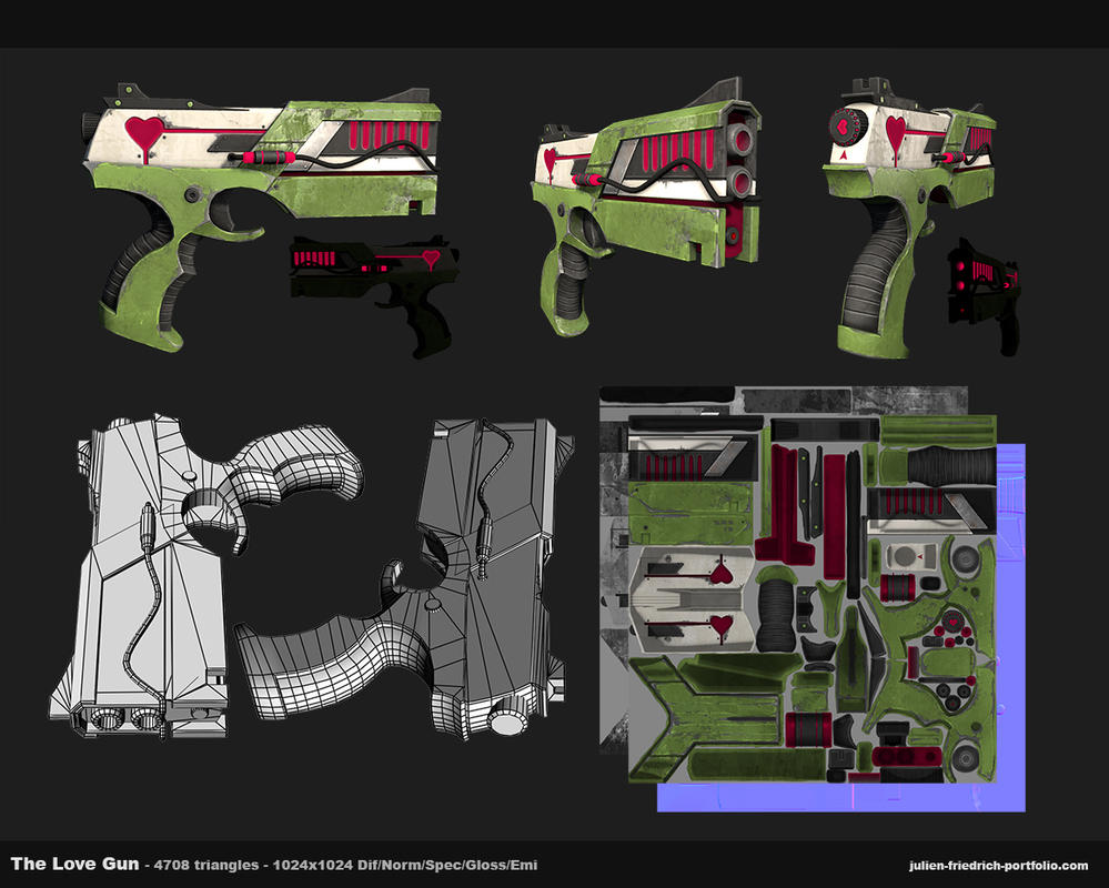
    For the gun I really wanted to do a classical "retro-futuristic" gun as me generally see in pinup illustration, and then I changed my mind... I will do one with more curves when I find the time, I don't really like this one.

    I will do some other shots with other poses later so I could make the changes.

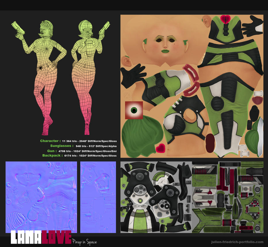
    @Mazz423 : totally agree with you, I textured evrything previewing in Marmoset,, but then I was unable to put the helmet on top of the eyelashes and sunglasses, because marmoset can't show two layers of transparency properly. So I went in UDK, and here my spec and gloss don't look the same at all, I tried to tweak that in the shader with some multiply nodes, but I can't have the exact same metallic look than in marmo... I'll try to find some tutos...

    Thanks for the comments guys, appreciated.
  • Di$array
    Options
    Offline / Send Message
    Di$array polycounter lvl 5
    Hey Texelion, Gotta say I really like your new piece. Fun, bubbly and a nice healthy dose of Barbarella influence. Most of the guys above pointed out a few problems. Mostly the lighting and spec maps for the metal.

    Personally I'd lose the angles of the model which are deep in shadow for a nice 50/50 between the light and shadow.
  • sheckee
    Options
    Offline / Send Message
    sheckee polycounter lvl 9
    Great piece! I really like her, I do echo a lot of the previous critique; but here's something that bothers me about the posing. The way her legs are posed reads strange from the Front view at a glance. It feels like the foot going behind is actually going in front. Here's a redline to hopefully explain it better than I can in words!

    J4O2Qgt.jpg
  • MarvinJC
    Options
    Offline / Send Message
    Great character!congrats.
  • Texelion
    Options
    Offline / Send Message
    Texelion polycounter lvl 8
    sheckee wrote: »
    Great piece! I really like her, I do echo a lot of the previous critique; but here's something that bothers me about the posing. The way her legs are posed reads strange from the Front view at a glance. It feels like the foot going behind is actually going in front. Here's a redline to hopefully explain it better than I can in words!

    Yeah I saw that when I put the screens together, totally agree with you, I didn't take the best angle... and I was too lazy to do another shot ^^. I'll do better for the next poses, I promise...
Sign In or Register to comment.