Landscape : In the Mountain
polycounter lvl 5
This work has been working in the past year
I was trying to express the feeling of an Oriental")
Please, I want your advice of this waok
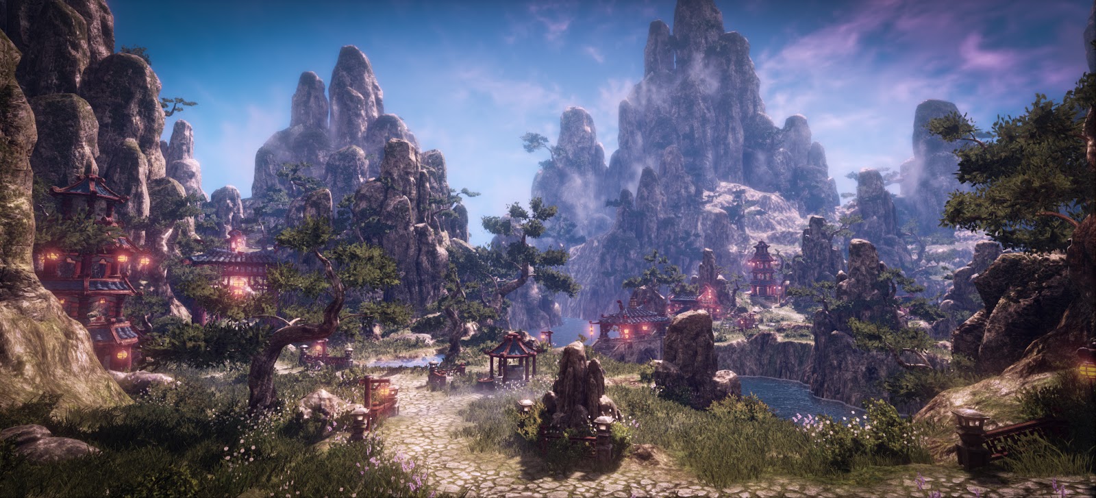
I was trying to express the feeling of an Oriental
Please, I want your advice of this waok
Replies
But, I feel like I'm getting lost trying to see everything as a composition. I believe it may have something to do with the values being too similar? For example, on the 2nd pic, the tree in the middle, against the rock, is a little too difficult to make out than it should be. It's almost like the tree and the rock are blending in together.
You can check out Jeff Parrot's blog. He explains it much better.
http://blog.environmentartist.com/?p=1127
Cheers.
Then some minor crits:
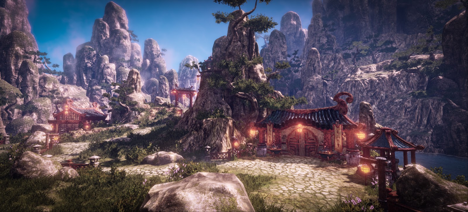
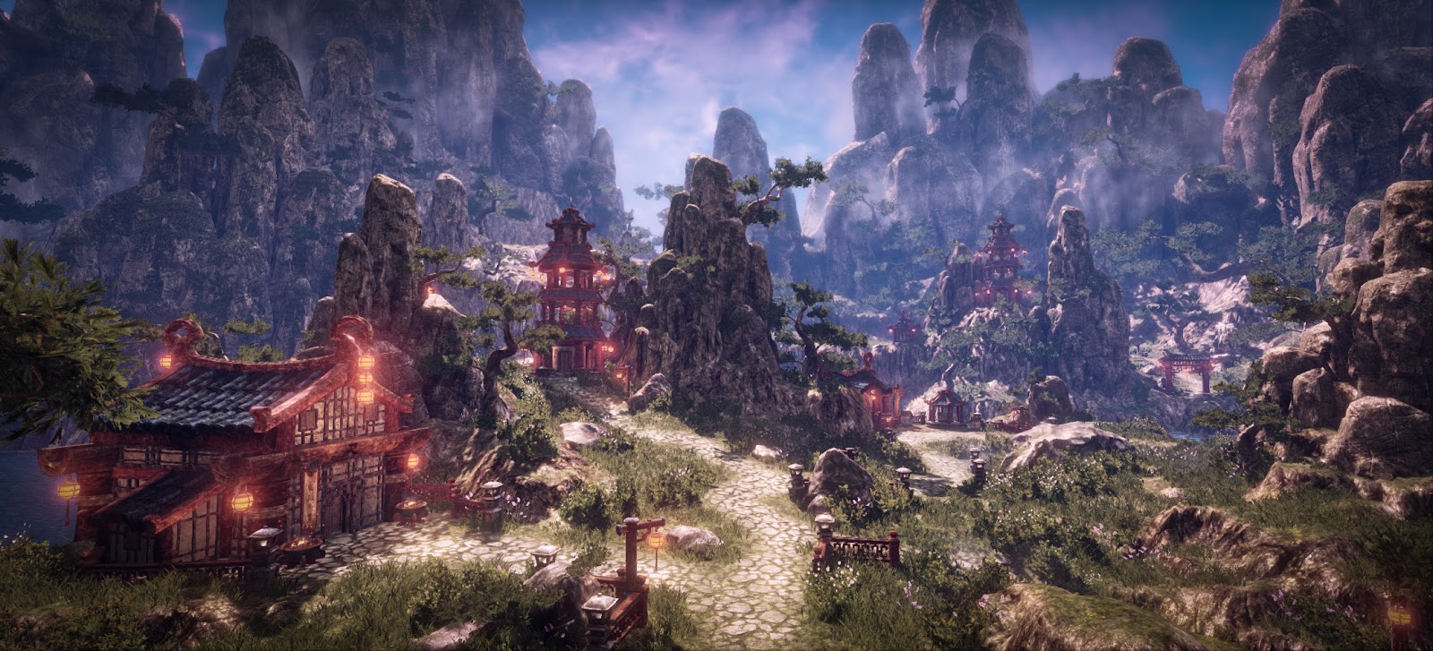
- As Tobbo said the values are overall a little to omogenous making it somewhat hard to read.
Making it even harder it's the noise that seems to be over every texture, do you mind showing flats? (particularly of the buildings and the rocks)
It's fine to have variation in a texture but i think this is a bit too much, and some of it doesn't really make much sense.
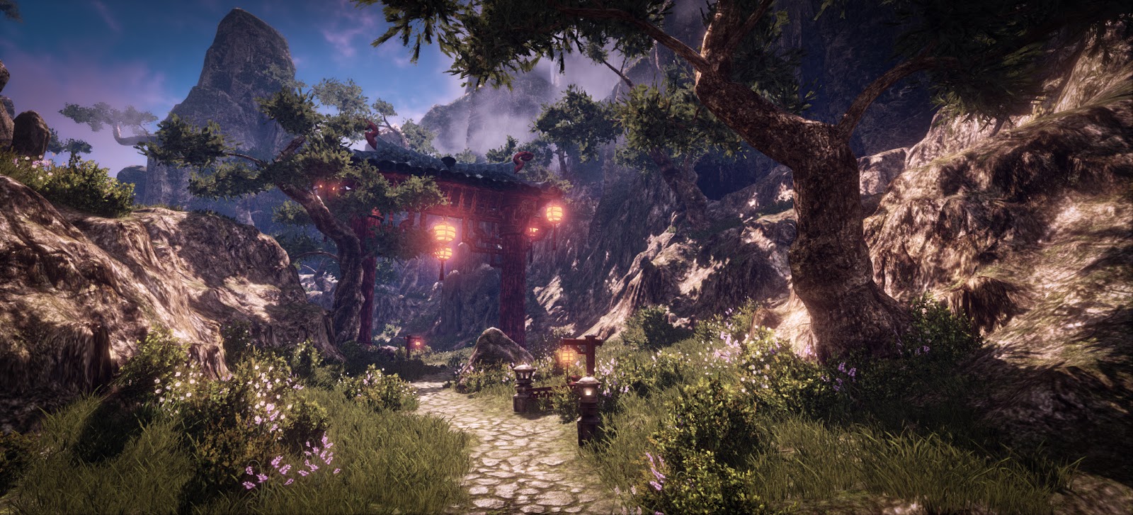
- The lamps, how are they so bright in such daylight? i think they shouldn't even be lit in plain day
See this example and how much "redder" they are and with a bright spot only in the middle... It might be somewhat difficult to make something like this but it's worth a try imho
- It could use a little more fog or clouds separating the front-middle-back planes for making the composition a little better
hope it helps and i don't sound like a harsh bitch
What he's trying to say is that, ideally, your textures and lighting would be highly distinguishable even if your art was in black and white, and as you can see
The middle, the tree in front of the large rock, kind of blend into each other. Still its pretty good overall. Also, while yes those would be some really bright lights, I say whatever! They look great, why are they so bright? Magic.