[UDK] DeadSpace apartments
polycounter lvl 8
Hi there,
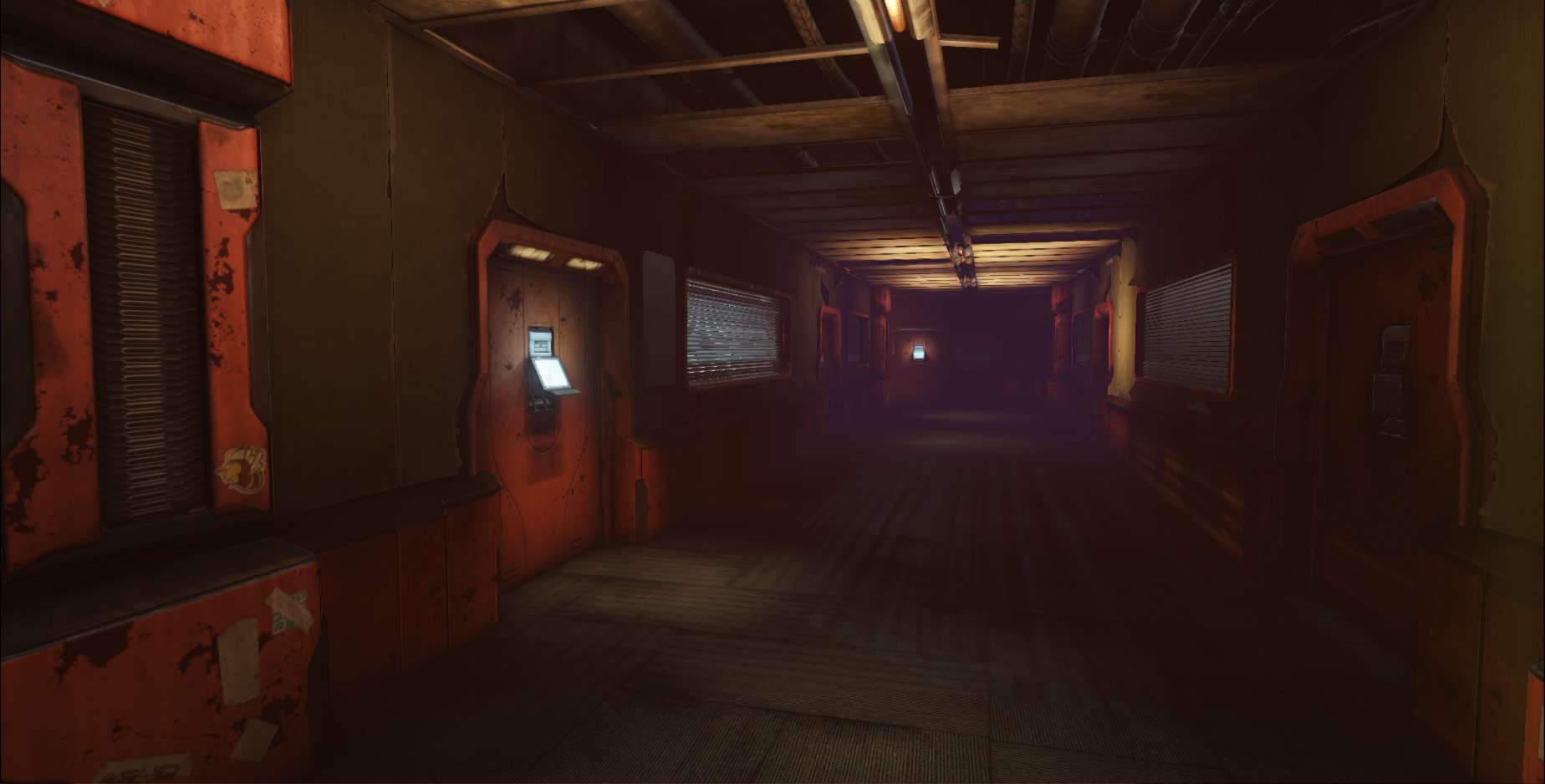
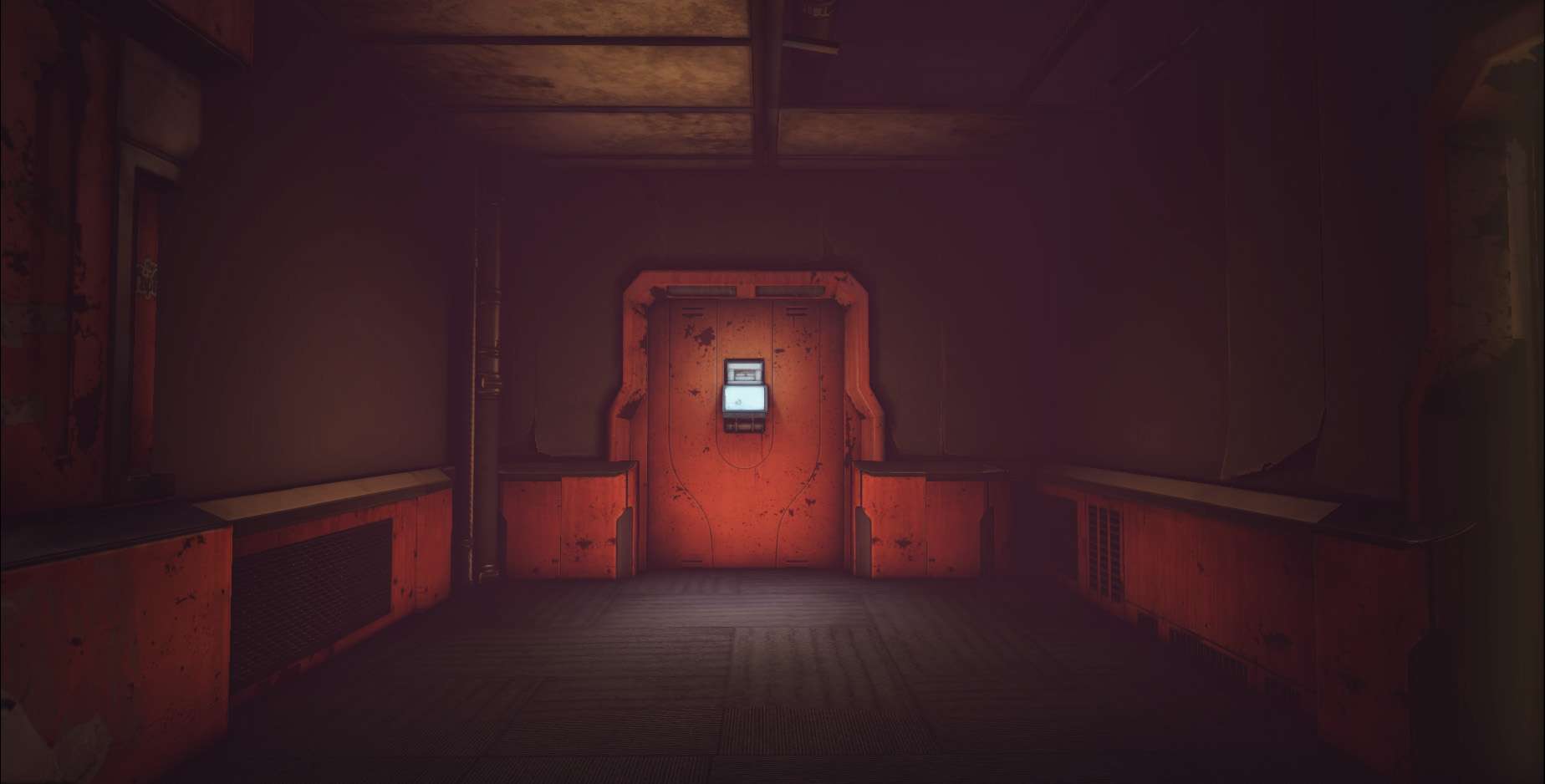
I've got most of the core elements done here and I'm about to move into the smaller elements and props that should paint a clearer picture of the story I want to tell in the environment. So while I mess about with props and stuff what do you guys think of the larger strokes ? colour? lighting? etc
I've got most of the core elements done here and I'm about to move into the smaller elements and props that should paint a clearer picture of the story I want to tell in the environment. So while I mess about with props and stuff what do you guys think of the larger strokes ? colour? lighting? etc
Replies
The most immediate is that your scene needs more contrast. Dead Space is a relatively dark game. You need to pump up the blacks in your dark sections. This screenshot is pretty bright compared to others, but showing how even the lighter scenes have darker blacks.
The floor bothers me because it's the same floor/carpet pattern that we use in my office. Also I don't recall from memory if that pattern was found in the hallways of Dead Space. I thought nearly all was metal paneling?
The fog is a bit harsh at the end of the hallway, especially from your last screenshot. It appears that you just walked into it. Having it falloff within a certain distance from the camera will probably work better (unless you are going to add steam coming out of a vent or something).
I can see what you mean with the contrast Ill play around with the lighting and later with the LUT to add contrast.
Hehe carpet from the office, now thats true horror ^^, but yeah their is carpet with that pattern in game, its in the first corridor in Dead Space 3.(Ive got some screens somewhere Ill post them later)
As for the fog, the idea is that door is surrounded in caddles etc, might still be a bit strong though
The roof plates also look like their wood, and seem a bit out of place in this mostly tech environment, unless it's referencing directly a part of the game I haven't seen.
Looking really good though!
Remember that before they started all that crazy scrawling on the walls, those walls were part of a living breathing community.
Have more light fixtures, mostly broken. Have more evidence of people having lived there. Posters on walls, normal graffiti, decorations, even shoes and a doormat.
What made the best dead space environments was not that crazy stuff alone, but rather, the crazy stuff on top of what should have been normal situations. Since you're doing apartments, the most unnerving parts was that you were going through the houses of normal people suddenly transformed into a nightmare.
What you have right now looks like a generic space door with crazy paint on it.
Ill continue to play about with the contrast, I think it was the overall env light in the world properties that was making everything flat. Ive killed it and it seemed to help quite a bit.
The roof pannel are suposed to be thoses foam things that office buildings have, and yeah its from the apartment level in dead space 2
@ Vertrucio :
Thanks for the crits, I was just playing around with the decals :P.
But Ive been working on all the props and still have quite a few more incoming.