The BRAWL² Tournament Challenge has been announced!
It starts May 12, and ends Oct 17. Let's see what you got!
https://polycount.com/discussion/237047/the-brawl²-tournament
It starts May 12, and ends Oct 17. Let's see what you got!
https://polycount.com/discussion/237047/the-brawl²-tournament
Environment portfolio piece, destroyed poultry cross
Alright so I'm 18 and will be finishing up high school within the next few weeks. I currently dont plan on going to college. Instead, Id like to try my hand at getting into a major studio right out of the gate. I understand the complexities with that and have already spoken to the professors at MMI and MATC "the colleges in my area" both told me that at this point for me that's not a bad idea at all. I have a close contact at Human Head studios, so they are at the top of my list, however I plan on sending my portfolio out to everyone that I can. Over the last 2 years I have been working close to full time as a freelancer but have recently stopped taking work to work on this piece, I want this piece to be the talking point of my portfolio, and so I come to you dear polycount, I await your intense and helpful crits!
LATEST
The piece is inspired by louise Rayners "Poultry Cross" painting
However I will be taking it in a quite different direction. The plan right now is to make a bit smaller, destroyed and overgrown version of the painting, without any of the people.
I havent done a block out yet because Id like to finish the stone tower thing first and then base the rest of the scene around that. here is the little bit of progress that I have made so far -
street lamp-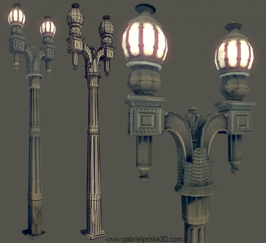
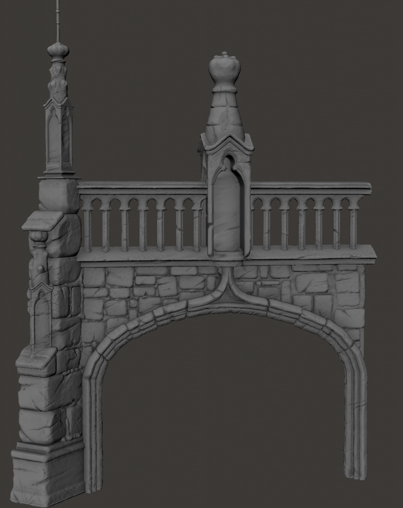
Tower HP in progress -
I really would love any and all crits and comments, dont hold back, I want to make this as good as I have the ability to. Updates coming soon.
LATEST

The piece is inspired by louise Rayners "Poultry Cross" painting
However I will be taking it in a quite different direction. The plan right now is to make a bit smaller, destroyed and overgrown version of the painting, without any of the people.
I havent done a block out yet because Id like to finish the stone tower thing first and then base the rest of the scene around that. here is the little bit of progress that I have made so far -
street lamp-

Tower HP in progress -

I really would love any and all crits and comments, dont hold back, I want to make this as good as I have the ability to. Updates coming soon.
Replies
The larger forms/shapes of the tower look OK, but I think everything is too soft and you need some tighter edges on the stonework. It looks a bit buttery and isn't communicating the same scale seen in the painting.
Are you going for a realistic shading style? Something shaded with the same painterly feel of the reference could be interesting (and challenging to pull off).
Good luck with the project.
On a side note, your work is pretty strong right out of high school, but I wouldn't underestimate a solid education\understanding of traditional art and design. Speaking from experience, taking art courses mixed with 3D classes has helped me a lot. I've found myself learning most of the 3D specific software stuff on my own and get the most value from the art/design classes.
But for all I know, you could've been brought up with all that stuff already. Cool pieces though, keep em coming
The ledge at the base of the railing should have a sharper angle.
As for the street lamp, @DWalker thank you very much for the historical insight, I decided to do this one instead of the kind in the painting because the one in the painting seemed a bit boring to me, wanted to spice it up a bit. However, I didnt even consider the gap in time between the two types of lamps. I think Ill keep it for the time being and see how it looks in the scene, if it just doesnt fit Ill need to replace it. For those interested this is the ref I used for the street lamp (@cholden is this pic from Market St, San Fransisco, wouldn't be surprised.) - http://www.digital-images.net/Images/LA_Architecture/Biltmore_Victorian_Street_Lamp_9687.jpg
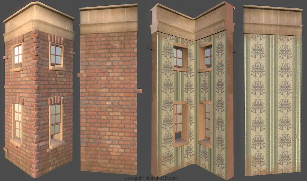
Obviously as it is the building looks pretty bland sense it needs to tile. I plan to detail all the structures with vines, flowerpots, and decals.
Cant wait to hear your thoughts polycount!
The partially open windows don't make sense. Aside from being far too high for anyone to open/close without a ladder, they look like the builder ordered the wrong size and hoped nobody would notice.
There is a noticable seam between the wall segments.