ESCAPE - World of Books - Deciduo
polycounter lvl 8
Hey everyone! So I'm team Deciduo ")
Unfortunately the rest of my team had to drop our project, so I'm going to go ahead and do my own thing. It took me awhile to come up with what I wanted to do.
Rather than trying to have my scene be about escaping from someone or something, I want it to be about escaping from reality and into a fantasy world! My idea has been heavily influenced by "The Pagemaster" (an amazing movie) and TearAway the game.
The scene will take place on a table where a castle is coming to life out of an open book. A festival is taking place within the castle/manor so colorful banners, flags, will decorate the scene. It may be hard to pull of since I wasn't planning on making people for the scene.
I concepted my idea in Maya, here is what I have so far. I'm not sure yet whether I want to have the background fade into the fantasy world, or just have a background of a library blurred out with DOF.
I was going to attempt a semi-realistic style for this project.
Let me know what you all think! Comments and critiques are welcome!
[IMG][/img]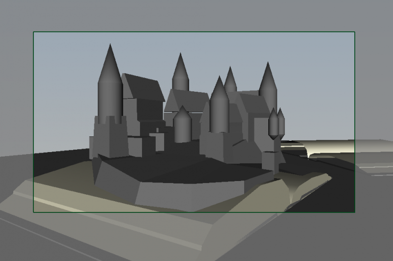
Replies
I really like the word blending idea.
For background and flair, why not add some magic-y sparkles and wooshes to emphasize the castle popping out? As it is, the castle is kind of resting on the book and could use a little action.
The exterior of the castle will be more rough and made of stone, mostly for defensive reasons, the interior will incorporate more intricate and detailed wood carvings. To help shield the interior section of the castle, "sails" can be extended from the tops of the defensive towers and above most of the buildings windows as well.
I started blocking out the forms for the cliff and I changed some of the design for the castle to create a focal point leading the viewer to the captains balcony.
I'm also trying to determine how towers to incorporate in the design without cluttering the scene.
I added some giant sails strung from tower to tower to help shade the courtyard area during high noon. This led me to thinking about what I wanted to do for the lighting.
My first thought was having a desk lamp provide the lighting, however if I chose this, I thought it would detract from the scene too much.
I thought about having a window provide the lighting, which I also thought would be interesting since the window is providing the light for the book, while the book itself is a window into another world. Yea that's right, I just BLEW your mind. lol
If I have enough time, I'm going to attempt to create stylized texturees
What do you guys think?
I've started texturing some of the models to get a better feel for how the colors, composition, and LOD( texture wise) will show up in my final screenshot.
I do apologize for the low quality screenshots, I'll post some higher resolution shots tomorrow.
As of now,I have only baked one highpoly model down. ( which I had to sculpt In Maya with a Mouse :poly142: I currently don't have access to Zbrush or Mudbox. So it's a VERY rough high poly model. If I have time, I'm certainly going to go back and fix it.
Most of the normal maps I have either generated from the textures themselves or creeated from scratch. I'm trying to leave most of the heavy loads to the materials and shaders.
Vertex painting made blending the book with the scene much easier! Still a WIP.
- Added Post Processing Effect ( DOF, Color Correction)
- Added Hanging Flags
- Improved Multiple Materials
So I decided to just recreate the book top in Maya, and it's working out just as well.
-updated render
- So I changed the DOF to Bokeh, which definitely gives the scene the proper feeling of scale and depth now. ( However where the field is focused on in the screenshot is not quite right atm)
- I've added some individual pages to the book so that it's not quite as flat
- A festival is not very festive without tents!!
- I decided to incorporate the logo/sponsors into a bookmark in the scene so that you don't loose the immersive effect rather than just sticking the logo in one of the corners of the picture. Don't worry Polycount, I'll make sure the sponsors and logo are clear enough to read :poly121:
- Fiddled around with post-process to create a warmer tint for the scene.
- Changed the coat of arms for the hanging flags. Lets just say "winter is coming" along with all of his friends
Let me know what you guys think!
For some reason it reminds me of the Game of Thrones opening :poly121:
I want to zoom in and I cant :P
They way you changed the book texture morphing into rock using stratas-like writing really works.
- Added some dust to the air, it's a very dirty room.
- Gave the books their leather covers
- A bit more various material work.
Here are some tech shots of my scene ( wireframe, vertex colors, lighting only, and texture density)
aaand here is my current render
- i would put some more effort in the table texture - looks very low
- the book on the foreground looks nice, the background "books" looking very lowpoly. (cant see the separate pages for example )
and there is no texture or some letters on the backside. (like in the foreground book)
- maybe tweak the light a bit more, i think some nice dust particle-effects could be nice.
- the castle position is in the middle section but the light is more focused on the stones - is this your purpose ?
- Personally - i would get rid of the escape signs and add some more books and old papers, candles, - put the escape node on one of the books back (in golden letters)
Just my 2 cents, overall looks nice - good luck with it.
I've gone ahead and changed the lighting, it's not quite right yet, but it's definitely brightened up the castle now. The dust particles also still need some work. I'm going to try and make a prop or two to add to the table, but because of my time constraints, I may unfortunately not get to them.
The book in the left hand corner is grabbing too much attention so I'll need to fix that tomorrow, also the title is un-readable.
I adding a few more lights around the central courtyard area would really help too, as well as using a few lights around the towers to just ping some highlights. I used a few level adjustments layers in Photoshop to illustrate what I mean:
Keep on truckin', its really coming together!
I definitely do plan on continuing work for this peice. I might possibly add 2d cards of people to add to the scene, I think it'll add some more interest and excitement to the festival going on.
Congrats and good luck