Blizzard Student Art Contest WIP "Character"
Hello Everyone!
I'm doing the Blizzard character and environment Contest. I have been working very hard on these pieces i hope you like it and also if you have the time i would love to get some feedback from you!
Thank you and enjoy!
Idea:
I wanted to create a Rhino because in WOW we don't have a official Rhino race besides "Kodos" and i will love to play as a Rhino.
I also would love to see a Blacksmith that fallows you in your journey like in DIII.
So based on this INFO i decided to create a Rhino Blacksmith with mighty hammers!
Reference
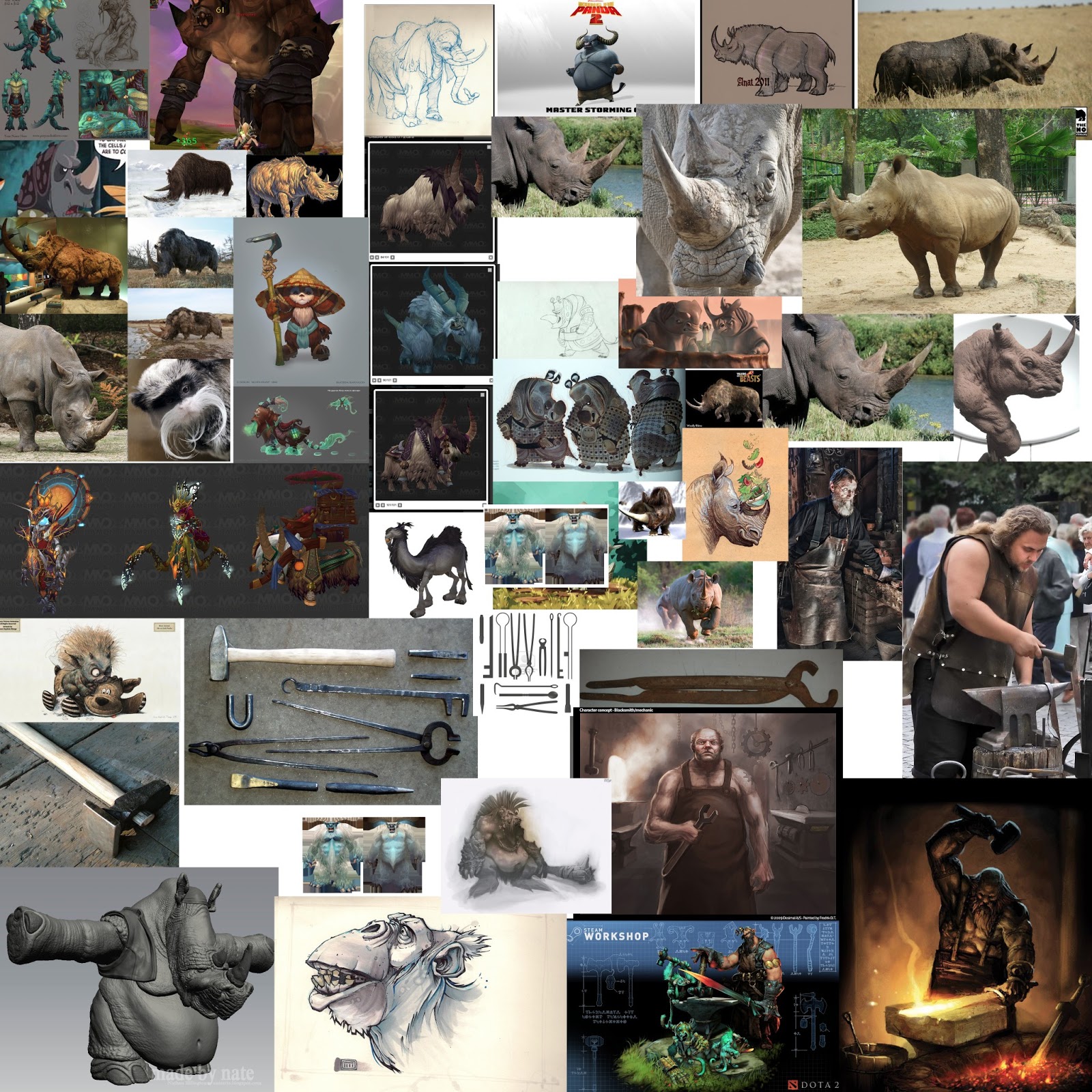
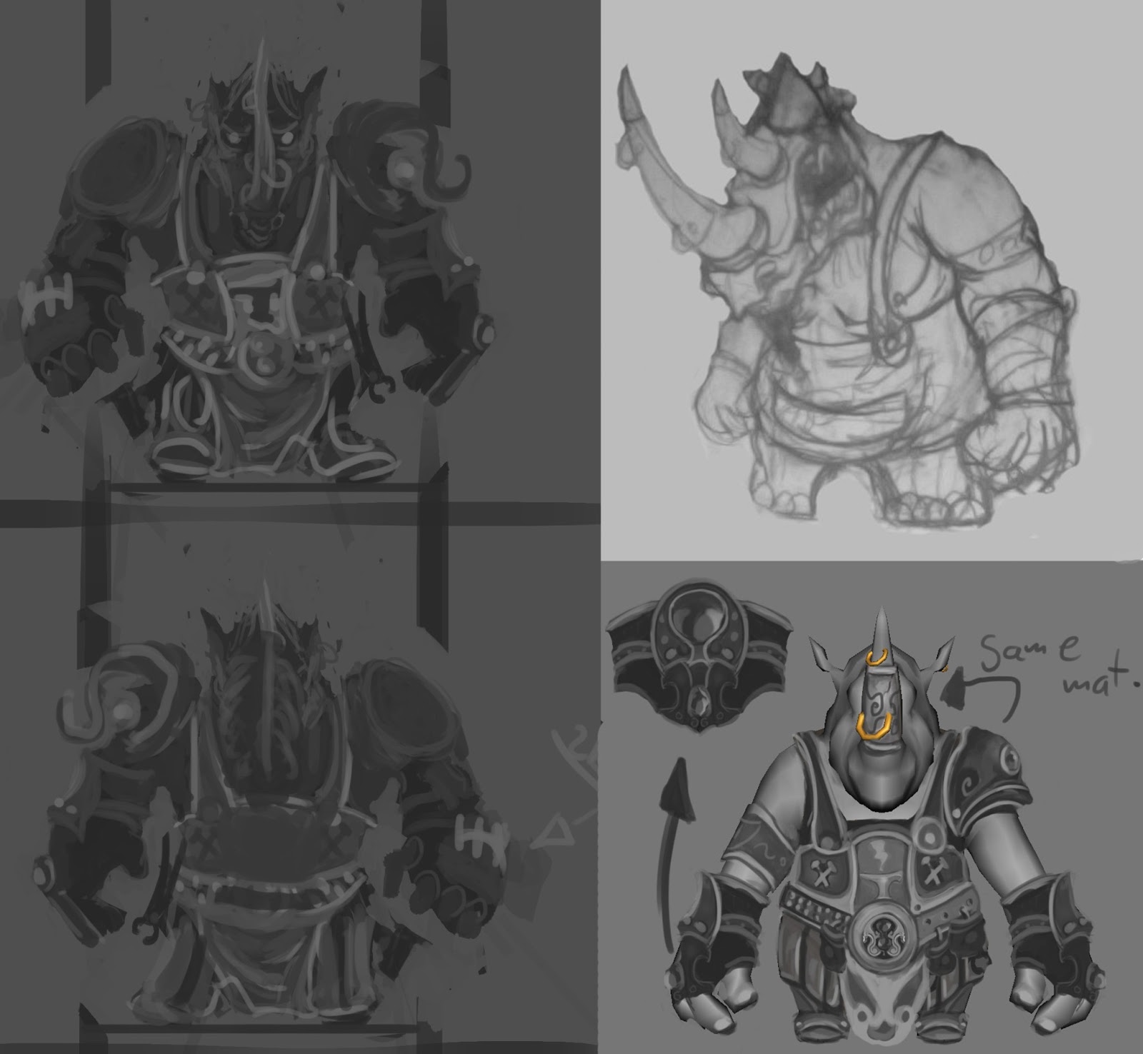
Concept Art
I did a few rough concepts cuz i really knew where this was going...
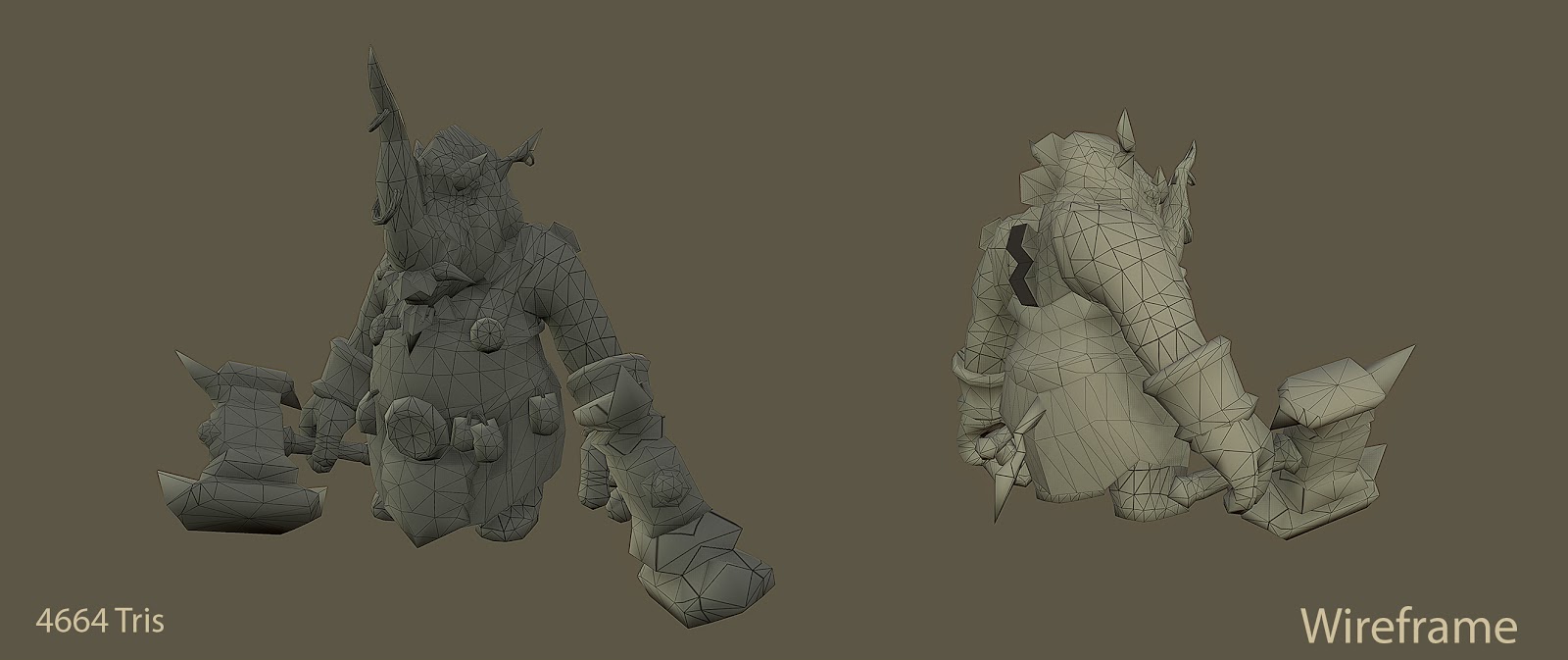
Model
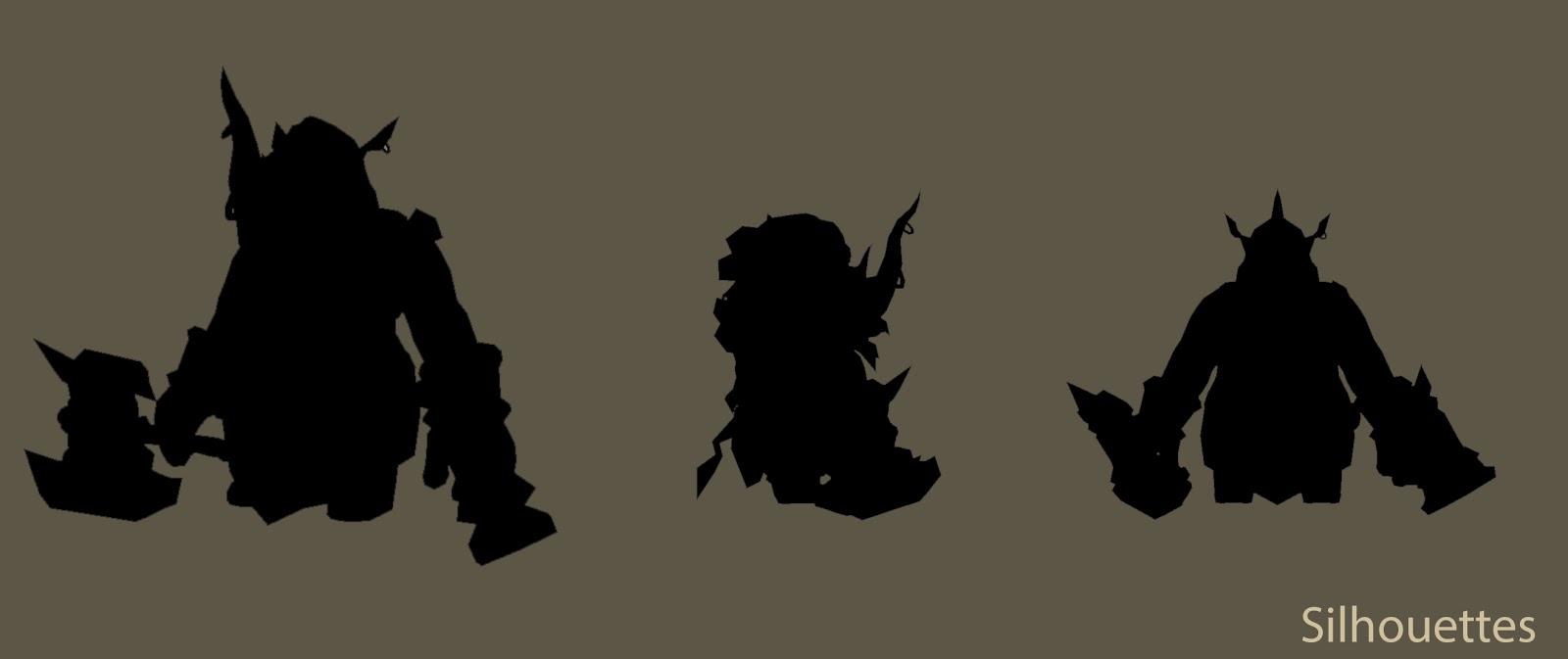
Silhouette
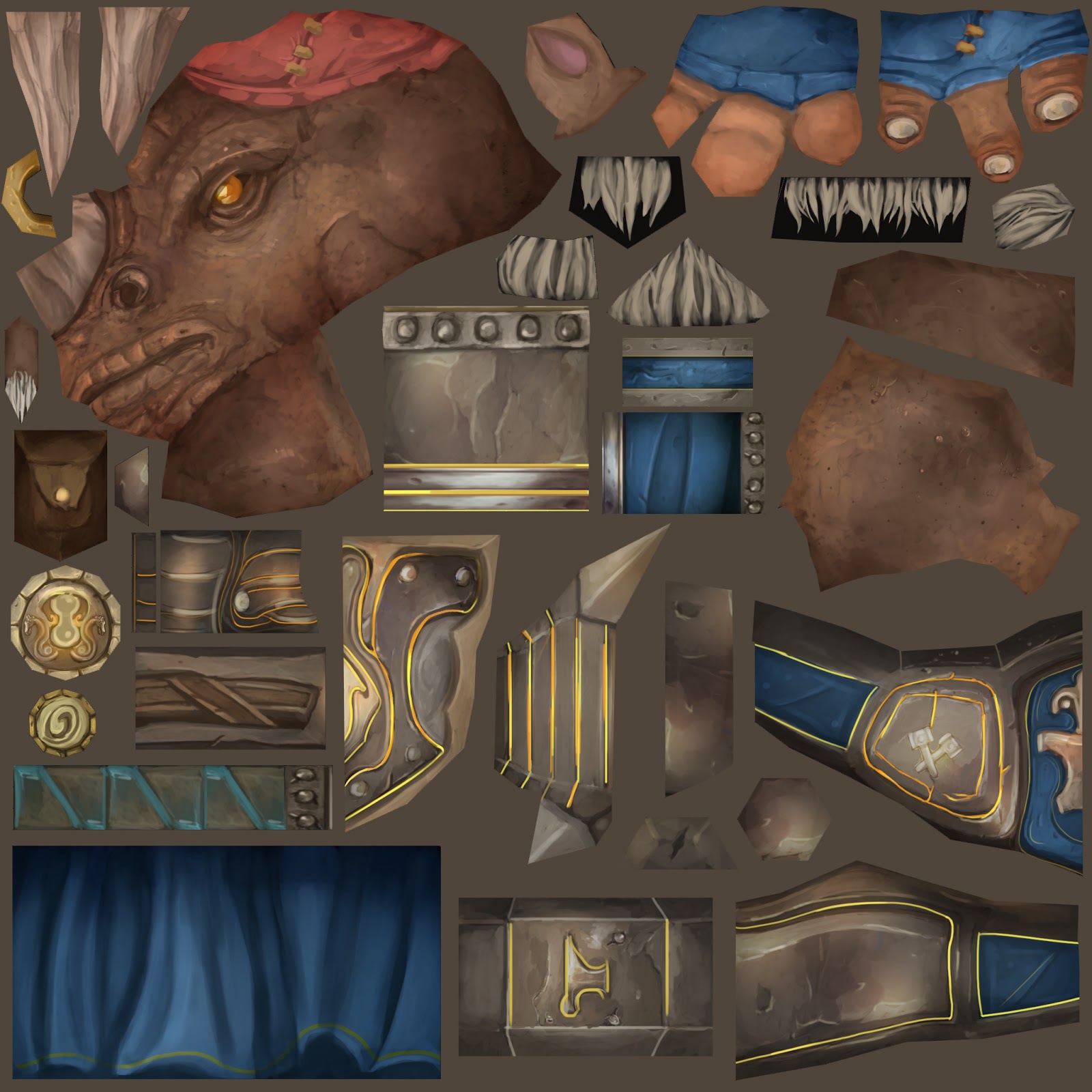
Texture
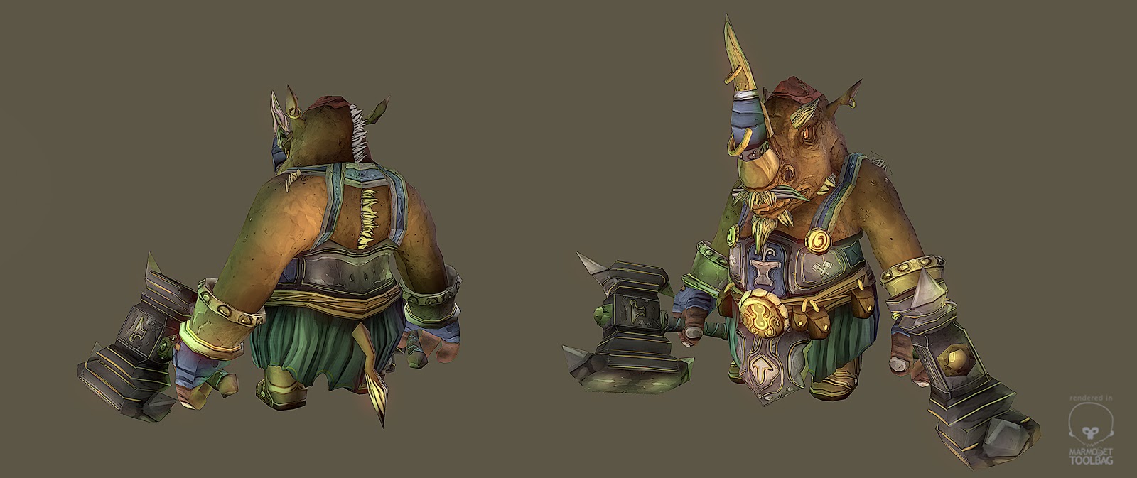
Renders "Marmoset"
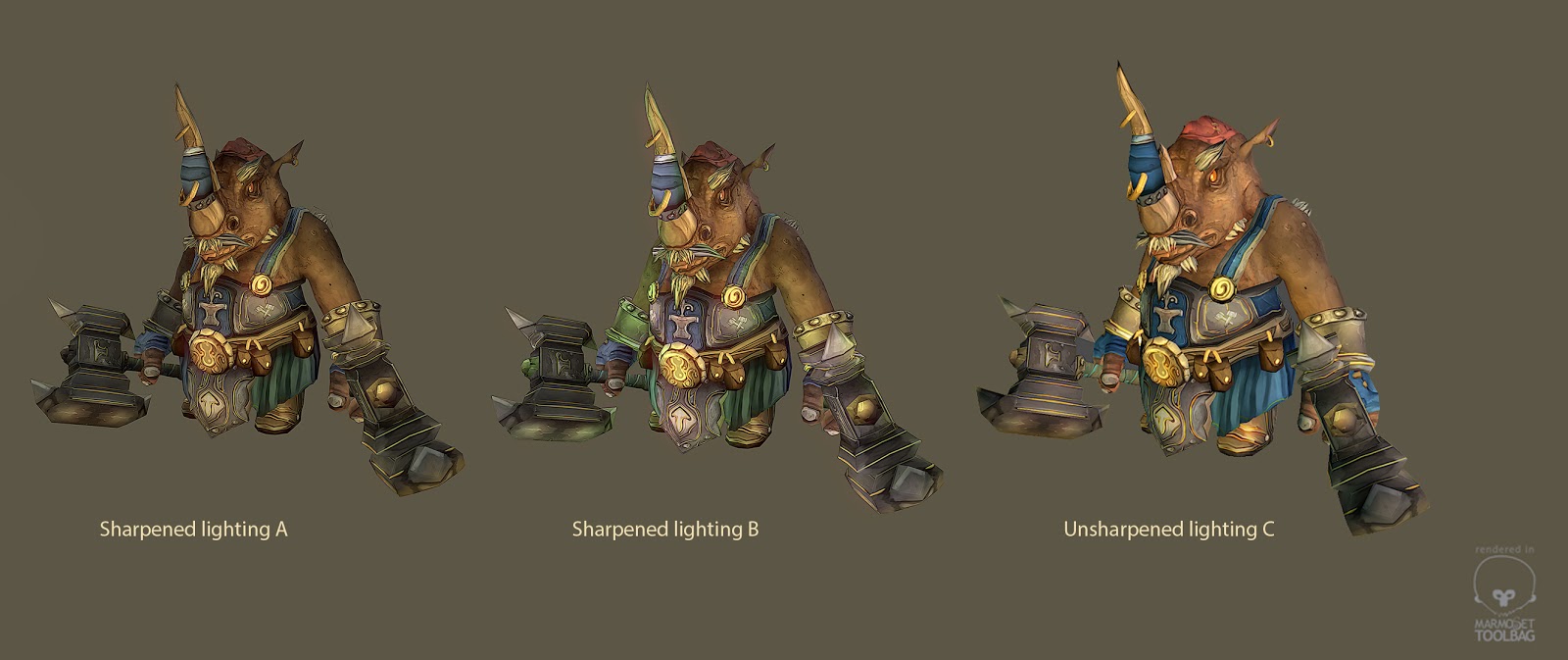
Im not sure with what lighting or sharpness i should go with, please take a look...
Software used
Maya: Modeling / Uv's
Photoshop: Textures
Marmoset: Renders
Zbrush: Armature with Z-spheres
3D Coat: Painting Seams
I'm doing the Blizzard character and environment Contest. I have been working very hard on these pieces i hope you like it and also if you have the time i would love to get some feedback from you!
Thank you and enjoy!
Idea:
I wanted to create a Rhino because in WOW we don't have a official Rhino race besides "Kodos" and i will love to play as a Rhino.
I also would love to see a Blacksmith that fallows you in your journey like in DIII.
So based on this INFO i decided to create a Rhino Blacksmith with mighty hammers!
Reference
Concept Art
I did a few rough concepts cuz i really knew where this was going...
Model
Silhouette
Texture
Renders "Marmoset"
Im not sure with what lighting or sharpness i should go with, please take a look...
Software used
Maya: Modeling / Uv's
Photoshop: Textures
Marmoset: Renders
Zbrush: Armature with Z-spheres
3D Coat: Painting Seams
Replies
The same goes for the upper arm/shoulder area. It feels empty compared to all the detail and value you've pumped into the rest of the piece. Also, one of your sketches shows a shoulder pad on only one side which I think breaks up the symmetry and silhouette nicely. Despite that, I think it looks good overall, it just may need some extra care.
Maybe baking a light gradient map might help out the textures?
praetus: I aggree with you on the option B for sure! Abput the shoulder pad i modeled but i decided not to included because i realized that Blacksmith don't have them...
JadeEyePanda: absolutely i'll try it out!
pixelb: More chunky shapes I'll do
Andy H : Certainly i will add more to his mustache!
Proxzee:
Absolutely ! i will do a better job on the lights and shadows i also think that is too monochromatic. About the Bolts i will definitely change that. About the planes you mean that i need to describe better the shape with the painting, right?
Also, if you don't mind, could you please take a quick look at my environment piece for the Blizzard contest? Thank you
http://www.polycount.com/forum/showthread.php?t=114161
Texture
Lighting unsharpen
Your color choices to me are spot on for WoW. Your texture though could stand to be polished a good deal more. A lot of details are getting a bit muddy and loose out on volume because of it imo. IE Rivets, Pouch, Hammer handle, etc.
The silhouette's pretty good except for the arms. I feel like the bicep and shoulders could be a bit more pronounces by taking in the elbow a bit and maybe bulking the shoulders?
This is really nice. WoW is all about texture details and your's has quite a lot. From the last three choices, I would go with A. it has a bit more dramatic feel to it.
Don't know whether you still have enough time and patience, but I`d go in and add a bit more ambient occlusion to the textures as they kind of blend together a bit too much.
You could work on their details a bit more, make them stand out from each other. Good job so far and good luck!
Oh, this guys reminds me of the kobolds
Hey guys for this image do you think i should submit just one concept art image or those 3 look good??
Praetus: good point ill rework it !
Thanks!
So the question was what did you use for your front and side shots
Good luck with the work btw. Keep tweaking until you can
A
B
C
Good Luck everyone!
Thank you for your support!