Home 3D Art Showcase & Critiques

AEON [First-Person Indie Horror]

1
polycounter lvl 10
Offline / Send Message
orihaus polycounter lvl 10
Hi everyone,

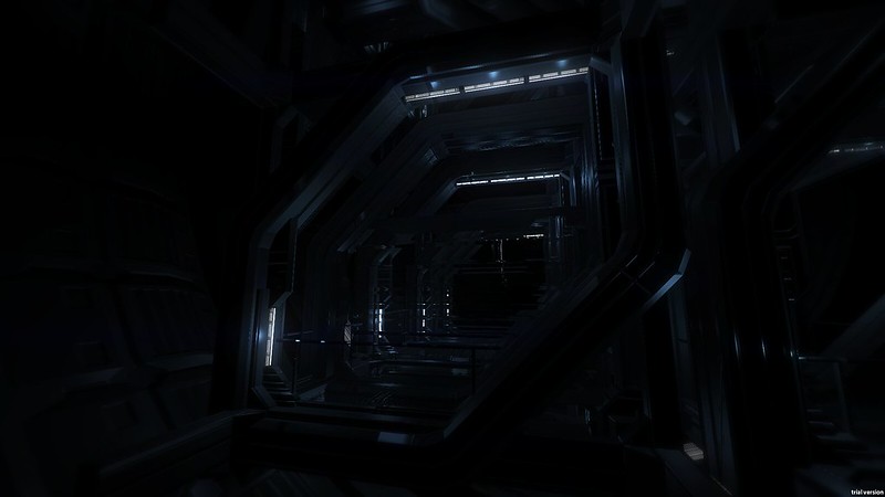
Here are some screenshots of a game I'm working on, currently in very early embryonic stage of development. Right now I'm setting up the world design and architecture for what may end up as a Amnesia style non-combat Science Fiction horror game. Name is very likely to change. Would love professional feedback and criticism of the environment design and modelling!

I should note that for the textures, I'm using PhilipK's excellent PK series.

8011878123_ec3d8e544e_c.jpg

8011885129_d74a84da10_c.jpg

8011915658_66c6dbc936_c.jpg

7947810064_a27e95c087_c.jpg

8011910516_cc2352b404_c.jpg

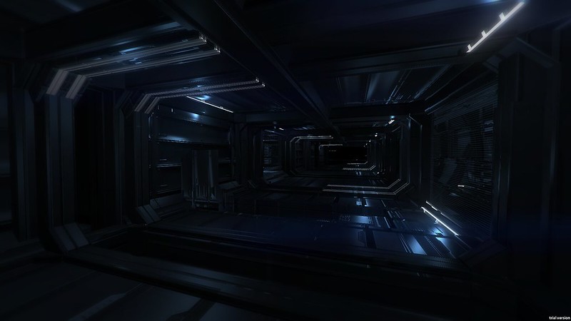
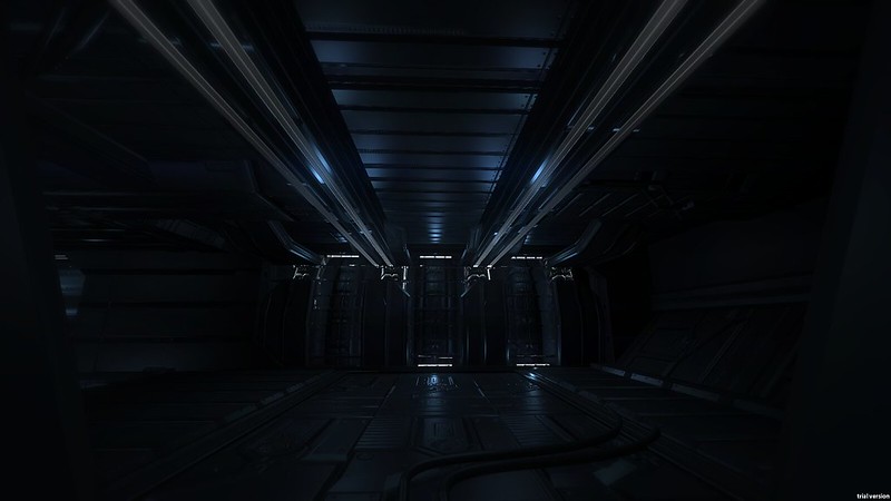
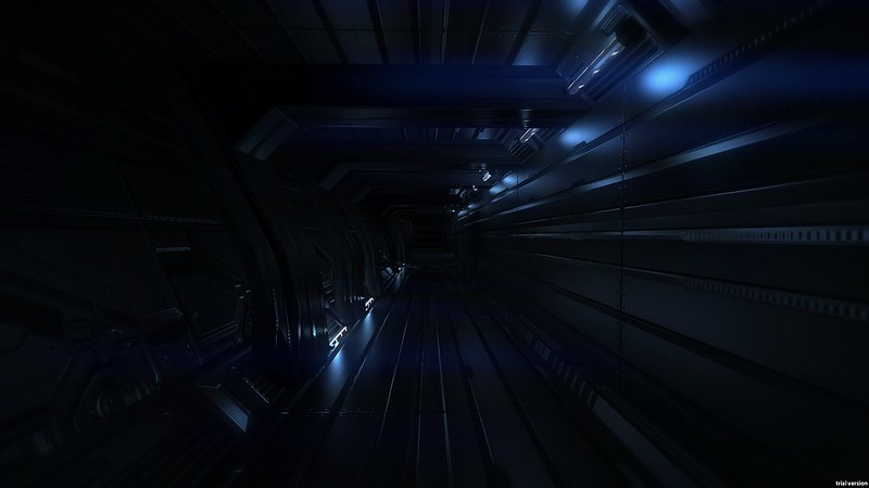
More screenshots here: http://www.flickr.com/photos/orihaus/.

Replies

  • airage
    Options
    Offline / Send Message
    airage polycounter lvl 13
    Looking cool so far!
    But it's probably too dark, in some of the screenshots i can barely see anything. I know you're going for dark horror so maybe some ambient light would help to still keep it scary and dark.
    The materials look pretty much all the same, but i guess you're working on them. Also some more color variation would be nice, so far everything is just monochromatic.
    You could have a look at some of the dead space stuff, it's dark yet you can see things and it's not like completely black:
    http://tavdsenvartist.blogspot.de/
    Or Routine: http://www.polycount.com/forum/showthread.php?t=103789
  • nick2730
    Options
    Offline / Send Message
    very very dark cant see anything
  • keres
    Options
    Offline / Send Message
    keres polycounter lvl 12
    That is pretty cool :) I can see stuff, but that could just be my monitor ;) If you throw dramatic lighting in 2-3 of the shots, I imagine people will be able to make out the details of the other ones.

    Red emergency lighting always make for excellently scary contrast to a desolate blue environment.

    I am keeping my eye on this one :D
  • Gannon
    Options
    Offline / Send Message
    Gannon interpolator
    It looks great on my one monitor, just a little dark on the other. I'd boost the light's just a little bit. Keep it subtle imo. Cry Engine?
  • toolpaddz
    Options
    Offline / Send Message
    toolpaddz polycounter lvl 10
    Looks great on both my monitors! Seems like some people need to readjust theirs ;)

    I really dig the mood, also your art style, though I absolutely cannot imagine how any type of monster would fit into that. Excited how you are going to manage this!
  • Macattackk
    Options
    Offline / Send Message
    Macattackk polycounter lvl 7
    looks great on my monitor. I love dark scenes like this, this is fantastic. If anything in the game just allow a gamma slider and it shouldnt be a problem.
  • cholden
    Options
    Offline / Send Message
    cholden polycounter lvl 18
    Love these types of games, looking forward to seeing more of this!
  • Fomori
    Options
    Offline / Send Message
    Fomori polycounter lvl 12
    I agree, really like the style. This looks really promising. Funny because I have 2 monitors at work and one is very high quality. Looks perfectly clear and readable on the high quality monitor but a bit too dark and my lesser quality monitor.
  • ghostwriter
    Options
    Offline / Send Message
    What's the engine, it is CryEngine, isn't it?
  • CordellC
    Options
    Offline / Send Message
    CordellC polycounter lvl 11
    Looks absolutely beautiful. The modeling and material work are fantastic.

    Maybe get some break up in there though? Looks great in still shots you look at for a couple minutes, but when playing a game for a sitting of an hour or so.. might get stale.
  • orihaus
    Options
    Offline / Send Message
    orihaus polycounter lvl 10
    Thanks everyone!

    @ghostwriter I'm using Unity right now, as I'm not sure about how I'd be able to release the game in CryEngine 3 due to the locked launcher. I'm looking into moving though!

    @CordellC Yea, I'll definitely look into other environment types, lighting. I'm thinking a 2001/Beyond The Black Rainbow massive diffuse look would contrast nicely, if I could pull it off!
  • Fomori
    Options
    Offline / Send Message
    Fomori polycounter lvl 12
    Wow looking great in Unity. I've been wanting to do an environment in Unity for a while now (if I can pull myself away from character stuff). This is encouraging. I wouldn't migrate over to Cryengine unless there's some very good reasons to....
  • Bek
    Options
    Offline / Send Message
    Bek interpolator
    It looks perfect on my ips monitor, but on my crappy TN panel monitor it's a lot darker - I can still make out most shapes but the details don't pop as much.

    CordellC makes a good point, if you're going to exist in this environment for any decent period of time it might help if there is something to break the space up a bit. Still, great work so far, looks beautiful.
  • AimBiZ
    Options
    Offline / Send Message
    AimBiZ polycounter lvl 14
    Dig the style quite a lot actually, a bit too dark though as already mentioned. In what way will it be a horror game? For the moment I get a meditative pleasant vibe than anything else.
  • CordellC
    Options
    Offline / Send Message
    CordellC polycounter lvl 11
    This is Unity? You should be pretty dang proud.
  • orihaus
    Options
    Offline / Send Message
    orihaus polycounter lvl 10
    Ok, lets try some more work in progress stuff. Reservoir walkway areas:

    Unity%202012-09-28%2021-54-26-34.png
    Unity%202012-09-28%2021-53-36-87.png
  • orihaus
    Options
    Offline / Send Message
    orihaus polycounter lvl 10
    Unity%202012-10-02%2020-37-17-37.png
    Unity%202012-10-02%2020-38-58-89.png

    Started lighting the new area, but I have no idea how to do the background.

    The idea is that there is no shore visible in the scene, but with water from horizon to horizon. Problem is, fog is needed to give depth to the scene and combined with endless water it ends up looking wrong. Maybe some beacons in the water too, but the same problem applies...

    Any ideas?
  • orihaus
    Options
    Offline / Send Message
    orihaus polycounter lvl 10
    Aha! Solution found. Particle fog!

    Still needs tweaking + better fog textures, but it works.

    Unity%202012-10-02%2021-26-05-45.png
    Unity%202012-10-02%2021-25-42-22.png
    Unity%202012-10-02%2021-25-27-52.png
  • Armageddon
    Options
    Offline / Send Message
    Armageddon polycounter lvl 5
    This is a very cool concept, hope to see more soon.
  • orihaus
    Options
    Offline / Send Message
    orihaus polycounter lvl 10
    Ok, proper screenshot time:

    8046627398_32c752f844_c.jpg
    8046621411_153c286c59_c.jpg
  • Benjam
    Options
    Offline / Send Message
    Benjam polycounter lvl 4
    as far as lighting goes, it is far too dark. I used to have this problem when i was first starting out with Maya and stuff i would want the lighting to be dark and spooky by keeping everything dim but when i realised nobody could see it it was too late.

    Try to brighten it up, but instead of using white lighting colour grade it so that it is grey or dark green or something spooky but so that you can see everything (well mostly everything). What you will end up with is a greyish/green spooky scene but looks the same as it did before just lighter and just as spooky. I hope i made sense
  • Bek
    Options
    Offline / Send Message
    Bek interpolator
    Obviously the fog needs work, I think it would be quite cool to see the moon giving some specular reflections across the water's surface.. not in a uniform way, but in relation to the camera.
  • Pierate
    Options
    Offline / Send Message
    Pierate polycounter lvl 15
    Alright, I tried calibrating my monitor to see if that was the issue, even going as far as trying different ICC profiles, but in the end, I still can't see much in your screens. The little I can see is looking nice though.
  • Madwish
    Options
    Offline / Send Message
    Madwish polycounter lvl 6
    Looking good so far.

    Amnesia was dark too, but you had the lantern to help you. I imagine you will get some torchlight in your game so it's kinda hard to say if it's really too dark. Although from what I recall, there was actually some kind of subtle blue ambient color coming in when you put the lantern away. You could actually somewhat see what was going on even without the lantern, I remember trying to keep my fuel that way, only to get mad after. :p

    I'm excited to see where your project leads, keep up the good work!
  • Bek
    Options
    Offline / Send Message
    Bek interpolator
    ^ In Amnesia (and Penumbra) your eyes would 'adjust' to the darkness and there would be a slight blue to everything as well as a small brightness increase. Although this was also part of the in/sanity gameplay mechanic.

    For those saying it's too dark, what monitors do you have? It looks great on my dell ips, but quite dark on my crap asus TN panel. I wouldn't worry TOO much about the final lighting until the scene is complete and lights (inc any the player might use) are sorted out.
  • Pierate
    Options
    Offline / Send Message
    Pierate polycounter lvl 15
    I'm using a HP ZR24w, somewhat stock settings with the brightness lowered (not to be confused with gamma). It's dark even when using a 'professionaly calibrated' ICC profile, which makes everything look greenish to me. I can see things, but I can't really make them out, because there is too much black everywhere. I don't know if it's my monitor or not, I'll see how it looks on my laptop later.

    Edit: Checking on my laptop, it's brighter and I can see what's in the screens, feels a tad too bright now but that's due to the monitor. I'll have another go at calibrating my desktop monitor I guess.
  • Snader
    Options
    Offline / Send Message
    Snader polycounter lvl 15
    Even at 8 times the brightness, your images still feel rather dark. This seriously isn't just a monitor issue.

    AEON_8xbrighter.jpg
  • Frankie
    Options
    Offline / Send Message
    Frankie polycounter lvl 19
    Chrome has different (no?) colour management than IE and firefox so could explain the differences people are seeing.
  • jdvi
    Options
    Offline / Send Message
    jdvi polycounter lvl 6
    I have to echo the comments on the brightness, especially since your latest screenshots are even darker than the first set.

    I don't think you would sacrifice any ambiance or mood by making the scenes brighter, and the darkness could become an issue during gameplay as the player struggles to navigate the environment.

    That being said, the abstract designs are really quite beautiful to look at and I'm curious to see what type of gameplay you have in mind. I would probably play it just to look at more of these environments.
  • Impala88
    Options
    Offline / Send Message
    brighten the first screenshots up slightly but not too much and that's about the right level of brightness. I can see that this environment takes alot from it being dark, it's meant to be a space horror idd. But don't go as far as to brighten things up tonnes, have certain lights that are pretty bright but flicker or something (i know it isn't a decrepid/run-down setting but flickering lights could still be usable, maybe faulty connections).

    I'm not sure where people are getting the impression that it should be far brighter than what you're making, the fact that it's a horror is something that makes the use of dark environments useful. A bright area gives you everything, no pitch black shadows in corners, down corridors etc.

    Take a look at Pandorum and Event Horizon in some cases. These use darkness to set the mood at times, but they do have quite a few lit up areas, at least bright enough around the central point which then disapears into darkness.

    As said above, the designs are pretty abstract and what i'm getting from it is if you light them up too much (they do need a bit more light, but not much) their abstract appearance may take a hit.
  • Pierate
    Options
    Offline / Send Message
    Pierate polycounter lvl 15
    It's not so much that it has to be bright but that it's difficult to distinguish anything, that's my problem anyway. The first screenshots are pretty good lighting-wise, it's not too difficult to see what is what, a tad lighter and it would be great I think.
  • orihaus
    Options
    Offline / Send Message
    orihaus polycounter lvl 10
    Yea, the lighting constantly being tweaked and reworked and is in no way final! I'll look at brightening stuff up more in post. I already am, but I'll boost it a bit and see what happens.
  • orihaus
    Options
    Offline / Send Message
    orihaus polycounter lvl 10
    Ok, boosted ocean brightness and made it illuminant. Boosted ambient and post processing and increased fog brightness x4.

    8058924613_eabc1e985a_c.jpg
    8061235081_a71b56aea1_c.jpg
  • PhilipK
    Options
    Offline / Send Message
    PhilipK polycounter lvl 10
    those last screens are cool, the earlier ones were pretty dark for me as well, but I like the direction you're going with this!

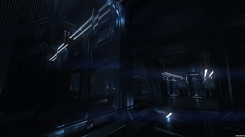
    Also glad to see those textures could be of any use for you :) can hardly tell your using them (which is a good thing :D)
  • orihaus
    Options
    Offline / Send Message
    orihaus polycounter lvl 10
    Thanks!

    I'm pretty much using only one of your textures, but it's also almost the only one I use! "Pk02_wall08". All the modular props are UV mapped to it.

    See here:
    8061935120_b7ff6ef434_c.jpg

    It's used everywhere in that image! And basically only the normal map too, though a black and white version of the diffuse is modulated in a bit to give depth.
  • orihaus
    Options
    Offline / Send Message
    orihaus polycounter lvl 10
    Just a little animated screenshot:
    [ame="http://www.youtube.com/watch?v=qqtjlLxFp0w"]AEON - Glimpse 1 - YouTube[/ame]

    1080p and fullscreen recommended!
  • cupsster
    Options
    Offline / Send Message
    cupsster polycounter lvl 11
    Damn man! I love feel of it! Black and blue can't be wrong.. Are you using Unity 4 or still on 3? BTW subscribed :) as I see PhilipK is here must say thanx for textures. I learned a lot from them!
  • orihaus
    Options
    Offline / Send Message
    orihaus polycounter lvl 10
    Thanks!

    Just Unity 3 actually. Would love to mess with the DirectX 10 features in 4 when I can!
  • Benjam
    Options
    Offline / Send Message
    Benjam polycounter lvl 4
    dude that looks so cool!! I love the feel you are going for!! are you going to add more to it? Like a longer level type thing?
  • AimBiZ
    Options
    Offline / Send Message
    AimBiZ polycounter lvl 14
    I really like the mood you got going on.
  • orihaus
    Options
    Offline / Send Message
    orihaus polycounter lvl 10
    Thanks! Some standard screenshots this time:

    8073169970_0e8ec6ddc3_c.jpg
    8073168844_479a41a23b_c.jpg
    8073167260_9c0bb3b11c_c.jpg
    8073168098_643a0640ba_c.jpg

    And as you can see, I'm having some issues with the cloud textures on the water. Not sure how to fix them, any ideas?
  • c22dunbar
    Options
    Offline / Send Message
    c22dunbar polycounter lvl 14
    if You want to show us them shapes, You'll have to drop all that fog/clouds and put some ambient light to that scene. the whole feel is nice, but You might as well stop posting pictures after a few first ones as all of them look almost the same. 90% black/dark and some bright edges.

    srsly
    batman-forever_15.jpg
  • Makkon
    Options
    Offline / Send Message
    Makkon polycounter
    I actually like the darkness. The best horror is the kind that you can't quite identify. The kind that you can't quite ever get a good look at it.

    Also, I can see your first images fine, I think it's a monitor issue.
  • Aga22
    Options
    Offline / Send Message
    Aga22 polycounter lvl 11
    event horizon. thats what it reminds me.
  • cholden
    Options
    Offline / Send Message
    cholden polycounter lvl 18
    Not understanding what you see is common. Maintain the current direction.
  • orihaus
    Options
    Offline / Send Message
    orihaus polycounter lvl 10
    [ame="http://www.youtube.com/watch?v=29bAsK5QoIc&feature=plcp"]AEON - Glimpse 2 - YouTube[/ame]

    As always, 1080p and fullscreen recommend!
  • stickadtroja
    Options
    Offline / Send Message
    stickadtroja polycounter lvl 11
    very cool stuff! everyting looks hard and cold, and gives a very desolate feeling.

    Im not a fan of all that blue though. maybe you could pull it towards teal, or just make it grayer. I think it would be nicer if you had smaller spots of intense blue (stars, lamps for example) and make all that fog less saturated.
  • orihaus
    Options
    Offline / Send Message
    orihaus polycounter lvl 10
    That's a good suggestion! I'll mess with saturation and see how it goes.
  • orihaus
    Options
    Offline / Send Message
    orihaus polycounter lvl 10
    8082190689_69d1be4806_c.jpg
    8082191089_ca3539e78e_c.jpg
    8082191445_7def694c03_c.jpg

    Any thoughts on the new colour scheme? Also, site launched here: http://www.noctuelles.info/AEON
  • Benjam
    Options
    Offline / Send Message
    Benjam polycounter lvl 4
    Bluer was better i think. It was colder, like you wernt supposed to be there type feel it gave a good sense of fear and alone. The orange is too warm takes away your horror edge i think
1
Sign In or Register to comment.