Wood Texture for Plank
polycounter lvl 4
Greetings fellow artists,
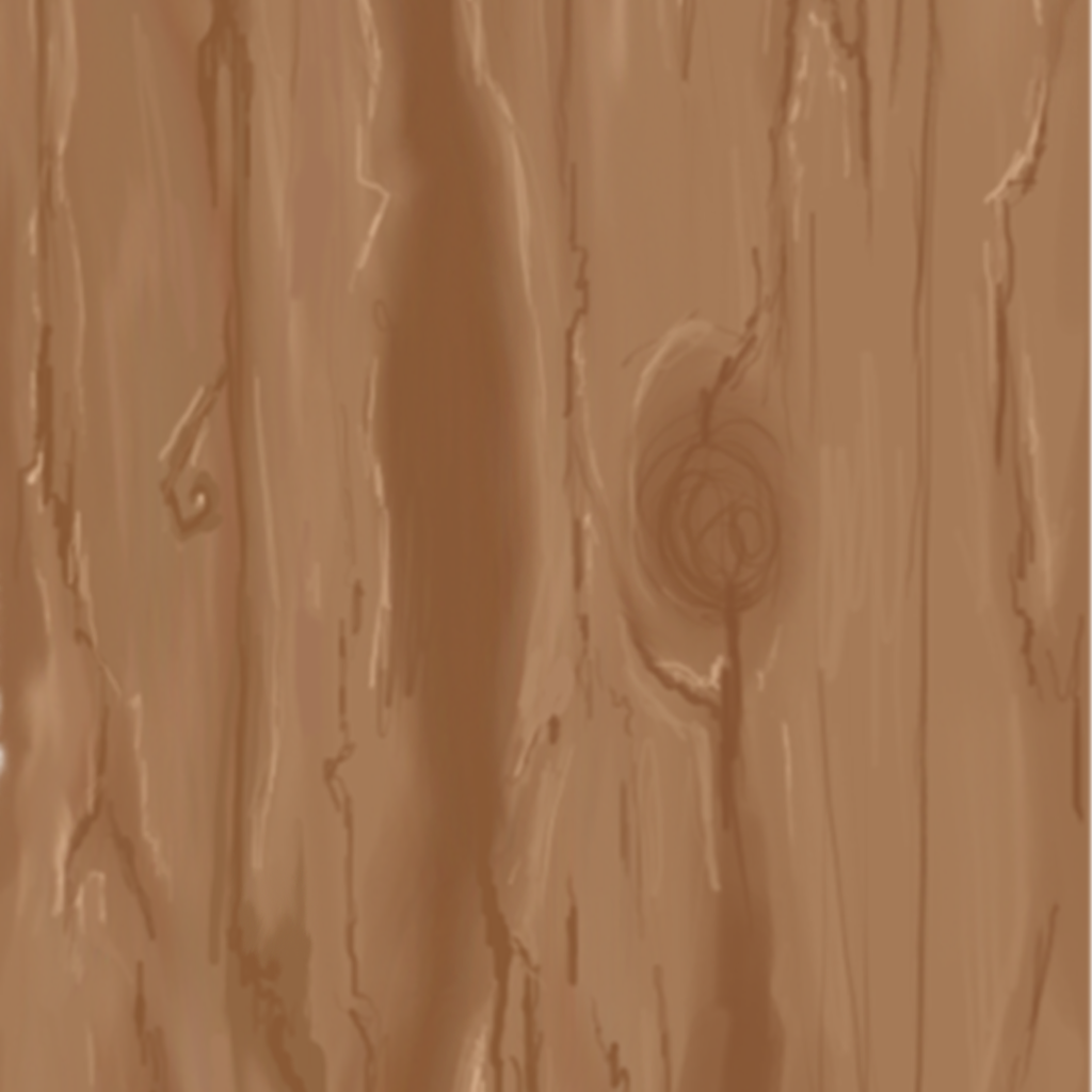
I have been working on a wood texture and I think it is coming along nicely. However, I feel like I am missing some details and not quite sure on how I should approach them. The circle was a key feature I wanted in my texture, but it does not seem to be tiling-friendly, so I might have to remove that. Anyways, any suggestions would be appreciated, thank you!
The texture:
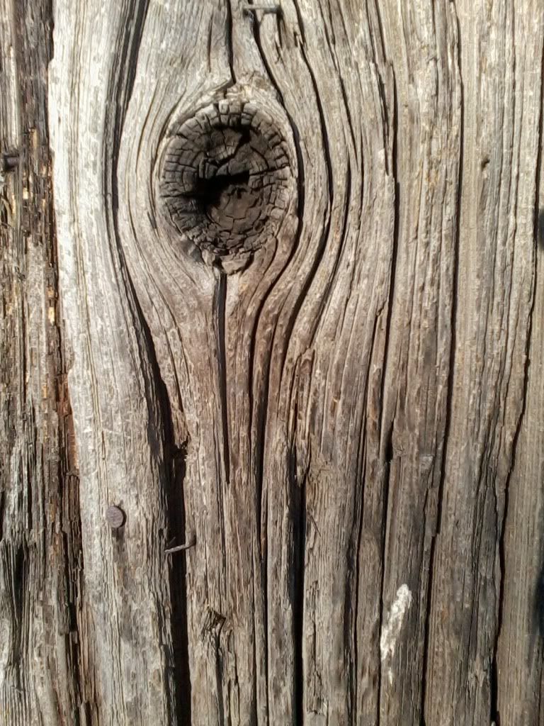
The reference image:
I have been working on a wood texture and I think it is coming along nicely. However, I feel like I am missing some details and not quite sure on how I should approach them. The circle was a key feature I wanted in my texture, but it does not seem to be tiling-friendly, so I might have to remove that. Anyways, any suggestions would be appreciated, thank you!
The texture:
The reference image:
Replies
So take this more as a "think about it/try it out and see if it's better", and not as a "I am right, you are wrong, do it this way".
Brighten up that screenshot a bit, kind of hard to tell what is going on.
Texture:
-I feel like the side feels "off"/not natural, I feel like the side would look more something like this:
http://www.eyesontutorials.com/images/Drawing/Sigma/tut17_WoodenPlank/12.jpg
Especially since the way those are cut, the ends would have a more circular pattern to them.
(can't immediatly find more/better reference).
-Also, it just feels a bit flat, it's just some darker/lighter versions of the same brown.
Especially since those are outside, keep in mind some weathering, some discoloration, planks from different tree's, etc.
Have a look at this one for example: http://ericchadwick.com/img/painted_textures.html
It depends ofcourse on what of style your going for, but I do feel like it could use something more.
-Shift the different planks more on the UV's, it's obvious that for the vertical ones they are all on the exact same spot in your UV's.
Model (in case it isn't just a quick testmodel)
Depending on the look/style you want to go for or the budget in terms of tri's, I feel like you could throw in some more edge loops and play around a bit with the overal form, now everything is so straight, wich just looks a bit boring.
For example, the horizontal bars on the side would be made of several planks, maybe some are a bit wider.
And to close it off, it doesn't really seem like the vertical beams are thick enough to hold the weight of the side planks.
The most distracting thing for me is the colour. The texture looks disaturated and lacks of colour variation. Try to add more colour, look at other photo refs, dont use just one. Also more contrast would be better.
Here is my old example of wood texture:
PS. not the best one
It seems like you're going for a somewhat stylized, hand-painted look here. If so, I found this tutorial helpful:
http://gimaldinov.deviantart.com/art/How-to-draw-wooden-plank-267517599
I made a really quick-and-dirty paintover to show how I'd apply some of these concepts to your texture:
The two main things I did were
1. Paint in a strong directional light to define the forms and
2. Remove a lot of the high frequency detail (thin lines, etc) and replace it with surface detail defined by the light source (basically random dark/light color variations with the appropriate edges darkened/lightened by the light source).
Hopefully this image will show what I mean:
Aside from that, I also upped the contrast a little bit and threw in some very low-opacity green and yellow colors using random layer masks made with Photoshop clouds, just to get some slight color variation.
If you want this to tile, I think you're probably right: you'll likely need to remove the knothole.
Anyway, you're headed in the right direction, good luck dude!
http://www.polycount.com/forum/showpost.php?p=1653674&postcount=9643
www . digitaltutors.com/forum/entry.php?147-Creating-Realistic-Wood-Texture-in-Maya-using-only-Procedural-Textures
if you wanna ask more you can find me here
Joseph Rohdes