Home 3D Art Showcase & Critiques

[UDK] The Apex Observatory

1
polycounter lvl 11
Offline / Send Message
Fingus polycounter lvl 11
All right, graduating in winter, time to get some portfolio pieces out of the door.

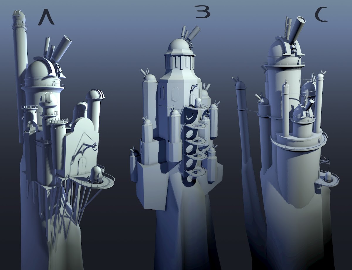
The Apex Observatory is built on a thin needle of a mountain that pokes up above the clouds so the astronomers always have a clear view of the sky. Unfortunately space is rather scarce and with star gazers flocking in from all corners of the world comes the demand for expanded facilities.

A bit of a whimsical environment. The idea is essentially a cluster of towers and buildings huddled together on a tiny peak. It will sort of float in an expansive sea of clouds with a few smaller peaks poking out like islands. Above will be a beautiful star filled sky with all its celestial bodies in clear view.

So far I've just done some quick block-ins in Maya, trying to get a feel for the general shape and composition of the structure. I like the lopsided and angular towers in A, but I find the general layout rather boring. I'm liking the general construction of the structure and the shape of the towers in B, but I feel the layout and negative space in C is a lot more interesting.

I'd like to hear you guy's opinions. Today I will make some more variations and perhaps do some paintovers in photoshop.

blockins.jpg

Replies

  • Brain Zapped
    Options
    Offline / Send Message
    This looks awesome! Can't wait to see this come together. I'll be following this post. Bookmarked your blog/portfolio as well!

    I vote C or A, btw.
  • Darkleopard
  • MindOfNash
    Options
    Offline / Send Message
    A as well. more interesting. looks sweet! :D
  • MystiqueX
    Options
    Offline / Send Message
    MystiqueX polycounter lvl 7
    I vote for A without the tallest tower (doesn't make sense to block part of the sky for the main observation room), place the weight thing as in C, but try to keep some of the supporting beams and maybe add some overpass connected towers also from C. Might also build some smaller building for living accommodations since it's supposed to be such an isolated place. Definitely keep the outdoor terraces (not sure what they are called...). Hope it gives some ideas.
  • Lord Fryingpan
    Options
    Offline / Send Message
    Lord Fryingpan polycounter lvl 12
    A's general aspect and wacky holding structure, but you should add the elevator system from B and the lonely tower in C
  • Rav3
    Options
    Offline / Send Message
    Rav3 interpolator
    A and C a bit similar, I prefer rather A
  • toxic_h2o
    Options
    Offline / Send Message
    toxic_h2o polycounter lvl 8
    I like "C" because of the negative space, "A" seems a bit busy. however I really like "A" because of the support structure holding it that funky wall. maybe a hybrid of the two?

    looks like a fun project!
  • Macattackk
    Options
    Offline / Send Message
    Macattackk polycounter lvl 7
    'A' please, I love how the platform is suspended out from the rock with support beams and the tall tower really adds to the silhouette.
  • Fingus
    Options
    Offline / Send Message
    Fingus polycounter lvl 11
    Wow, thanks for all the positive feedback guys! I was actually the least happy with A, but with the overwhelming support for it I will absolutely revisit it. I suppose I will go for a sort of hybrid of A and C. :)
  • megalmn2000
    Options
    Offline / Send Message
    megalmn2000 polycounter lvl 13
    A! The silhouette is much more interesting than the other two. :)
  • Fingus
    Options
    Offline / Send Message
    Fingus polycounter lvl 11
    Lost one variation to accidentally overwriting the file, hella unprofessional. :/ This one turned out a bit better anyway.

    Capture1.PNG

    Capture2.PNG

    Capture3.PNG

    I moved the platform further out so players arriving on the elevator will get a better view of the building. I'm not sure if it's really working out that well, and I'm not very happy with the mechanism.
  • SuperFranky
    Options
    Offline / Send Message
    SuperFranky polycounter lvl 10
    if you want a reference for an elevator mechanism, you should google "old elevators" (if you are looking for that style) for pictures, there are a lot of pictures of mechanisms and such.
  • Fingus
    Options
    Offline / Send Message
    Fingus polycounter lvl 11
    Oh yeah, tonight is going to be spent on reference scrounging and figuring out a better way to get that platform working.

    Also, this never bodes well when you're looking for reference: XD

    Capture.PNG
  • Dazhbug
    Options
    Offline / Send Message
    Pardon the perhaps silly question, but I've been tearing my hair out over re-building a scene all day, and keeping things modular is driving me slightly nutty. Is this a scene you'd build modular-style (in whole or in part), and how would you keep something like this on a consistent grid?

    Anyway, it looks pretty amazing, and I love the vertical, spindly feel. Reminds me of a cross between Dr. Seuss and the high mountain retreats from Dinotopia, for some reason.
  • Bek
    Options
    Offline / Send Message
    Bek interpolator
    A's general aspect and wacky holding structure, but you should add the elevator system from B and the lonely tower in C
    This! Looks crazy awesome.
  • rustim
    Options
    Offline / Send Message
    rustim polycounter lvl 10
    This is looking good, but I think I preferred it in concept A. It looked a lot more precarious, as if it could fall down at any moment. The current model looks like the rocks have been built to hold the buildings, rather than the other way around.
  • Fingus
    Options
    Offline / Send Message
    Fingus polycounter lvl 11
    Ran into some technical problems so I've been troubleshooting more than actually working.

    Just some subtle changes to make it look more precarious, and a new design for the elevator mechanism.

    Capture5.PNG

    Capture6.PNG

    Capture7.PNG

    Capture8.PNG

    And I've decided to not spend too much time on the block-in stage and rather push through and get some stuff into UDK. I feel that it will be easier for me to make desicions once I understand the tool better.

    So far just a simple import of the main building to wrap my head around the fbx workflow for UDK, smoothing groups, scale, multiple materials, and collision meshes.

    Capture4.PNG
    Pardon the perhaps silly question, but I've been tearing my hair out over re-building a scene all day, and keeping things modular is driving me slightly nutty. Is this a scene you'd build modular-style (in whole or in part), and how would you keep something like this on a consistent grid?

    In some initial block-ins (discarded and not posted here) I tried to keep everything very modular and on the grid. I quickly found out that I couldn't really achieve the look I was after with that so I decided to build the scene largely out of unique meshes and instead make heavy use of tiling textures and materials. I think my approach will be to assemble the buildings as layers and then move and rotate the grouped together meshes around so I can get that whimsical lopsided look without running into too many problems with lining up the meshes.

    And thanks for the comments everyone, very encouraging. :)
  • Fingus
    Options
    Offline / Send Message
    Fingus polycounter lvl 11
    Just did a quick texture pass on the walkway to snag any issues with UV's and textures and such. I discovered that shadows won't render if the UV's go outside 0-1 space. And I ran into a problem with baking lightmaps. It seems like meshes with transparency won't cast shadows when using Lightmass, although realtime shadows do. Apparently this is a bug with the May build, but a workaround is supposed to be to change the material Blend Mode to BLEND_Translucent and set Cast Shadow As Masked to True but that isn't working either. Any advice?

    Capture10.PNG

    Capture9.PNG

    Also, here is the texture.

    walkway.png
  • sltrOlsson
    Options
    Offline / Send Message
    sltrOlsson polycounter lvl 14
    Nice blockout and good start.. The wooden texture you got is just repeating 9 times, make them unique :)
  • Barnhill8
  • Fingus
    Options
    Offline / Send Message
    Fingus polycounter lvl 11
    sltrOlsson wrote: »
    Nice blockout and good start.. The wooden texture you got is just repeating 9 times, make them unique :)

    Oh yeah, this was just a test. For the proper one I plan on overlaying two textures, one for the main shape and color of the planks and one for the wood grain. That way I can make the two patterns tile at different rates so the repetition is less obvious.
  • DanRoss
    Options
    Offline / Send Message
    Looks fantastic!, can't wait to see how it progresses
  • AzzaMat
    Options
    Offline / Send Message
    AzzaMat polycounter lvl 9
    your wood planks look like they could use some depth I made this tutorial as a suggestion. Really effective against bulky alphas like yours.

    Untitled-2.png
  • whw
    Options
    Offline / Send Message
    whw
    Sweet as... Looks like I'm late to the party though I'm in agreement with the choice of A. I think the lonely tower would work better to one side rather than behind - just so it pokes out when viewed from the far end of the platform. It'll add a better sense of overall scale to the scene.
  • Lord Fryingpan
    Options
    Offline / Send Message
    Lord Fryingpan polycounter lvl 12
    I discovered that shadows won't render if the UV's go outside 0-1 space.

    I don't know if that's your issue, but you may have two UV channels, the first one for the texturing, the second one for the lightmass.
  • Fingus
    Options
    Offline / Send Message
    Fingus polycounter lvl 11
    AzzaMat wrote: »
    your wood planks look like they could use some depth I made this tutorial as a suggestion. Really effective against bulky alphas like yours.

    Oh that's very clever, I'll give that a go! I think I have an idea how to do that through a material too...
    whw wrote: »
    Sweet as... Looks like I'm late to the party though I'm in agreement with the choice of A. I think the lonely tower would work better to one side rather than behind - just so it pokes out when viewed from the far end of the platform. It'll add a better sense of overall scale to the scene.

    Well it's not too late to do that. :) That's a very good idea, I didn't consider it because I intend to show a pan around of the building in my portfolio, but it makes a lot of sense that i should be visible for the player.
    I don't know if that's your issue, but you may have two UV channels, the first one for the texturing, the second one for the lightmass.

    I looked into that initially. The problem was that it wouldn't cast realtime or baked shadows. I made a second channel for lightmaps and that didn't fix the problem, but when I moved some shells that poked outside the 0-1 space into the bounds the realtime shadows suddenly worked again. But now they won't bake with lightmass...

    Capture14.png
  • AlanSMitchell
    Options
    Offline / Send Message
    AlanSMitchell polycounter lvl 14
    thanks for the tut about the fake depth great stuff.
  • AzzaMat
    Options
    Offline / Send Message
    AzzaMat polycounter lvl 9
  • Marchwarden
    Options
    Offline / Send Message
    AzzaMat wrote: »
    your wood planks look like they could use some depth I made this tutorial as a suggestion. Really effective against bulky alphas like yours.

    Untitled-2.png

    Haha I saw them do this when I played Arkham City, was pretty cool.
  • Fingus
    Options
    Offline / Send Message
    Fingus polycounter lvl 11
    So Azzamat I though about that double plane technique of yours and wondered if I could do it with a shader. Turns out I can!

    thickness%2520mat.PNG

    [ame="http://www.youtube.com/watch?v=fqKG6FuABqE"]UDK Fake Thickness Material - YouTube[/ame]

    The concept is basically to offset the texture with a Bump Offset node (also known as Parallax), then darkening it with a multiply node, and then adding it underneath the original texture with a Lerp node. It doesn't handle corners that well, so I'm wondering if multiple stacks of Lerp might help with the illusion but I'm worried about the drawcalls. Also, I'm not sure if this is more efficient than just stacking two planes, I'll have to do some testing.

    Here is the shader graph if you're curious as to how it works: thickness%2520mat%2520graph.PNG
  • ZacD
    Options
    Offline / Send Message
    ZacD ngon master
    I would just model the planks, its not like planks are very expensive polycount wise, 8-16 tris per board. With this approach you have a more expensive shader that uses opacity and parallax, plus you are using more memory for the opacity/offset, and still doesn't look great at extreme angles. This approach is useful though for any curvy or polycount expensive railing or similar objects.
  • Fingus
    Options
    Offline / Send Message
    Fingus polycounter lvl 11
    Oh yeah, it's totally overkill for simple planks like that. Especially considering they're going to be so close to the camera. But like you said railings like these are probably going to benefit the most from it.

    images%5Cgallery%5Crailing%5Cstair_railing%5CSR_201.jpg
  • SHEPEIRO
    Options
    Offline / Send Message
    SHEPEIRO polycounter lvl 17
    even if its useless effeciency wise its cool ;-)
  • AzzaMat
    Options
    Offline / Send Message
    AzzaMat polycounter lvl 9
    Yeh its a fairly simple shader to make, should of mentioned it could be done like that as well =P. Good work on it though =D.
    ZacD and Fingus are right in this case though I think it depends on
    a) how often the planks are used (if they are everywhere then its probably not going to be as efficient as using a shader or double alpha on a flat plane)
    B) How intricate the object is. If you decide to alpha an object instead of model it, it is probably worth using either the shader or the double alpha technique.
  • Fingus
    Options
    Offline / Send Message
    Fingus polycounter lvl 11
    I made some planks and made an asset, and a tilable texture out of them.

    planks.jpg

    [ame="http://www.youtube.com/watch?v=lddOrWmLGLw"]Stylized planks in zBrush - YouTube[/ame]

    Capture15.PNG

    Capture16.PNG

    tiled_planks_diffuse.png

    I used instancing in 3DCoat to make the planks tilable. I didn't record the process because I was still working things out, but I will record the next tilable asset I make. I'm thinking a brick texture.
  • AlanSMitchell
    Options
    Offline / Send Message
    AlanSMitchell polycounter lvl 14
    Love the style of the wood it feels really good and it's interesting to see how you extracted your mesh from the tiling texture.
  • Dysengaged
    Options
    Offline / Send Message
    Looks good, Yeah I like the texture really works :)
    Keep up the good work :)
  • Fingus
    Options
    Offline / Send Message
    Fingus polycounter lvl 11
    All right, updates have been slow recently. Moving out and stuff. Will probably be slow over the weekend too due to the Massive Black Workshop.

    window.jpg

    Trying to build a set of MultiMesh brushes through this project. It's a bit of a slow process to align all the subtools, but I can see it paying off immensely down the road.
  • SimonT
    Options
    Offline / Send Message
    SimonT interpolator
    That could be very interesting! Go on :)
  • AzzaMat
    Options
    Offline / Send Message
    AzzaMat polycounter lvl 9
    looking nice dude =D look forward to seeing more
  • Marchwarden
    Options
    Offline / Send Message
    So the window looks nice technically -- the wood and stone are well sculpted. I think, though, the exaggerated angles on the window panes aren't working, but they could. The silhouette of the whole window is perfectly rectangular -- I suggest getting that same cartoony style into the larger forms and it will sell it much better. Good work, keep going :).
  • Fingus
    Options
    Offline / Send Message
    Fingus polycounter lvl 11
    Spot on Marc, I was thinking the same thing while detailing it. But zBrush is not too good at doing high level transfrmations like that so I'll give it more of a tapering shape with a Lattice Deformer in Maya.

    I'm also thinking I need to sit down and figure out an art direction properly. Right now I'm sort of pushing and pulling and trying things out, but I really need to just put together a style sheet and gather some inspiration and reference.

    Anyway. When decimating my window mesh I ran across an odd issue.

    Some of my objects would end up snapping to the center of the scene, like I applied a Unify deformation to them. A bit of poking around revealed the following:

    2.png

    This error message popped up when I ran the decimation process, so naturally I went to check out the layers.

    1.PNG

    Turns out my layer was still in recording mode.

    3.PNG

    Running the decimation process results in this. The subtool is decimated but is unified, and the layers are deleted.

    4.PNG

    But what if I turn off the layer recording?

    5.PNG

    Tadaaah! It decimates without problem. It even keeps the Layers, but toggling or adjusting them results in terrible glitches so there is no reason to keep them. I just did Bake All on all my subtools that had layers.

    TL;DR. Before decimating your mesh, merge (Bake All) your layers to prevent the process from glitching out and rearraging your tools.

    I just did this explanation because I couldn't find an answer with a quick google search. Hopefully this will help someone who runs into the same problem as me.
  • Fingus
    Options
    Offline / Send Message
    Fingus polycounter lvl 11
    Baked the textures for the window.

    window.PNG
  • Fingus
    Options
    Offline / Send Message
    Fingus polycounter lvl 11
    After doing an asset count I quickly figured that doing everything as a unique piece would take far too long. So here's the start of a trim texture. Gonna beat it up in zBrush a bit.

    trim_wall02.PNG

    I have a material set up in UDK that lets me use masks and a second UV channel to combine up to 4 tiling detail textures and colors on with them. I think this should give me quite a lot of mileage from my trim sheets.

    Here is a quick test I did yesterday while building the material:

    trimtest.PNG

    And here is the really simple trim sheet I made out of some photos.

    trim_walls01.jpg
  • InvertedVantage
    Options
    Offline / Send Message
    InvertedVantage polygon
    Cool work! I'm reminded of a music video I saw sometime ago...
  • Fingus
    Options
    Offline / Send Message
    Fingus polycounter lvl 11
    Been making slow progress on this. Got the trim texture baked out and built some pieces out of it in Maya.

    trim_walls02_diffuse.jpg

    pieces.PNG

    And here is the start of getting stuff built in UDK.

    1.PNG
  • Fingus
    Options
    Offline / Send Message
    Fingus polycounter lvl 11
    Still doing shit, doop doop doop.

    2.PNG
  • nathanbarrett
    Options
    Offline / Send Message
    nathanbarrett polycounter lvl 6
    When I saw the first images I wondered if you were going to go for a bold, hand-painted style. The telescopes looked super cool! This is coming along really nicely, keep at it man :)
  • Fingus
    Options
    Offline / Send Message
    Fingus polycounter lvl 11
    Trying to decide on a design for the large window in front. Any suggestions?

    main_window01_abc.jpg
  • Froyok
    Options
    Offline / Send Message
    Froyok greentooth
    I like the right one (C) personally. It's simple but the mix between two colors and the same pattern works fine I think. :)
1
Sign In or Register to comment.