Baby Death Knight - WoW Fan Art
polycounter lvl 9
Here is a little fella that I started a over the weekend based o nsome conceprt art in "The Art of WoW"
You will have to try and ignore some of the scruffy areas like the teeth on the boots, I have been playing around with all of the major forms etc trying to get the colour balance right. I still need to add some classic wear and tear to the character.
I am going to add some more alphas to the model to break up the hair and to add some cool aura glow to the eyes, as I still have 50 tri's to play with.
He is currently 1,950 tri's, The weapon is 320 tri's.
The character uses 2 256x256 textures and the sword is 128x256.
I might also have a play around and see what they look like at even lower resolutions.
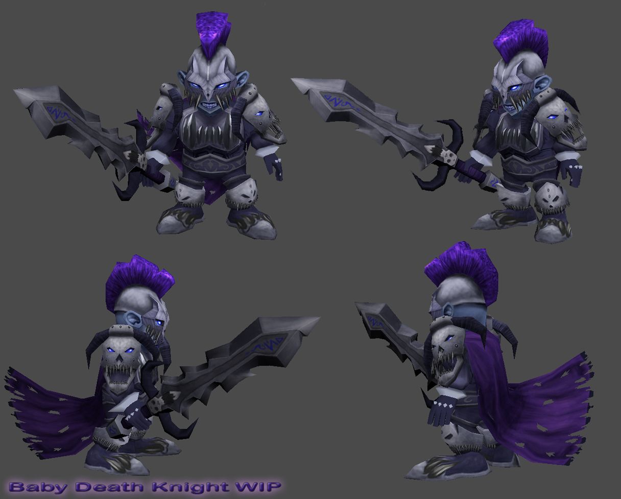
I hope you guys like him")
You will have to try and ignore some of the scruffy areas like the teeth on the boots, I have been playing around with all of the major forms etc trying to get the colour balance right. I still need to add some classic wear and tear to the character.
I am going to add some more alphas to the model to break up the hair and to add some cool aura glow to the eyes, as I still have 50 tri's to play with.
He is currently 1,950 tri's, The weapon is 320 tri's.
The character uses 2 256x256 textures and the sword is 128x256.
I might also have a play around and see what they look like at even lower resolutions.
I hope you guys like him
Replies
dpadam450 - Your right, it does seem pretty flat. I will see if I can work some more light into it, make the shoulders and helmet stand out.
I am hoping that the scratches and stuff will add to the contrast aswell.
-- UPDATE --
Here is a tiny update, I have managed to finish blocking everything in.
But yeah, looks pretty cool to me
I have also brightened up some of the armour but I am not sure if the knee pads are too bright now.
-- UPDATE --
I have managed to get lots done today. I still need to play around with the contrast and fine details.
I have added the extra planes to the hair to bring the character up to 2000 tri's.
I think I am going to make the skull on the sword much darker as it doesnt seem to fit in with the rest of the colours.