Helmet design
I'm currently working on a helmet for Planetside 2.
VS Templar Helmet (View in 3D)

Overall I'm happy with it, however some people seem to take issue with the T (or Y) piece on the front. I'm thinking the angles might be conflicting visually.
Here's some variant ideas I've been messing around with in PS.
1- Unchanged
2&3- ways to cut up the piece
4- removing the "brow ridge" unifying the center piece in with the surrounding mesh to make the y less apparent
5- altering the vertical green pieces to fill in the space, as well as removed brow ridge
6-8- changing the top green piece to a less angled, squared off version to make the angles on the y piece less jarring
Which, if any, is working best? Do you have any other suggestions?
Thanks in advance")
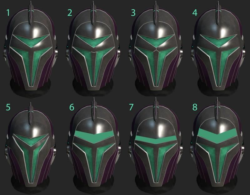
VS Templar Helmet (View in 3D)

Overall I'm happy with it, however some people seem to take issue with the T (or Y) piece on the front. I'm thinking the angles might be conflicting visually.
Here's some variant ideas I've been messing around with in PS.
1- Unchanged
2&3- ways to cut up the piece
4- removing the "brow ridge" unifying the center piece in with the surrounding mesh to make the y less apparent
5- altering the vertical green pieces to fill in the space, as well as removed brow ridge
6-8- changing the top green piece to a less angled, squared off version to make the angles on the y piece less jarring
Which, if any, is working best? Do you have any other suggestions?
Thanks in advance
Replies
I've posted this several places to get as much feedback as possible.
Here's a new sheet incorporating feedback I've received
VS Templar Helmetalt11 (View in 3D)