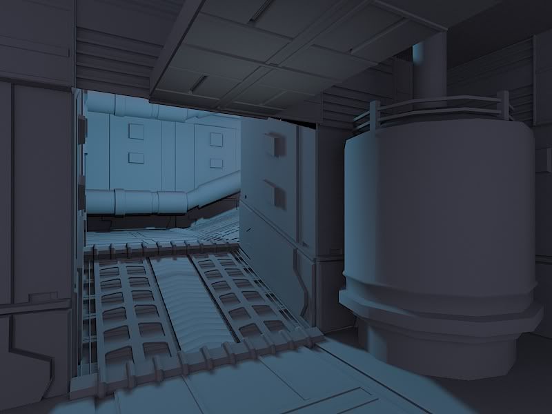
I've been working on this for a few days now. Do you guys recommend me using zbrush for the models for detail? The concept is from Visceral Games. Here is what I have so far.
Really isn't too much in there that would merit using zbrush at all. Maybe do add some dents to the nitrogen tank but its all hard surface stuff.
For your walkway, those holes appear to be modeled in right? I would consider using a tiled texture with opacity for holes. Also, your nitrogen tank doesn't have loops, the edges are quite noticeable. It stands out because it looks much lower than everything else in your scene.
Good start. But before you move further into detail, I think there is something wrong with the propportions. It MIGHT just be the camera lens, but your set looks somewhere between 30 and 50% too smallscale wise.
I would watch those major trip hazards. The ramp going up is nice and smooth, you have some type of hinge at the base and top of the ramp. The Ceiling should also be inset and beveled a bit higher. You can see an extruded bulkhead at the top left and piping down the center ceiling that's breaking up the linear ceiling. Details are looking good so far, good luck!
Thanks for the feedback. I went and imported the scene into unreal just to see how the proportions would look in game, tell me what you think...you guys mentioned the ramp looking off, is it the angle? Hey Kaburan Ill be lower the height of the hinges.
"The Ceiling should also be inset and beveled a bit higher." I didn't get you on this part can you do a quick overlay for me?
Textures have way too much noise. Also the lighting is too blue. If you look at concept, there are hints of warm yellows. Might be temp stuff dont really know.
Saturation is over the top, I agree about noise as well. Now there is problem for the eye to recognize the shapes, because it has a strong overall blue tint, there is also a resolution problem with the textures they look blurry and that is making the shapes look like jello.
Look how subtle are the tonal changes in the concept, thats what makes it strong, try breaking surfaces by material type, different types of metal, glass, cables, etc.
sorry to be a bit harsh btw! ice is not an easy shader to get it right.
I wanted to post this without lights and without the models and textures that weren't done.
haiddasalami- what would you recommend to achieve the ice affect?
How do you know when to let the lighting affect the color and when to paint it in?
Also for the textures that I posted up here, any suggestions or paint overs would help.
the concept you chose looks really nice and you have a solid base i think the one thing you really need to work on is the texturing and the way you construct your highpoly models.
Right now it seems like you haven't put a lot of thought into creating the textures and have rushed that process, it basically looks like you baked out some AO and slapped a metal texture onto it and changed the color to blue.
I would look more closely at the concept and try to get the same color values and detail that it has while trying to keep the noise levels in your textures down.
Also i would agree with ErichWK and try to achieve the snow effect from shaders as it looks like the effect/texture style your using right now is ruining the overall look of the piece.
Ive known you for awhile man so ill be blunt your scenes usually looked rushed like you want to get them done and out of the door quickly or there is a lack of thought put into them which results in poor execution.
I think if you buckle down and look at the concept again and spend some time on both the highpolygon model and textures you can really bust out a solid scene man.
below are some video tutorials i would recomend you look at before you take this scene any further.
My best advice right now again is to look at those tutorials and incorporate what you learn from them into this scene.
I know how hard it is to construct a scene but there's no point of even trying if your not gonna put your best foot forward, I hope i do not come off as an asshole because that's not my intention.
I genuinely want you to get better as an artist and grow your skill-set so you'll be able to get a job in the industry one day.
Yeah what Erich said. Do all your original textures clean, and then have it as another completely ice/frost texture (and shader that has more specular and even handles light differently) that is painted in via vertex colours. This will add more variety to the scene as areas that use the same textures can have different frosting, definitely helps breaks up the repetition too.
Also with your lighting, don't be afraid to have darker areas. More contrast in the lighting will create a much more moody scene and draw focus to particular areas and details. It's better to draw the eye to follow the path around the corner than to just be uniformly lit over the entire scene.
http://www.chrisalbeluhn.com/UDK_Advanced_Vertex_Painting.html
Also, Virtuosic's (he's doing The Pit scene currently in Pimpin and previews) Mesh paint tutorial that ae. linked, is really rad and really helpful. That guy does some pretty crazy shit. Also, your giant container on the right is..i dunno, Kinda low on the poly side. It's really distracting. This is for your portfolio, right? Buff it up a little and make it rounder
thinking about a reason to have ramps, I would go in the direction of, that there are some heavy stuff on wheels that need to be transported trough these corridors allot. There fore I would place as little obstacles that could block little wheels in these halls as possible. Those large ridges you have at the start and end of each ramp should be level with the ramp itself, as you can even see in the concept art, this is the case. This is also the part that Kaburan commented about.
"I would watch those major trip hazards. The ramp going up is nice and smooth, you have some type of hinge at the base and top of the ramp."
your scene has some sort of big rectangle thing in the middle of the ceiling. in the concept its some sort of bridge, hinting at a second floor above this. looking at your modeling, you realized this, even modeled it that way, but somehow when doing the low poly it slipped your mind?
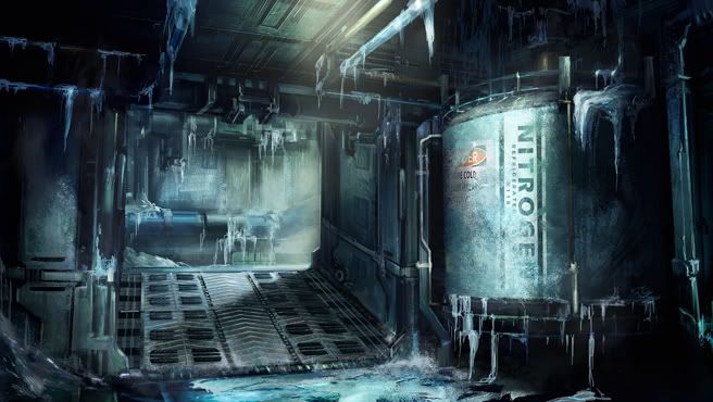
The blue of the material itself says a lot about it being cold. The intention of the concept is to convey the quality of a "cold room" they accomplished this with the color, icicles, and icing on the surface.
I would break those three elements down and find a way to visually communicate them using the tools you have.
An environment artist job isn't necessarily to copy, its to visually communicate something with the framework of technical limitations and the medium they are working in (in this case UDK).
Try to figure out the best way to capture the spirt of the scene that presented there using the tools you have.
One simple and fast option would be to tone down the ice you have in your texture a lot so its barely noticeable. Just a stippling of what you currently have.
Then use just a few decals to show some really icy spots making sure that the placement of those decals makes visual sense and doesn't break any other logical rules presented in the scene (ice being on top of a hot vent wouldn't happen for example).
Then make a few icicle meshes and place those around the room and ceiling. See how it looks work quickly, and stay focused on visually communicating things and not copying stuff. Might help you pull this off.
For the frost on cylinder effect, I would texture the metal adding a tint of blue (dont overdo it) and vertex blend in some frost. Also try to tone down the amount of noise in your textures.
thanks for all of the replies, Im going to go back and rework the highpoly in the scene and make it more interesting and once that is done then ill begin texturing again. I did some google searching for a good way to make an ice shader but have not found one yet. I am going to keep on looking.
Replies
For your walkway, those holes appear to be modeled in right? I would consider using a tiled texture with opacity for holes. Also, your nitrogen tank doesn't have loops, the edges are quite noticeable. It stands out because it looks much lower than everything else in your scene.
"The Ceiling should also be inset and beveled a bit higher." I didn't get you on this part can you do a quick overlay for me?
Look how subtle are the tonal changes in the concept, thats what makes it strong, try breaking surfaces by material type, different types of metal, glass, cables, etc.
sorry to be a bit harsh btw! ice is not an easy shader to get it right.
haiddasalami- what would you recommend to achieve the ice affect?
How do you know when to let the lighting affect the color and when to paint it in?
Also for the textures that I posted up here, any suggestions or paint overs would help.
the concept you chose looks really nice and you have a solid base i think the one thing you really need to work on is the texturing and the way you construct your highpoly models.
Right now it seems like you haven't put a lot of thought into creating the textures and have rushed that process, it basically looks like you baked out some AO and slapped a metal texture onto it and changed the color to blue.
I would look more closely at the concept and try to get the same color values and detail that it has while trying to keep the noise levels in your textures down.
Also i would agree with ErichWK and try to achieve the snow effect from shaders as it looks like the effect/texture style your using right now is ruining the overall look of the piece.
Ive known you for awhile man so ill be blunt your scenes usually looked rushed like you want to get them done and out of the door quickly or there is a lack of thought put into them which results in poor execution.
I think if you buckle down and look at the concept again and spend some time on both the highpolygon model and textures you can really bust out a solid scene man.
below are some video tutorials i would recomend you look at before you take this scene any further.
Tutorials:
http://www.3dmotive.com/product-udk-mesh-paint
http://www.3dmotive.com/product-high-poly-modeling
http://eat3d.com/texturing
My best advice right now again is to look at those tutorials and incorporate what you learn from them into this scene.
I know how hard it is to construct a scene but there's no point of even trying if your not gonna put your best foot forward, I hope i do not come off as an asshole because that's not my intention.
I genuinely want you to get better as an artist and grow your skill-set so you'll be able to get a job in the industry one day.
Cheers,
Arman
Also with your lighting, don't be afraid to have darker areas. More contrast in the lighting will create a much more moody scene and draw focus to particular areas and details. It's better to draw the eye to follow the path around the corner than to just be uniformly lit over the entire scene.
Keep at it
http://www.chrisalbeluhn.com/UDK_Advanced_Vertex_Painting.html
Also, Virtuosic's (he's doing The Pit scene currently in Pimpin and previews) Mesh paint tutorial that ae. linked, is really rad and really helpful. That guy does some pretty crazy shit. Also, your giant container on the right is..i dunno, Kinda low on the poly side. It's really distracting. This is for your portfolio, right? Buff it up a little and make it rounder
"I would watch those major trip hazards. The ramp going up is nice and smooth, you have some type of hinge at the base and top of the ramp."
your scene has some sort of big rectangle thing in the middle of the ceiling. in the concept its some sort of bridge, hinting at a second floor above this. looking at your modeling, you realized this, even modeled it that way, but somehow when doing the low poly it slipped your mind?
I would break those three elements down and find a way to visually communicate them using the tools you have.
An environment artist job isn't necessarily to copy, its to visually communicate something with the framework of technical limitations and the medium they are working in (in this case UDK).
Try to figure out the best way to capture the spirt of the scene that presented there using the tools you have.
One simple and fast option would be to tone down the ice you have in your texture a lot so its barely noticeable. Just a stippling of what you currently have.
Then use just a few decals to show some really icy spots making sure that the placement of those decals makes visual sense and doesn't break any other logical rules presented in the scene (ice being on top of a hot vent wouldn't happen for example).
Then make a few icicle meshes and place those around the room and ceiling. See how it looks work quickly, and stay focused on visually communicating things and not copying stuff. Might help you pull this off.
Anyways hope that helps.
For actual ice, look at references of ice and just experiment with using normal map to do most of the work.
http://www.talesofmikkimoto.com/wp-content/uploads/2008/12/shoveling-out-car.jpg
Have a look at the way snow and ice behaves. Notice that ice is that notisable in the first place.
http://www.lucypaintbox.org.uk/Photo-gallery-frost-ice/frost-0712-1412-lucy-paintbox.jpg
Look at how frost isnt really white. its just desaturating and lighting the material behind it.
hope this helps.