I need help with some lighting/composition, please?

polycounter lvl 18
Hey guys,
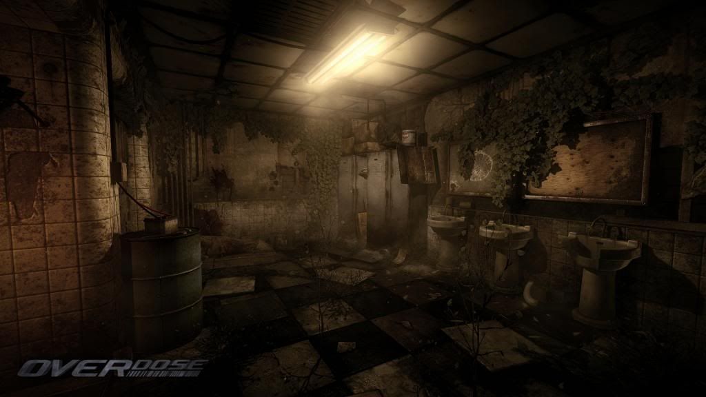
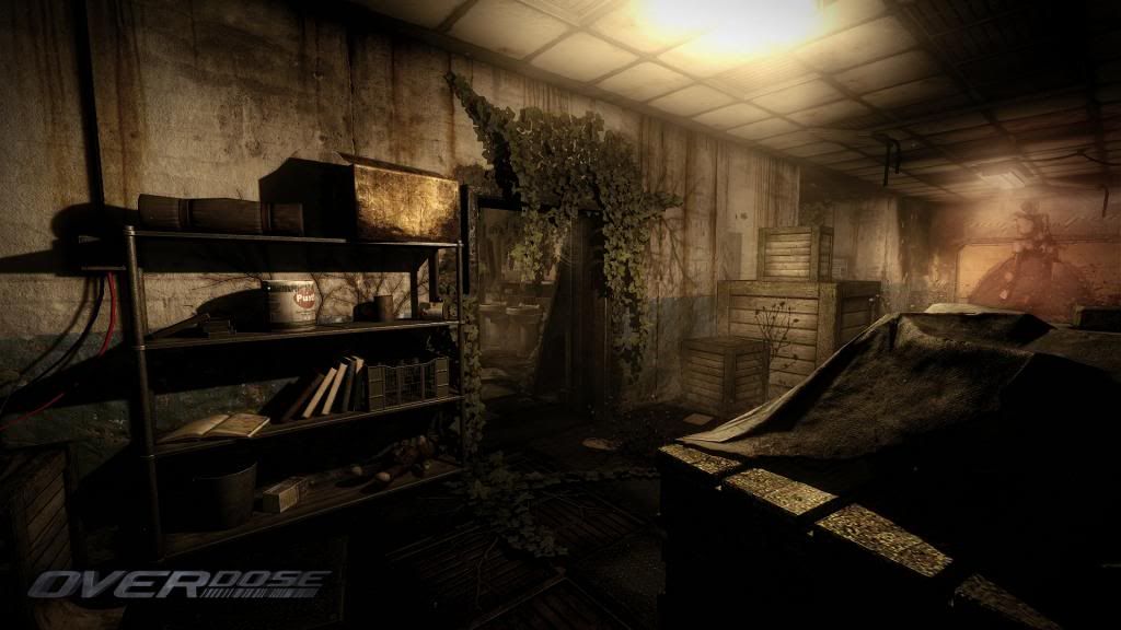
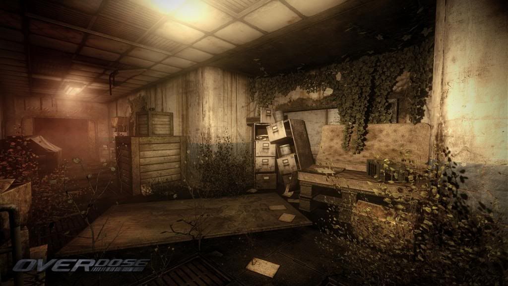
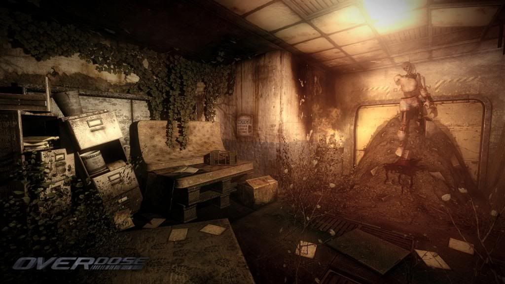
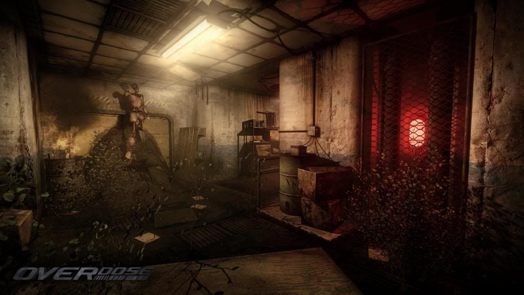
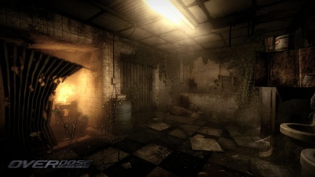
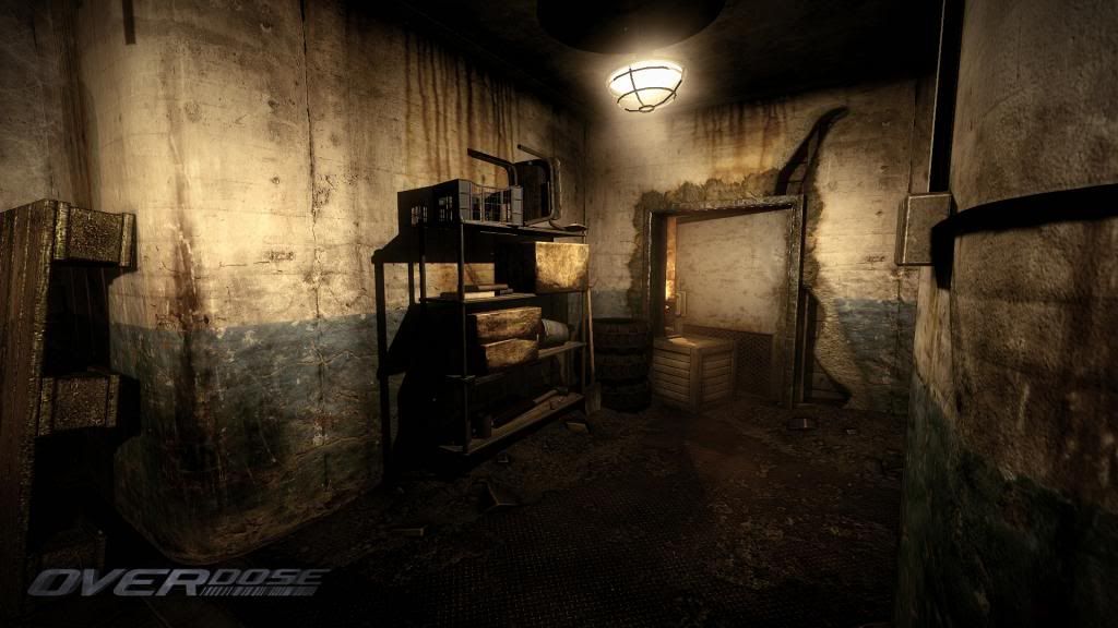
Aside from the usual comment of "dog shit brown" or "piss filter yellow", I'm trying to add some colour and focal points to this small section so that it doesn't all look quite so bland and flat. ATM, even though its full of shadow, it all really does come over as quite the flatly lit area.
Any suggestions would be awesome, cheers.
Game is OverDose btw, revamped id Tech 2. 1080p uncompressed shot link below each pic:
http://i1196.photobucket.com/albums/aa409/Gavavva/shot_0000.jpg~original

http://i1196.photobucket.com/albums/aa409/Gavavva/shot_0001.jpg~original
http://i1196.photobucket.com/albums/aa409/Gavavva/shot_0002.jpg~original
http://i1196.photobucket.com/albums/aa409/Gavavva/shot_0003.jpg~original
(Theres a f;are bug in this shot, top right. ignore for now)
http://i1196.photobucket.com/albums/aa409/Gavavva/shot_0004.jpg~original
http://i1196.photobucket.com/albums/aa409/Gavavva/shot_0005.jpg~original
http://i1196.photobucket.com/albums/aa409/Gavavva/shot_0006.jpg~original
http://i1196.photobucket.com/albums/aa409/Gavavva/shot_0007.jpg~original
http://i1196.photobucket.com/albums/aa409/Gavavva/shot_0008.jpg~original

http://i1196.photobucket.com/albums/aa409/Gavavva/shot_0009.jpg~original
Aside from the usual comment of "dog shit brown" or "piss filter yellow", I'm trying to add some colour and focal points to this small section so that it doesn't all look quite so bland and flat. ATM, even though its full of shadow, it all really does come over as quite the flatly lit area.
Any suggestions would be awesome, cheers.
Game is OverDose btw, revamped id Tech 2. 1080p uncompressed shot link below each pic:
http://i1196.photobucket.com/albums/aa409/Gavavva/shot_0000.jpg~original
http://i1196.photobucket.com/albums/aa409/Gavavva/shot_0001.jpg~original
http://i1196.photobucket.com/albums/aa409/Gavavva/shot_0002.jpg~original
http://i1196.photobucket.com/albums/aa409/Gavavva/shot_0003.jpg~original
(Theres a f;are bug in this shot, top right. ignore for now)
http://i1196.photobucket.com/albums/aa409/Gavavva/shot_0004.jpg~original
http://i1196.photobucket.com/albums/aa409/Gavavva/shot_0005.jpg~original
http://i1196.photobucket.com/albums/aa409/Gavavva/shot_0006.jpg~original
http://i1196.photobucket.com/albums/aa409/Gavavva/shot_0007.jpg~original
http://i1196.photobucket.com/albums/aa409/Gavavva/shot_0008.jpg~original
http://i1196.photobucket.com/albums/aa409/Gavavva/shot_0009.jpg~original
Replies
Since I know a bit of OverDose mapping, I know the restrictions you're working with. I also know how this maps moves and behaves, even if I haven't actually tried out the build with the new particle system, so I do take that in account.
I'll see if I'm able to do a paintover later this evening, but here are my inital thoughts.
Composition:
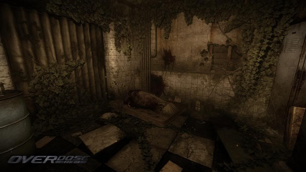
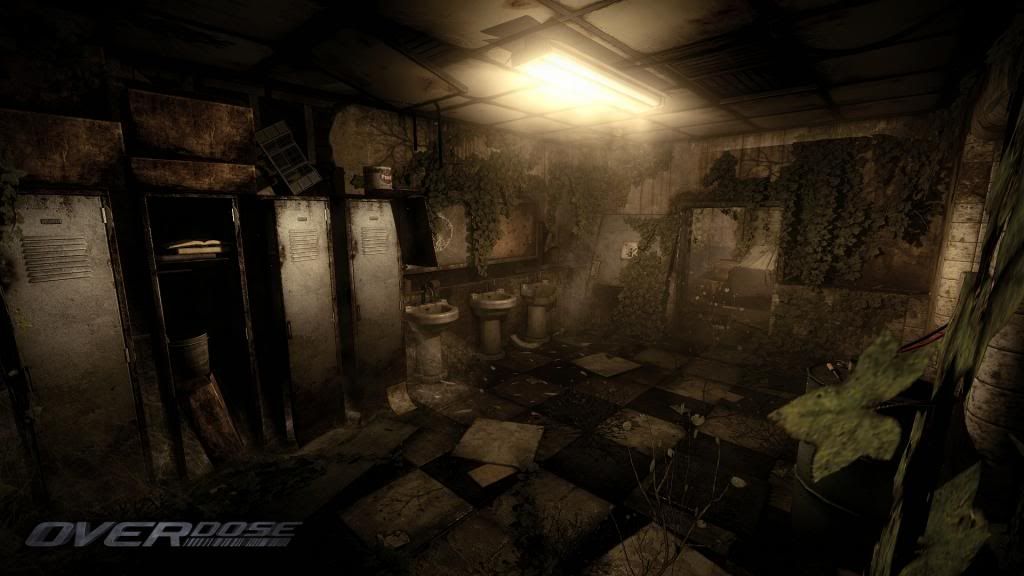
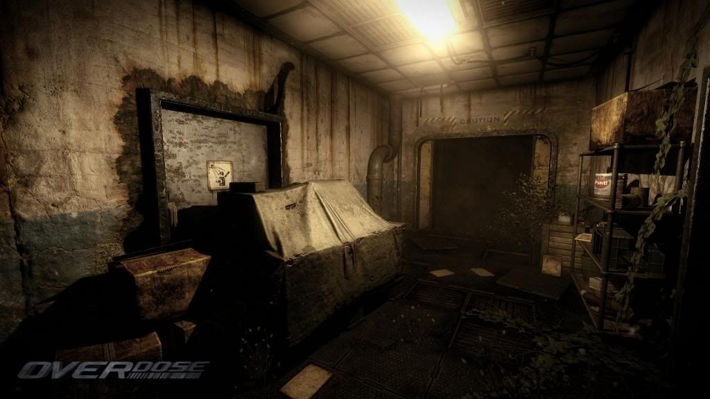
As usual, your props are well made, but you don't need that many fillers, specifically the foliage coming out of the floor makes it look buzy, as they more than often just show up as dark streakish things, or makes it difficult to focus on the silhouttes behind them. You might be able to reduce their impact by just scaling them down quite a bit. I know this isn't a easy task with the editor, but I would recommend you to try and strip out things that really don't add anything to gameplay, if this map is intended as such.
Lighting:
You won't get away with the "dog shit brown" or "piss filter yellow" unless you start using contrasting lights, atm most of the things are lit with warm colors, a yellowish light from the ceiling lights and redish light from the alarm strobes/lights. You could probably give the map more depth if you added a blue hue to the fog you're using in the map, aswell as trying to experiment with different light setups (blue hue flourcent lights vs red/yellow strobes).
Effects:
The bathroom has good lighting, it fits with the dark shadows and it seems like you have worked on your atmospherics there more than the rest of the place. I suggest you try and add the same type of atmospherics there aswell.
I'm sure you can up with other ways to enhance the atmospherics with the new particle system.
That's it for now. Keep at it and keep going!
On the plus side... The editor is coming
Neon lights are weaker than normal light bulbs and I find my eye adjusting to them quicker, so it never seems that strong at least to me. They also expire quicker and in this environment, most likely a few of them wouldn't work. I would tone them down a bit (at least to a state where you can see their shape clearly), and I would make a few of them broken where the burning barrel is. Also the plants would grow from between the floor panels and if a lot of people have passed through the hallways, they would have stepped over them.
Can't wait to see more of it !
I think one big problem with the lighting is it's consistency. Same light source(more or less), Same color, Same intensity, etc. I think it would be very beneficial to change up where light is coming from. Add some lamps that sit waste high, maybe have some of the hanging lights torn down off of the ceiling and put them on the floor. Maybe in the room with the red light, you use only that red light and all other lights are broken/burnt out.
Along with changing the consistency of the placement, I would also add some variance in the quality of light. Meaning, Maybe every so often one out of the two bulbs is burnt out, and emits half the light. Or perhaps there is a plastic cover over some of them that is really dirty and occludes a lot of the light emitted. Right now the lights are so bright it illuminates everything in the room pretty well. Which is fine, but for a more suspenseful and dramatic set up I would imagine you'd want the lights dim enough for corners of the room to start occluding. I think would help a lot with the images mentioned flatness at the current moment. from left to right, front to back, every wall/floor/surface receives a similar value and makes it feel shallow. More contrast in the scene will help things pop a bit more I think.
That combined with adding a little more contrast in saturation I think you would be looking pretty good!
I'm by no means a lighting expert, but I do know that contrast= Drama. Research chiaroscuro in painting and photography to get a better idea of where i'm coming from in saying that.
My main thought when it comes to awesome lighting is Bioshock. Check out really any 3 of the games (interiors) and see how they handled things. Should get you in a solid direction.
*Gif removed to avoid confusion*
Basically, you need to reduce your yellows by decreasing your green and blue channel, add bluish/turqois - fog/particles. Remove thin type of foliage to reduce noise. Bring out the actual color of your props, don't wash your environment with the color of your light to much.
Also, you can create also vertex paint/color your ivys to go from browns to greens or to control saturation.
Also, s6, what you're suggesting is basically SSAO/HBAO, which OverDose doesn't support anymore, it used to have it, but was removed for performance reasons.
Perhaps the paintover was misleading.
Turning down the radius of the light and experimenting with a more immediate falloff (low attenuation) would naturally darken the corners/edges (furthest points from the light source) and create much more contrast. I think things like post process and hue are just a matter of opinion/artistic choice. Really depends on what kind of feel you're going for.
I personally like Sams suggestion for hue/light quality a bit better. Reminds me of Rage.
My main point here being: contrast is king. Every scary/suspenseful/dramatic game I can think of has had a high contrast chiaroscuro type of lighting.
.02
Nah, sorry for jumping to conclusions to soon, obviously you were talking about compositional contrast, my bad!
I think Odium needs to describe what type of mood he is going for in order to get more defined help.
http://i1196.photobucket.com/albums/aa409/Gavavva/shot_0000-1.jpg~original
http://i1196.photobucket.com/albums/aa409/Gavavva/shot_0001-1.jpg~original
http://i1196.photobucket.com/albums/aa409/Gavavva/shot_0002-1.jpg~original
http://i1196.photobucket.com/albums/aa409/Gavavva/shot_0003-1.jpg~original
Trying to get more contrast/light in those areas might help. Maybe light thats kinda pouring in from the next room or something.
I think others have talked to main points - Color, lack of interest/importance/focal elements, light attenuation, etc.
Is starting from scratch an option? Is using 1 light an option? I think if you're able to have a clean slate and ask yourself what you'd like the viewer to pay attention to, you'd set yourself up for more success. Right now, if you were to ask me what you wanted me to pay attention to, I'd say...everything.
Like the picture from Bioshock Infinite that s6 posted, there's no way around that focal point. There's great color, contrast, and atmosphere, but your eye can't avoid the obvious. *What isn't important isn't lit as strongly, and while it's still appealing, it doesn't detract from the main focal element in the scene.
The answer isn't to throw more light at the scene, the answer is to do more with less. This is why I'm suggesting starting with 1 light - 1 focal source. Just like a scene shouldn't have 10 focal points, your lighting shouldn't have 10 equally competitive sources.
Can you look at each composition and try to tell a story? Figure out what you want us to see? Sure, you can try multiple focal points, but a problem I see in your scene is that everything feels equally important - light is playing pretty evenly across most of the image.
To remedy, work on the light intensity, attenuation, and then bounce. Your indirect/bounced lighting is really washing you out. Those booming reference images that s6 posted shows strong motivated lighting without a ton of indirect light filling in the blanks.
If you're using point lights (which some of the images look that way), consider spots. Whatever light you're using seems to give an even wash in all directions and I'd like to see the sourced lighting move with fluidity and directionality rather than touching all surfaces in a similar manner. Concerning surfaces, what's there tends to be gritty and warm, so light will play against these textures pretty similar. That's why you were having a monochromatic look in earlier iterations. I think you're making improvements there.
Finally, I'd like to feel the depth of your scene a bit more. There's something there that feels hazy, washy, and it makes everything feel muddled together. Can you create separation with some crisp blacks in the foreground? Have that foreground sit over and illuminated mid ground?
I'm not sure any of that was useful, I kind of just threw out a bunch of ideas. If you're looking for some tips (self promotion), here's a piece I just wrote if you're interested. You might find some cool stuff there (or not):
http://jcricreate.blogspot.com/2014/01/jons-lighting-journal-2013-edition.html
Hope there was something there that helped,
Love,
-Jon
However...
Having said that, I certainly am taking it all onboard. But "remaking it all from scratch" isn't an option.
Perhaps you could try a warm color spilling out from decision points in your level (ie the doorways) and the overhead lights a cooler tone. Once you have some clear player paths then focus on the secondary lights.