I am sure that I have posted most of these shots on"what are you working on now" but the more people that get to see my work the better chance of getting a job.
great to see you're still working your butt off david! you should crop out window frames and hide editor grid lines where you can, etc. for a better presentation. you're getting better, keep it up! the plane looks great, that will be a nice portfolio piece. it has some shading errors near the edges here and there, nip those in the bud.
Thanks Cory, Ill start cropping out where it says editor. I have been working on the level for a few months now and I will finish it one day, hopefully sooner than later. For the jet I am waiting for my client to circle what he wants changed and then its on to the texturing. Anyway arigato for the kind words.
1) the scene still looks really busy like your just throwing things in there to fill it out
what i would do is make sure to only add things if you really need them if you want to make the place more populated id suggest throwing down some garabge and such.
2) my only other crit is to get rid of things in your portfolio that you dont need anymore, some of your stuff needs to be let go like this:
You have too many materials in those ingame shots. Too many different metals, too many different kinds of horizontal flowing dark lines in them too etc.
Its overkill, noisy, busy, cant focus, hard to read and see a grand design or idea behind it all... too random ...and so on.
If you look at the last screenshot, you have 4 different metals in that small area of floor you can see. 4 different wall metals, plus all the props and ceiling sporting something else again.
You should reduce that. Find a main metal surface you like and use it as base for most of the walls.
Pick a secondary darker and rustier from the bunch and use it for the details and trims.
Same with the floors. lose the yellow or orange inbetween the floor panels, use instead a darker or brighter, shinier aluminum which would look more believable.
THat will make the orangish fllor trim separating the panels floor from the room floor stand out more as a unique division.
Then symplify some of the textures, give them less but larger details that are still cool but dont add too much noise when repeating.
I would try to think of the overall design a little. Think of the presentation of your focus points. Gather ideas from existing architectural places.
A focus place in a church/cathedral would be the altar. Similar for a temple or throne etc... there will usually be a stark contrast between the focus point and the rest of the building.
Either a empty area and/or elevated platform, sorrounding the altar, better lighting, statues and ornaments behind or around the altar etc. All hints that tell us that whatever is there is special.
That easily translates into Scifi too, a less noisy, simplier and better lit area around your focus points, statues translate into large/heavy SciFi machinery or pipes around it drawing your attention at a distance and elevated platforms with lit stairs or a flat floor with painted or lit stripes around the area or flowing to the area guiding you (etc etc etc.).
Concentrate your love on making those areas great, and noone will care much if the rest isn't great, people remember the amazing altars and statues around it, not the simple benches and dusty floor of the rest of the less lit cathedral.
I went and took out the ceiling meshes and just put the basic metal texture up there. I also changed two of the lights and gave it a different color to bring out the robotic arm.
Is this to obviously, should I just model out a different light and put it on the ground.
I love your modeling work but I will reiterate what StrangeFate said. There seems to be no focus at all. The main issue as I see it is that there are too many points of light. It distracts my eyes and actually confuses me a bit. The lights on all the crates are reeeealy distracting. If you don't want to get rid of their glow all together I would dim them a lot.
I would try changing your lighting to create more depth to the environment and to create focus points of where you would want the player (or viewer) to look.
Bright lights really draw the focus of the player. In particular horizontal neon lights. Lighting should always in my opinion take into account what the player is thinking as well as objectives. If the objective is simply to get the player from one end of the corridor to another then a bright light at the end of the tunnel will do this easily enough. Try not to make it to obvious though because you don't want the player knowing they are being lead.
Ill a example to show what I am talking about.
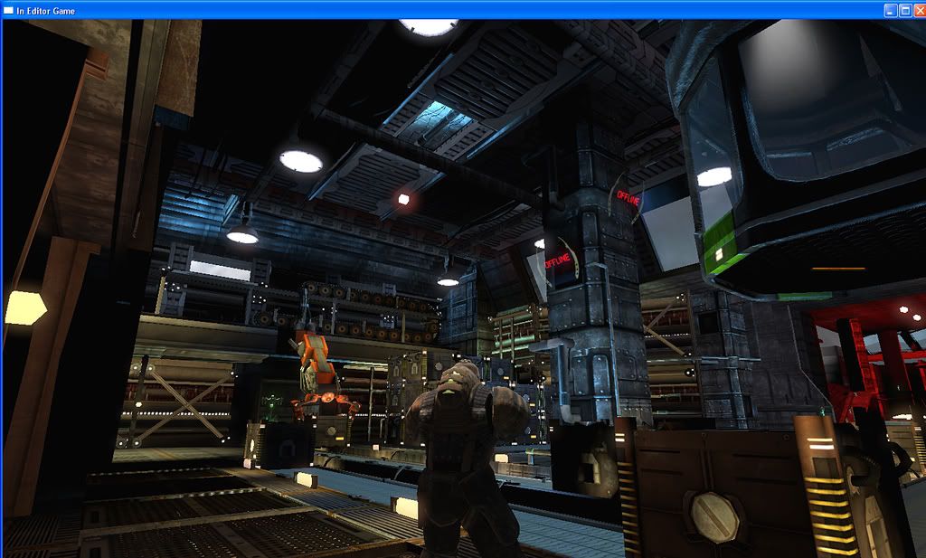
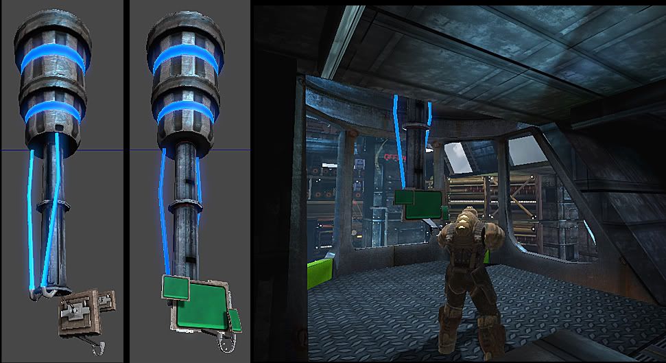
Lets say that the control consul room behind the glass in this pic is your current objective (or just where you need to get to.) The door leading to a cooridor with stairs that lead up to that room is pointed by a green arrow in above pic.
First thing I would do is darken up the area lighting around the glass, allowing the neon lights behind the glass shine through into the room. This would make the room a focal point and easily draw the players attention.
If the door is where I pointed to then your horizontal lights on the back wall are well placed because it makes my eyes kind of "flow" to the doorway. However looking at other pics I see that the while room is wrapped around by this light. I would try to refrain from this or you could possibly change the color to a darker one. You should also darken up your ceiling areas and recessed areas so your lighting doesn't look so flat. You seem to be using so many lights that there are no shadows at all.
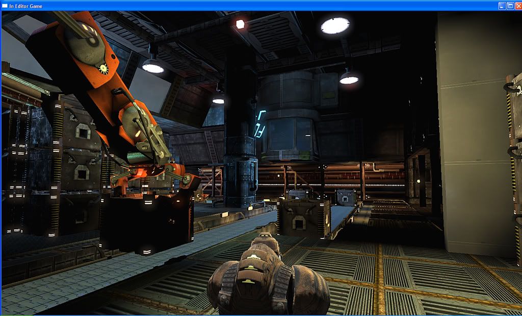
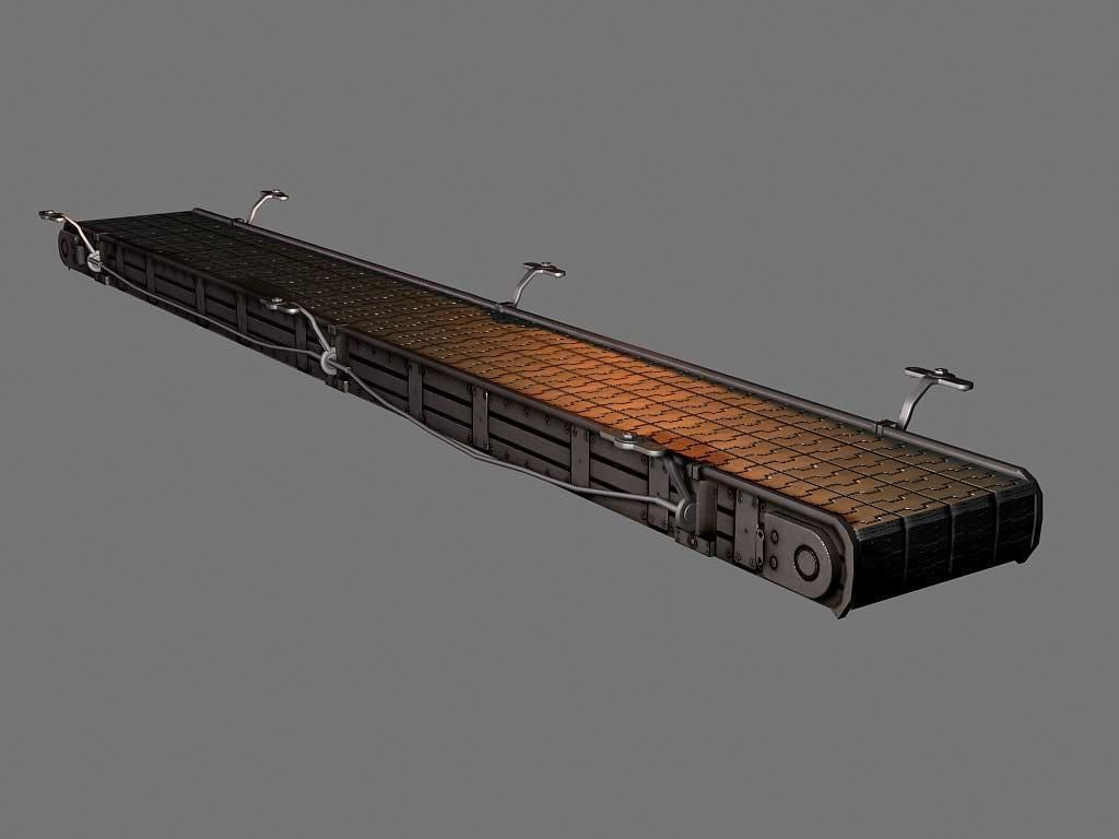
The conveyer also creates a nice flow in directing the player in that direction.
One thing I would suggest for this example is that you animate the crane and conveyer system, then only make the crates on the conveyer light up. This will also draw the player in that direction.
Thanks for the detailed advice. I went to the main light and lower it down and then I went and lowered the glow on the wall and the crates.
I just wanted a sci atmosphere, led lighting everywhere, hopefully on the screens there will be moving text and graphics.
The idea is that there will be rockets behind the robotic arm. the player takes the elevator up and clicks the trigger in the control room and the arm moves up allowing the player to go down and pick up the weapon and also could be used to trap players inside of the trailer where the rockets are. The glass in the control room will be breakable (hopefully) so it wont be so hard to grab the rocket after opening it.
The crates on the conveyor belt are for cover.
ok so I went back and deleted the lights and then placed some lights in the gameplay areas and then put a few in the middle to get an overall lighting in there. Also turned off the glow on the crates and walls, though I thought it would help sell the scifi effect but I don't want it to be distracting either.
Just some updated pictures. Lighting is not final, I have been working on this for a while. I went in and tried to break this room up by taking the main wall model and taking the texture on it and duplicating it and changing it a little bit.
This is the first time I've seen this thread. All my initial thoughts seemed like basic advice so I scrolled up and noticed SnowGhost said it already, and he was reiteration of StrangeFate. Based on these, is it even worth it to give any feedback since you're not paying it any mind? Either way, I'm going with it.
High Poly work of individual meshed seem pretty good, but this level work is a junker. It's all lines, boxes and noise. You have one unique detail per room (circle thing, giant robot arm) plotting it down in a giant box room and using one floor path tile, one main wall tile. There not focus, no support, no trim. Therefore, you're ending up with all your effort and good work lots in a giant pile of wtf. Long story short, you're thinking too big about the level layout, and not tight, acheivable goals.
A simple plan of correction would be recreate individual rooms as a small, central focus point to show off your work and create a good looking sci-fi hall to connect them. Again, the scope here is totally out of your league unless you want to be pounding on it for the next year or so.
Here's how I would handle two rooms of these assets.
First is an environment design to enhance your centerpiece asset.
Thanks Cholden, I just want to say is that I did read what others have written above you and I tried to make it less noisy by reducing the lighting on the crates and getting rid of the main texture that was on the floor and going with a more generic seamless metal texture. The reason I choose to make a level was because Ive had several chances of getting a job but the lack of having real industry experience has held me back. I had an interview over the phone with a game company and they loved my art but my lack of actual object placement within a world, I did not get the job. This has encouraged me to make something playable, a small team based death match was the idea.
Cholden, I do appreciate the paint over, I would like you to look at the layout design, or thought process that I had and then give ideas off that. I just want to say, its more about me not understanding the advice rather than not listening to it... I want to be better and I want to get out of this BOX mentality but this seems to be the most difficult part for me as an artist.
I am trying hard to break up this room that I have been working on for a while by using different models , decals. I just need more experience in being able to place focus in the level, i know what MY focus is for the player but to convey that is more difficult than expected.
I've had a lot of my play lately, hadn't hadtime to get back to this. Oh and I did get your pm as I was putting this together.
Yeap, seeing this layout the scope is out of the range of assets created. To keep things short, you've got a big ass room and not enough art to fill it. It's fun to dream about huge team maps, but they are huge. As you said you need work presented in a game.
What you need:
Two room centerpieces (robot arm and power weapon circular deal). These are roughly complete.
Main material; basic, low contrast with nice specular. This should be a metal (since this is sci-fi) that unifies all metal materials in the environment. As in, they are all based on the level of wear/tear/rust/color/etc presented in this material. Think of this material like the walls of your room or the brick of a castle, it's everywhere.
walkway and support structure; I pooled these together because these are the two main thing the player will see while navigating an environment. Walkway seems self explanatory as the surface used to guide the player through the environment. Support is used to break up the walls, add depth and believability to a scene.
hall and collar; to connect areas you'll need a modular hallway piece, and to visually snap these two together you'll need a collar. Some sort of large opened airlock style door tends to work for these types of environments. People make these all the time, in fact, here's a recent example: http://boards.polycount.net/showthread.php?t=65374
light sources; Lights have to come from somewhere. Building small ambient lights into your walkways and support is useful. No need to get crazy with these, since a nice glowing effect and recognizable light shape tends to handle this.
Hard to grasp all of what you've accumulated through what's already posted, but it looks like you may have it all short of unification of material, quality and organizing into a neat, presentable package. Normally, I'd think about things like visibility, flow, game play, etc, but that doesn't present itself as important here. We're going to narrow the focus down to three distinct areas, power weapon room, robo-conveyor room and the connecting hallway.
Rooms build for some wacky design and not to show off the work involved. I've been guild of this before too, but as an artist presenting art you have to get over this now. Forget some neat design or cool level trick. Your rooms need to be specifically built to present your art.
Replies
i got a few crits if thats ok:
1) the scene still looks really busy like your just throwing things in there to fill it out
what i would do is make sure to only add things if you really need them if you want to make the place more populated id suggest throwing down some garabge and such.
2) my only other crit is to get rid of things in your portfolio that you dont need anymore, some of your stuff needs to be let go like this:
http://www.dwbailey.com/images/barricadeprops.jpg
http://www.dwbailey.com/images/knifeWEB.jpg
http://www.dwbailey.com/images/ICECREAMTRUCK.jpg
nice jet btw
Its overkill, noisy, busy, cant focus, hard to read and see a grand design or idea behind it all... too random ...and so on.
If you look at the last screenshot, you have 4 different metals in that small area of floor you can see. 4 different wall metals, plus all the props and ceiling sporting something else again.
You should reduce that. Find a main metal surface you like and use it as base for most of the walls.
Pick a secondary darker and rustier from the bunch and use it for the details and trims.
Same with the floors. lose the yellow or orange inbetween the floor panels, use instead a darker or brighter, shinier aluminum which would look more believable.
THat will make the orangish fllor trim separating the panels floor from the room floor stand out more as a unique division.
Then symplify some of the textures, give them less but larger details that are still cool but dont add too much noise when repeating.
I would try to think of the overall design a little. Think of the presentation of your focus points. Gather ideas from existing architectural places.
A focus place in a church/cathedral would be the altar. Similar for a temple or throne etc... there will usually be a stark contrast between the focus point and the rest of the building.
Either a empty area and/or elevated platform, sorrounding the altar, better lighting, statues and ornaments behind or around the altar etc. All hints that tell us that whatever is there is special.
That easily translates into Scifi too, a less noisy, simplier and better lit area around your focus points, statues translate into large/heavy SciFi machinery or pipes around it drawing your attention at a distance and elevated platforms with lit stairs or a flat floor with painted or lit stripes around the area or flowing to the area guiding you (etc etc etc.).
Concentrate your love on making those areas great, and noone will care much if the rest isn't great, people remember the amazing altars and statues around it, not the simple benches and dusty floor of the rest of the less lit cathedral.
Is this to obviously, should I just model out a different light and put it on the ground.
I would try changing your lighting to create more depth to the environment and to create focus points of where you would want the player (or viewer) to look.
Bright lights really draw the focus of the player. In particular horizontal neon lights. Lighting should always in my opinion take into account what the player is thinking as well as objectives. If the objective is simply to get the player from one end of the corridor to another then a bright light at the end of the tunnel will do this easily enough. Try not to make it to obvious though because you don't want the player knowing they are being lead.
Ill a example to show what I am talking about.
Lets say that the control consul room behind the glass in this pic is your current objective (or just where you need to get to.) The door leading to a cooridor with stairs that lead up to that room is pointed by a green arrow in above pic.
First thing I would do is darken up the area lighting around the glass, allowing the neon lights behind the glass shine through into the room. This would make the room a focal point and easily draw the players attention.
If the door is where I pointed to then your horizontal lights on the back wall are well placed because it makes my eyes kind of "flow" to the doorway. However looking at other pics I see that the while room is wrapped around by this light. I would try to refrain from this or you could possibly change the color to a darker one. You should also darken up your ceiling areas and recessed areas so your lighting doesn't look so flat. You seem to be using so many lights that there are no shadows at all.
The conveyer also creates a nice flow in directing the player in that direction.
One thing I would suggest for this example is that you animate the crane and conveyer system, then only make the crates on the conveyer light up. This will also draw the player in that direction.
I just wanted a sci atmosphere, led lighting everywhere, hopefully on the screens there will be moving text and graphics.
The idea is that there will be rockets behind the robotic arm. the player takes the elevator up and clicks the trigger in the control room and the arm moves up allowing the player to go down and pick up the weapon and also could be used to trap players inside of the trailer where the rockets are. The glass in the control room will be breakable (hopefully) so it wont be so hard to grab the rocket after opening it.
The crates on the conveyor belt are for cover.
this is the high poly for the bullet casting.
High Poly work of individual meshed seem pretty good, but this level work is a junker. It's all lines, boxes and noise. You have one unique detail per room (circle thing, giant robot arm) plotting it down in a giant box room and using one floor path tile, one main wall tile. There not focus, no support, no trim. Therefore, you're ending up with all your effort and good work lots in a giant pile of wtf. Long story short, you're thinking too big about the level layout, and not tight, acheivable goals.
A simple plan of correction would be recreate individual rooms as a small, central focus point to show off your work and create a good looking sci-fi hall to connect them. Again, the scope here is totally out of your league unless you want to be pounding on it for the next year or so.
Here's how I would handle two rooms of these assets.
First is an environment design to enhance your centerpiece asset.
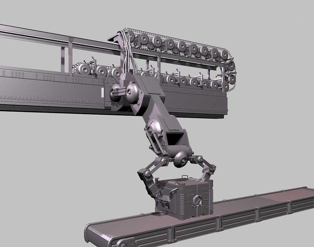
Second is the robot arm assembly line.
Cholden, I do appreciate the paint over, I would like you to look at the layout design, or thought process that I had and then give ideas off that. I just want to say, its more about me not understanding the advice rather than not listening to it... I want to be better and I want to get out of this BOX mentality but this seems to be the most difficult part for me as an artist.
I am trying hard to break up this room that I have been working on for a while by using different models , decals. I just need more experience in being able to place focus in the level, i know what MY focus is for the player but to convey that is more difficult than expected.
Yeap, seeing this layout the scope is out of the range of assets created. To keep things short, you've got a big ass room and not enough art to fill it. It's fun to dream about huge team maps, but they are huge. As you said you need work presented in a game.
What you need:
Two room centerpieces (robot arm and power weapon circular deal). These are roughly complete.
Main material; basic, low contrast with nice specular. This should be a metal (since this is sci-fi) that unifies all metal materials in the environment. As in, they are all based on the level of wear/tear/rust/color/etc presented in this material. Think of this material like the walls of your room or the brick of a castle, it's everywhere.
walkway and support structure; I pooled these together because these are the two main thing the player will see while navigating an environment. Walkway seems self explanatory as the surface used to guide the player through the environment. Support is used to break up the walls, add depth and believability to a scene.
hall and collar; to connect areas you'll need a modular hallway piece, and to visually snap these two together you'll need a collar. Some sort of large opened airlock style door tends to work for these types of environments. People make these all the time, in fact, here's a recent example: http://boards.polycount.net/showthread.php?t=65374
light sources; Lights have to come from somewhere. Building small ambient lights into your walkways and support is useful. No need to get crazy with these, since a nice glowing effect and recognizable light shape tends to handle this.
Hard to grasp all of what you've accumulated through what's already posted, but it looks like you may have it all short of unification of material, quality and organizing into a neat, presentable package. Normally, I'd think about things like visibility, flow, game play, etc, but that doesn't present itself as important here. We're going to narrow the focus down to three distinct areas, power weapon room, robo-conveyor room and the connecting hallway.
Rooms build for some wacky design and not to show off the work involved. I've been guild of this before too, but as an artist presenting art you have to get over this now. Forget some neat design or cool level trick. Your rooms need to be specifically built to present your art.
Look at this image for example, THIS is how you WANTED people to see all your hard work. http://www.dwbailey.com/images/highpoly_02.jpg
But somehow it ended up like this, and unless we KNEW it was supposed to be in there, we'd never know. It's turned into 2 shades of blue blobs at best. http://i93.photobucket.com/albums/l74/spawn85027/lightingidea.jpg
Anyway, going back to my last post, and condensing the layout you posted.
woof, I've already typed too much here.