Home 3D Art Showcase & Critiques

Fordson Snow Motor "Snow Devil"

Hey guys. I decided to work on this cool tractor converted to be a screw-driven snowmobile. Crits always appreciated.

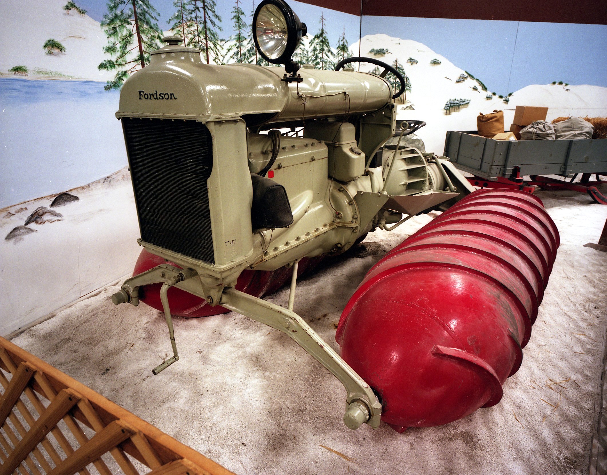
Reference - For more just google "Fordson Snow Devil"

Update:

Still very much WIP, but I've been having fun with the texturing and doing a little warhammer-esque stand for it!

Update: I adjusted the lighting after dealing with my gamma issues. Does this look more appropriate? Also a bit of an update to the textures. Started adding in some nettles also :) Let me know what you think. Bear in mind that it's very WIP, don't shout at me for obvious seams/missing gloss etc :) Mainly it's more generalised feedback I'd like at the moment.

j2XwXf0.jpg
ZMKNkFd.jpg
u4kwzkH.jpg

Replies

  • ghaztehschmexeh
    Current progress on the high poly

    6fb91afa31.jpg
  • ghaztehschmexeh
    Small update. Mainly just need to do the exhaust system, front suspension and some minor detailing. Any crits would be welcome.

    ee4f576706.jpg
  • ghaztehschmexeh
    what is that machine ....what kind of work that could be done by it

    It's a modified 1920's tractor. The theory behind the screw propulsion is that it would allow easy movement through snow and mud. However they didn't work outside of these conditions, and were slow in them.

    More can be read here if you are interested: http://en.wikipedia.org/wiki/Screw-propelled_vehicle
  • ghaztehschmexeh
    Almost done. A couple of areas to finish off, then I'll probably bring it in zbrush to add some light wear and detailing.

    5d60680fb9.jpg

    fad1887688.jpg
  • Holland
    Offline / Send Message
    Holland polycounter lvl 9
    Didn't they build something like this on Top Gear? Looking great, can't wait to see the finished model :)
  • ghaztehschmexeh
    @Holland I don't recall seeing that one, sounds interesting though! I'm sure James would enjoy how slow they are ;p

    Anyway, unless anyone has critique I will call the high poly done. What do you guys think?

    7335ea454c.jpg
    a8e4fc2f4b.jpg
    22d624a57f.jpg
    641ea0cf7c.jpg
  • ghaztehschmexeh
    No-one has anything to say? :(
  • beefaroni
    Offline / Send Message
    beefaroni sublime tool
    Apparently not. I think it looks pretty sweet though.

    Reminds me of the image posted on polycount awhile back.

    Beginners: 10000s of replies
    Industry Pro's: 10000s of replies
    Anything that falls in-between: 5 replies

    edit: I made a terrible version in 5 seconds.
  • ghaztehschmexeh
    beefaroni wrote: »
    Apparently not. I think it looks pretty sweet though.

    Reminds me of the image posted on polycount awhile back.

    Beginners: 10000s of replies
    Industry Pro's: 10000s of replies
    Anything that falls in-between: 5 replies

    edit: I made a terrible version in 5 seconds.
    Haha, I guess it makes sense. Beginners are easy to help, professionals are easy to be in awe of.

    Thanks though.
  • ZombieWells
    Offline / Send Message
    ZombieWells polycounter lvl 12
    yeah its well done, but you would want to show reference... like is this the 1926 Fordson? So is this'n

    Fordson3.jpg

    or is it this'n?

    1926_Fordson_snowmobile.jpg

    is it this?

    3446422078_a893cc2f63_o.jpg

    this guy... cool looking treads.

    69fa048a-4c86-42a7-be30-d5df2415a70f.JPG


    and snow! this is a sweet vid. check it out!

    https://www.youtube.com/watch?v=L3NGCL-efRM
  • ghaztehschmexeh
    The first two images are of the same model of tractor as far as I'm aware. I'm sure I added in a link to some references in the first post, I guess I must have accidentally deleted it. Anyway here is my reference folder for this tractor. Included are some of the unmodified/different alterations as they provided angles not seen for the screw-type.

    Also I'm aware there are some parts which are a little off from how they should be, but they really won't detract in any way (unless you are a vintage tractor enthusiast ;P) I'm perfectly capable of fixing them I just would rather get on with it than fixing tiny things forever.
  • ZombieWells
    Offline / Send Message
    ZombieWells polycounter lvl 12
    hahah so they are! Great ref folder by by the way, good gathering ;) I would have put up a few images fist, then at the bottom had the link, "this is the rest of my ref" unfortunately folks just speed through these WIPs threads. Still, there are some really cool shapes your missing out on... missing struts, support molding missing, front end is off,(has a kind of molded skirt where gaps the engine, and that top piece is one shape that lips in at the ends to support the exhaust), type is missing. I would, if your moving on anyway, at least do the type, front back middle. A quick z pass, (subtle) for wobbles and dents, make it looked used. Used is always more interesting then new. Maybe put that spot light in too, its a small thing, but it adds. Just as a side, when I look at these type of things, I look for those devil in the detail moments. Means the artist is paying attention. I also look for hard to model shapes... the more the better. Means your showing off technical abilities, and don't shy away from difficult modeling.
  • ghaztehschmexeh
    hahah so they are! Great ref folder by by the way, good gathering ;) I would have put up a few images fist, then at the bottom had the link, "this is the rest of my ref" unfortunately folks just speed through these WIPs threads. Still, there are some really cool shapes your missing out on... missing struts, support molding missing, front end is off,(has a kind of molded skirt where gaps the engine, and that top piece is one shape that lips in at the ends to support the exhaust), type is missing. I would, if your moving on anyway, at least do the type, front back middle. A quick z pass, (subtle) for wobbles and dents, make it looked used. Used is always more interesting then new. Maybe put that spot light in too, its a small thing, but it adds. Just as a side, when I look at these type of things, I look for those devil in the detail moments. Means the artist is paying attention. I also look for hard to model shapes... the more the better. Means your showing off technical abilities, and don't shy away from difficult modeling.

    Thanks for the feedback! I was thinking about doing a zbrush pass. I'm not hugely experienced with zbrush, it will be a good challenge. And maybe I will go back in and do a few of those details - I took a small break from this to practise some texturing work anyway.
  • ghaztehschmexeh
    I'm not hugely confident with zbrush so I'm pleased I managed to sculpt what I was aiming for. What do you think?

    3f9f4287a1.jpg
  • Damian Nachman
    Offline / Send Message
    Damian Nachman polycounter lvl 6
    I'm not hugely confident with zbrush so I'm pleased I managed to sculpt what I was aiming for. What do you think?

    3f9f4287a1.jpg

    The upper part looks great, but the bottom looks abit weird.
    I'd replace the small bumps, with a bigger and noisier but shallower indentation.
  • ghaztehschmexeh
    Fair point, I'll probably make another pass at it later.

    I redid the radiator to have the appropriate curve and lip.

    aee56b6144.jpg

    And also a bit of sculpting on the exhaust area

    4924b6c86d.jpg
  • ghaztehschmexeh
    Got distracted texturing some stuff, but I went and baked this. I used a different workflow for this, I didn't explode the mesh but exported as several non-intersecting groups and used backstube and packstube to bake/composite. Worked out quite well. I still need to fix some AO errors though. Polycount is kinda high (30-40k iirc) but meh I don't think I've been too inefficient with my usage.

    eb2cccc467.png
    098280f7b0.png
    15c3e1fdc8.png
  • beefaroni
    Offline / Send Message
    beefaroni sublime tool
  • Shrike
    Offline / Send Message
    Shrike interpolator
    beefaroni wrote: »
    Apparently not. I think it looks pretty sweet though.

    Reminds me of the image posted on polycount awhile back.

    Beginners: 10000s of replies
    Industry Pro's: 10000s of replies
    Anything that falls in-between: 5 replies

    edit: I made a terrible version in 5 seconds.

    Ouch : P
    Dunno what youre implying, highpoly looks pretty professional to me


    That AO on the lowpoly really kills it however, waay too strong
    its a very subtle effect in RL, you have like 5x as much as you should
  • ghaztehschmexeh
    Shrike wrote: »
    Ouch : P
    Dunno what youre implying, highpoly looks pretty professional to me


    That AO on the lowpoly really kills it however, waay too strong
    its a very subtle effect in RL, you have like 5x as much as you should

    Hey thanks!

    It's just AO and cavity baked with default settings in xNormal, in the corresponding slots in TB2. Perhaps it's the lack of other materials? If it's too strong when I start texturing I'll tone it down.
  • Shrike
    Offline / Send Message
    Shrike interpolator
    sure default settings in xnormal

    but thats a base thing. Just because its coming out of the program that way, with settings a programmer 10 years ago once put in, does it not mean that its perfect right off the bat for your usage right now :P

    AO is simply a gradient map, ranging from black to white. What you generate is a gradient map that can be used to make an AO map. Its a very easy tweak for once, but
    what in this profession does not require tweaking ? Just taking it as it comes is nearly never right.

    Just look at it

    ao.PNG

    Light can reach this place perfectly. Theyre not stones, those are uncountable photons, they find their way and they even bounce.
    At the blue example, there is a 90° angle where light can hit. AO would be so subtle you wouldnt notice unless in a direct comparison. Just look how strange the soft seams look inmid the dark occlusion. Even your sculpted dents have strong AO. How do you imagine light not reaching these spots ? : P

    Look at the top corners of the room youre in. You can barely tell the ao.

    I use 30-40% grey to white as gradient that seems to come pretty close
    Dont forget theres screen space AO / HBAO in engines again, (which is way over the top in 90% of the games again)
  • ghaztehschmexeh
    Well the parts on the right are actually covered usually, I just didn't mirror the geo yet. But you have some good points. I guess I've always been a bit put off changing settings in xnormal, because I'm not really sure what to change (and baking isn't exactly quick, even just loading the high poly). But I'll have a little play. Thanks for the input.

    EDIT: Actally, pretty much everything you pointed out is the cavity map. Should I perhaps not use it?

    Here's it without the cavity

    f606633867.jpg
  • Shrike
    Offline / Send Message
    Shrike interpolator
    the cavity map will give you the effect AO again for most of places, and many people use a heavily modified cavity as mask for texturing, but also for small detail occlusion. If you really use both, you have twice the strenght obviously so you would alteast have each one in half. But again here, the name is the same in toolbag and XN,but that does not mean that cavity should be used or that your map is as it should. You only need it if your AO bake does not get all the things you want.
    Theres no such thing as a cavity effect in real life, its simply AO, just that RL bakes perfectly : P XN is just giving you things to work with to replicate AO or other effects.

    Just look what it does / how it looks and if thats what you want.
    Cavity in current form should be simply removed, or overlayed on AO and everything erased but the things you really want (small cavities where AO dosnt grip) but theres pretty much nothing on your mesh that demands this.
    You could make somewhat nice dirt with the cavity map however

    Edit: Yea that looks pretty good without the cavity, maybe a little bit less but its also fine like that.
  • ghaztehschmexeh
    Very helpful, thank you! If I recall, originally I used "cavity" map from ndo, which gave nice edge highlights pre-pbr. Then I found cavity maps in xnormal were like AO, and I used it on a mesh and it looked nice. From then on I was using it without thinking about it...

    But thank you, I will put more thought into my AO in the future!
  • Elith2
    Offline / Send Message
    Elith2 polycounter lvl 9
    That's coming on really nice dude, you tri count makes my gun look way too high :D I really need to get down the entire sculpting bit for those extra details you have managed to get. It is next on my list.
  • ghaztehschmexeh
    Elith2 wrote: »
    That's coming on really nice dude, you tri count makes my gun look way too high :D I really need to get down the entire sculpting bit for those extra details you have managed to get. It is next on my list.

    Thanks!

    Here is me in zbrush

    i-have-no-idea-what-im-doing-science-dog.jpg
  • Elith2
    Offline / Send Message
    Elith2 polycounter lvl 9
    Hah awwwh that dog, always gets me. Well it's better than what I produce, I tend to just turn everything into odd blobs, get angry at it and then swear off sculpting forever. Think that happens every time I do personal work.
  • beefaroni
    Offline / Send Message
    beefaroni sublime tool
    Shrike wrote: »
    Ouch : P
    Dunno what youre implying, highpoly looks pretty professional to me

    Oh no that wasn't mean to be a slight in any way. If it came across like that I apologize. More of just a joke around here I guess? I should have replaced professional with popular maybe. hmm.

    And there is no way I could ever hate on the work in this thread, cmoooon.
  • ghaztehschmexeh
    I took no offence, don't worry :)

    I got the bake and low poly all fixed up, started texturing it (I have a rather big pile of things to texture though mind you, I'm always starting things again due to thinking I can do it better).

    In the mean time, can I get an opinion on this portfolio presentation? Obviously I didn't use all the program listed for the HP, it's just for example.

    d3d5b42c69.jpg
  • Mimapnd
    Hi,
    I cant stop looking at your work. it is great. But, there is 1 part that you are missing on front axle - and that is so called "Front axle trunnion" - it is that V shaped rod that makes front axle more stable... otherwise. very nice. do you have any images of front view, rear view and side/top/bottom views, but not from angle?
    M.
  • ghaztehschmexeh
    Hey thanks! Hmm you are right, this little detail escaped me. Ah well. Here are my HP render shots:

    0eccb6460e.jpg
    659f58f367.jpg
    3a97b7c503.jpg

    And here is my start on texturing. I still find texturing tricky, so any input would be great. So far I plan to tone down the rust a bit and add in subtle dripping from rust/leaking stuff. Perhaps more oil on the engine, to get across that it blew up.

    acece9892e.png
  • ghaztehschmexeh
    I have been working on this again. Still very much a work in progress, but I'm having a lot of fun texturing and making a little warhammer-esque stand for it. Any feedback on it is lovely.

    300ce1cb07.jpg
  • beefaroni
    Offline / Send Message
    beefaroni sublime tool
    Hmm. So I was going to mention that I think it could be warmer, however, I played around in photoshop and I do like the cool color tone you have going on.

    The one thing that I still think could be changed is the overall lighting. It feels a touch dark right now. And I'll reserve crits on the textures until you're a bit further as you mentioned you aren't finished yet.

    Overall, insane job on dis :D

    Oh, and reading through the thread again, I didn't mean anything negative by that silly graph. I apologize to you (and Shrike) if it was taken as an insult.
  • ghaztehschmexeh
    Aha no worries, I didn't think anything of it :^D I'll have a play around with the lighting at some point. I have a feeling it's not so much the scene lighting but that I made the SSAO a bit too intense. Apparently I love AO a bit too much. I could probably get some nice highlights going as well. We'll see anyway. Thanks for taking the time to post :)
  • beefaroni
    Offline / Send Message
    beefaroni sublime tool
    Hmm just a quick thought.

    I was looking at this on both my more-or-less calibrated monitor and TN panel. The black levels look pretty nice on the TN panel, but are pretty dark on my main monitor. It could just be me, but maybe it's looking different on your screen?

    Anyone else?
  • ghaztehschmexeh
    Yeah I actually showed my friend this at his place, and I noticed it looked a lot darker on his screen. I've had issues with this in the past, gamma correction issues I think. I'm not really sure how to deal with it. When I open a screenshot in PS it looks really dark - probably what you are seeing. It looks a lot better when I change the calibration profile to that of my monitor. But I'm guessing this won't yield correct results for other people? So maybe I should change the calibration profile to a common one, and look into setting my monitor to match it?
  • nickcomeau
    Offline / Send Message
    nickcomeau polycounter lvl 4
    It's looking great but like someone else mentioned, really dark. Something you might really want to think about is adding a bounce light coming from the back to help push the silhouette. When light comes to the ground it hits the surface and redirects back outwards, so getting that bounce light will also help this mini scene you have look more realistic. You seem to have a tiny bit but I would definitely push it more.

    Also you could try pushing the spec/metalness of the textures to give them a bit more shine? Even though deteriorated metal is going to be pretty dull, it still has some parts that are less affected than others and will shine a bit brighter than what you have I think. And not having that seems to be flattening out your objects.
  • beefaroni
    Offline / Send Message
    beefaroni sublime tool
    nickcomeau wrote: »
    Also you could try pushing the spec/metalness of the textures to give them a bit more shine? Even though deteriorated metal is going to be pretty dull, it still has some parts that are less affected than others and will shine a bit brighter than what you have I think.

    Hmm looking at a few images I think you're right. Even if it's subtle, the spec hit really helps sell the rust.

    3518852-rusty-anchor-chain-in-the-sun-background--Stock-Photo.jpg

    nautical-industrial-broad-rusted-metal-chain-made-of-torus-shaped-D8FF5D.jpg
  • ghaztehschmexeh
    As I mentioned I'm almost entirely sure the darkness is a gamma correction issue. Maybe it's that it's too dark and I'm not seeing it as too dark - in which case I'm sure it'll be no issue for me to fix if I can sort my monitor. Maybe I need to correct the image in PS? I just don't know.

    Texture is entirely WIP, gloss I have barely touched ;) That is a pretty helpful rust reference, thanks.

    nickcomeau - you mean a rim light yeah? I hadn't put much thought into lighting as of yet, I had basically just used IBL and some spotlights made from that in toolbag. Properly placed 3 point lighting means I have to think about my final camera placement - which I will do further down the line. As you describe it though, it does sound like it will have a great effect.

    Thanks for replying guys!

    EDIT: had a little play with the lighting for the fun of it - gosh just a little effort with the rim light looks damn good! Especially on the terrain!

    EDIT: ok I calibrated my monitor properly. Had to whack my gamma all the way down (ideally a bit lower than it would let me). I don't know why I have to put it so low. Anyway I can see what you guys can see how. Way too dark lol.
  • ghaztehschmexeh
    Hey guys, I adjusted the lighting after dealing with my gamma issues. Does this look more appropriate? Also a bit of an update to the textures. Also started adding in some nettles :) Let me know what you think.

    j2XwXf0.jpg
    ZMKNkFd.jpg
    u4kwzkH.jpg
  • beefaroni
    Offline / Send Message
    beefaroni sublime tool
    I'll have to come back to this thread to comment more in detail tomorrow but!!

    The nettles are nice; however, I think they mask too much of the model right now. The middle part of the model (with the engine and seat and everything) is extremely noisy right now, and of course, I want to see the model you put so much work into!
  • tynew
    Offline / Send Message
    tynew polycounter lvl 9
    It looks good, love the muddy turntable as well. Those cylinder pieces completely covered in rust seem weird though. The main part of the tractor still have layers of paint. I think you could bring those closer together in wear consistency. You also have extremely visible seams a on the ends of the rust parts!
  • ghaztehschmexeh
    tynew: The screws, which I assume you are referring to, either are completely rusted exposed metal or painted in the references I have. I was thinking of having them painted instead. I will re-do them soon. The seams as well as the inconsistency in wear, I am aware of, it's one of those "WIP" parts. It's either been fixed or being worked on.

    beefaroni: thanks for the consistent feedback :) I agree about the noise. I don't mind too much about obscuring stuff as I will probably present this with and without the turntable. However the noise is an issue. I want to fill it with foliage, so it feels like a boggy woodland area. I guess I will make them smaller but scatter them around a bit more. I may also play around with the ivy a bit as well. The plugin I am using to generate the ivy crashes a lot, so it causes me headaches to use. Maybe if I use an earlier version of max it may be more cooperative...

    Edit: I actually tried removing the ivy in the middle, I think the nettles look fine without it. The ivy also changed the silhouette a bit too much. I think I will try making some more subtle ivy creeping across it.
Sign In or Register to comment.