Stylized Character: Hunter
Hi there.
Would love to hear your opinions and especially critiques on my newest character:


12,800 tris, body map 2K size, and weapon 1K.
Based on this concept:
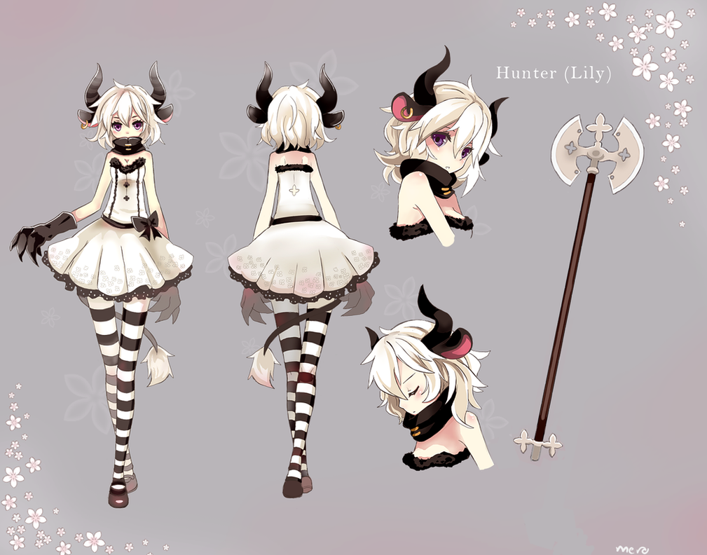
(http://merollet.deviantart.com/art/Hunter-328441474)
Please let me know what you think! even if you think it's no good.
Thanks!
Would love to hear your opinions and especially critiques on my newest character:
12,800 tris, body map 2K size, and weapon 1K.
Based on this concept:
(http://merollet.deviantart.com/art/Hunter-328441474)
Please let me know what you think! even if you think it's no good.
Thanks!
Replies
Now if you aren't trying to match it 100%, then ignore all that. ;P
But this is a good start, just work on pushing it more and adding some personality.
Wasn't really trying to match the concept exactly, but I get your point.
About the "personality", it is really hard for me to do. I don't know yet how to give interests into my works.. Maybe it's a matter of practice?
And thanks for the feedback!
==Axe==
Mesh is fine, but the texturing you have right now makes it look cloudy. There's no specification about where the wear and tear is localized (i.e. areas of the axe that would meet other surfaces). It feels like you tried to go realistic with it, but ended up losing definition in the attempt to give it that realistic noise.
Either stick to the concept's relatively clean look, or look at real life used axes, see where certain noise details are localized. Better to nail a clean look than have a noisy one.
You also have these weird texture seams. Fix those.
==Body Topology==
You need to make specific topology additions to make sure your elbows, knees, and other joints have proper topology so they can collapse properly. Right now, given the rather light density of polys around those areas, if the model was to get rigged and animated by another tech artist/animator, it's not going to deform pretty.
Look into the Polycount Wiki's Character Topology section for references on how to make proper topology for joint bends.
Skirt geometry looks weird. Doesn't follow the contours of the skirt and seems to follow an overlayed grid.
Face topology is wrong. Reference the wiki once again for proper facial topology. Check your loops. Build the big, basic loops first and go from there.
Do you have a specular map or normals?
Or a Metalness map, etc?
As well, do you practice figure drawing by any chance?
Wow. Thank you so so much!
I'm pretty bad at 2D drawing so I don't do figure drawing (if I understood what it is), should I?
It has specular and normals, does it look like it doesn't? what's a metalness map? And I'll look up the face topology wiki to see where exactly I went wrong. admittedly after I rigged her I noticed weird deformations in her arms and legs when I tried to pose her, figured I was just posing her wrong or something :S Next time I'll make sure to do it right.
Again, huge thanks for your comment critique and input.
With texturing, I think you should just start learning how to do PBR texturing (google it, search through Polycount, there's a lot of threads). There's no strong need to learn the previous gen way of texturing if there's a new one that may likely become the standard. "Metalness' is within that realm of PBR texturing.
http://www.marmoset.co/toolbag/learn/pbr-practice
I can't thank you enough, really. Now I know a where to head forward with my 3D (and 2D T_T ) knowledge to be a better artist.
I have to admit, in my experience, you pick this up by actually taking figure drawing courses. Not online.
==Fixes you can do now==
Fix the proportions on the low-poly. Stretch, etc.
Do you see on the concept where the skin seems to be redder, like it's blushing?
Add that to your skin texture, soft air brush. Make your skin pop so it acoids being flat. This also gives it a sense of volume. Don't always depend on lighting to make-up for work you can do in your texturing.
I see. Figure drawing is extremely intimidating for me :S but I'll try.
And about how much detail should I put into my diffuse? I tried to avoid getting into too much detail to try and and achieve a more anime-style colors, btw baking shadow is a no-no right?
Textures contribute TO a shader/material. Think of textures as skin, and shaders as a set of rules telling light how to show that skin. "Hey, reflect this hard with this much brightness back outwards to any eyes that see this from such and such an angle."
Details that make it look more realistic, avoid. Details that make it look more fleshed out, have a body, NOT flat, do it.
You're basically aiming to reach the quality of Jon Troy Nickel with this style.
What he seems to do is use a soft round brush to best effect to add in blush, some warm tones here and there. It feels soft, rounded. There's no just slapping on ONE color and calling it a day.
Baking Ambient Occlusion, Cavity Maps, etc (i.e. shadows) is recommended.
Fire Emblem. Those models still look like anime, but rest assured those shadows you see? Baked into the diffuse texture ONLY (as far as I can tell). It's like World of Warcraft.
Look how well DOTA 2 models use baked in shadows for good effect.
http://media.steampowered.com/apps/dota2/workshop/Dota2CharacterArtGuide.pdf
Baked shadows provide focal points for players, accentuate internal elements of a character, etc. You see how in the Fire Emblem screenshot above, if you greyscale that whole picture, your eyes are immediately drawn to the character's faces because it's the BRIGHTEST thing on the whole character model? Jacket is medium dark, pants are medium dark, but the face is lit up like a Christmas tree, white snow hair and all.
Experiment! Give a light hue to an ambient occlusion bakem see how the temperature and "feel" of a character changes with only an adjustment layer in photoshop. Play with Level Adjustments on an AO bake. Blow out certain areas to make it look like there's intense lighting.
The really simple answer is "What do you see in the concept?"
Replicate it.
Just seriously attempt to replicate it.
This is practice for real, game development work. If you're given a concept, you're going to be expected to replicate it to the best of your abilities.
I can understand figure drawing being intimidating. If it helps, always realize the only person ever really seeing the sketches you do on a weekly basis is you and/or a teacher who should totally understand how you're improving.
The public doesn't see unless you share with them.
The "color" slot in up-to-date terms is called the "albedo", and yes, an albedo does not contain highlights or shading. For the style you're going for, you can break a few rules here and there (her eyes, for example, should have that tell-tale anime highlight, and unless you're working in-engine and you're a shader/tech artist, that may as well just be drawn in). There is, however, a slot in Toolbag 2 for AO, and you SHOULD have that in there as a separate map. Tends to pull stuff together.
That aside, you're... missing a lot here. You took the concept, but you didn't run in any real direction with it. It feels unfinished as a result, and I don't think there's any minor thing you could do to fix it, honestly.
You seem to have... no offense intended, really, but a pretty bad eye for shape right now. A lot of the issues seem to stem less from you deciding to put your own spin on it, more from you not quite understanding how to figure out shape by eye and replicate from that while still retaining the character. As if you see a leg, so you model a leg. A spiky hand so you model a hand, hair so you model hair cards... But they're not the same silhouette, they don't hold the same personality and balance.
This sort of thing should come with time and practice, as you address other issues and get a handle on things (try recreating a concept perfectly some time, instead of letting your own style and sense in), so try not to worry about it too much.
You should do some figure and gesture drawing, it's a good idea, it's good practice and not too much strain for you frustration-wise. If you find yourself unable to get to a class, try this site.
http://artists.pixelovely.com/
I find it's better for gesture drawings (quick, efficient scribbles that just try to capture the essence and character of a pose) than full figure studies, but it works in a pinch. Real life is always better, though!
Just some thoughts translated to sketches/paintovers, because I can doodle out what I mean better than I can say it. Match the colored text and scribbles to the same color on the opposite side.
okay i speak for roughly 300 years sorry about that.
Please keep in mind, I don't mean that this is a terrible piece by going on for so long, I would just like to help you improve. Keep it up.
JadeEyePanda seriously thanks. I wrote down all the tips and pointers you gave me and I'll start figure drawing as you and BagelHero suggested, I assume practicing this will also help me to better my eye for shapes..
And BagelHero you are totally right, I lack a lot of knowledge and practice but I'll keep trying and learning. thanks for the website it look good and I'll use it because I don't think I'll go to a class. I'll try to learn these stuff on my own, I did that until now and I manage to move forward despite that.
With my next piece I'll try to match the concept as much as possible so to keep it's personality and interest.
Again, you guys are awesome! Thank you!!