Home 2D Art Showcase & Critiques

Tyrande Whisperwind

Hi poly (:

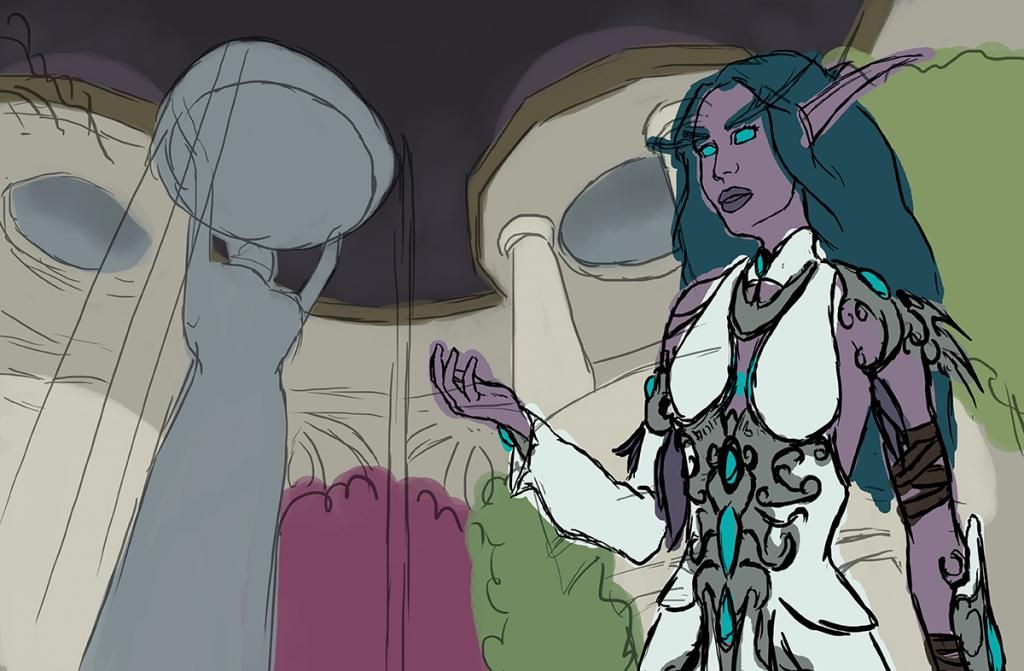
I'm planning a Tyrande fanart with the Temple of the Moon from Darnassus as a background. I did a quick sketch of the bg plus Tyrande herself and before starting to paint properly I would like to know if there are any big mistakes that I should correct before starting (specially on anatomy) to get rid of the lineart.

Tyrande5web_zpsdb5fb310.jpg

Replies

  • Mnemosyne
    Options
    Offline / Send Message
    Started with the face and I'm kinda happy with it, but now I'm having issues with the lips and inside the mouth itself. I tried to make it look like if the teeth could be seen but it looks horrible. Darkness also looks strange, do you have any advice about painting the interior of a mouth like this? I did the lips closed also but I prefer these ones so I'd better learn how to paint the entire mouth xD

    I specially love the nose, spent a lot of time with it and it's the first time I get a good looking one :D

    Also, I like a bit the eyelashes, but I'm still experimenting on how to do them. This time is with simple brush strokes + motion blur, do you have any tips about making eyelashes too? (:

    tyrwip7_zps890e8cea.png
  • Two Listen
    Options
    Offline / Send Message
    Two Listen polycount sponsor
    I think you need to break down your face into planes to better understand your light setup. It sort of looks like your lighting is coming from the top-left side (of the last image you showed us) based on some shadows you've got going on the right side of the painting (left side of her face), but her nose isn't really casting a shadow that corresponds very well, the areas of her face on each side of her nose seem to be in shadow - even on the side where the light seems to be coming from (and keeping in mind these areas are usually raised a bit as they curve forward into the nose), etc.

    The way you're painting the light at the moment is very "2D", viewing the object as a silhouette and putting highlights along one edge, shadows along the other. In reality this isn't usually how light works, and you need to keep in mind things like specular highlights showing up at points where light direction meets a surface closest to the viewer's eye, etc.

    Regarding the lips, your lips at the moment appear to just be a solid color - there's a stark highlight on the top edge and they appear to be casting a fairly nondescript shadow, but they themselves are a flat purple.

    Sorry if that comes off as too direct, just my observations, I won't pretend I'm an expert on the subject. I've got some obligations that will keep me occupied for the next several hours, but I may try to do a paintover to help illustrate some of these points a bit better before bed, so you can decide for yourself if they would help.
  • Mnemosyne
    Options
    Offline / Send Message
    Thank you a lot Two Listen (: Don't worry, you aren't rude, this type of help is exactly what I need and I appreciate it a lot. Last time I posted here I got similar responses and another painting improved a lot with the help. Your manners are very good so there's no need to apologize for telling the truth I asked for :P Thank you for your time too ^^

    The paintover would come very handy since I don't fully understand everything you said (Because of my english maybe :P) but if you don't find time for it don't worry. For now I'll go onto the nose's cast shadow (totally forgot about it) and the curves around the nose you said too. Anyways I'll be out of home for 3 days so I can't paint again till Monday ):

    Lips are only the base, not detailed yet, my problem is more about what to do with the interior or the mouth rather than the lips itself, but tips on painting lips would come handy too since I haven't found any way of painting them I'm comfortable with yet. I don't like pure realism, but more like semi-realism/not-very-detailed-but-readable.

    And yep, the light is coming from the top left, from the dome zone that I will convert into an open night sky. Then I'll add a secondary light source from the blue moonwell coming from the bottom left, under the statue.

    Thank you again, you're awesome (:
  • Two Listen
    Options
    Offline / Send Message
    Two Listen polycount sponsor
    Paintover time. I tried not to really deviate from the colors or values already in the painting (gif conversion probably messed with them slightly), thought it might make it easier for you to translate or interpret if there wasn't drastic deviation (though I do think the painting could benefit from using a wider value range and more colors eventually).

    Mnemosyne_PO_Tyrande.gif

    Hope that helps a bit.
  • Mnemosyne
    Options
    Offline / Send Message
    I'm back! Wanted to paint yesterday but my plane got me to home very late and tired and I only wanted to go into the cozy bed ):

    So I started to work on the face and so far I'm liking a lot the results. I already liked my own nose, but the new one with your advice is way better (: I wanted to maintain the face's shape and corrected the chin's problem I had since the view is a bit below from her face.

    I tried some different lips but ended up going back to my original ones. Anyways, now the teeth aren't horrible and I learnt how to make them in that type of mouth thanks to you (:

    Also cast shadows are corrected but I think I can still improve them a bit. I added some new colors to the entire face following James Gurney's book about color zones for faces and a bit of the hair's color reflection in the nose and chin.

    I love the new eyes too, even if I didn't make a lot of changes. I guess it's the cheeks value change that makes them look better.

    Overall it improved a lot, so I'm leaving the face for now till I finish the entire body and outfit and then I can correct every little thing that is left.

    Thank you again Two Listen, it improved and I learnt new things, you're fantastic! (:

    tyrwip8_zps0a88028b.png
  • valkan
    Options
    Offline / Send Message
    Hi Mnemosyne,


    I think you've improved the lighting and coloration in the face a noticeable deal. It looks less pasty and doll like before and more naturalistic. It's also good that you've adapted Two Listen's suggestions without completely relying on all of them. I can't wait to see the final result.
  • Mnemosyne
    Options
    Offline / Send Message
    Thank you (: I agree with the change from doll to natural. I love how I'm not able to see that it looks bad at first and how with the new changes it's like "woah! it could change that much" xD

    I'm so excited to see how the rest comes out with these awesome feedback, so tomorrow I'll try to make the features of the dress since I have a free day (:
  • Mnemosyne
    Options
    Offline / Send Message
    More progress! Sorry for not posting in a few days, I was busy D: This armor was a pain, and still lacks some more detailing, but well, I don't want to paint it anymore for a few days, my finger hurts xD I'll move onto the background tomorrow I think.

    Tyrande-Recovered11web_zps49d8d879.jpg
  • zetheros
    Options
    Offline / Send Message
    zetheros interpolator
    Awwww man.... I haven't done concept art in years, but I don't know if it was a good idea to paint the armour on, before you're 100% done with the body and at least most of the environment and lighting.

    It's usually best to not get too hung up on details when you're still in a rough blocking-out stage.
  • Stinkhorse
    Options
    Offline / Send Message
    Stinkhorse polycounter lvl 12
    I've got to agree with Zetheros. The arrangement of the metal under bra has some funky perspective going on. The left and right side look like they need to be a good nipple and a half higher and lower respectively.
  • Mnemosyne
    Options
    Offline / Send Message
    Yep, I've had serious problems with the armor perspective and still looks very bad. I'm redoing it again when I'm done with the background. I wanted to paint the armor so badly but I got over-excited about it and did it without properly setting everything else, my bad xD

    Thank you for pointing it out, even when it was a bit obvious but I didn't want to admit it due to all the time I put into the armor :p Sometimes I need somebody to just tell me that is wrong to admit it and start fixing xD

    I'm having problems also with painting the dress. Do you know any tip to shade white clothing you could share, please?
  • acapulco
    Options
    Offline / Send Message
    acapulco polycounter lvl 9
    Well, I think you are going forward too fast. I like that you try your best on a grand illustration and take feedback serious! So here is mine =)
    Your background and person perspective do not match at all. I can see, that you understood perspective and constructed it loosely correct in the sketch, but the character does not obey these perspective guidelines at all. There are some very basic problems in this image that you did not takle and went on way too fast thinking that perhaps detailing the armor would help.
    What these main problems are:
    1. perspective does not fit. Character doesn't fit into the environments perspective.
    2. what is the light situation of your character and / or environment. They don't have to match exactly, but the character has to at least feel like he is in the environment. Perhaps I oversaw it, but I can't see any plan for a lightsetup here.
    3. Composition: Your composition is very very balanced which makes it kinda boring. You have 2 great columns in your composition. The girl on the right, the fountain on the left. They kinda take the same space in your artwork. One should be greater than the other to create tension.
  • Mnemosyne
    Options
    Offline / Send Message
    Some other people told me about the background perspective, but the thing is that the statue is much much taller than her. It's based on a screen of the game and that's what I can see when putting the player view at that point. If I put her on the same perspective as the statue it would look like the statue is way smaller than it is. I already tried to put her in the same perspective, and it doesn't look the way I want it to look. You can actually have a photo of somebody standing in front of a very tall monument that is seen the same way as this statue. I know it's confusing, but it could be a real perspective. Anyways, it needs a change to not be that confusing, for sure.

    The main light source comes from above, but since it's night and there's no moon I'm not lighting it a lot since it will also have another hard light source from the bottom left coming from the moonwell.

    About the composition I totally agree, I'm even being bored while painting overall details at the background. I'm thinking about moving the statue and columns to the back so it can also change a bit the perspective towards Tyrande and then it won't look the confusing way it looks now. What about this idea?

    I think I'm going to stop and redo a lot of things to continue on a new way. Thank you for your feedback, you made me think a lot about the overall image (:

    Forget about the armor, I'm gonna delete that xDDD
  • Mnemosyne
    Options
    Offline / Send Message
    I'll also add a base for the statue to make it feel like Tyrande is far from the statue. Right now it looks like she's under it.
  • Catell-Ruz
    Options
    Offline / Send Message
    Hi Mnemosyne,

    I don't speak English very well, so a quick rough probably will be more explicit than a written comment with a lot of syntax errors!
    I think your character could be more impressive with a better up shot perspective... But it's just a suggestion, if your illustration is inspired by a screenshot, maybe the perspective is different. (Anyway I think drawing some building lines could be interesting for this type of work)

    perso_RTK.jpg
  • Mnemosyne
    Options
    Offline / Send Message
    Thank you a lot, I love when somebody dedicates time for me by making a paintover! (:

    I do like your perspective change for the pose. I'll try to reduce the statue's size, put a base under it and change the pose. Maybe I'll redraw her instead of modifying the actual Tyrande. I loved how the face turned out, but I can do it again :p
  • Mnemosyne
    Options
    Offline / Send Message
    I remade the composition with changing a bit the background and adding that base under the statue. Also did Tyrande again but maintained the head and hand which I already liked a lot, but I'll still make more changes to the face. Anyways I'm looking for general comp now, what do you think? (:

    tyrandeweb13_zps41aae83b.jpg
  • acapulco
    Options
    Offline / Send Message
    acapulco polycounter lvl 9
    Looks way better!
    Her head is kinda weirdly placed on her neck. =)
  • Mnemosyne
    Options
    Offline / Send Message
    Yep, I noticed it right now xD I shall move it to the right and maybe adjust the size too. Luckily it's still in sketch phase and I can move things before starting to paint the armor over everything else... :D
  • Mnemosyne
    Options
    Offline / Send Message
    More WIP of the new version, I'm so happy with it now (:

    I'm going to change the base of the moonwell after doing some rock studies, right now it's a mess xD I love the hair, couldn't resist detailing :D I'll darken the background way more I think.

    Any tips? How is it going? (:

    TyrandeF5_zpsa180cec4.jpg
  • Zwebbie
    Options
    Offline / Send Message
    Zwebbie polycounter lvl 18
    The rendering you did on the face and hair is very nice! I think the composition and colour will make for a good piece in the end. But the perspective is still off, or at least the character doesn't seem to be drawn from the same position as the background is. The background reads as if the horizon is very near the bottom of the canvas, whereas that of the character is much higher. The breasts are about an even height, so that's where the horizon would more or less be. For a composition as difficult as this one, you need to lay out your basic perspective guidelines and build up everything from simple forms. In a bout of spectacular stupidity, I've made a paintover that is actually wrong (the vanishing points are not level), but I'll add it anyway to give an idea of how I'd construct the scene.

    Maybe Carapace is a useful tool for you.
  • Mnemosyne
    Options
    Offline / Send Message
    Oh, I see, but I don't know how to fix it without redoing the entire head again D:

    I have another perspective tool made by a user from Polycount. I tried Carapace too, but I don't know what I did wrong, it didn't seem to make any vanishing points. I clicked everywhere with both mouse buttons but nothing xD So I switched to the other tool and works nice (:

    Thank you a lot for your guidelines, I'll try to see tomorrow how could I fix that head. It's my first complex background with perspective in mind, it's being so hard for me but thanks to all your help it's being a nice walk through learning. I love you so much guys (:
  • pmiller001
    Options
    Offline / Send Message
    pmiller001 greentooth
    wew, that perspective is really bothering me. You might take second to re=check that out.
  • Mnemosyne
    Options
    Offline / Send Message
    I don't really know how to fix it :S For my eyes it isn't looking "that" bad at all but definitely something is bad. I guess I don't have the eye training to see through it yet D:

    How could I fix it without starting over again for a second time?
  • pmiller001
    Options
    Offline / Send Message
    pmiller001 greentooth
    you might try lasso-ing the selection you want to edit, then doing a perspective transform, ,or liquefying the layer.
  • Mnemosyne
    Options
    Offline / Send Message
    A bit more progress (:

    TyrandeF6_zpsd79bec64.jpg
  • Stinkhorse
    Options
    Offline / Send Message
    Stinkhorse polycounter lvl 12
    That's looking worlds better!
  • Mnemosyne
    Options
    Offline / Send Message
    Thank you! (:

    I'll try to finish all the background today so then I can try to fix it a bit with liquify and lasso tool. Anyways it's by far the best background I've ever done, so I would be happy even if it stayed like it's now xD

    Still lacks the secondary lighting from the moonwell, the base of it too, Tyrande's dress (and hellish armor :D) and some minor extra details like the stars & sky. I love detailing (:
  • IosuPalacios
    Options
    Offline / Send Message
    Well even when the perspective in the background it's interesting itself if you don't want to start over the character to mach with it may be you should consider to re arrange the background.

    may be you are been a bit to ambitious with this illustration towards perspective. My advice would be continue with that cool render and shades you are using in the character and create an amazing background. One who can be impressive for the things you are good at and not one that looks off because something you still need to study carefully.

    Keep the trick of the forced perspective in the backpack for the next illustration after studying some perspective books and rock it in your next project :).

    Untitled-1_zps0b39d861.jpg
  • Mnemosyne
    Options
    Offline / Send Message
    Yep, I agree that I was too ambitious with it since it's my very first real background (My other ones where just adding some leaves and branches to make the feeling of being inside a forest, nothing else xD).

    I love your rearrangement, it has more depth and imho it's more relaxing for the eye. I'll try to change it that way. However if I find that I have to redo the entire background from scratch I'll prefer to leave it as it is now since it's starting to burn me a bit and I would like to start a new image soon. But I'll try anyways, thank you so much! (:
  • Mnemosyne
    Options
    Offline / Send Message
    Well, new WIP and it's almost finished. In some days I'll need to make a big two month break from digital art so I'll need to finish it soon. I guess I won't have much time to fix the background, I'll try to experiment a bit with liquify and lasso but I'll leave that for the end. Right now only the dress, armor and overal blue lighting that comes from the moonwell are left, plus minor changes like the middle rock. I tried to give a depth sensation with the blurred foliage at the left and the big rock on the foreground. The moonwell has a wrong forced perspective too, but it's been a headache to finally find something I'm happy with so I think I could leave it this way. It's starting to look a bit like an inverted fish-eye xD

    I hope to finish it for Friday if I find time between packing everything for my move to Ireland. What do you think? (:

    TyrandeF9_zps4e835ec8.jpg
  • Stinkhorse
    Options
    Offline / Send Message
    Stinkhorse polycounter lvl 12
    Thats tightening up nicely. Keep going!
  • Mnemosyne
    Options
    Offline / Send Message
    I want to finish it tonight, and I feel exhausted about it due to all the changes and mistakes, but oh I love how it's turning thanks to all your advice (:

    As of now, things to finish/fix:

    Feathers, Leather bands, nails, fix hair, fix that horrible rock, correct value levels between the background and her to make her pop-out, the shiny light at her hand and the overall lighting from it onto her. I think that's all, and I'm so sorry for not having more time to fix the background properly, but it's starting to burn me and I think it's better if I finish it, practice perspective these two months without PC and then try again with a new piece then.

    Anyways, I'm f*king proud! :D Thanks a lot guys, the finished one will be soon (:

    TyrandeF11_zpsbb044ca7.jpg
  • Mnemosyne
    Options
    Offline / Send Message
    Finished! Thank you so much to all the people who gave advice and sorry to all those that spent time correcting the perspective mistakes that I couldn't change at the end. I appreciate a lot your dedication to help us newcomers (:

    I would still love some critiques or opinions on what are your thoughts about all the process. You rock! (:

    TyrandeFfinal1FFweb_zpsa6ee324e.jpg
Sign In or Register to comment.