[UDK] <<SUPER PROJECT!>> Post apocalyptic trainstation with a spices of asian flavour
polycounter lvl 11
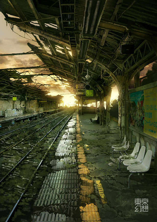
Hi polycount! ")
I found this concept somewhere in the interwebz and I just had to make that into 3d, now this has turned to another portfolio project which I will use to get internship on november.


This time I don't have any deadlines and I mostly do this on my free time. I plan have it done somewhere during or in the beginning of summer. Which means I don't really plan how I work but more do
(which isn't really my workstyle, but for this project its better)
I have had a real hard time making good looking blends between textures on the ground and cracks on the station platform. If anyone has good tutorials or tips please comment
I found this concept somewhere in the interwebz and I just had to make that into 3d, now this has turned to another portfolio project which I will use to get internship on november.
This time I don't have any deadlines and I mostly do this on my free time. I plan have it done somewhere during or in the beginning of summer. Which means I don't really plan how I work but more do
(which isn't really my workstyle, but for this project its better)
I have had a real hard time making good looking blends between textures on the ground and cracks on the station platform. If anyone has good tutorials or tips please comment
Replies
You can either use a Vertex Blended shader to 'paint' the cracks on your mesh, or you can use decals.
Not sure which would work for you best.
Also, basing this off any artwork?
Cheers!
Heres something I've noticed recently while working on my new scene, doing a vertex blend of two or more textures is cleaner in your editor/view port, but I don't think you get the best result, at least not with something like cracks because it will fade out at points and look obvious that its a vertex blend. Decals are better for doing crack quality wise in my opinion, BUT they can clutter your scene if you put in too many, and if you don't watch the size placement on the mesh it will look unnatural and obviously cg.
Now time for a little critique. It looks like you're trying to do a moss/nature overground kind of thing on the rails and ground, but it just looks bad, the texel density doesn't fit. Your texture for the moss/grass is too large and became pixelated and blurry. what you can do to fix this is to tile the texture more. preferably in engine, gives you more control, and its easier, at least in udk if you are using udk, i'm unfamiliar with how to do this in CE3.
Also, your posts for the platform are too dark in diffuse, lighten them up and always remember, lights will become lighter and darks will become darker, you don't want to use something thats already black if its just going to be shadowed black. And if its a shadow error, you can always put a very low intensity light there with a small radius to brighten the area up just enough to make it visible and better.
I'd like to see some vines growing up the platform, since its supposed to be apocalyptic, nature should be more overgrown. also dirty up your platform a bit, needs some clutter, like dirt, maybe water stains, mud. just make it look good and natural.
I also think you should add in a bench on the platform, and make a second chair mesh with damage to it.
And I am using UDK as the thread title says
Serriffe: I don't think its from Kusanagi artbook, but here is some more concept art I think is more inspirational : http://pinktentacle.com/2010/08/post-apocalyptic-tokyo-scenery/
Luge: I will try to use decals and see if I get better results!
I will start working on adding vegetation soon, but good thing you named vines crawling up on the platform, didn't think of that
Yes, more of everything! Benches, dirt etc!
hey thanks for the link- I like these concepts, I think I've seened this before? I probably came across these while I was doing some research awhile back. These will add nicely on my inspirational art folder
Here is the link about vertex painting: http://www.chrisalbeluhn.com/UDK_Advanced_Vertex_Painting.html
Looking at your concept, I would say you're in a good place, although I suggest before you go any further to try and improve what you have currently. Your smoothing groups seem to be fighting your normals for the tiles, and they're too uniform.
You should try and break up parts of them, or make 'tile' sets in your app before importing them, and tile those instead, so instead of tiling 1 block a hundred time, you could have 10 blocks (with a few of them broken) in one 'mesh', and tile that 10 times instead.
And heeeres some updates!
I've added all sorts of stuff and there is still A LOT to go
The rails themselves appear flat, rather than like the modified i-beams they are:
The proper shape is there in the concept (although a bit subtle), and should be even more apparent in a 3-D scene.
The ties are too thick and prominent, and appear to lie within the rails (the rails sit on top of the ties). Tokyo stations actually embed the ties in the stations within what appears to be asphalt; in other places loose gravel fills most of the empty spaces between ties.
I made som modifications on the rails but I haven't redesigned them that much just yet, might be something I pick up later on. Because the model dosen't need to be an exact replica for that matter. But I am thinking of making LOD versions of the rails so I could make them better. Thanks for crits!
Here are some subtle updates, mostly on lightning and a little texture polish here and there!
I dont have a full on crit or anything- I just wanted to say I think you should take a second look at the white plates along the edge of the platform. It would appear as if the block is all on one smoothing group, causing a large shading/gradient effect across the plates. The end result makes them look "pillowy" as opposed to a nice "plate" look.
Also- in reguards to the chairs: Like Herr was saying, I don't think those are supposed to be individual chairs.
Looking at the concept, it looks as if there are individual seats- but they are all attached to a framework, that`s bolted to the wall.
Lastly- looking at the concept- one of the coolest details is the decay in the roofing. I think more emphasis there would go a long way.
I REALLY like the grass material down by the tracks. That area looks perfect!