Home 3D Art Showcase & Critiques

Hand painted/sculpted texture

Polynaut
polycounter lvl 7
Offline / Send Message
Polynaut polycounter lvl 7
--EDIT--

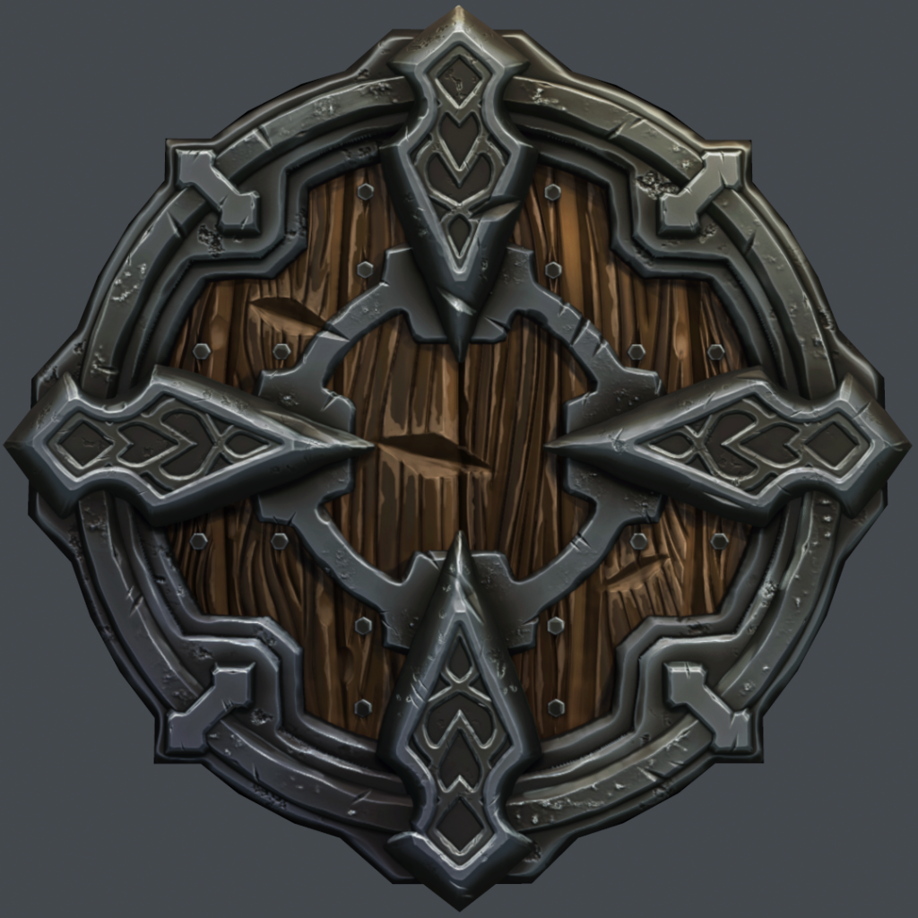
New Project:
screenshot001_zps2eaa9577.png~original

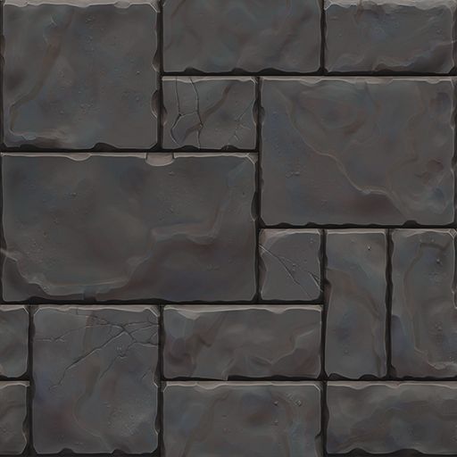
Final texture:
block_02_zps240e4b5a.jpg~original

--ORIGINAL POST--
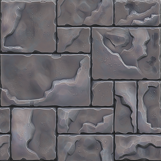
Testing out some hand painted textures.. I would love some feedback on this.

ps:
handpainted_tile_zpsce1cca29.png~original

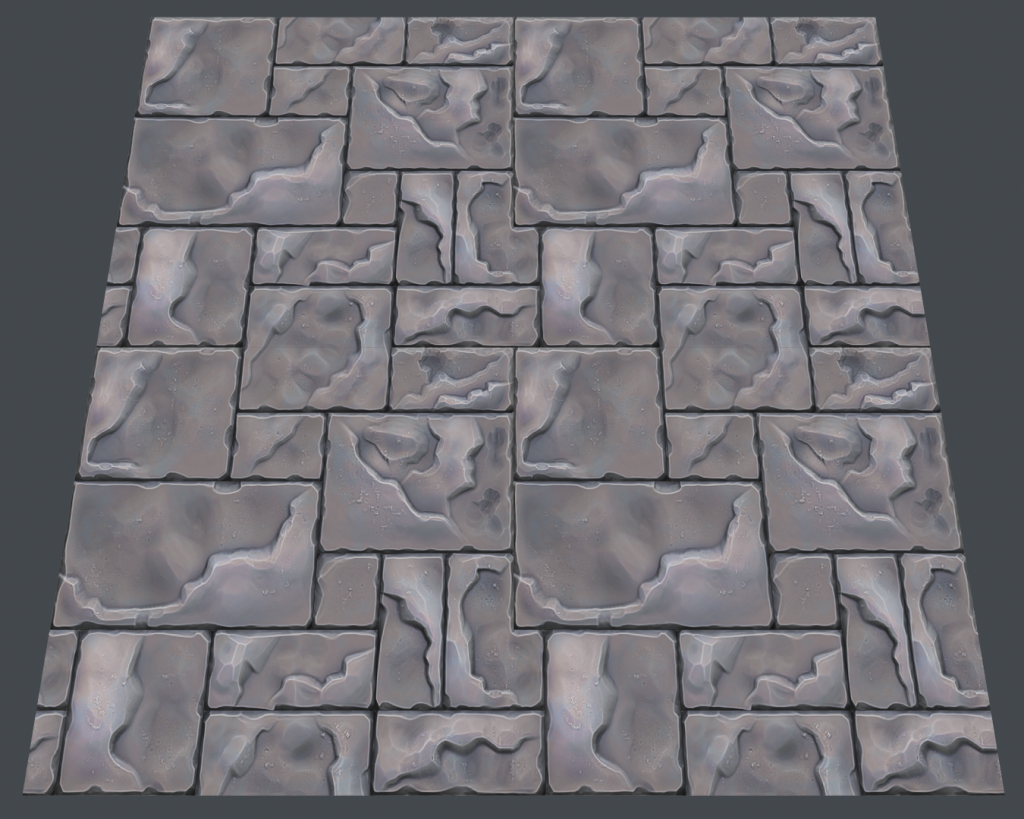
marmoset:
handsculpted_tile_zps81da2819.png~original

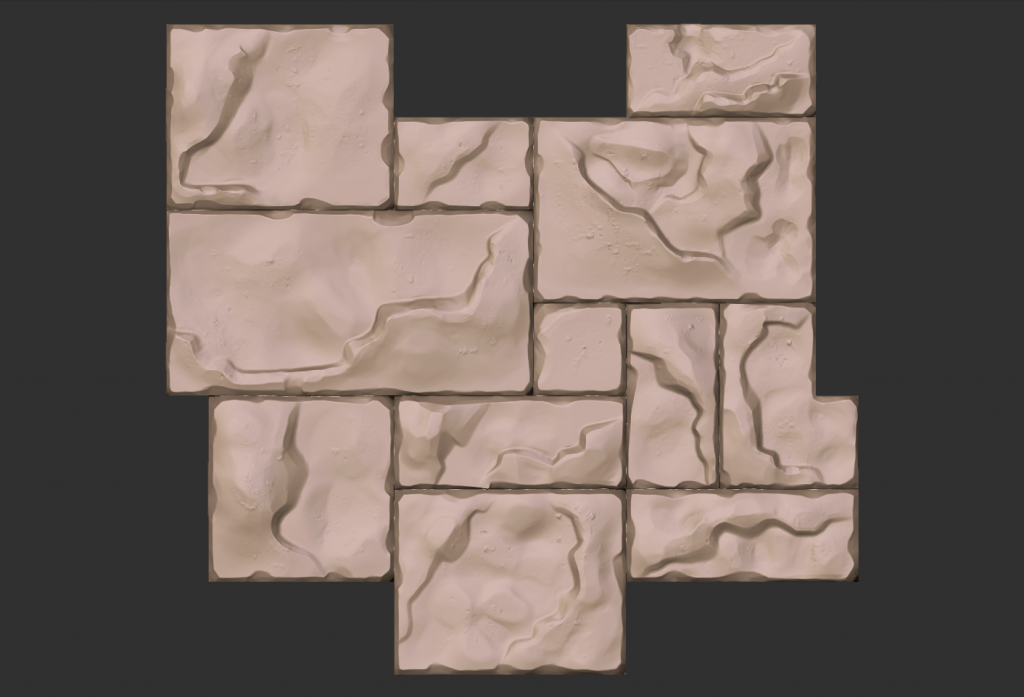
zbrush:
hiRessculpted_tile_zpsef00c694.png~original

I feel like this would be the base that I would paint over, to give it more of a painterly feel, but I'm not sure where to take it from here.

Replies

  • Spoon
    Options
    Offline / Send Message
    Spoon polycounter lvl 11
    I like what you have so far in terms of style, but I have no idea what material this is, which I think is super important to make absolutely clear :) Also, the damage or what it is seems completely random, but maybe I am misinterpreting it.
    Where do you want to go with this? :)
  • Polynaut
    Options
    Offline / Send Message
    Polynaut polycounter lvl 7
    if it's not being interpreted well - then I probably didn't execute well! Here is the aim of what I'm going for:

    aim_zpscebd8525.jpg~original

    just a simple stone paver.
  • Polynaut
    Options
    Offline / Send Message
    Polynaut polycounter lvl 7
    ok. made some tweaks.. mainly pulled back the cavity and lighting info inside the stones themselves so they look a bit more even over-all.

    update_01_zps16fe3502.png~original

    by the way, I'm not going for an exact color match, just trying to capture that style.
  • Fwap
    Options
    Offline / Send Message
    Fwap polycounter lvl 13
    Its a really good start man, your cavity is still really strong, almost metallic like.
    the style is defiantly on its way tho, lets see some real time renders?
  • Tobbo
    Options
    Offline / Send Message
    Tobbo polycounter lvl 11
    Yeah I agree. I think it could be pulled back much more still.
  • Jedairusz
    Options
    Offline / Send Message
    Jedairusz polycounter lvl 13
    I think, you should change contrast of your texture.
    Paintover:
    nachwilej_erxnsrw.jpg
  • metric meditation
    Options
    Offline / Send Message
    metric meditation polycounter lvl 5
    so far so good :) I am more biased to painting everything from scratch, but so far your composition is looking great. Looking forward to seeing some cracks and stepping away from the mono-tone look :)

    You values are good. lets see what can be done about the color :)
  • MeshModeler
    Options
    Offline / Send Message
    MeshModeler polycounter lvl 11
  • Fenyce
    Options
    Offline / Send Message
    Fenyce polycounter lvl 11
    Nice sculpt, but I think that layered rock is a little to high. I'd do is more decent next time, since it looks kinda odd, Fanny did it more decent in her tutorial, I guess.
    But I really enjoy those little details you added.
  • Polynaut
    Options
    Offline / Send Message
    Polynaut polycounter lvl 7
    Thanks for all the helpful crits guys/gals! Here is where I'm at currently:

    Marmoset_zps4ffc22ca.jpg~original

    screenshot000_zps862f22e5.png~original
  • stevston89
    Options
    Offline / Send Message
    stevston89 interpolator
    I would look at playing with the height of each brick. It will add a lot of depth that you are currently lacking.

    EDIT: Should mention I meant in the Zbrush sculpt not the low poly.

    Sort of like this:

    brick_damaged_0030_02_preview.jpg
  • Polynaut
    Options
    Offline / Send Message
    Polynaut polycounter lvl 7
    ok - this is what I'm calling done on this unless there is something fundamentally wrong with what I've done so far.

    The main thing I learned on this project was the interior cracks and height changes need to be secondary lighting info - so not as bold as the edge highlights and shadows. Also, subtle light changes make a big difference when there is not spec/gloss/roughness maps involved.

    Thanks again for all the help spotting trouble areas for me!

    block_02_zpsd098c2ed.jpg~original

    Also threw Fanny's texture in the marmoset render to give myself a better idea of what I was shooting for:
    screenshot000_zps609516a1.png~original
  • CarlK3D
    Options
    Offline / Send Message
    CarlK3D polycounter lvl 7
    Wow looks great. Love the Style, reminds me of DOTA 2
    I do like the one on the right of the last Image more, looks more natural, less visual noise. I'm not sure if you used nDo 2 to bake your AO but It's giving that type of Colored AO effect nDo 2 gives makes it look a bit metal since it uses Blue and Red
    I like the design more to
    Keep it up!
  • Polynaut
    Options
    Offline / Send Message
    Polynaut polycounter lvl 7
    Thanks for the feedback again. I went back in and toned down the bricks a bit more to remove most of the noise. The last things that are really bothering me now are the L shaped stone and the 2 big stones that repeat a seams line going up the 'path'. Anyway, here is my progress.

    block_02_zps240e4b5a.jpg~original

    screenshot000_zps552d87b5.png~original
  • Polynaut
    Options
    Offline / Send Message
    Polynaut polycounter lvl 7
    And here is a new project I just started:

    concept: (not sure who did this, but I would love to find out)
    shield_ref_zps394e749b.jpg~original

    block out:
    ShieldWIP_zps72ed4470.jpg~original
  • Danglebob
    Options
    Offline / Send Message
    Danglebob polycounter lvl 15
    Looks like its two concepts chopped up into one. And they both belong to Artyom Vlaskin. (did one of his/her shields a while back as well)

    I think what you have is a solid start. Excited to see where you take it.
  • MexPineapple
    Options
    Offline / Send Message
    Those stone floors look very nice. They've got good wear and I'm loving the almost slate-like look.
    Maybe chopping one of the big stones into two stones might help? Or you could replace two small stones with a big one.

    The shield is looking great so far, but it seems a lot more spaced out/bigger than the concept. What I mean is that, in the concept, the left and right arrows are thicker and covering both of the skeleton's eye sockets. Making the arrows thicker and less sharp around the edges might help.
  • Polynaut
    Options
    Offline / Send Message
    Polynaut polycounter lvl 7
    lunch crunched on this a bit. Changed the size of some of the stuff and was able to do a quick edge wear pass on most of the pieces.

    02_zps4df74bbf.jpg~original
  • Polynaut
    Options
    Offline / Send Message
    Polynaut polycounter lvl 7
  • josh_lynch
    Options
    Offline / Send Message
    josh_lynch interpolator
    The shield has some good progress on it. I know your still working on it, but I would not be afraid to go in and vary up the pock sizes and damage.

    FIgjxLj.png

    The stones feel a bit wobbly in certain parts, like they have too much surface undulation. If you look at the reference you provide from Fanny's work there is little to no surface undulation, its subtle.

    As well I would add more line variation to your steps on the stops, more thick to thin.

    Look forward to seeing more!
  • Polynaut
    Options
    Offline / Send Message
    Polynaut polycounter lvl 7
    Latest revision:

    shield_zps4ac11be8.jpg~original
  • Polynaut
    Options
    Offline / Send Message
    Polynaut polycounter lvl 7
    I'm not really even done with the sculpt, but I really wanted to test out the zbrush to game res workflow on a piece like this. Just a simple color block out with AO overlayed.. nothing even close to final yet.

    ps file:
    shield_textureTEMP_zpsd6dc8fcc.jpg~original

    maya game res:
    shield_gameRes_zps8e8bbe27.jpg~original

    The game res is just under 1000 tri's. Not really sure what a good count is on something in this style, but it seems low in my opinion. Wouldn't be too hard to get that count down pretty quick and let the normal map take care of the inner detail.
  • ZacD
    Options
    Offline / Send Message
    ZacD ngon master
    The scale of the detail on the skulls doesn't make the rest of the design and shield. They need to be chunkier and more defined. I also feel with the polycount of the rest of the model, you should be able to model out the skulls in the low poly instead of them being flat details.
  • Grindigo
    Options
    Offline / Send Message
    Grindigo polycounter lvl 6
    I think skulls throw the design of this shield completely off balance, it does not match the other material type for example if I wanted to have skulls on the shield then I'd make the shield out of bones and leather rather than thick iron and wood, it does not make any sense, so right now it's better off without the skulls and it would be better to put some chunky piece in the middle with pattern to match other patterns, this way it will make sense, I'd personally keep the skulls as an idea for another shield, make the whole thing out of thick bones strapped together with leather.
  • Fenyce
    Options
    Offline / Send Message
    Fenyce polycounter lvl 11
    Biggest issue is that the skulls do not look like they've been made from wood or metal. And for real skulls they are to flat. So it seems unfitting. I'd revisit the skulls and make them look more like craftes from metal, with the intention of being rather flat. Like the metal edges of the shield itself.

    I know you are sticking to that concept, but that's something that's coming along kinda weird in the concept itself.
    And it's kinda sad that it ruins your great work, because the metal and wood parts really look great! In my opinions you did a fantastic job on those!
  • Polynaut
    Options
    Offline / Send Message
    Polynaut polycounter lvl 7
    Alright, so I didn't really know where I was going to take the skull anyway - after all the critiques I went back to the original concept:
    shield_zpsb8961621.jpg~original

    ps file:
    shield_d_zps2ce56991.jpg~original

    Marmoset unlit shader:
    screenshot000_zps456f12bb.png~original
  • Polynaut
    Options
    Offline / Send Message
    Polynaut polycounter lvl 7
    been struggling to get that metal to look right.. I still don't feel like it has a hand painted quality to it.

    screenshot000_zps21b69775.png~original
  • Polynaut
    Options
    Offline / Send Message
    Polynaut polycounter lvl 7
    Someone at work schooled me on local color, which was making my last post look like a milk chocolate shield.. mmmmm!

    Marmoset unlit shader:
    screenshot001_zps2eaa9577.png~original
Sign In or Register to comment.