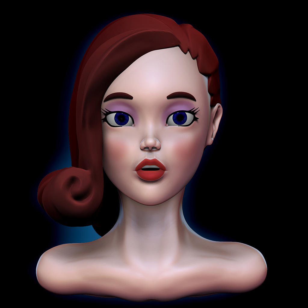
I'm trying to get better both at sculpting faces (in this case a rather stylized/cartoonish) and to get better renders out of Zbrush. Please give your input both of the bust itself but also of the render quality.
Nice big eyes
The head isnt sitting on the neck properly atm, the neck doesnt come out at the front like that. The ears should be helical forms and it would help if the neck went down showing a bit of the chest.
Even with cartoons you stll have to use some anatomy for the character to read as best it can.
Keep em coming!
Cheerio
The left hair shell could use some more strand/gesture definition.
Solid base overall. Getting a very strong Betty Boop / Max Fleischer feel from this.
The line leading from the apex of the nose to the philtrum should be brought down and smoothed out. It's awkwardly just jutting into the face, and then becoming the philtrum.
got to ask yourself , do yuo really need to make a character like this in zbrush. maybe build it sub d. ears need 'loads' of work. neck looks odd. use more ref IMHO
hair looks like an afterthought
not keen on the render, has no depth and seems to lack any kind of shadows
sorry to be harsh, but i always just list things that jump out as looking odd( as i do to my work)
I might not need to work in Zbrush but I'm comfortable there, I mostly work with Zbrush and Blender.
The ears I think I'll redo from scratch in a different manner. I was quite satisfied with the hair, I feel it might need a bit more detail and refining but not much. Hair has however always been a weak point of mine, when I work it to hard it tends to look worse and worse. It's one of the reasons I want to make something stylized/cartoonish.
About the render I agree, I'm still not very good at setting them up or doing the post processing. If you have any constructive comments on how I could improve on the lighting for this piece I'd love to hear it.
NalimTheRed - for the hair in zbrush I tend to use the clay buildup brush which is great for blocking out large directional shapes.
the neck has no real form, you should really fiind some nicer ref
re the render I just think it need a bit more shadowing, looks too light and the skin is like plastic. maybe do a bit more work on the face texture as well
The reason I mentioned that it could be good to make the head initially in a 3d modelling package is that its easier to make a nice base mesh which you can reuse and there is nothing currently in the model that you could not make the traditonal way
depends what you want it for I suppose
Thanks.
Yeah the sculpt was for practice mainly. Just want to become better at everything involved. As for base meshes I have made a few that have decent geometry and edge flow, I lack more when it comes to sculpting so that's what I'm practicing.
I think you are making some good progress. I took a quick look and made a few critiques. These are definitely just my opinion and I'm not saying it's right or wrong. Just what I would do if it were me, just opinion
I also understand that I just did a 2D paintover so what may look right in 2D might not translate to the 3D but I tried to keep what I could in mind.
I hope that helps at least a little bit and keep at it!
Sorry about my messy writing I hope you can read it
Replies
The head isnt sitting on the neck properly atm, the neck doesnt come out at the front like that. The ears should be helical forms and it would help if the neck went down showing a bit of the chest.
Even with cartoons you stll have to use some anatomy for the character to read as best it can.
Keep em coming!
Cheerio
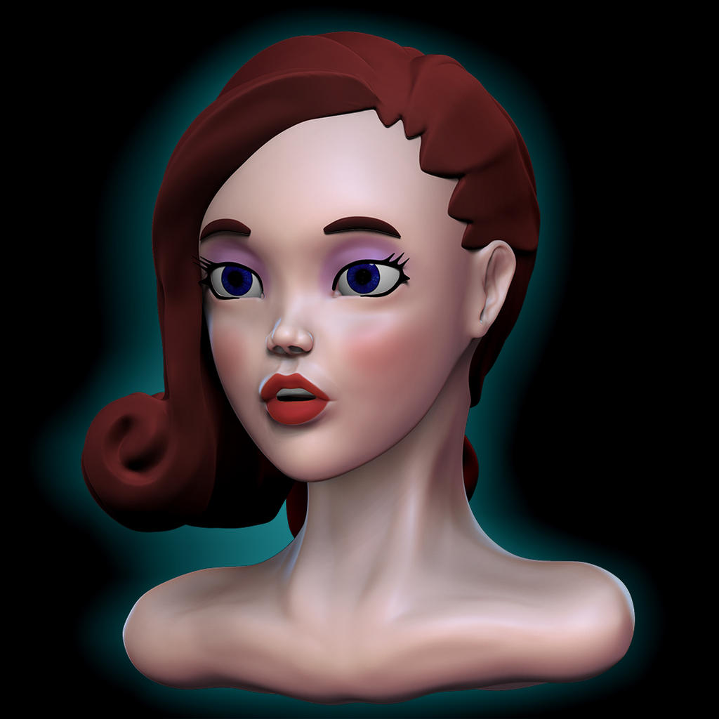
(Renders were done at low resolution just to show what's changed)
The looks pointy comment is just the background blending there I think, but still when you're presenting your sculpt be aware of it.
Thanks for the input, I'll go over the figure again and try to fix it.
The left hair shell could use some more strand/gesture definition.
Solid base overall. Getting a very strong Betty Boop / Max Fleischer feel from this.
The line leading from the apex of the nose to the philtrum should be brought down and smoothed out. It's awkwardly just jutting into the face, and then becoming the philtrum.
hair looks like an afterthought
not keen on the render, has no depth and seems to lack any kind of shadows
sorry to be harsh, but i always just list things that jump out as looking odd( as i do to my work)
Keep on going!
I might not need to work in Zbrush but I'm comfortable there, I mostly work with Zbrush and Blender.
The ears I think I'll redo from scratch in a different manner. I was quite satisfied with the hair, I feel it might need a bit more detail and refining but not much. Hair has however always been a weak point of mine, when I work it to hard it tends to look worse and worse. It's one of the reasons I want to make something stylized/cartoonish.
About the render I agree, I'm still not very good at setting them up or doing the post processing. If you have any constructive comments on how I could improve on the lighting for this piece I'd love to hear it.
the neck has no real form, you should really fiind some nicer ref
re the render I just think it need a bit more shadowing, looks too light and the skin is like plastic. maybe do a bit more work on the face texture as well
The reason I mentioned that it could be good to make the head initially in a 3d modelling package is that its easier to make a nice base mesh which you can reuse and there is nothing currently in the model that you could not make the traditonal way
depends what you want it for I suppose
Yeah the sculpt was for practice mainly. Just want to become better at everything involved. As for base meshes I have made a few that have decent geometry and edge flow, I lack more when it comes to sculpting so that's what I'm practicing.
I also understand that I just did a 2D paintover so what may look right in 2D might not translate to the 3D but I tried to keep what I could in mind.
I hope that helps at least a little bit and keep at it!
Sorry about my messy writing I hope you can read it