The BRAWL² Tournament Challenge has been announced!
It starts May 12, and ends Oct 17. Let's see what you got!
https://polycount.com/discussion/237047/the-brawl²-tournament
It starts May 12, and ends Oct 17. Let's see what you got!
https://polycount.com/discussion/237047/the-brawl²-tournament
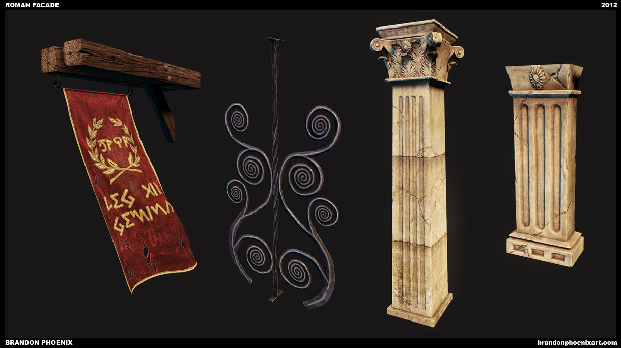
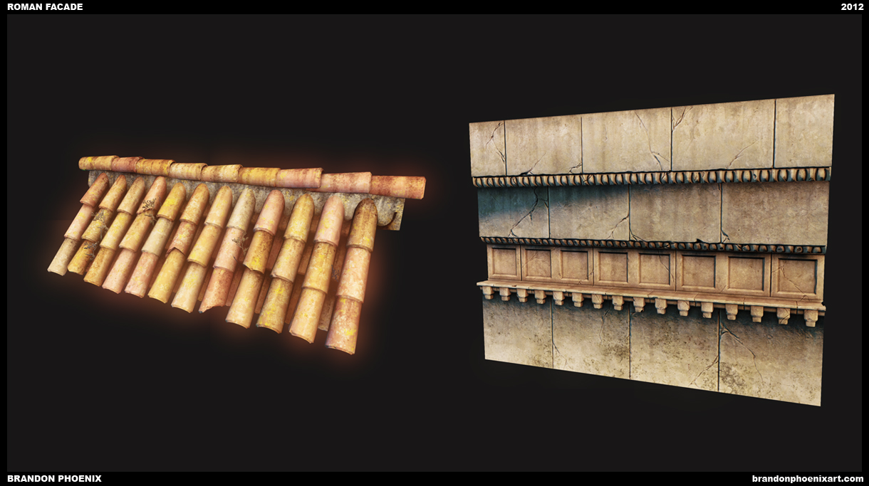
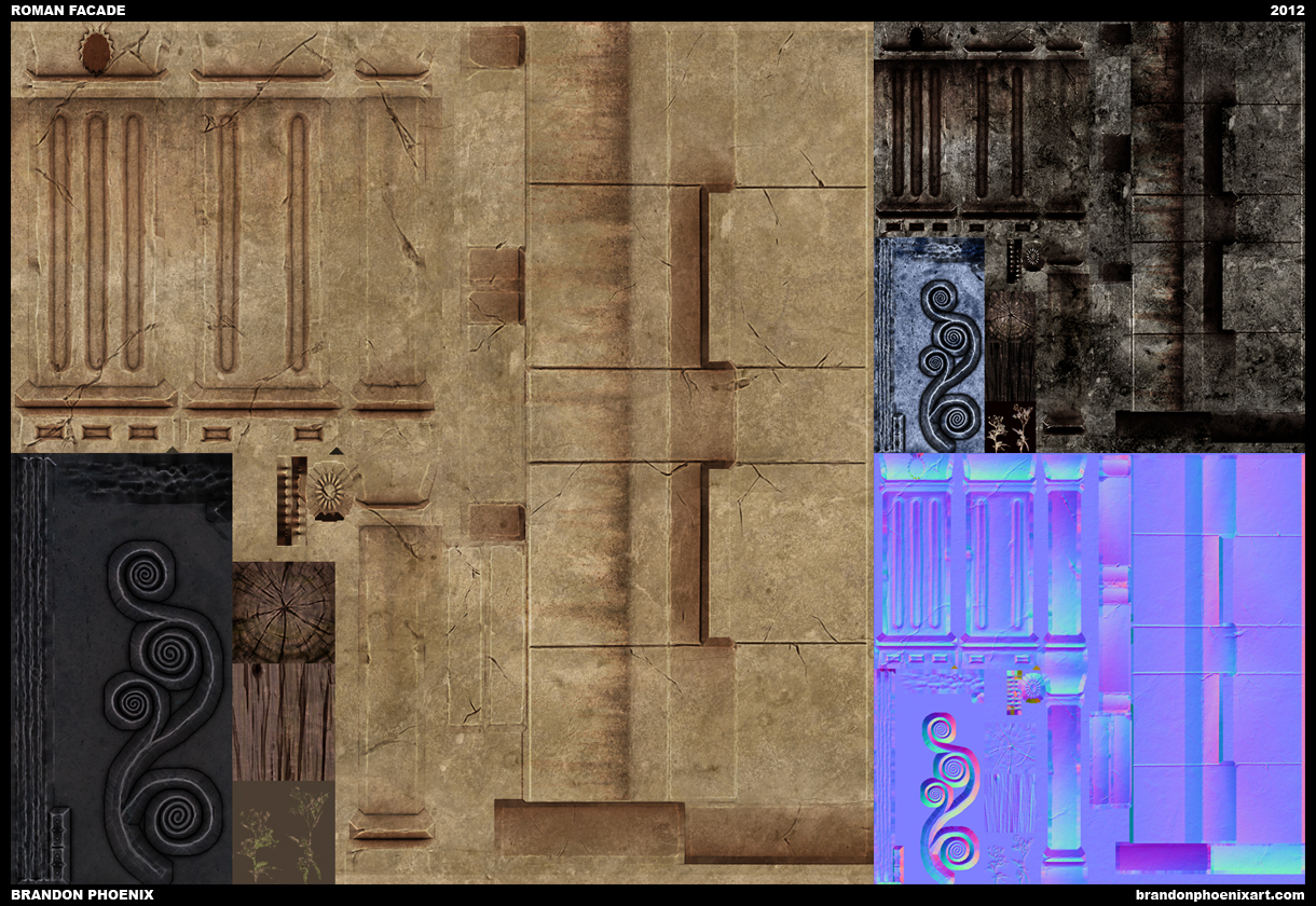
Roman Facade
polycounter lvl 16
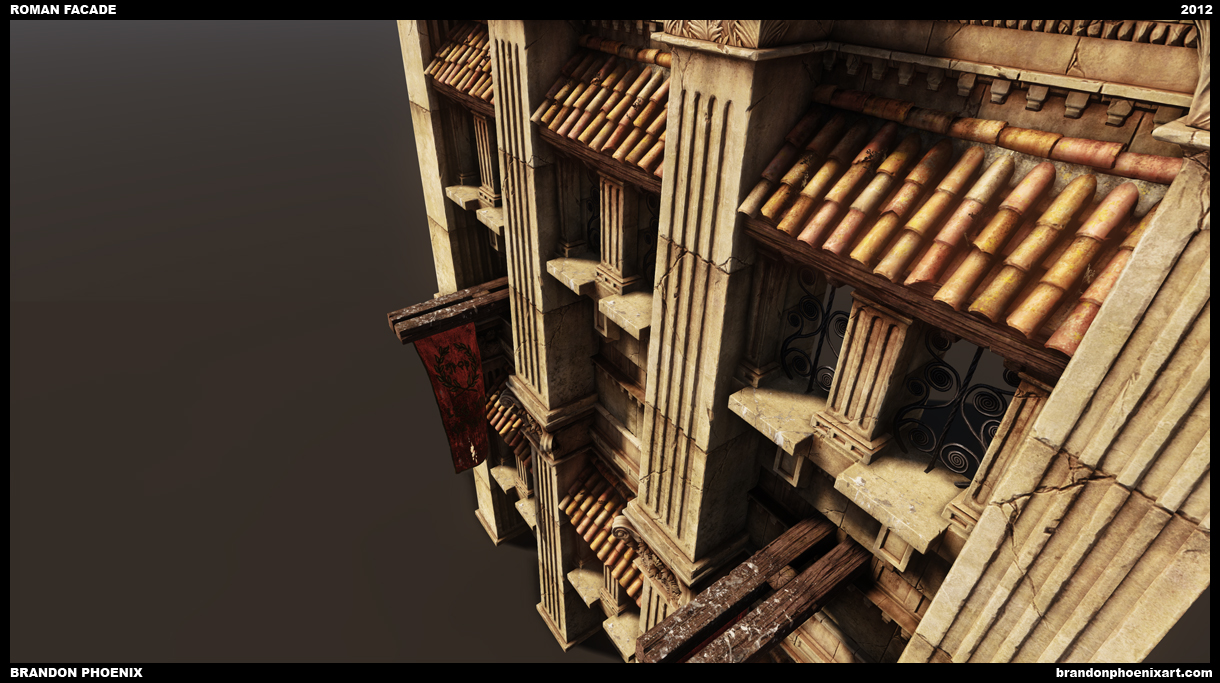
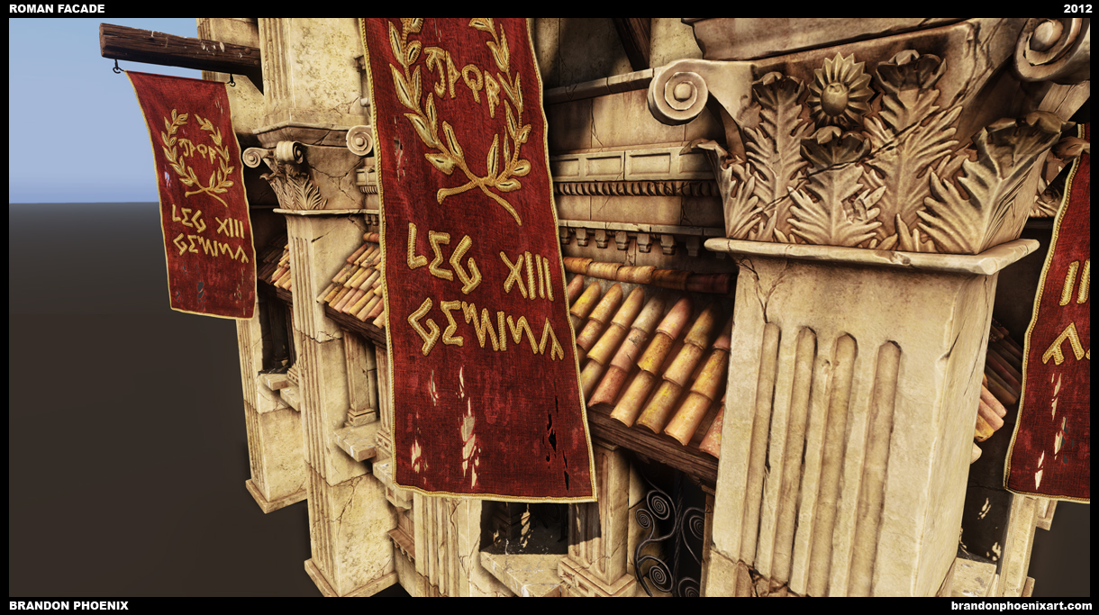
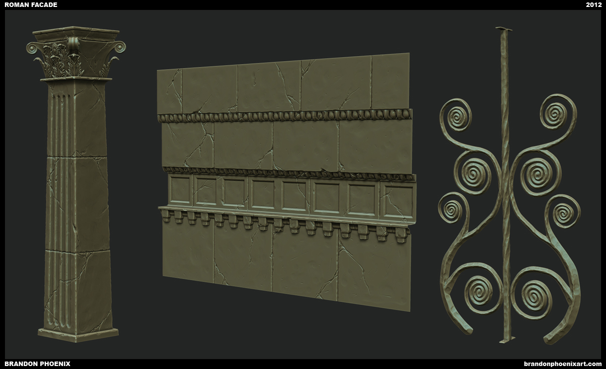
Hey guys, did this as an art test for a studio that would prefer to remain nameless. They had very different optimization requirements from what I was used to, so it's a bit awkward on that front, but let me know what you think over all. Modeled from their concept art. Did not get the job btw.
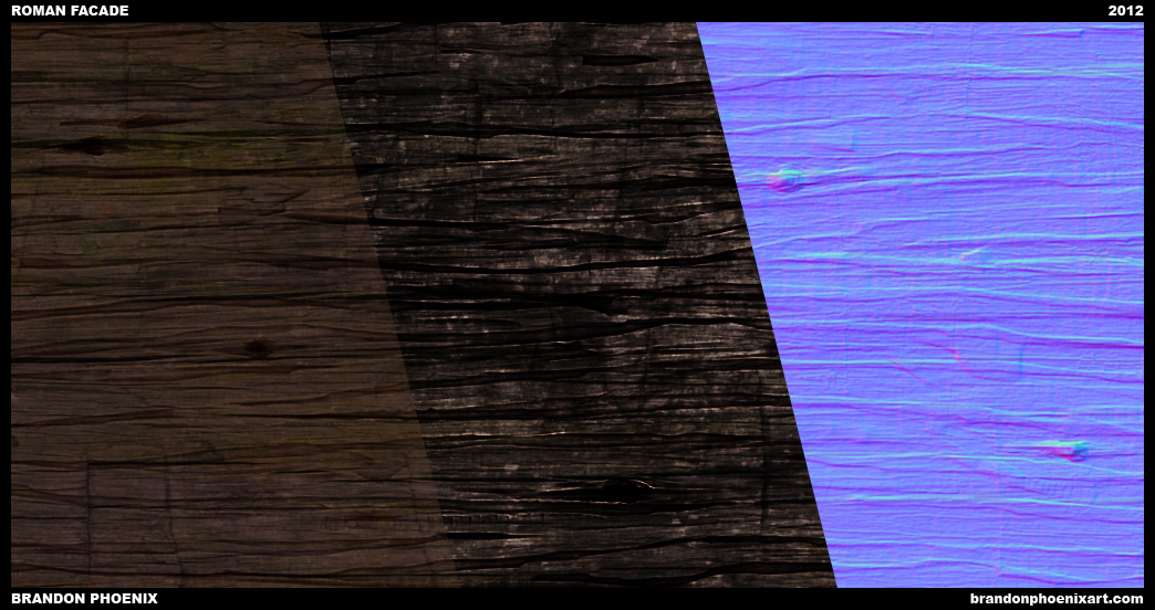
Modeled in Max/Blender, sculpted in ZBrush, rendered in UDK. If you want any more info on the work, let me know.
C&C, much appreciated.
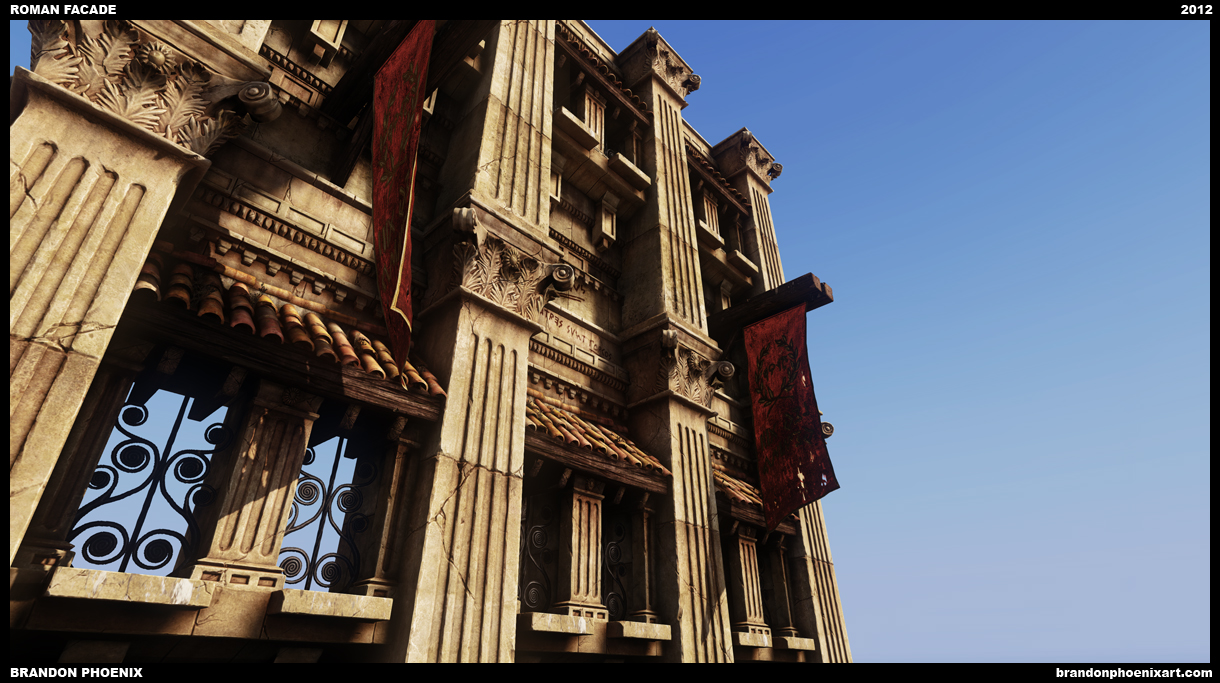
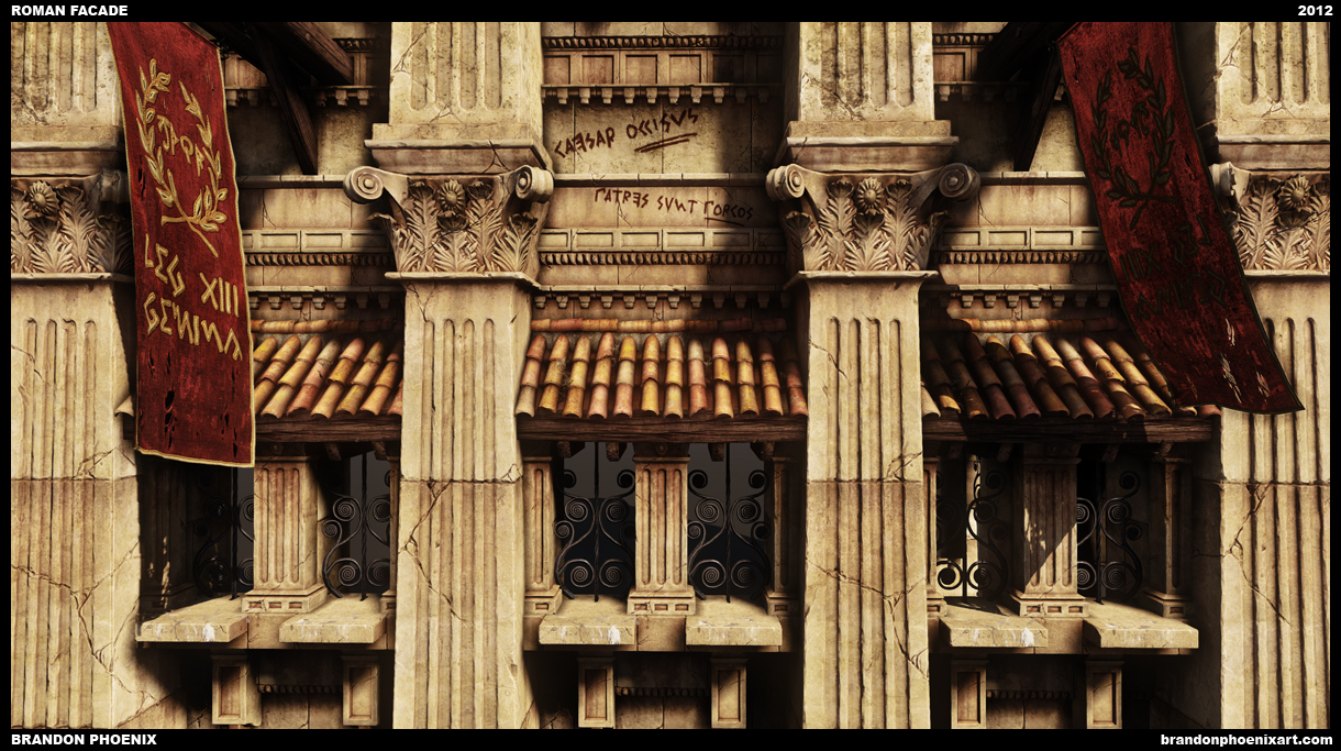
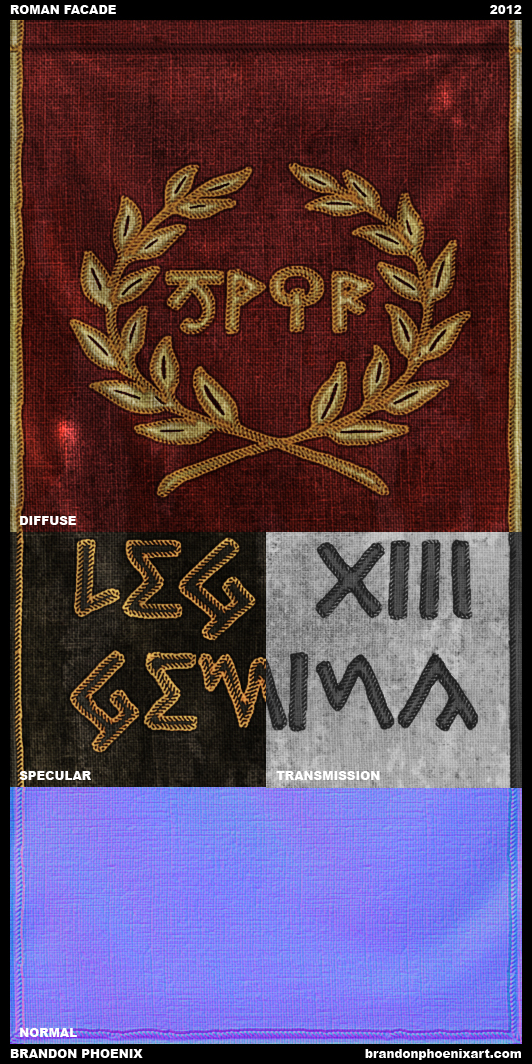
As a wee bit o' bonus, anyone have any idea what the latin graffiti says? If you answer correctly, you get a digital cookie! Hooray!
Modeled in Max/Blender, sculpted in ZBrush, rendered in UDK. If you want any more info on the work, let me know.
C&C, much appreciated.
As a wee bit o' bonus, anyone have any idea what the latin graffiti says? If you answer correctly, you get a digital cookie! Hooray!
Replies
@garriola83: Correct! (actually senators, but I think patrons and senators were analogous terms at the time as you pointed out) Here you go:
Also, here's a very high res screenie.
It looks like you did a fantastic job with the art test.
What program did you use to get your normals with the wood?
Here were my sculpts:
This scene is already pretty sweet, but I have a few nitpicks that may help you..
Quickie paint over in the white square:
Id say really try to work on getting a large range of color in your pieces, and then pull back when you go overboard. Your highpoly/lowpoly workflow is looking pretty solid, but the textures are not as awesome.
Again, looks pretty good sir!
I'll +1 the street scene suggestion.
But generally it's fantastic. It will remain a mystery why you didn't get the job and I'm sure you will get something else soon.
What did you bake your normals in? Max scanline or mental ray or X normal? I'm aware you use some NDO2.
The only beef I have is that the cracks repeat a bit too much. you could probably create some crack decals or work out a blend material and make that kind of damage a bit more random?
don't really understand why you didn't get the job!
are you allowed to post the concept art?
maybe it's bc you made it to similair, to true to the concept?
I've heard a couple of times that they like you to put in a lot of yourself while keeping somewaht true to the concept, but giving it more life, like you did whit the writings
maybe they wanted some small vegetation in there or something?
or maybe it wasn't really the style they where looking for
anyway, I think you did great!
Up close your textures look sort of painterlay, good for that kind of art style or getting the most out of current console texture resolutions. But you'll need to get into photo real/ulra sharp textures for a lot of newer jobs.
Another thing to note is details like that leaf relief motif (queef, because it rhymes!) need to be in full 3d now. No more trying to fake it with normal maps/textures.
In other words, when someone's giving you huge texture/poly targets you need to be in the mode of actually USING that stuff to its full potential.
@aajohnny, Rhoutermans, whw, nathdevlin: I'll consider doing the street, because it's probably a really good idea for the 'folio and would be fun, but I'm pretty burnt on this for the time being, will probably take a break.
@Rhoutermans: Here's my moodboard. I made this when I started, but it evolved as I went. Still like that lighting ref a lot more than what I have. Also, the concept they gave me is blacked out there.
@nathdevlin: Yeah, in retrospect, that would be a much better way to go. I'm still learning a lot of things in UDK, and that is definitely one of them.
@Fomori: All the normals were baked in xNormal, but some of the tangents are wrong. If anyone has good info about using normal maps well in UDK, it'd be much appreciated. They were fine in Marmoset.
@Mark Dygert: You're definitely right, and I would have put more effort into that if this was to be anything but a test. The wireframe shot shows all I was required to do, but I jammed a bunch of stuff together for the UDK shots because it's a lot more interesting.
@Quickel: Probably because it is the default UDK sun
@LuCh!: Naw, can't post the concepts.
@locater16: I think you're right about the generational difference. Also, polycount/texture requirements were not specified in the initial test, so I sort of gradually realized the optimization requirements as I recieved feedback, and ended up retrofitting a lot.
Really appreciate the crits/comments guys! Thanks.
Thought the first image was a ref pic
Im impressed
^_^