Home 3D Art Showcase & Critiques

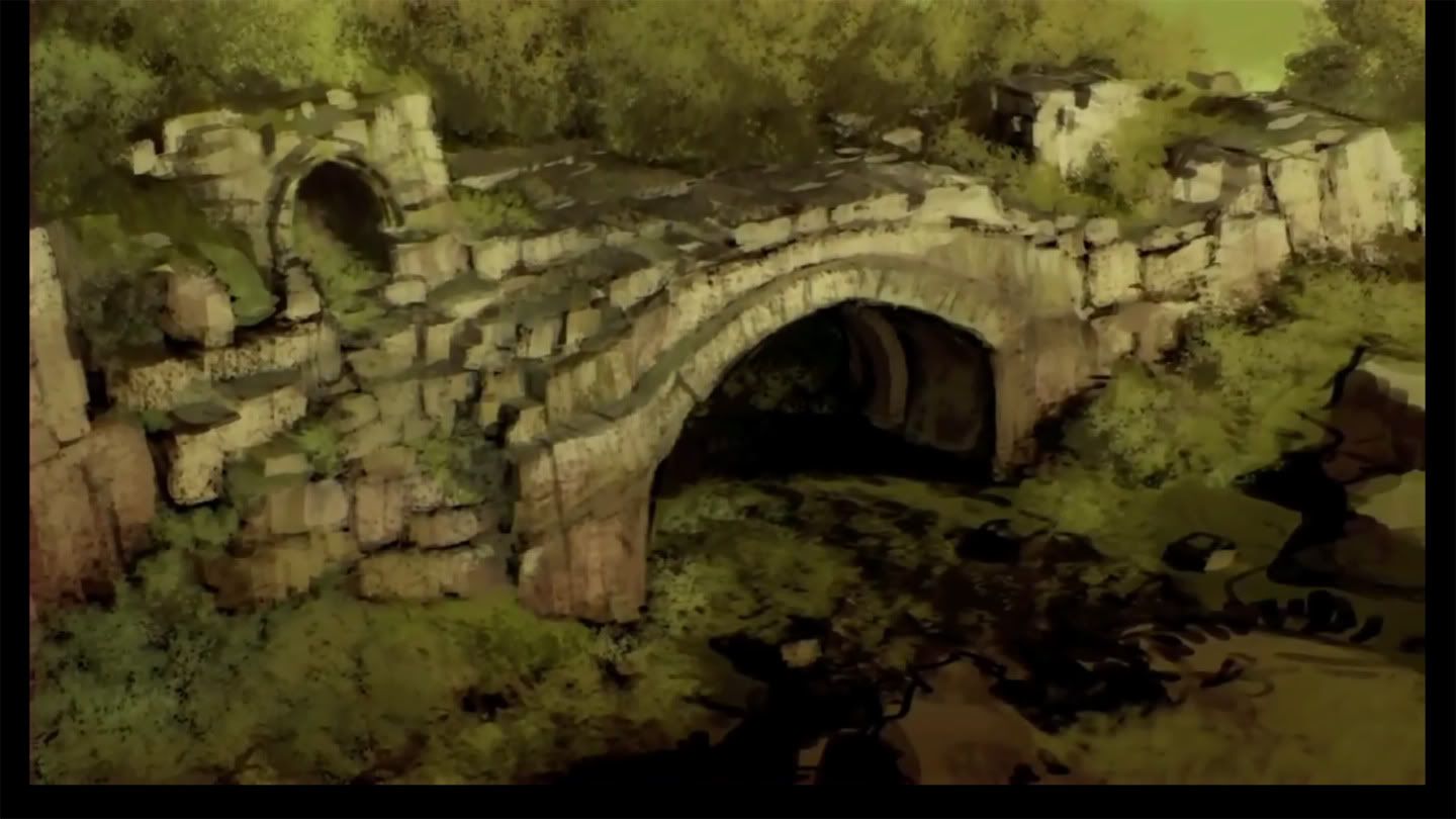
[UDK] Guild Wars 2 Concepts

polycounter lvl 9
Offline / Send Message
PatrickL polycounter lvl 9
So after watching a few of the Guild Wars 2 concept art videos, I found a few environments that I really liked. I've decided to take them into the UDK, and to polish them up as worthy portfolio pieces. There are currently 4 scenes I'd like to tackle, and this is the first! I just started on this a few hours ago, and it's starting to come along.

Any crits/comments appreciated!

UDK_Concept.jpg

UDK.jpg

Replies

  • pr1mus
    Offline / Send Message
    pr1mus polycounter lvl 8
    Good start :) I'll follow this thread, to see those stuff finished.
  • PatrickL
    Offline / Send Message
    PatrickL polycounter lvl 9
    Rough textures thrown on, and I've only just started the sculpt... But it's looking like a decent start so far! Expect another update today.

    UDK02.jpg

    I've never EVER done grass decently with the UDK, so hopefully I'll be able to pull it off for this scene. I also plan on adding in a few bushes to break up the edges a bit more.
  • pr1mus
    Offline / Send Message
    pr1mus polycounter lvl 8
    From the concept, i would say, the stones look too clean. More moss would be great :) so, that the stones only look few a bit.
    Especially on the left side.
  • PatrickL
    Offline / Send Message
    PatrickL polycounter lvl 9
    Don't worry! Once I get the rocks finished, I'll paint over a moss/grass layer onto them.
  • PatrickL
  • ParoXum
    Offline / Send Message
    ParoXum polycounter lvl 9
    Looking real good this far.

    Just a crit on the 3D grass not matching the ground texture color, but maybe it's just a lighting problem to fix like point normals up or something.

    Keep it up :)
  • PatrickL
    Offline / Send Message
    PatrickL polycounter lvl 9
    The left side needs some polish, but it's really coming together. I'm still not happy with the grass, but I'll keep working with it. Gonna take a break from this to do some work on my BEAT-EM-UP! entry!

    UDK04.jpg
  • PatrickL
    Offline / Send Message
    PatrickL polycounter lvl 9
    One last thing left to do...

    UDK05.jpg
  • oobersli
    Offline / Send Message
    oobersli polycounter lvl 17
    just looks like you used one tileable stone texture across it all. Maybe try and make it more custom and unique? sculpt some of those stone bricks to have some wear and age. everything is sharp and too blocky.
  • Ryan Smith
    Offline / Send Message
    Ryan Smith polycounter lvl 11
    Needs more color. Take the time to make some wildflowers or dandelions or some trees that are flowing. Also experiment changing the saturation of the grass slightly. Grassy fields usually dont have the same color throughout, there are dry patches and green patches.
  • amotaf
    To be honest it doesn't feel like Guild wars at all, the only way I associated it with GW was because you said it was. There landscapes seem much more colourful and vivid I've played that game inside out and I don't feel those images say GW. Try looking at the pictures of their landscapes a little more. I'm getting the impression you are going for a pre ascalon look though I might be wrong.

    Also who lives in those caves?? Tell a story to the environment make it seem as if someone or something lives there. Also that grass doesn't seem right and change that sky I can clearly see you've just slapped it on there check out Mount and Blade sky make it like this.

    200pxpresearingascalon.jpg
    Guild Wars 1 - good use of colour, quite vivid almost dream like to some extent, bright and appealing.


    guildwars22009081906141.jpg
    Guild Wars 2 - They have continued that theme to some extent look at the grass very colourful and vibrant, different foilage meshes scattered about the landscape. It does have that slight vivid look to it. Look at the sky very dynamic and it draws your eye immediately look at the constrast going across the sky from light to dark it adds more interest to a scene where there isn't anything going on. Look at the grass as it transitions from a nice green tone to a bright yellow at it's tip, you can see that overal green feel is slightly broken up with warm/ hot colours in the background giving that pleasant and inviting feel in my opinion


    Mount and Blade 2 - look at that sky interesting and engaging, how many times have we all looked at skys like these picturing different shapes with our imagination.Look at the contrast that goes right across the screen from that blown out look on the left which clearly indicates our light source to the slightly darker right side which is much further away from our dominant light source.

    the clouds seem quite realistic and it demands our attention like it's saying "look at me look" as it bears down upon the rest of the terrain that alone made me feel wow.
    54c2e0d3e7a0cd40167e4ab.jpg
  • raul
    Offline / Send Message
    raul polycounter lvl 11
    the one thing i would say, is that you may want to make a few more foliage variations on your meshes and textures. right now i can read the pattern by simple glancing at the image. You've got the right idea, just need to put in a little more attention.

    looking forward for more!
  • PatrickL
    Offline / Send Message
    PatrickL polycounter lvl 9
    Well, to be honest, I had only intended to match the concept, which I feel I've done fairly well. It's stone blocks are very clean cut, it's color palette is very limited, and it feels very abandoned. The "last thing" I was going to do to it was spice up the terrain with more foliage and a few small rocks to break up the edges...

    But to be honest, after all this feedback, I'm going to take it past the concept art and expand it into a full scene.
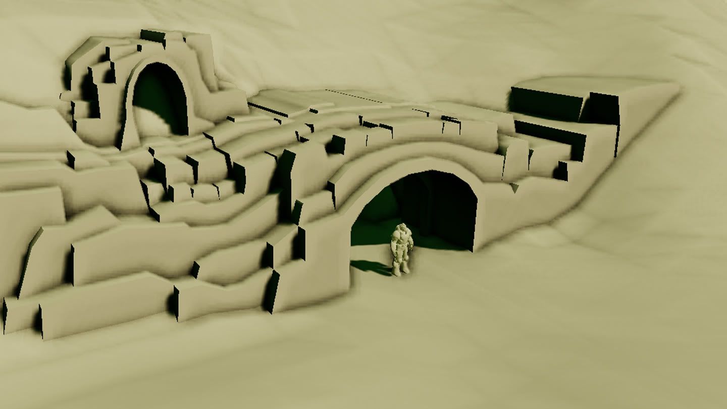
  • PatrickL
    Offline / Send Message
    PatrickL polycounter lvl 9
    Concept
    UDK_Concept.jpg

    UDK
    09.jpg

    There are few things here I need help with, and a few things I'd like some second opinions on. Of course, general C&C is greatly welcomed.

    First off, the black stuff is what I plan to add to flesh out the scene some more, but I'd like a bit more. Any suggests would be greatly appreciated.

    The grass circled by red is actually no longer a problem. The rock on the far left... Does it stick out as odd? The same question for the moss on the nearby meshes. The red arrows up top are just pointing out my poor terrain skills/remind me later of what to fix.
  • DInusty
    Offline / Send Message
    DInusty polycounter lvl 17
    looking good so far.

    it would be nice to bring the back of the scene down a bit to reveal some of the horizon which could then show off some other things in the distance. just very flat right now as far as distance.

    do u know why your grass is shadowing? i think thats whats going on. so on the back sides its very black. possibly in the grass TGA itself it would be good to not have it curve so much in the blades. cam make it easy to pick out from the scene currently. your goal with grass to help ground things man made to the environment, such as the areas where the bricks meet the ground. other then that i like the fence addition in the front. in the concept i think it was supposed to be a drainage end tunnel not so much an entrance. so maybe think a bit with liquid runoff or something along those lines.

    keep it up! i looked at ur other stuff and ur getting better :)
  • roosterMAP
    Offline / Send Message
    roosterMAP polycounter lvl 12
    the grass needs a lot of work.
  • PatrickL
    Offline / Send Message
    PatrickL polycounter lvl 9
    The tree is a placeholder, taken from the UDK stock files. I don't know if I like it there or not. Any and all C&C is greatly appreciated!

    10.jpg
  • uneditablepoly
    So much better on that grass! The dark grass looked so out of place and consumed the scene. You definitely have something cool going here! Keep it up! I think my only real crit at this point would be that the tree back there dominates the background and is pulling my eye to the upper left. I'd either remove it or fill up the background a bit more.
  • gauss
    Offline / Send Message
    gauss polycounter lvl 18
    I think it's coming along well, good work. I think some minor tweaks with the tunnel forms would help it get more of the feeling of the concept. Which is to say that the main tunnel entrance doesn't look as wide and imposing as the concept suggests, though certainly FOV/distance plays a role here.

    A suggestion--I think the lower portion of the frame, the "path" leading into the tunnel is pretty ambiguous in the concept, but to me it reads less like a tunnel than say a large drainage, with the black in the foreground almost like standing water in a shallow riverbed. I know that would increase time spent building this piece, but I think it would be an interesting interpretation of the scene, showing that you're adding something to the mix.

    Oh and as far as the fences you've added, I would suggest elaborating further on them as well. It's not a bad idea, but draw them out, you've already got the model, so extend them out of the frame. Fences are excellent tools in landscape composition for framing and directing attention of the viewer, or leading a wandering player. I always liked placing wrecked and leaning fences; you can create huge variety with so few assets. Export out a single fence post and a "collapsed" version of the fence you have there already and that's a lot of free variety.

    edit: better by illustration:
    patrickl.jpg
  • PatrickL
    Offline / Send Message
    PatrickL polycounter lvl 9
    Fantastic suggestions. Thanks!
  • PatrickL
    Offline / Send Message
    PatrickL polycounter lvl 9
    11.jpg

    12.jpg

    Still trying to work out how I could do the water. I've tried a few different materials, and nothing seems to give a nice reflection and edge like I want. Added some fences and a bit of more detail to the horizon line.
  • HughieDM
    Offline / Send Message
    HughieDM polycounter lvl 7
    lookin great would be pretty cool to create some sort of special hero piece to put in the scene like a statue or something
    keep it up
  • PatrickL
    Offline / Send Message
    PatrickL polycounter lvl 9
    Added some flowers, changed the terrain material density. Still haven't found a way to approach a nice reflective water.

    13.jpg
  • PatrickL
    Offline / Send Message
    PatrickL polycounter lvl 9
    Been playing with the lighting, AO, and DOF a bit.

    15.jpg
  • Gilgamesh
    Offline / Send Message
    Gilgamesh polycounter lvl 12
    Yer the ssao was way too strong in previous shots, it's something I was going to post on till i saw the last shot :)

    Looking really nice, but as you say, it really does need the water to finish it off.
  • PatrickL
    Offline / Send Message
    PatrickL polycounter lvl 9
    Another update! I'm not entirely satisfied with the water, but it's the best I have been able to get it. I'll continue to try and improve it, of course. I also am experiencing a problem with a terrain material involving it's alpha mask. The material is mud with a bunch of rocks, and I'm masking out the mud so it leaves just the rocks. Then ideally I'd paint just the rocks onto the terrain, but not so. It appears there is some fancy method for alpha to work on a terrain? Or a perhaps a check box I missed? Any help with that would be great. (Will try to get some pictures of the problem in here soon.)


    All C&C welcomed!
  • MainManiac
    Offline / Send Message
    MainManiac polycounter lvl 11
    Make the grass look a little less like fur and itll look amazing
  • PatrickL
    Offline / Send Message
    PatrickL polycounter lvl 9
    problemb0.jpg

    Essentially, the material view port shows what I'd like to paint onto the terrain. Basically a decal layer, if that makes sense. The image on the left is what I am getting. I've played with a lot of alpha/opacity settings, and it seems to not want to work. I'll probably just end up placing decals, even though the UDK seems to hate them.
  • PatrickL
    Offline / Send Message
    PatrickL polycounter lvl 9
    Not all at once, now. :P
  • e-freak
    for the rendering (light and sky mainly) i'd get some blue-violet in there and some higher contrast to the sky (probably cloudier with harsher sun-light) and give the terrain some cloud-shadowing.
  • PatrickL
    Offline / Send Message
    PatrickL polycounter lvl 9
    I think I'm going to call this done, even though it's not exactly perfect. I'm getting pretty anxious to move on to my next scene. (Trying to get six solid scenes done before the end of December for my portfolio. No small feat.)


  • ZacD
    Online / Send Message
    ZacD ngon master
    that grass looks radioactive
Sign In or Register to comment.